Table of Contents
One request that’s been coming up from our users in the comments section is to demonstrate the process of building a full website using Hello Theme and the Elementor Theme Builder.
Our goal is to be the best at helping others excel in their craft. This is why we‘ve decided to dedicate several articles to this purpose, each time showing the creation of different parts of the site.
We’ll begin this series by showing you the easy process of building a one-page website, to include a header, footer, and content of the page.
Before we delve deeper into the one-page website, we’d like to explain the difference between a theme and a template.
What Is a One-Page Website?
A one-page website sometimes called a single-page website is exactly what it sounds like — it is a website that is wholly made from one page. It has no additional pages like the About page, Contacts page, or other similar pages.
The user has to simply keep scrolling down to receive all of the information the website has to offer.
This allows the website to provide information in a direct matter, and create a more fluid experience for the user.
Why Use a One-Page-Website?
It shouldn’t come as a surprise that more and more businesses are relying on one-page websites.
For one thing, having all of your content on one streamlined linear page means that visitors remain focused on your content.
As such, your one page becomes the funnel itself, continuously convincing readers to scroll down to a Call-to-Action. This reduces the risk of losing customers when clicking on links to other pages, that could load too slowly or create a distraction.
This format of website layout also limits us to the amount of content, forcing us to be spartan and laconic, something that is perfect when targeting younger audiences and mobile users – which is where Google is directing its search engine bias, with its Mobile-First agenda that began July 1st.
One-page websites are great for all sorts of businesses and causes. Not long ago we published a list of 12 Essential Tips to Making Your Portfolio Website Stand Out, just one of countless examples of ways that One-Page websites are used more and more.
When To Use a One-Page Website
The decision to use a one-page website depends entirely on the content and services that you are providing.
Clearly, if you have lots of information or various different services and products that you offer, the choice of a single-page website may be unwise, as it may create confusion and provide a bad experience for the user.
This type of website is often used by companies with a single product, businesses that offer a single service (like lawyers, accountants, consulting firms, etc.), or individual portfolios (freelancers).
Examples of One Page Websites
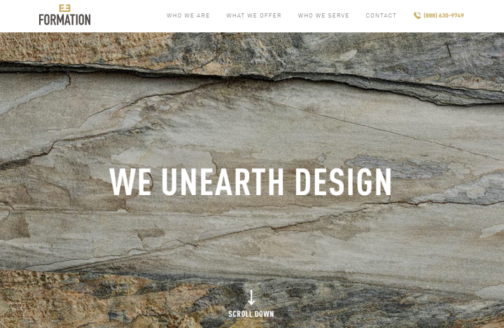
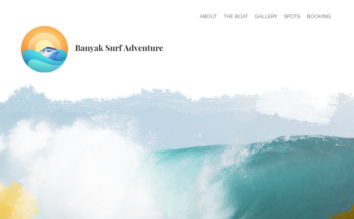
We’ve gathered some interesting examples of one-page websites, so you can see what they look like visually.
Formation Stone
Banyak Surf Adventure
How to Create a One-Page Website
In this week’s tutorial we will be building a one-page website from scratch that will include:
- The page itself, with the content divided into sections
- A menu that will allow visitors to skip ahead to the relevant sections
- A header that will include our menu.
- A footer.
Our example client has commissioned us to build a website for his yacht rental service, Yachtora.
To set the ball rolling on this tutorial, we’ll need some basics:
- WordPress (we like to work with a clean install, and the 2019 theme activated)
- Elementor builder (free) and Elementor Pro
We will also install the Hello Theme, a free starter theme that is so minimalistic, it’s practically blank. As such, it will not only allow us to use Elementor’s theme builder, it will allow us to add elements to theme parts (header, footer, etc.) without any worry of conflictions, as well as help to reduce load time and the need for additional plugins.
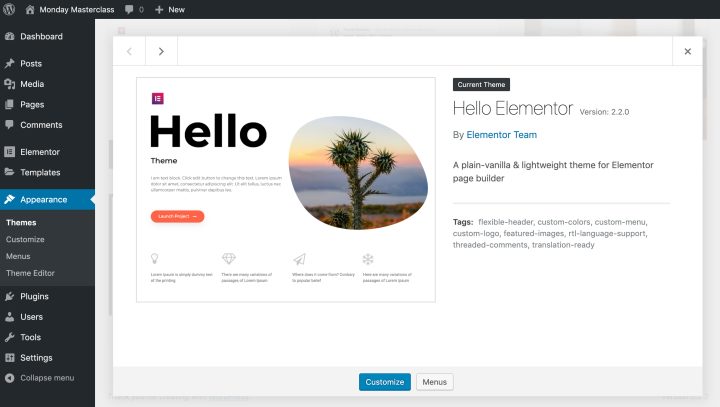
To install Hello Theme:
- In the WordPress dashboard, go to Themes, and click on Add New.
- In the Add New Theme dialogue box, use the search box to search for the ‘Hello’ theme.
- Install the Hello theme.
- Once it is installed, activate it.
Creating Your One-Page Website
We’ll create our page in the simplest, most efficient way possible, by clicking on New on the WordPress dashboard and selecting the Page option.
Once your page has opened, select the Edit in Elementor option.
While in Elementor Editor, click on the library icon and in the template library search box, search for the term ‘Yacht’. Click on the template and insert it.
We’ll be using this as a foundation for our page.
Creating a Menu for Your One-Page Website in WordPress
As you will see, our page now includes the following sections:
- Top (Home)
- Features
- About Us
- Our CEO
- Destinations
- Photo Gallery
- Subscribe
- Contact Us
These are the basic sections that we want our menu to refer to. But there’s a chance that when we imported the template, the sections might have been renamed automatically.
As we want to avoid this causing any future problems, we’ll assign each of these sections a CSS ID.
To do this, we’ll simply right-click the Section Handle of each section and select Edit Section. From the menu. Enter the Advanced tab in the Editor panel, and in the CSS ID field, enter the correct section name.
Important Note: Avoid using the hash key (#) in front of the IDs in Elementor, as Elementor adds this automatically to the code. |
We’ll be naming our sections as follows (you can of course use any names you prefer):
- Top
- Features
- About
- CEO
- Destinations
- Photos
- Subscribe
- Contact
With every section now clearly named, it’s time to build our page’s menu.
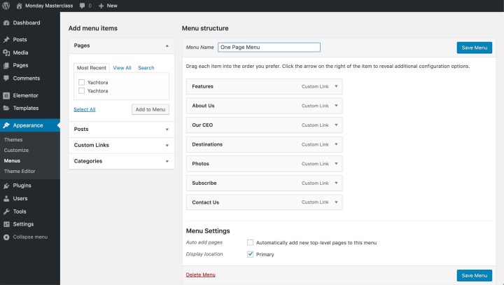
Use the Finder tool (cmnd or ctrl + E) to get to the Menus options on the WordPress dashboard (you can also find the Menus options in the Appearance section on the WordPress dashboard). We’ll name our menu “One Page Menu”, and click Create Menu.
Now we can begin adding the menu items to our new menu.
To add Menu items, click on the Custom Links button, and in the URL field, enter the website’s URL followed by a hash sign (#) and the appropriate CSS ID to create the slug for each section. In the Link Text field, enter the menu title as you would like it to appear on your website.
We’ll start with the features section because we want to turn the Company Logo into a ‘Home’ Button later. So the menu items that we created are as follows:
URL
- #features
- #about
- #ceo
- #destinations
- #photos
- #subscribe
- #contact
Link Text
- Features
- About
- CEO
- Destinations
- Photos
- Subscribe
- Contact Us
Once we’ve finished creating our menu items, we’ll assign the menu to the appropriate location in the menu settings and check the Primary checkbox, and click Save to save this menu.
Creating a Header/Footer for Your One-Page Website
We’ll create our header and footer in Theme Builder, found under the Templates section in the WordPress dashboard. Both the header and footer can be created this way, however, for the purpose of this tutorial we’ll focus mainly on the header, rather than repeating the same instructions.
In the Theme Builder, click on Add New and in the dialogue box that appears, select Header, and give it a name, then click on the Create Template button.
From the Template gallery, we’ll select a header that suits our design (we selected Header 1), and click Insert.
Adding a Logo
Having returned to Elementor mode, we’ll begin tweaking our header by deleting the logo, and replacing it with an Icon Box.
In the Elementor editor panel, we’ll change the icon to an Anchor from the icon library that appears when we click on the icon image.
We can also add a custom icon/logo here in SVG format, the same way, in both the Free and Pro versions of Elementor.
Continuing in the Elementor editor panel, I’ll set the icon’s view to be Framed, and I’ll type the name of the company Yachtora in the Title box and delete the text from the description box.
To turn the icon or logo itself into a home button, enter the link to the top section in the Link field. Be sure to use your websites’ address, followed by a hash key and the name we used as the CSS ID. In our case, the link would read: http://yourwebsite.com/#top
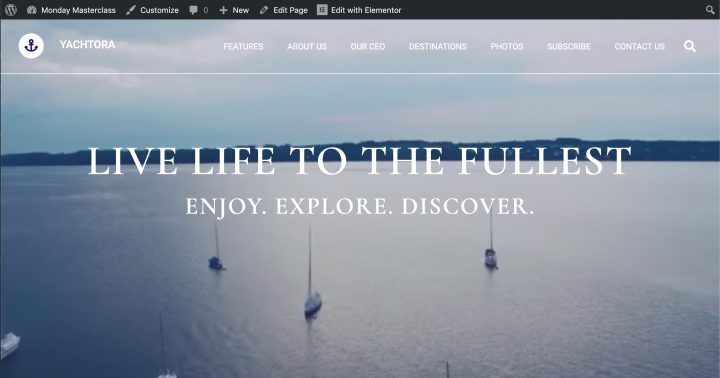
Use the widget’s flexibility to your advantage, and make good use of the variety of settings in the Editor panel to stylize and perfect your header.
We used changed the icon’s position in the content tab and in the style tab we changed the icon color to the same reoccurring dark blue that’s used elsewhere on the page. We also changed the icon’s frame and background color to white and adjusted the spacing to 27 pixels and the size to 21 pixels.
As for the text, we changed the color to white, and entered topography settings to set the font size to 18, the weight 500, and Transform the letters to Uppercase.
We would also like this icon to look more contemporary and add some animation by selecting the Float option in the Hover settings.
Customising Your Header Menu
Moving on to other header elements, we’ll tweak the Navigation menu.
In the Content tab, on the Elementor panel, we’ll set the pointer to Text, set the animation to Float, to stay consistent with our icon/logo. We will also set the Sub Menu to Classic
In the style tab, under Topography, we’ll set the font size to 14 pixels, and the weight to 400, as well as setting the text Transform to Uppercase.
We’ll remain consistent with our icon/logo, and change the color of the text to white, and do the same to the search icon (in the editor panel for the search form widget, under the Style tab)
While here, we thought to add a solid border, with a width of 1 pixel, on the bottom of the heading section.
We also want to make the background of the whole header transparent, so that we can preserve the romantic and peaceful seascape with all the yachts that we have on our page as a video. To do this, we’ll go into the Section Editor, and under the Style tab, we’ll use the color selector to make the background transparent.
To ensure that this lovely video background appears as the background of our header, we’ll make 2 small adjustments. First, under the Advanced tab of the section editor, we’ll set the Z Index to 4 (the index can be any number so long as it is higher than everything else). Second, we’ll set a negative margin for the ‘hero section’, the section containing the video at the top of the page. This, however, might be more convenient to do when we return to the main page, once we’ve finished our header/footer.
Setting Up a Header/Footer on Your Website
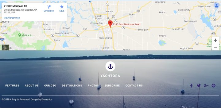
Once we’re done designing our header/footer, we’ll click Publish at the bottom of the editor panel. In the dialogue box that appears, we’ll add a condition, and select it to appear throughout the Entire Sight, then click on Save and Close.
Using the Finder (cmnd/ctrl + E), we’ll return as promised to our main page and there, go into the section editor, to the advanced tab and set a negative margin of -300 pixels, to ensure its place as the background of our header.
Click on the view option (bottom of the editor panel) and in view mode, test all the links in the header to make sure that they actually work and navigate down your page reaching the assigned locations.
As aforementioned, we’ll use this same procedure to create our footer, using the Theme Builder, then selecting a template, customizing, then publishing it with a set condition to appear across the entire site.
Setting Up the Main Page as Homepage for Your Website
Once we have completed building and entering the content of our one-page website, we’ll go back to the WordPress dashboard, and in the (WordPress) Settings section select the Reading sub-section. In the options under Your homepage displays, select A static page, then select your main page from the dropdown menu below the option.
Click on Save Changes, and you’re done. We now have our one-page website, that includes a header, content, and footer.
One Page Website WordPress Themes
The rudimentary function of the Hello Theme, like a minimalistic foundation, will prove very efficient in lowering the weight of the page and speeding up the load time.
However, there are numerous one-page WordPress themes available for expedient use.
Astra
Astra is a popular theme provider for WordPress. They’ve surpassed 1,000,000 users, and they offer numerous themes. They have a good selection of single-page website themes.
OceanWP
Envato
Build a One-Page-Website With Elementor Quickly and Easily
A one-page-website is a great way to focus the user’s attention to the most important information, and slowly nudge them and funnel them towards the call to action. The one-page-website also serves as a clutter limiter. It forces the website creator to be as succinct and focused on the message they are trying to deliver as possible.
This type of website also offers visual design challenges, that, if tackled well, can bring out creativity and showcase it to the world.
With Elementor, the task of creating a single-page-website becomes extremely easy. Elementor has numerous widgets that can make the website more appealing, and easy to navigate. Get Elementor today!
We’d love to see what you’ve designed, and really appreciate hearing about your experience.
What advice would you give other users? If you have any tips or tricks you use when building pages in Theme Builder, please share them in the comments below.
Looking for fresh content?
By entering your email, you agree to receive Elementor emails, including marketing emails,
and agree to our Terms & Conditions and Privacy Policy.
