Table of Contents
One-page websites are:
- Easy to use
- Quick to load
- Focused on your main message
With so many one-page website builders out there, it can take time to choose the right one. Don’t worry – we’ve done the research for you. In this guide, we’ll show you the nine best one-page website builders of 2026. We’ll give you the info you need to make a smart choice and get your website up and running fast.
What is a One-Page Website?
A one-page website puts all your important info on a single, scrolling page. It’s like a digital flyer or a well-organized presentation. Visitors scroll down to see different sections instead of clicking through many pages. This style gets rid of complicated menus and keeps your message clear and to the point. It’s great for:
- Portfolios
- Landing pages
- Event promotions
- Small businesses that want a simple but effective online presence
Why Choose a One-Page Website?
One-page websites have several benefits:
- Easy to use: Visitors can find all the info they need without getting lost in many pages.
- Fast loading: The simple design means the site loads quickly, which is important these days.
- Clear message: You have to focus on your most important content, which helps create a strong, clear story.
- Better engagement: Visitors are more likely to take action when they see a focused message.
- Great for visuals: One-page sites work well for showing off photos or products.
- Cost-effective: They usually take less time and money to make compared to bigger websites.
- Mobile-friendly: Your content looks good and works well on any device.
Key Features to Look for in a One-Page Website Builder
When you’re choosing a one-page website builder, some features are must-haves. The best builders give you tools that make the process easier, improve your site’s functions, and create a great experience for your visitors. Here are the important features to look for:
- Drag-and-Drop Interface
- What it is: A tool that lets you move website elements around by clicking and dragging.
- Why it’s important: You can design your site without knowing how to code. It’s simple and fast, even for beginners.
- Responsive Design
- What it is: Your website automatically adjusts to fit any screen size.
- Why it’s important: It ensures your site looks good on computers, tablets, and phones. This keeps visitors interested and reduces the chance they’ll leave quickly.
- Template Library
- What it is: A collection of pre-designed website layouts.
- Why it’s important: Templates give you a starting point, saving you time and effort. Look for a builder with many templates for different industries and styles.
- SEO-Friendly Features
- What it is: Tools that help your website rank higher in search results.
- Why it’s important: These features make it easier for people to find your site when they search online. Look for things like customizable meta tags, clean code, and fast loading times.
- E-commerce Integration
- What it is: The ability to add an online store to your website.
- Why it’s important: If you want to sell products or services, you need features like a shopping cart, inventory management, and payment processing.
- Mobile Optimization
- What it is: Features that make your site work well on mobile devices.
- Why it’s important: It goes beyond just fitting the screen. Look for touch-friendly elements, optimized images, and fast loading on mobile.
- Customization Options
- What it is: Tools to change the look and feel of your website.
- Why it’s important: You can change the fonts, colors, how it’s set up, and other design stuff to match your brand and make your site look unique.
Top 9 One-Page Website Builders in 2026
Now that we know what to look for in a website builder let’s check out the best ones for making one-page websites in 2026. Each tool has its own style and works well for different needs and skill levels. Let’s find the right one for you!
1. Elementor
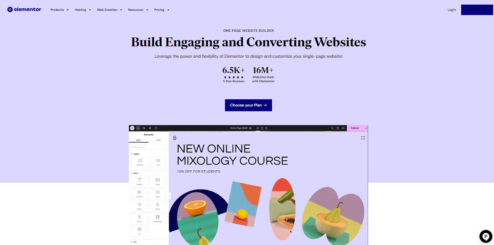
Elementor is the top pick on our list. Over 17 million websites use it. It’s a flexible website builder that’s easy to use and has lots of design options. Both beginners and pros like it because you can drag and drop things around, and it has many templates and widgets to choose from. With Elementor, you can make great-looking one-page websites that work well too.
Key Features:
- AI Design Helper: Elementor’s AI Copilot gives you ideas for layouts, elements, and content based on your preferences, making designing easier and faster.
- Lots of Templates: Choose from many pre-made designs for different industries. These give you a good starting point so you can focus on making the site your own.
- Works with WordPress: Elementor integrates seamlessly with WordPress, so you can use many plugins to add more features to your site.
- Fast and Efficient: Elementor has tools to make your site load quickly, which gives visitors a smooth experience.
Elementor Hosting: If you want an easy way to host your Elementor site, try Elementor’s WordPress Hosting. It’s all set up for you and works great with Elementor. They’ll handle all the techy stuff so you can concentrate on making your website look fabulous.
2. Wix
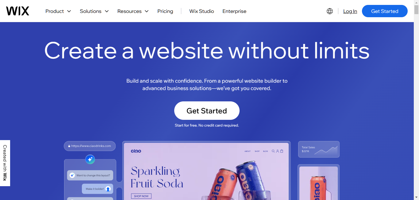
Wix is another popular choice for making one-page websites. 11 million websites use Wix for its versatility and beautiful design. It’s known for being easy to use and having lots of templates. You can drag and drop things to design your page, and Wix even has an AI tool that can make a layout for you based on a few questions.
Key Features:
- Easy Drag-and-Drop Editor: Even if you’re new to making websites, you can easily move things around and make them look how you want.
- Lots of Templates: Wix has many pre-made designs, including ones made just for one-page websites.
- AI Design Helper: Wix’s Artificial Design Intelligence (ADI) can create a website layout for you, saving you time.
- App Market: You can add extra features to your site with apps from Wix’s App Market.
- Mobile-Friendly: Wix websites look good on phones and tablets, too.
Pros:
- Easy to use
- There are many templates to choose from
- AI helps with design
- Lots of apps to add features
Who it’s for: Beginners and small businesses who want to make a nice-looking one-page website quickly and easily.
3. Squarespace
Squarespace is popular with creative people and businesses who want their websites to look stylish and simple. Over 6 million websites use Squarespace, which is known for making beautiful websites. It’s great for:
It offers well-designed templates that look modern and elegant. Squarespace is easy to use and has features for blogging and selling products.
Key Features:
- Great-Looking Templates: Squarespace’s designs are beautiful and professional, helping your site stand out.
- Easy-to-Use Editor: You can easily change your chosen template by adding and moving things around.
- Blogging and Online Store Tools: Squarespace is useful for different needs. You can add a blog or sell products on your site.
- Works on All Devices: Your site will look good on computers, phones, and tablets.
- Help When You Need It: Squarespace’s support team is available 24/7 if you have questions.
Pros:
- Beautiful templates
- Easy to use
- Can do many things on one platform
- Great customer support
Who it’s for: Creative people, photographers, and small businesses who want their one-page website to look really good and professional.
4. Carrd
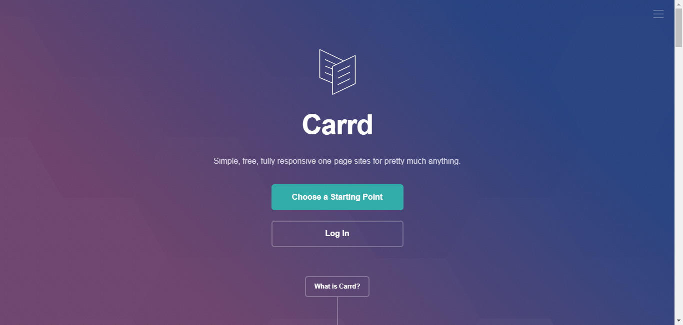
If you want something simple and cheap, Carrd is a great choice. It focuses on making things easy and fast, letting you create nice one-page websites without any fuss. Carrd’s designs are clean and modern, and it’s very straightforward to use.
Key Features:
- Simple Designs: Carrd’s templates are clean and uncluttered, perfect for showing important info without distractions.
- Very Easy to Use: Carrd is easy to figure out, even if you’ve never made a website before.
- Affordable: Carrd has a free plan with basic features, and its paid plans are cheap.
- Works on All Devices: Carrd websites look good on computers, phones, and tablets.
- Can Be Added to Other Sites: You can easily put your Carrd site inside other websites or share it on its own.
Pros:
- Simple design
- Very easy to use
- Cheap
- It looks good on all devices
- Can be added to other sites
Who it’s for: People making personal portfolios, single-page ads, or simple websites that need to look clean and focused.
5. GoDaddy Website Builder
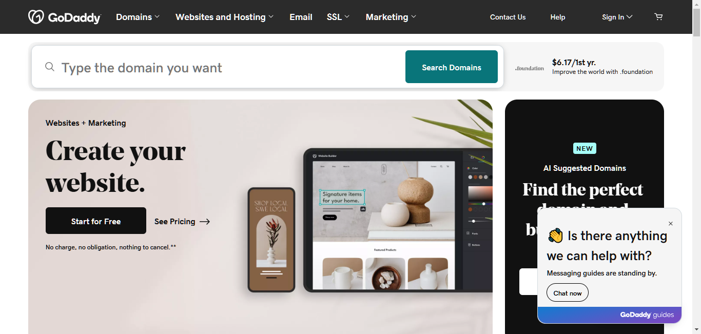
GoDaddy, with over 34 million users, is known for web hosting and now offers a website builder that’s cheap and easy to use. It’s made to be fast and simple, good for people who want to get their one-page website up quickly. GoDaddy’s tool is streamlined and easy to use, and its templates work well on all devices.
Key Features:
- Easy-to-Use Interface: You can add and change things on your site with simple clicks and drag.
- Templates That Work on All Devices: GoDaddy’s designs automatically adjust to look good on computers, phones, and tablets.
- Basic SEO Tools: GoDaddy includes simple tools to help your site show up in search results.
- Can Sell Products: You can add a simple online store to your one-page website.
- 24/7 Help: GoDaddy’s support team is available any time if you need help.
Pros:
- Easy to use
- Quick to set up
- Works well on mobile devices
- Has SEO and online store tools built-in
- Support available anytime
Who it’s for: People and small businesses who need a basic one-page website quickly and cheaply.
6. Webflow
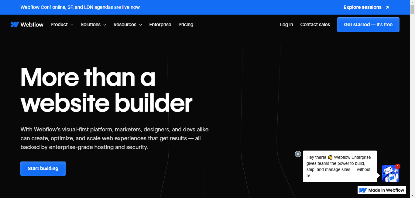
Webflow stands out because it gives designers and developers more control over their websites. It’s like a canvas where you can directly change HTML and CSS elements (the code that makes up websites).
This makes it a powerful tool for creating custom one-page websites. Webflow is harder to learn, but it’s great for people who want complete creative freedom. The user base is growing every year, with almost a million users and still counting.
Key Features:
- Visual Design Canvas: Webflow lets you design and build your website at the same time, giving you exact control over how everything looks.
- Custom Animations: You can add unique movements and interactions to your site to make it more engaging.
- Content Management System (CMS): Webflow has a built-in system that makes it easy to update your website’s content.
- Can Sell Products: You can sell things directly on your one-page website with Webflow’s online store features.
- Works on All Devices: Webflow has tools to make sure your website looks great on computers, phones, and tablets.
Pros:
- Lots of design flexibility
- Powerful animation tools
- Built-in content management
- Can sell products
- It looks good on all devices
Who it’s for: Designers, developers, and agencies who want complete control over how their one-page website looks and works.
7. Jimdo
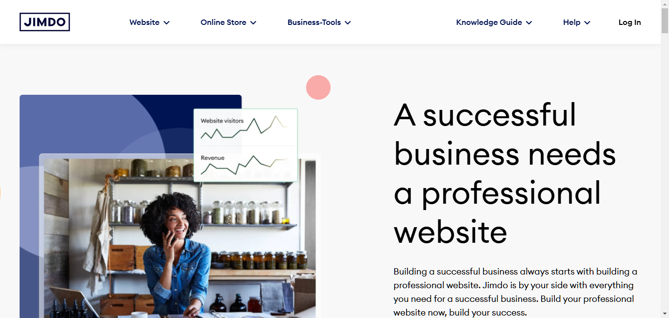
Jimdo is a website builder that’s easy to use and great for small businesses and individuals. Jimdo, with over a million users, uses AI (artificial intelligence) to help you make a website. It does this by asking you some questions about your business. After that, you can change the design using Jimdo’s drag-and-drop editor.
Key Features:
- AI Helper (Dolphin): Makes a basic layout for your site based on what you tell it.
- Drag-and-Drop Editor: Easy-to-use tool for changing how your site looks.
- Mobile-Friendly Templates: Your site will look good on phones and computers.
- Blogging and Online Store: You can add a blog or sell things on your site.
- SEO Tools: Basic tools to help your site show up in search results.
Pros:
- AI helps make your site
- Easy to use
- Works well on mobile
- Can add a blog or store
- Affordable
Who it’s for: Small businesses and individuals who want a simple, affordable one-page website with some AI help.
8. Strikingly
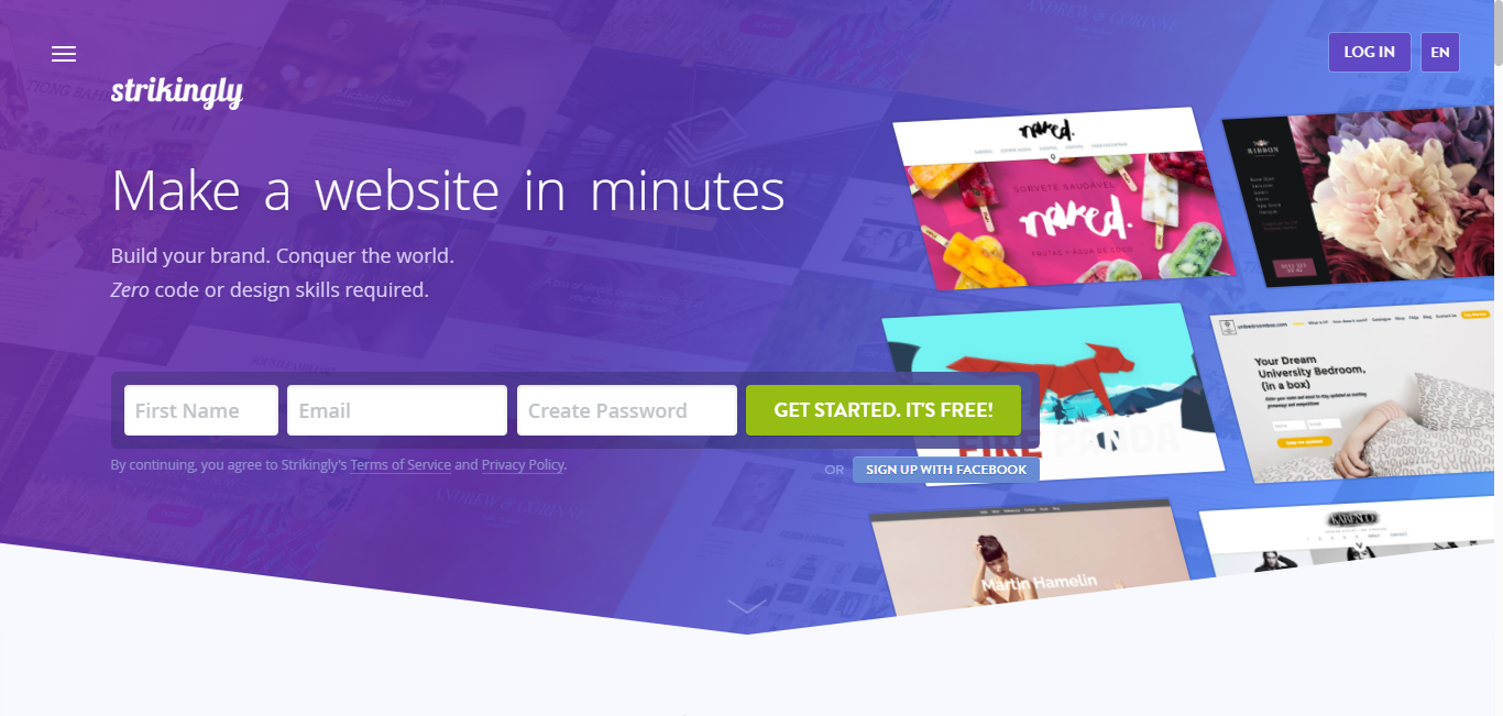
Strikingly helps you make eye-catching one-page websites easily. Its templates look modern and stylish, and it’s easy to use even if you’re new to making websites. Strikingly also has a mobile app so that you can work on your website from your phone. Be one of the 94 thousand users who enjoy the benefits of amazing services.
Key Features:
- Modern Templates: Bold designs that grab attention.
- Easy Drag-and-Drop Editor: Change your site’s look without needing to know the code.
- Mobile App: Manage your website from your phone.
- Blogging and Online Store: Add a blog or sell things on your site.
- Social Media Connection: Link your social media accounts to your website.
Pros:
- Great-looking templates
- Easy to use
- Mobile app for managing on the go
- Can add a blog or store
- Connects with social media
Who it’s for: People, artists, and small businesses who want a stylish one-page website that’s easy to manage.
9. SeedProd
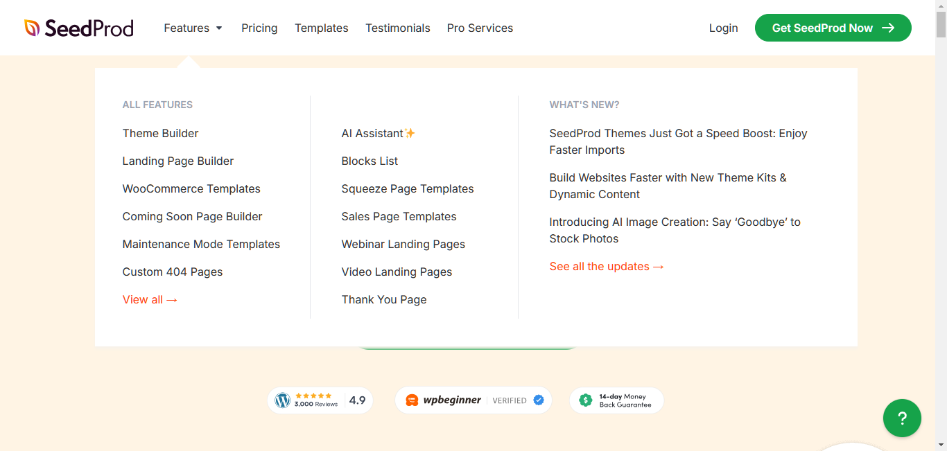
SeedProd is known for its tools that make “coming soon” and “under maintenance” pages. But it’s also good for making one-page websites. It has a drag-and-drop interface and templates for landing pages and can work with other tools to add more features to your site. With over 34 thousand users, SeedProd is perfect when you’re working on your site and don’t want people to see it yet.
Key Features:
- Drag-and-Drop Builder: Design your site without needing to know the code.
- Landing Page Templates: Pre-made designs to help you start quickly.
- Coming Soon & Maintenance Mode: Easily put up a temporary page while you’re working on your site.
- Works with Other Tools: Connect SeedProd with email marketing, customer management, and other tools.
- Ready-Made Blocks: Add things like customer reviews, pricing tables, and sign-up forms easily.
Pros:
- Easy to use
- Good for making landing pages
- Can make “coming soon” pages
- Works with popular tools
- Has ready-made parts you can add to your page
Who it’s for: People making landing pages, “coming soon” pages, and simple one-page websites, especially if you want to get visitors’ contact information.
How to Pick the Right Website Builder for You
There are many great one-page website builders out there. So, how do you choose the best one for your project? Don’t worry. We’ll help you figure it out. Let’s look at what’s important to think about when you’re deciding.
What to Think About
Before you pick a website builder, ask yourself:
- How much can I spend? Prices can be very different between builders.
- How good am I with tech? Some builders let you do more, but they might be harder to learn.
- What special things do I need? Like selling products, writing a blog, or using tools to help people find your site online.
- Will my website need to grow? Make sure the builder can handle your needs as your site gets bigger.
Matching Builders to Your Needs
The best builder for you depends on what you’re using your website for. Here are some ideas:
- If you’re showing off your work (like art or photos), try Squarespace or Wix. They make your work look great.
- If you’re selling something, consider Unbounce or Leadpages. They’re effective at getting people to buy.
- Elementor is a good choice for small businesses that need to do a bit of everything. It can do many different things.
- If you’re on a tight budget or need a simple site fast, check out Carrd or Jimdo.
Remember, there’s no perfect choice for everyone. Try out different builders (many have free trials) and see which one feels right for you.
How to Make a Great One-Page Website
Now that you know about different website builders, let’s talk about how to make your one-page site really good. A great one-page website looks nice, but it also makes people want to stay, read your message, and do what you want them to do (like buy something or sign up for emails).
1. Use Clear and Simple Message
You only have a little space on a one-page site, so you need to be clear about what you’re saying. Here’s how:
- Put only a little information or too many things on your page. It can overwhelm people.
- Write a strong headline that grabs attention and tells people what you’re about.
- Use short paragraphs and bullet points to make information easy to read.
- Include clear calls to action (CTAs). These are buttons or links that tell people what to do next, like “Buy Now” or “Sign Up.”
Everything on your page should have a reason for being there. If it doesn’t help tell your story or get people to act, consider removing it.
2. Make Things Easy to Find
You want people to find what they’re looking for on your page easily. Here’s how to do that:
- Use headings and subheadings to organize your information.
- Use different font sizes to show what’s most important.
- Use colors or special design elements to make important parts stand out.
- Arrange your sections in an order that makes sense, like telling a story.
3. Use Great Pictures and Videos
Pictures and videos can say a lot without using words. They can:
- Grab people’s attention
- Show what your product or service is like
- Make people feel something about your brand
Use high-quality images and videos that fit your brand and appeal to the people you want to reach.
4. Make Your Site Work Well on Phones
Most people look at websites on their phones now. So, your site needs to look good and work well on small screens. This means:
- Making sure text is easy to read on phones
- Putting buttons where they’re easy to tap
- Making sure images look good on small screens
A site that works well on all devices (like computers, tablets, and phones) is called “responsive.”
5. Help People Find Your Site Online
Even though your website is just one page, you still want people to find it when they search online. This is called Search Engine Optimization (SEO). Here’s how to do it:
- Find out what words people use when they search for things like your business.
- Use these words naturally in your content, headings, and behind-the-scenes parts of your site.
- Your website should load super fast and be easy to use on smartphones and tablets. Google and other search engines really dig websites that do this.
If you’re making use of Elementor, it plays nicely with tools like Yoast SEO, which can help you with this.
Remember, SEO is something you keep working on. Keep learning about it and improving your site to help more people find you online.
How to Make Your One-Page Website Better
Building a nice-looking one-page website is just the start. To really do well online, you need to make sure your website works great, gets visitors, and helps you reach your business goals. Let’s look at how to do this.
1. Make Your Site Fast
People want to start immediately. If your site takes too long to load, visitors might leave. Here’s how to make your site faster:
- Make your images smaller: Use tools to compress images so they load faster but still look good.
- Use lazy loading: This means pictures only load when people scroll down to them.
- Clean up your code: Remove any extra stuff in your HTML, CSS, and JavaScript files.
- Use caching: This saves parts of your site so it loads faster for people who visit again.
- Use a Content Delivery Network (CDN): This method places copies of your site on servers around the world, so they load faster for people in different places.
2. Understand How People Use Your Site
It’s important to know how people are using your website. You can check out tools like Google Analytics to see:
- How many people visit your site
- What parts of your site do they look at most
- Where they click
- How long they stay
This information helps you make your site better. If you’re using Elementor, it’s easy to add Google Analytics to your site.
3. Test Different Versions of Your Site
Even if your site looks great, you can always improve it. One way to do this is through A/B testing. This means you create two slightly different versions of your site and see which one works better.
You can test things like:
- Different headlines
- Different colors for buttons
- Different pictures
This helps you find out what your visitors like best. Many website builders work with tools that let you do A/B testing.
4. Keep Your Site Safe
It’s really important to keep your website and your visitors’ information safe. Here’s how:
- Keep your website builder and any extra tools up to date.
- Use strong passwords and turn on two-factor authentication if you can.
- Block unwanted traffic with a web application firewall (WAF).
If you’re using Elementor, they take safety very seriously. Their hosting includes strong protection against attacks.
Remember, you need to work on keeping your site safe constantly. Keep an eye on it and always be ready to protect it and your visitors’ information.
Examples of Great One-Page Websites
Let’s look at some real examples of great one-page websites. These show how powerful and flexible one-page sites can be for different kinds of businesses.
- A Photographer’s Portfolio
Imagine a website for a freelance photographer. As you scroll down, you see different sections showing off their best work. Each section has a different style of photography with short descriptions. The simple design and beautiful pictures make visitors want to keep scrolling and hire a photographer.

- A New Product Launch
Picture a website for a new tech product. It starts with a catchy headline and a video of the product. As you scroll, you see what makes the product special, quotes from happy customers, and buttons to buy or learn more. The one-page design builds excitement and makes people want to buy.
- An Event Website
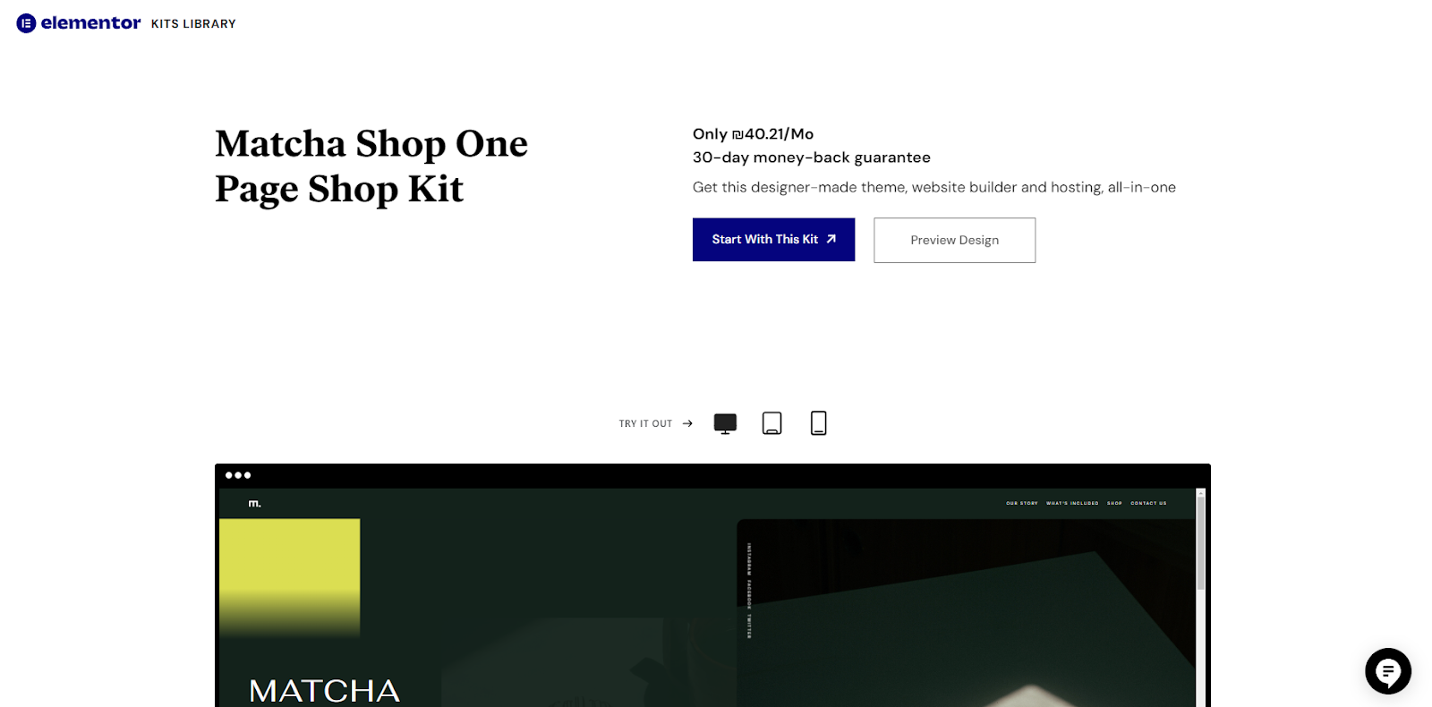
Think about a website for a big conference or festival. It has bright colors, videos from past events, and a clear schedule. Visitors can easily find all the information they need about the event and sign up to attend. The one-page design makes it simple for people to get excited about the event.
These examples show how one-page websites can tell great stories, show off products or services, and get people to take action. By thinking carefully about your content, design, and how people will use your site, you can make a one-page website that looks amazing and helps your business grow.
Wrapping Up: Your One-Page Website Journey
We’ve covered a lot about one-page websites and the tools to build them. Let’s go over the main points one more time to help you make your final choice.
Why One-Page Websites Are Great
- They’re simple for visitors to use
- They tell your story in a focused way
- They work well on phones and computers
What to Look for in a Website Builder
- Keep it Clear: Choose a builder that helps you make your message easy to understand.
- Make it Look Good: Pick a builder with nice templates and ways to change the design.
- Think Mobile: Make sure your site will work well on phones.
- Speed Matters: Look for features that make your site load fast.
- Stay Safe: Choose a builder that helps keep your site secure.
Our Top Picks
There’s no perfect choice for everyone, but here are our favorites for different needs:
- For Lots of Options: Elementor is our top pick. It’s flexible, works with WordPress, and has many features.
- To Keep it simple, try Carrd or Jimdo. They’re easy to use and don’t cost much.
- For Making Things Beautiful: Squarespace is great if you want your site to look really polished.
- For Total Control: If you know a bit about web design, Webflow lets you customize everything.
Your Next Step
Don’t let worries about making a website hold you back. With these one-page website builders, you can create a great site that shows off what you do. Why not start today? Pick a builder and give it a try!
Remember, the best website is one that’s actually out there on the internet. So go ahead, choose a builder, and start creating your own corner of the web. Your perfect one-page website is waiting to be built!
Looking for fresh content?
By entering your email, you agree to receive Elementor emails, including marketing emails,
and agree to our Terms & Conditions and Privacy Policy.
