Table of Contents
Reviewed by: Tamar Schapira, SenseIT
Disclaimer:
This article is for informational purposes only and does not constitute legal advice. We recommend consulting a qualified attorney for guidance on accessibility compliance and legal requirements specific to your situation.
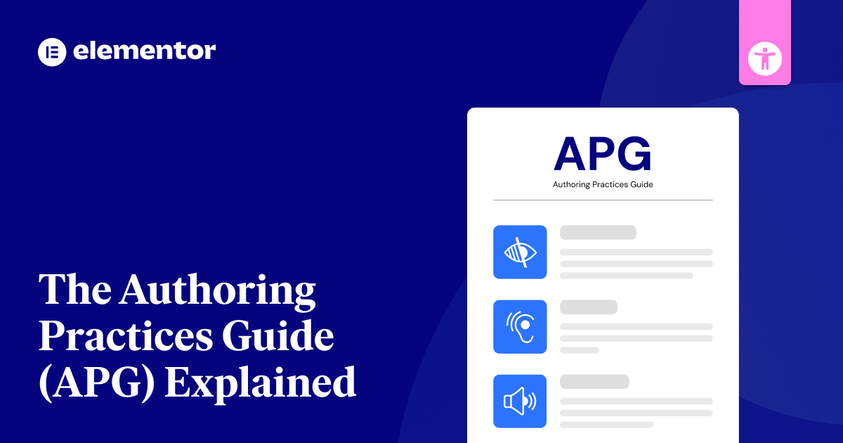
The Authoring Practices Guide (APG) is a valuable resource for building accessible websites. It provides practical guidance on how to apply WCAG and ARIA rules, offering clear examples and design patterns for developers.
Originally created in 2014 as a guide for ARIA 1.0, the APG has evolved into a dynamic resource thanks to contributions from a large community via GitHub. It now includes a comprehensive ARIA guidance, automatic testing, and information on how assistive technologies interact with web content.
The APG aims to make it easier for developers to create websites that are usable by everyone, including people with disabilities.
Understanding Web Accessibility
The internet has become essential for communication, education, employment, and accessing services. Yet, a staggering number of websites remain inaccessible to people with disabilities. While over 1.3 billion people worldwide rely on web accessibility, only a tiny fraction of websites are truly usable for them. This digital divide is not only unjust but also excludes a significant portion of the population from participating fully in society.
The consequences of inaccessible websites are far-reaching. Many sites fail to meet basic accessibility standards and are riddled with errors that create barriers for people with visual, auditory, motor, or cognitive disabilities. Common issues include poor color contrast, missing image descriptions, and complex forms that are difficult to navigate.
Why Web Accessibility Matters
Making websites accessible is not just about complying with regulations or doing the right thing; it’s about creating a better experience for everyone. Accessible websites are:
- Usability and Benefits for All: Making websites accessible benefits everyone by simplifying the user experience. Accessible design ensures that people with disabilities can easily perceive, understand, navigate, and interact with websites, while also enhancing the overall experience for all users. For example, features like clear navigation, captions, and adaptable content are not just helpful for users with disabilities—they improve usability for everyone, including those in noisy environments or those who prefer simple, intuitive interfaces.
- Good for business: Accessible websites help businesses reach a wider audience, including people with disabilities. By making your site usable for everyone, you improve customer satisfaction and loyalty, showing that your brand values inclusivity. Accessibility also reduces the risk of legal issues and can enhance your reputation, making your website a positive reflection of your commitment to social responsibility.
Key Principles of Accessible Design
Creating accessible websites requires a shift in mindset—considering the diverse needs of users from the start of the design process. The key principles include:
- Perceivable: Information and user interface components must be presented in ways that users can perceive, such as providing text alternatives for non-text content, captions for multimedia, and content that adapts to different sensory needs.
- Operable: Users must be able to operate the interface, which includes keyboard accessibility, providing enough time to complete tasks, and avoiding elements that could trigger seizures.
- Understandable: Content and the operation of the interface must be easy to understand, with clear language, predictable navigation, and mechanisms to prevent errors.
- Robust: Content must be robust enough to be reliably interpreted by a wide variety of user agents, including assistive technologies.
ARIA (Accessible Rich Internet Applications)
ARIA helps make websites easier to use for everyone. It’s a set of special tags that web developers add to their code to help people who use screen readers and other assistive tools. When regular HTML isn’t enough, ARIA steps in to make web apps more understandable. The W3C’s Web Accessibility Initiative maintains and updates ARIA to keep it current with technology needs.
ARIA works through:
- Roles that tell users what parts do
- Properties that describe how parts work
- States that show when parts change
Role of ARIA in web accessibility
Today’s websites need good tools to help everyone use them.
- ARIA helps by telling screen readers and other tools what each part of a website does and how it works.
- When checking if a website is easy to use, start with basic HTML tags. Only add ARIA when you need to make things clearer for people using screen readers.
- ARIA landmarks and roles support web accessibility by helping users perceive and navigate content effectively through assistive technologies.
ARIA vs. HTML5 semantic elements
Building accessible websites means picking between HTML5 elements and ARIA roles to help users with assistive tools. Both options tell screen readers and other tools what your content means.
HTML5 elements are easier to use because:
- They work right out of the box
- They need less upkeep
- They take less time to test
ARIA roles give you more options when you need to build special features that HTML5 can’t handle alone.
Therefore best way to build accessible websites is to use HTML5 elements first. Only add ARIA when you need extra features that HTML5 can’t provide by itself. Modern browsers are designed to ignore unrecognized tags while still displaying their content properly.
Make your site more accessible with Ally.
Core Components of the APG
APG helps you build accessible web parts with ready-to-use design patterns and widgets. It shows you how to make common web items like menus, pop-ups, and tabs that work well for all users.
You’ll learn how to handle keyboard controls, manage screen focus, and build clear web structures. The guide includes working code samples and simple ways to meet web access rules.
The section bridges instructional gaps by providing missing guidance material for implementing accessible features.
Design patterns
The APG’s design patterns offer proven ways to build accessible websites. You can use these patterns as a starting point, but feel free to adapt them to your needs.
These patterns:
- Work with simple and complex website parts like buttons and menus
- Use WAI-ARIA tools to make sites work better
- Follow common rules while letting you make changes as needed
The guide includes over 60 examples for implementing accessible user interface components across different design patterns.
Widget examples
Basic web parts help make websites easier to use. Common examples include:
- Combo boxes that let users pick many items and search through lists
- Pop-up boxes that keep users focused on one task
- Menus that sort items into groups
- Tabs that arrange content in sections
- Tooltips that show helpful details when using a mouse or keyboard
These building blocks are key to creating websites that everyone can use. Clear and concise language helps explain these components effectively to users.
Keyboard interaction
Keyboard shortcuts allow users to navigate your website without a mouse. Good keyboard controls make websites work for everyone.
Focus indicators must be visible at all times to help users track their location.
Use these common keyboard controls:
- Tab and Shift+Tab to move between items
- Arrow keys to move inside menus and lists
- Enter or Space to select things
- Esc to close popups
Make sure users can predict where the focus goes next and can use every feature with just a keyboard.
WAI-ARIA implementation
WAI-ARIA makes web content accessible using five key parts. Roles tell you what elements do, properties add meaning, and states show current conditions.
Live regions let users know about changes, while relationship attributes connect different elements. These work together to help everyone use web content easily. Following established design patterns helps create consistent and familiar user interfaces that benefit all users.
Breakdown of APG Design Patterns
Building accessible websites requires knowing five basic design patterns from APG.
Each pattern needs specific ARIA roles and keyboard controls to work with screen readers and other tools. For components like tabs, using the role “tab list” as a container is essential for proper accessibility. You can adjust these patterns to fit your needs while keeping them accessible to all users.
1. Accordion
Accordions stack headings and hide content until you click them. This design saves space on the page.
- To make accordions work well for all users, you need to:
- Use button controls inside headings
- Add proper aria labels
- Make sure users can open panels with Enter, Space, and Tab keys
The right setup helps everyone use accordions easily, whether they use a mouse, keyboard, or screen reader. Each panel must have unique panel IDs to connect buttons with their corresponding content sections properly.
2. Alert and Message Dialogs
Alert and message boxes work differently to make websites easy to use. Alert boxes pop up to get quick answers from users. They use special code like role=”alert dialog” and aria-modal=”true” to work well. When an alert box opens, users must act on it before doing anything else.
You need to ensure that users can close these boxes with the Esc key. For proper accessibility, the focus must be set to the confirmation button in simple message dialogs. Regular alerts that use role=”alert” work better for simple warnings. These alerts don’t stop users from working and can stay on screen until they choose to close them.
3. Breadcrumbs
Breadcrumbs help users track where they’re on a website by showing their path through the pages. For mobile users, add a collapse feature when the path shows more than three items.
Keep these points in mind:
- Use tags and ARIA labels in your code
- Put breadcrumbs right under the header
- Show only half the page width and cut long names with dots
Clickable ellipses can be placed near the first item to show the full breadcrumb path when expanded.
4. Buttons
Buttons help users take action on a page with just one click. There are three main types: command buttons, which do something immediately, like “Save” or “Delete.” Toggle buttons switch between two states, like “On” or “Off.” Menu buttons open up more choices for the user.
When making buttons, use clear labels that say what they do. Avoid vague words like “OK” or “Click here.” Make sure users can work with buttons using a keyboard, and add proper ARIA labels to help screen readers. Remember that no ARIA is preferable to implementing ARIA incorrectly, so test thoroughly before adding ARIA attributes to buttons.
5. Carousels
Carousels need more attention than simple buttons to work well for everyone. When you build a carousel that adjusts to screen size, make sure it:
- Stops moving when users hover over it or use the keyboard
- Shows each slide for at least 5 seconds
- Works on mobile devices without needing swipe actions
- Uses the right labels (role=”region” and aria-roledescription=”carousel”) to help screen readers
Your carousel must also be easy to use with a keyboard so that tools for disabled users can work properly. Research shows that only 1% of users actually interact with carousel content, so it’s crucial to carefully consider whether a carousel is the best choice for your content.
6. Checkboxes
You need a few key features to create checkboxes that everyone can use. Add ‘role=”checkbox”‘ and ‘aria-checked’ to track whether boxes are checked. Use ‘tabindex=” 0 “‘ to ensure users can move to each checkbox with the Tab key.
Let people check boxes with the Space bar, Enter key, or arrow keys. Clearly show when boxes are checked or empty, and make sure screen readers tell users when the status changes. The group of checkboxes must be wrapped in a div with the role=”group” attribute.
7. Comboboxes
Checkboxes let you make simple choices, but comboboxes give you more options. To make a combobox work well for all users, you need:
- A combobox part marked with role=”combobox” and ARIA tags
- A popup menu that shows your choices (like a list or grid)
- Full keyboard controls for moving up, down, and picking items
You can either type directly into the combobox or select from the available options in the dropdown list.
8. Dialog Boxes (Modal)
Today’s web apps often use dialog boxes (or modal windows) to display important messages and collect user input. Dialog boxes need to be placed and styled well on the screen.
When users open a dialog box, they should only be able to interact with what’s inside it. The dialog needs a special code (role=”dialog”, aria-modal=”true”) to work correctly for all users. It should also let users close it with the Escape key and move around inside it using the Tab key. The ARIA APG patterns provide comprehensive guidance for implementing accessible dialog components.
9. Disclosure Buttons (Show/Hide)
Disclosure buttons allow you to show or hide content on websites with a single click. They require special code to work well for all users, including those who use screen readers or keyboards.
Following WAI ARIA patterns from the APG ensures the proper implementation of disclosure components. Add the right button labels and ensure users can toggle content using the Enter or Space keys. Also, clear arrows or icons should be shown so people know if sections are open or closed.
10. Feeds
Feeds load new content as you scroll down a page. Like show/hide buttons, they help make websites easier to use.
Feeds need special code to help screen readers understand the changing content. This code includes proper labels and keyboard controls so everyone can read and browse the content smoothly. Each section of content in a feed is displayed within article elements.
11. Grids
Grids help organize website content into rows and columns. To make grids work for everyone, you need to think about both keyboard use and screen readers.
Add these key features to make your grid accessible:
- ARIA roles (grid, row, gridcell)
- Arrow keys to move between cells
- Testing with screen readers and other tools
Make sure users can see which cell is active and move around easily with a keyboard. This helps all visitors use your grid, no matter how they browse. The grid pattern preserves semantic elements while organizing content into meaningful groups.
12. Landmarks
Landmarks help people using assistive tech to find their way around web pages. They split pages into clear sections and show how the page is laid out.
Each page needs one main landmark, with just a few banner and footer landmarks. Make sure all content sits inside the right landmark areas. This helps keyboard users move through the page more easily. Using HTML sectioning elements alongside ARIA landmark roles creates the most robust accessibility support.
13. Links
Links help users move around websites by clicking from one page to another. To make links work well for everyone, keep these basic rules in mind:
- Always use ” tags with ‘href’ for links to work properly
- Write clear link text that tells users where they’ll go
- Make sure links work with keyboards: users should be able to press Enter or Space to click, and Tab to move between links
14. Listboxes
Listboxes let you pick items from a list on a web page. When building one, add role=”listbox” to the main container and role=”option” to each item inside.
You can set up listboxes to let users pick one or many items using aria-multiselectable. Users can move through the list with arrow keys, type letters to jump to items, and use the keyboard to make their choice.
Screen readers can announce the name and position of each option to help users understand what they’re selecting.
15. Menus
Making menus work well on websites takes extra care to match how they work on regular computer programs. To build good menus, you need to follow key rules:
Your menu code must include:
- Special tags that mark menu boxes and menu choices
- Arrow keys that let users move up and down
- Enter or Space keys that let users pick items
When you add dropdown menus, you must handle them the right way. These menus work differently from simple website links, so you need to control where users click and what shows up on screen.
Make sure your menus are clear and easy to use for everyone. Add the right code to help people who use screen readers or keyboard shortcuts. Following the ARIA APG guidelines helps create a consistent user experience that website visitors can rely on.
16. Menubars
Menubars organize commands or links in a horizontal or vertical layout. These navigation tools work like standard menus but include keyboard controls. When building menubars, think about how they work on mobile devices and how they might affect your site’s speed. Some experts argue that navigation menus should be treated as lists of links rather than true menus.
| Element | Role | Interaction |
| Container | menubar | Arrow navigation |
| Items | menuitem | Enter/Space activation |
| Submenus | menu | Escape to close |
| Radio Items | menuitemradio | Home/End movement |
| Checkboxes | menuitemcheckbox | Character key jumps |
17. Meters
Meters show numbers between set limits, making them perfect for displaying battery status or disk space usage.
To create meters that everyone can use:
- Make sure to include role=”meter” with aria-valuenow, aria-valuemin, and aria-valuemax
- Add clear labels using aria-labelledby or aria-label
- Use more than just colors to show meter readings
- These simple rules make meters work well for all users.
Make your site more accessible with Ally.
18. Radio Groups
Radio groups let users pick one choice from a list of options on websites. For good design, make sure users can see which option is selected. The radio buttons should work with arrow keys on the keyboard.
Add proper labels and roles so everyone, including those using screen readers, can use them easily.
The container element should use the role=”radiogroup” attribute to properly group related radio buttons together.
19. Sliders
Digital sliders work just like real ones – they let you pick exact numbers from a range. To make them work well on websites, you need to set them up right.
The basics include using the range input tag, adding proper ARIA labels, and making sure the slider shows changes as they happen. When users slide with their fingers or use the arrow keys, the value updates immediately.
For maximum accessibility and control, the slider can be operated using Page Up and Down keys to move through multiple steps at once.
20. Tabs
Tabs are common tools used on many websites. To make them work well for everyone, you need three main pieces: a list of tabs, each tab itself, and the content areas. Each part needs special code to help people who use screen readers.
When building tabs, make sure users can open them with the Space or Enter keys. Also, think about how the tab content loads to keep your site running smoothly. Including meaningful, short labels helps users quickly understand what each tab contains.
21. Toolbars
Toolbars help group similar buttons and controls in one place on a webpage. To make a toolbar work well, you need to:
- Set up the main toolbar container with role=”toolbar”
- Add keyboard controls so users can move between items
- Make sure the toolbar looks good on all screen sizes
This layout keeps things tidy and makes it easier for people to find what they need. When moving horizontally across controls, users can navigate through toolbar items using the Left and Right Arrow keys.
22. Tooltips
Tooltips help users by showing extra info when they hover over or focus on items on a webpage. While simple, they make websites easier to use for everyone.
To make tooltips work well, style them clearly and put them in the right spot. Add role=”tooltip” and aria-describedby to help screen readers. Keep the focus on the item that triggered the tooltip, and let users close it with the Escape key. Using a standard HTML title attribute can provide basic tooltip functionality without custom ARIA implementation.
23. Tree Views
Tree views show data in a parent-child format that can be expanded or closed. Clear visual signs help users know when items are selected or in focus.
The root part needs role=”tree” while each child item needs role=”treeitem”. Set up arrow keys so users can move around, and make Enter/Space work for picking items. Make sure to add aria-expanded, aria-level, and aria-selected to help screen readers work better. When a file directory treeview needs to display files and folders, it serves as an example tree view pattern that users are familiar with.
Implementing APG Patterns
When using APG patterns, focus on maintaining key accessibility features as you adjust them for your project. Test your changes with different screen readers and browsers to ensure accessibility.
Keep track of your code updates, don’t remove ARIA labels, and check that your changes still meet WCAG rules. Subject matter experts should review your pattern implementations to validate their accessibility compliance.
Best practices for implementation
Building accessible patterns starts with basic HTML before adding more complex features. Follow these simple steps:
- Use regular HTML elements first before adding ARIA tags
- Check how the keyboard works with screen readers and other tools
- Keep ARIA labels and states up to date as content changes
Make sure your patterns work the same way on all devices and match APG standards. Screen reader support alone isn’t enough since touch support testing is often missing from APG patterns.
Common pitfalls and how to avoid them
Basic steps help create accessible patterns, but some common mistakes can cause problems. Let’s look at key issues and how to fix them:
| Pitfall | Solution |
| Wrong role syntax and casing | Write roles in lowercase, check spelling |
| Missing parent-child links | Make sure all roles follow proper order |
| Limits of auto-testing | Add manual screen reader checks |
Watch out for moving content and keep ARIA states up to date when users interact with the page. The new information architecture has made finding resources and examples significantly faster.
Keyboard Interaction in APG
Keyboard access is key to making websites work for everyone. Good keyboard support helps make sites easier to use and lets people with different needs browse the web.
Main benefits of keyboard access:
- Makes websites usable for people who can’t use a mouse
- Works across all types of devices
- Follows the law and makes sites better for all users
Digital sites today must work well with keyboards. This helps people who use screen readers and other tools to browse the web. When you make your site work with keyboards, you make it open to more people. Users with disabilities often rely on external keyboard devices when accessing mobile websites and applications.
Standard keyboard interactions for different patterns
Basic keyboard controls help everyone use websites better. You can press Tab to move forward and Shift+Tab to move backward between items. Arrow keys let you move around inside menus and lists.
Press Enter or Space to select buttons and links. The Escape key closes pop-ups. Managing focus properly helps ensure discernible focus indicators remain visible at all times. Type letters to search or find items quickly. When making new keyboard controls, think about how they’ll work on phones and tablets too.
Implementing custom keyboard interactions
Custom keyboard controls need three key things to work well: clear focus handling, easy navigation, and visual cues that show where you are. To make this work, you need to set up ways to track keyboard actions that won’t slow down your site.
React hooks help manage keyboard events better. Lock the keyboard focus inside pop-up windows. Ensure that all similar parts of your site use the same keyboard shortcuts. The WAI-ARIA Practices provide detailed patterns for implementing standard keyboard interactions across common UI components.
WAI-ARIA Roles, States, and Properties
ARIA roles make web content easier for screen readers to understand. They give special meaning to different parts of a web page.
- Over 50 ARIA roles fall into three main groups:
- Landmark roles show key areas like headers and navigation sections
- Widget roles mark interactive items like buttons and menus
- Document roles organize content into clear sections
When basic HTML tags aren’t enough, ARIA roles help make web pages work better for everyone. Since WAI-ARIA 1.2 is the current standard, it’s crucial to use native HTML elements whenever possible.
ARIA states and their significance
ARIA states that there are live attributes that show how elements work on web pages. Like traffic signals, they tell screen readers when things change. JavaScript is needed to keep these states current and accurate.
Some common states are aria-checked, aria-disabled, and aria-expanded. Test these states with different screen readers to make sure they work well for users who need them. The role attribute cannot be changed once it is set for an element.
ARIA properties and how to use them effectively
ARIA properties help make web elements clear to assistive tools. They work with roles to share key details about what’s on the page. When you add ARIA properties that change, use JavaScript to keep them up to date. Automated tools like Axe or WAVE can validate your ARIA implementation.
Follow these basic rules:
- Automated tools like Axe, Accessibility Checker by Equalize Digital or WAVE can validate your ARIA implementation
- Put your values inside double quotes
- Check and update properties when things change on the page
Testing and Validating APG Implementations
Testing APG patterns requires both computer tools and human checks. Start with basic testing tools like Accessibility Insights and WAI-ARIA checkers. However, keep in mind that these tools only catch about half of all issues.
To test fully, you must also use screen readers like NVDA and JAWS, check keyboard controls, and examine how the page shows its parts to support tools. This mix of testing methods helps ensure that your website works for everyone.
Tools for testing accessibility
You need several tools to test if websites are easy for everyone to use. Basic tools include simple scanners that check for common problems. These tools work together to find different issues.
Main tools you’ll want:
- Quick-scan tools like axe DevTools
- Screen readers to check how pages sound
- Tools that test if colors are easy to see
Manual testing techniques
Manual testing is key for checking website accessibility since it finds issues that automated tools miss. When testing, make sure users can navigate with a keyboard and that screen readers work well.
Check that users can tab through items in a logical way and see where they’re on the page. Look at ARIA labels to ensure they make sense.
To get the best results, test with people with disabilities and record any problems you find.
Automated accessibility testing
Tools that check web accessibility automatically can find about half of all possible issues. These tools are important for testing how well you follow accessibility guidelines. You’ll want to use them as you build your websites.
To test accessibility:
- Use axe DevTools, Accessibility Checker by Equalize Digital and WAVE to check issues right away
- Set up aXe-core to test your code before it goes live
- Do manual testing too, since tools can’t catch everything
APG and Mobile Accessibility
Making APG patterns work on mobile devices needs a focus on touch-friendly targets, screen rotation, and easy navigation. Your mobile design must follow WCAG 2.2 rules while keeping the basic access features from APG patterns.
Pay close attention to simple touch controls, keyboard use, and content that fits small screens. Be sure to keep the APG’s keyboard controls and ARIA roles intact.
Adapting APG patterns for mobile devices
Making APG patterns work on mobile devices can be tricky. The guide doesn’t tell us which patterns work well on phones or tablets.
To create good mobile interfaces that everyone can use, focus on these key points:
- Break content into small, easy chunks with clear buttons
- Test how screen readers work on both iPhone and Android
- Make sure buttons and links are easy to tap while still working with keyboards and other devices
Mobile-specific accessibility considerations
Making mobile apps easy to use requires attention to both touch controls and screen features. Touch buttons should be at least 9mm wide, and apps must work with tools like VoiceOver and TalkBack.
The app should also work with external keyboards. Users need clear feedback when they tap or swipe, proper headings to find content, and simple ways to perform actions that usually need complex gestures.
APG and Responsive Design
Making APG patterns work on different screen sizes means keeping them easy to use for everyone. Your design should work well whether someone uses a keyboard, mouse, or touchscreen. Make sure buttons and menus are big enough to tap on mobile devices.
When layouts change size, check that users can still use all parts of your site with a keyboard. Pay special attention to navigation menus, accordions, and pop-up windows to ensure they work smoothly on all devices. Keep track of where users are focused as they move through your site, no matter what device they use.
Implementing APG patterns in responsive layouts
Making APG patterns work well in responsive layouts needs both easy access and flexible design. When you adjust widgets for mobile devices, focus on:
- Changing complex widgets into simpler ones for mobile use
- Making touch targets big enough while keeping keyboard controls
- Testing all ARIA labels and roles at different screen sizes
The key is to keep everything working smoothly as screens change size, whether users tap or use a keyboard to navigate.
Accessibility considerations for different screen sizes
Accessible designs must work well on all screen sizes. Content should flow smoothly at 320 CSS pixels and allow users to zoom in up to 200%. To help with mobile display, add the viewport meta tag.
Design buttons and links large enough for easy tapping on phones and tablets. Keep text and images clear when screens change size.
Integrating APG with Popular Frameworks
Modern web frameworks work well with APG patterns. React’s components and hooks make it easy to build accessible widgets.
Angular’s built-in tools and TypeScript support help you add accessibility features. Vue lets you create accessible components that you can reuse across your website. Each framework offers different ways to follow APG rules when building your web apps.
Using APG with React
Making React apps accessible is easier when you combine APG patterns with React tools that help with accessibility. Libraries like react-aria and react-a11y work well with APG to make your apps more usable.
To build accessible React apps:
- Pick UI libraries like Chakra UI or Material-UI that follow APG rules
- Add keyboard controls by setting up onKeyDown handlers
- Control focus with React’s useRef and useEffect hooks
Implementing APG in Angular
Angular makes it easy to follow APG rules with its built-in tools. Use the CDK/a11y module to handle focus and keyboard controls.
Test your app’s accessibility using reactive forms with axe-core tools. Run tests through TestBed and add end-to-end checks using Protractor or Cypress to ensure everything works for all users.
APG in Vue.js applications
Vue.js makes it easy to build sites that work well for everyone. Its system helps you create pages that follow web rules for access.
Simple tools let you:
- Link ARIA labels to your content
- Control where users focus on the page
- Check if your site works for all users
APG and Performance Optimization
Using APG patterns means finding the right mix of good accessibility and fast performance. To keep your site running fast quick, use basic HTML elements when you can and cut down on extra ARIA tags.
Make sure your events run smoothly, use live regions wisely, and check how well your ARIA parts work with browser tools.
Balancing accessibility and performance
When using APG patterns, you need to balance making things work for everyone while keeping your site fast. Speed tests will show you if ARIA and JavaScript are slowing things down.
To keep your site running well:
- Use basic HTML instead of complex ARIA when possible
- Load accessibility features only when needed
- Keep JavaScript simple when updating ARIA states
Techniques for optimizing APG implementations
To make APG work well, you need to make smart changes on several levels. Clean up your code to make it run faster and reduce page load times.
Keep DOM changes small, use tools like requestAnimationFrame and Web Workers to speed up scripts, and add resource hints to load content faster. Clear out old event listeners and avoid links that loop back on themselves to save memory.
Future of the APG
The APG will grow with new AI tools and better testing features to make development work easier.
Future updates will add rules for VR, AR, and mobile devices, following the WCAG 2.2 and 3.0 standards. The community helps shape these changes through GitHub and mailing lists, keeping the APG useful and up-to-date while focusing on clear guidance for making sites accessible.
Upcoming features and improvements
New features are coming to improve the APG. Our plans focus on tools that more people can use and test. We want to help developers build websites that work for everyone.
Future updates will include:
- Better tools to check website features
- Simple guides you can practice with
- Support for new web tools
These changes will help make more websites work well for all users.
Potential changes in web accessibility standards
Web accessibility rules are changing quickly. The new WCAG 3.0 brings major updates to how we make sites work for everyone.
AI tools are now helping test whether websites are easy to use. Recent rules, such as WCAG 2.2 and the European Accessibility Act, require websites to meet higher standards by 2025. These changes improve sites for all users but require more work from developers.
APG and Emerging Technologies
When building for newer tech like voice and AR/VR, you need to make APG work in fresh ways.
Voice tools must handle live regions and speech controls well. AR/VR needs special ways to manage what users focus on and how they move around.
These new tools push APG beyond regular websites into 3D spaces and voice chats.
APG in the context of voice interfaces
Voice interfaces are a key component of APG’s guides for making apps easy to use. These guides help blend voice features with visible and touchable screens.
When building voice controls, you need to add special code and test how well they work.
To make voice features work well:
- Make sure what users see matches what they hear
- Set up voice commands that work like keyboard shortcuts
- Test the system with different voices and devices
Accessibility considerations for AR/VR applications
AR/VR apps need to work well for everyone. To make this happen, test your apps with people who have disabilities and check how accessible they really are.
| Challenge | Solution |
| Visual Navigation | Multi-sensory Feedback |
| Motor Limitations | Alternative Inputs |
| Cognitive Load | Simplified Interfaces |
Give users different ways to interact with your app. Make sure they can find their way around easily. Let them adjust settings to match their needs. Keep things simple and clear for all users.
Challenges in Implementing APG
While the APG provides valuable guidance, developers may encounter challenges when implementing its patterns:
- Browser Compatibility: Not all browsers fully support all ARIA attributes and properties. This can lead to inconsistencies in how assistive technologies interpret web content.
- Mobile Accessibility: Adapting APG patterns for mobile devices can be complex, requiring careful consideration of touch targets, screen orientation changes, and limited screen real estate.
- ARIA Overuse: It’s easy to fall into the trap of overusing ARIA attributes. In some cases, relying on semantic HTML5 elements provides better accessibility and simpler code.
- Testing Complexity: Thoroughly testing APG implementations requires checking across various browsers, assistive technologies, and devices, which can be time-consuming.
Common Obstacles Faced by Developers
Several factors contribute to the difficulties developers face in implementing accessibility:
- Lack of Awareness: Many developers lack awareness of accessibility guidelines and best practices.
- Complexity of Guidelines: Understanding and applying accessibility standards like WCAG can be challenging, especially for complex web applications.
- Design and Accessibility Conflicts: Balancing accessibility requirements with design aesthetics and user experience can sometimes feel like a trade-off.
- Limited Resources: Developers may have limited time, budget, or tools to dedicate to accessibility testing and implementation.
Make your site more accessible with Ally.
Strategies for Overcoming Implementation Challenges
Organizations and developers can take proactive steps to address these challenges:
- Education and Training: Invest in accessibility training for developers to build awareness and understanding of accessibility principles and techniques.
- Prioritize Semantic HTML: Encourage the use of semantic HTML5 elements whenever possible, as they often provide built-in accessibility features.
- Thorough Testing: Implement a robust testing strategy that includes automated tools, manual testing with assistive technologies, and user testing with people with disabilities.
- Iterate: An iIterative aApproach involves starting with small, achievable accessibility improvements and gradually expanding efforts as the team gains experience and confidence.
- Find Accessibility Champions: Identify and empower accessibility champions within the development team to promote best practices and provide guidance.
APG and Content Management Systems
Major website platforms like WordPress, Drupal, and Joomla offer special add-ons that make it easy to follow APG rules. These tools check your content and help you add the right code to keep your site accessible.
You can use built-in features to add proper labels and tags that help everyone use your website. The tools work on their own to make sure your content follows accessibility rules as you create it.
Implementing APG in popular CMS platforms
Many popular content management systems (CMS) are making strides in simplifying web accessibility. Platforms like WordPress, Drupal, and Joomla offer various features and tools that can assist developers in building websites that adhere to APG guidelines.
1. WordPress
WordPress, known for its flexibility and extensive plugin ecosystem, provides a solid foundation for accessible websites.
- Semantic HTML: WordPress themes are generally built using semantic HTML5 elements, which provide basic accessibility features.
- Accessibility-Ready Themes: Many WordPress themes are designed with accessibility in mind, offering features like keyboard navigation and proper heading structures.
- Page Builders: Page builders like Elementor can further simplify the process of creating accessible layouts and content. Elementor, for instance, allows users to easily add ARIA attributes to elements, ensuring proper communication with assistive technologies. Additionally, some Elementor themes and templates are built with accessibility in mind.
- Plugins: Plugins like “Accessibility Checker” and “WP ADA Compliance” can help identify and resolve accessibility issues within WordPress sites.
2. Drupal
Drupal has a strong emphasis on accessibility, offering several features to support APG implementation.
- Core Accessibility Modules: Drupal core includes modules that improve accessibility, such as the “Accessibility” module, which provides tools for managing ARIA attributes and keyboard navigation.
- CKEditor Accessibility Checker: The CKEditor, a popular text editor used in Drupal, can be enhanced with accessibility checkers to ensure content created within it is accessible.
- Theme Accessibility: Drupal themes are often built with accessibility considerations, ensuring proper HTML structure and ARIA usage.
3. Joomla
Joomla also offers tools and resources for building accessible websites.
- Extensions: Extensions like the “a11y suite” provide accessibility testing and remediation tools for Joomla sites.
- Template Accessibility: Many Joomla templates are designed with accessibility in mind, offering features like keyboard navigation and screen reader compatibility.
By leveraging the accessibility features of these CMS platforms and their associated tools, developers can streamline the process of building websites that are inclusive and compliant with APG guidelines.
Accessibility Beyond APG
APG helps build accessible interfaces, but you need more standards like WCAG 2.1 to make websites fully accessible.
Use good content practices to go beyond technical rules. These include clear page titles, proper HTML, and easy-to-understand link text.
Make your site better for everyone by adding keyboard controls, using ARIA landmarks, and writing content that’s easy to read.
Complementary accessibility guidelines and standards
Several guidelines work together with APG to make websites accessible to everyone. To create websites that everyone can use, you need to know about:
- WCAG 2.2 and its four main rules
- Section 508 rules for government websites
- Mobile guidelines for phones and tablets
These rules help make sure all users can access digital content easily.
Holistic approach to web accessibility
Making websites accessible takes more than just following technical rules. The whole organization needs to work together in several key ways:
| Key Area | What To Do |
| User Research | Test with disabled users |
| Training | Teach all staff about accessibility |
| Content | Use clear, simple writing |
| Technology | Use tools that check for problems |
| Monitoring | Check progress often |
To keep websites accessible, you need:
- Clear rules about who does what
- Regular feedback from users
- Ways to track how well you’re doing
Training and Resources for APG
Many free resources help you learn the basics of APG. The W3C website has clear guides and examples to help you get started.
Need help? Ask questions on Stack Overflow or WebAIM forums, where experts share solutions.
Want structured learning? Take classes through Deque University or join workshops at events like CSUN. These hands-on sessions make APG patterns easier to understand and use.
Official documentation and tutorials
The official APG website offers clear guides to help you learn and use ARIA features. Complete details about ARIA rules and updates are available at w3.org/WAI/ARIA/apg/.
Main learning resources:
- WAI-ARIA 1.2 guide for developers
- Web access training from WAI
- Basic APG steps and tips
Check the APG GitHub page for real working examples and how-to guides.
Community resources and forums
APG users can find help through many online communities. The W3C WAI mailing lists and GitHub allow users to discuss problems with each other.
Social media groups on LinkedIn, Twitter (#a11y), and Reddit are great places to learn from experts. These groups share tips and best ways to use APG features.
Training programs and certifications
Want to learn about APG? Many free training options can help you.
W3C offers basic online classes to get you started. Microsoft has simple videos that show you how to make files easier to use. Pearson’s training helps you learn special skills.
Main training choices:
- W3C basic course on digital access
- Microsoft videos about making files easy to read
- ARIA training for special skills
These tools teach you how to use APG and make your work better for everyone.
APG Compliance and Legal Considerations
Following APG patterns requires meeting WCAG 2.1 Level AA rules and local accessibility laws like ADA and Section 508. Make sure to test for accessibility often, keep records of your compliance work, and check that ARIA roles and properties are correct.
While the APG offers helpful guidance, you must check that your work meets both ARIA rules and the legal requirements for web accessibility in your area.
Legal requirements for web accessibility
Making your website accessible is a legal must. Following WCAG 2.1 Level AA rules helps protect your business from lawsuits and costly fines.
Both the ADA and Section 508 laws require digital content to be accessible to everyone. It’s smarter and cheaper to build accessibility from the start than to fix problems later.
APG’s role in meeting accessibility standards
The Authoring Practices Guide (APG) helps web developers make sites accessible. It explains how to use tested patterns and proper code to comply with legal rules.
While optional, APG offers clear steps for adding ARIA labels, keyboard controls, and screen reader support. These features go beyond basic web standards and help build sites everyone can use while avoiding legal problems.
Customizing APG Patterns
APG patterns help make interfaces accessible, but you may need to adapt them for your project. When you change these patterns, keep the key accessibility features, such as ARIA roles, keyboard controls, and screen reader support.
Pick an APG pattern to build from, then test your changes with tools and users with disabilities to ensure they work well.
When and how to modify standard patterns
If you want to change standard patterns, first consider what users need and how to keep things accessible. Then, start with the basic pattern and build from there.
Make small changes one at a time and test them with tools for users with disabilities. Track what you change and why. Most importantly, keep the core features that help users navigate and use the pattern.
Remember these key points:
- Use the original pattern as your starting point
- Test each change
- Write down your changes
Never remove features that help with keyboard use or screen readers.
Maintaining accessibility in custom implementations
When you make your own custom designs, keep them accessible by following key guidelines. Use clear labels and structures that make sense. Test that everything works with a keyboard and screen readers. Add proper ARIA tags and roles to help users understand your content. Have people who use assistive tools try out your designs and give feedback.
Keep good records of what you build and check them often to make sure they still work well.
APG and User Experience (UX)
APG patterns help your design work better for everyone. Following APG guides lets you build simple interfaces that are easy to use and compatible with accessibility tools.
Using APG’s tips, you can create clearer menus, more consistent controls, and better-organized content that will help all users navigate your site smoothly.
Balancing accessibility and user experience
Creating websites that work for everyone means carefully blending access needs with good design. When making choices about design, look for ways to help all users have a smooth experience.
- Add clear page landmarks that keep navigation simple
- Pick colors that people can read easily, while matching your brand
- Make layouts that fit different ways of using your site
Enhancing UX through accessible design
Making websites accessible helps create a better experience for all users. APG offers tested design patterns that everyone can use easily. When you add inclusive features and test them with real users, you improve your site in these ways:
| Feature | Benefit | Impact |
| ARIA landmarks | Clear navigation | Improved wayfinding |
| Keyboard support | Multiple input methods | Enhanced accessibility |
| Focus management | Intuitive interactions | Better usability |
Using APG patterns ensures your website is easy to see, use, and understand across all devices.
Internationalization and APG
Making multilingual websites that follow APG rules means thinking about both access and cultural needs. Use clear language tags, support right-to-left text, and create layouts that can grow with different languages.
Keep your designs open and easy to use for everyone. Mix APG’s access patterns with global features like local dates, numbers, and culturally fitting images.
Pick designs that work well across languages and cultures.
Implementing APG in multilingual websites
When building multilingual websites with APG, focus on making them work well for everyone. Keep these key points in mind:
Use clear ARIA labels and keyboard controls that work in all languages. Test how screen readers handle each language you support.
Make sure your layouts can handle both long and short text.
Check with users who speak different languages to ensure everything works as it should. This will help catch any cultural issues early.
The simple steps above will help you create websites that are compatible with all languages and accessible to all users.
Cultural considerations in accessible design
To make patterns work across cultures, focus on how different regions view colors, gestures, page layouts, support tools, and disabilities.
When changing patterns for local use, remember that regions have their own testing methods, language needs, and access rules. Work with local experts to ensure that your changes fit the culture and follow area standards.
APG and Search Engine Optimization (SEO)
Did you know that making your website accessible can also boost your search engine rankings?
How APG implementation affects SEO
APG helps both users and search engines find your content better. When you use APG the right way, your website will rank higher in search results.
APG makes your site better by:
- Using clearer HTML that search engines can read easily
- Making content flow in a way that lets Google show key pieces
- Loading pages faster, which Google likes more
Leveraging accessibility for improved search rankings
Making your website accessible helps it rank better in search results. By following accessibility guidelines, you build a site that is easy to use for both people and search engines.
Add features like clear headings, image descriptions, and proper HTML code. Make sure your site works well on phones too – with easy-to-tap buttons and text that’s simple to read.
These changes will help more people find and use your website.
Conclusion
The APG helps create better websites that everyone can use. It provides clear examples and demonstrates how to make sites work with keyboards and screen readers.
As websites get more complex, developers and designers can rely on the APG to build sites that follow accessibility rules. The guide will keep helping teams create websites that work for all users while meeting WCAG standards.
Recap of key points
The APG helps web developers turn complex rules into accessible websites. It offers clear guidance that anyone can follow.
Regular updates and community input keep the guide current and useful.
- Use proven design patterns
- Check your work with screen readers and other tools
- Keep up with new APG guidelines
The future of web accessibility and APG’s role
Web design for everyone is changing fast as new tech arrives. More tools are making it easier to catch and fix problems that keep some people from using websites well.
Global rules are coming together to help everyone build better sites. APG will continue to show developers how to make websites work for all users and help with new technologies like virtual reality and smart devices.
As AI gets better at testing websites, APG will use these tools to help make the web open to everyone.
Looking for fresh content?
By entering your email, you agree to receive Elementor emails, including marketing emails,
and agree to our Terms & Conditions and Privacy Policy.


