Table of Contents
Attention spans are short, and encouraging users to remain engaged with your website is a skill to be mastered. Optimizing the visual appearance and including visual cues can increase how long users stay on your website and how many pages they engage with, reduce page bounce, and significantly improve the user experience.
Progress Tracker: Show Users How Far They’ve Come
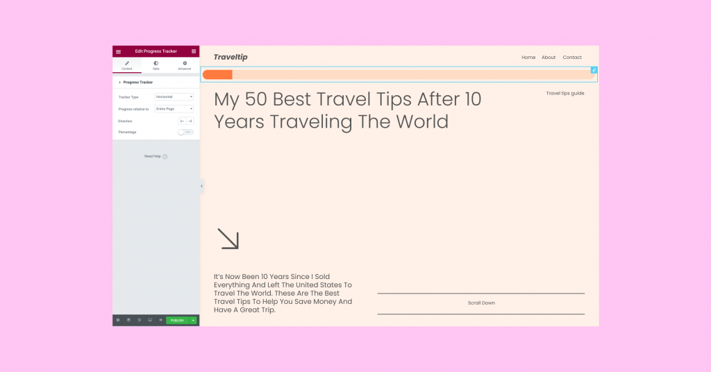
Creating a sense of FOMO and providing positive reinforcement are some of the most effective ways of increasing user engagement. Using a Progress Tracker achieves both of those feelings by showing users on the one hand that there’s still more of the content to be discovered, and on the other hand encouraging them to scroll through to the end.
The new Progress Tracker widget can be placed on any post or page and can be set to begin tracking the user’s progress relative to the full page, the post content, or a selector (class or ID). To customize the appearance of the Progress Tracker, start by choosing whether you want a vertical or circular tracker and whether the progress in percentages should be visible or hidden. Then, you can also adjust the style of it so it matches the look and feel of the rest of your website.

Scroll Snap: Create Impressive Scrolling Experiences
You put a lot of thought and effort into how your website looks, paying attention to colors, typography and all the other “small” details that make your website perfect. Then, you spend hours thinking about the layout that will deliver the precise message you want to convey. Finally, after all the hard work you’ve put in, users come to your website, and often end up experiencing it differently than you intended.
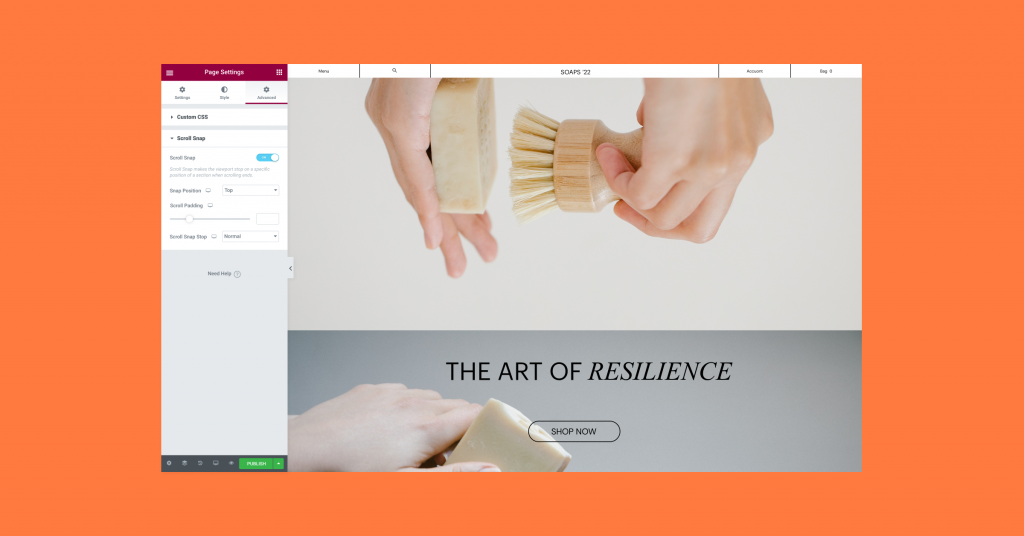
With the new Scroll Snap feature, you gain more control over how users view your website on any device. By setting the Snap Position to Top, Center or Bottom, each time the user scrolls, the next section will snap to the determined location. For example, if you set the viewport of each section to 100%, and Snap Position to Top, each time the user scrolls, the next section will take up the entire screen. This is extremely useful when you want to highlight products, set a design narrative, build a portfolio, or create presentations, among many other creative displays.

Put the User Experience Front and Center
After all the hard work you’ve put into designing your website and crafting its content, it’s only natural that you’ll want your users to enjoy it the same way you do. With these new features, you can optimize the user’s experience and encourage them to enjoy more of your creation.
Try out the Progress Tracker and Scroll Snap on your websites and let them do their magic. Then, let us know what you think about them in the comments below.
* Elementor 3.5 Pro also includes WooCommerce updates that allow you to create the ultimate shopping experience, read more about them here.
Looking for fresh content?
By entering your email, you agree to receive Elementor emails, including marketing emails,
and agree to our Terms & Conditions and Privacy Policy.


