We’ve all been there: you click a promising link, and before you can read a sentence, a giant pop-up locks the screen. So you hit back and go elsewhere. For your own visitors, a clunky consent prompt can send them away before they’ve seen what you offer. Good news: you don’t have to choose between compliance and a good experience. A well-built banner can respect privacy, keep your bounce rate low, and even build trust.
Key Takeaways
- Nail the first impression. A full-screen consent wall triggers instant bounces, especially on mobile.
- Pick a native tool. Cookie Consent keeps your site fast by skipping heavy external scripts.
- Tighten your mobile layout. Dock the banner at the bottom of the screen and keep padding minimal.
- Turn on geo-targeting. Show the banner only where it’s legally required.
- Enable Google Consent Mode v2 to keep tracking accurate without repeat prompts.
The Relationship Between Cookie Banners and Bounce Rates
A bounce happens when someone lands on your page and leaves without engaging. If your cookie banner loads slowly, blocks your content, or feels out of place, it pushes people away before they’ve read a word.
Many site owners treat compliance as an afterthought: grab a default template, drop it on the page, move on. The result is a jarring mismatch between careful design and a generic system alert, and that gap makes visitors uneasy enough to leave.
Focus on these to keep visitors from running:
- Match your colors, buttons, and fonts to your design so the banner feels native, not bolted on.
- Place it where it won’t block navigation or content the moment someone lands.
- Keep it lightweight, since heavy third-party tools slow rendering and frustrate visitors.
- Write clear, friendly microcopy instead of stiff legal language.
- Make dismissal easy with a clear, low-stress choice.
- Keep it mobile-friendly so it doesn’t swallow a phone screen.
Implementing Cookie Consent to Keep Visitors Engaged
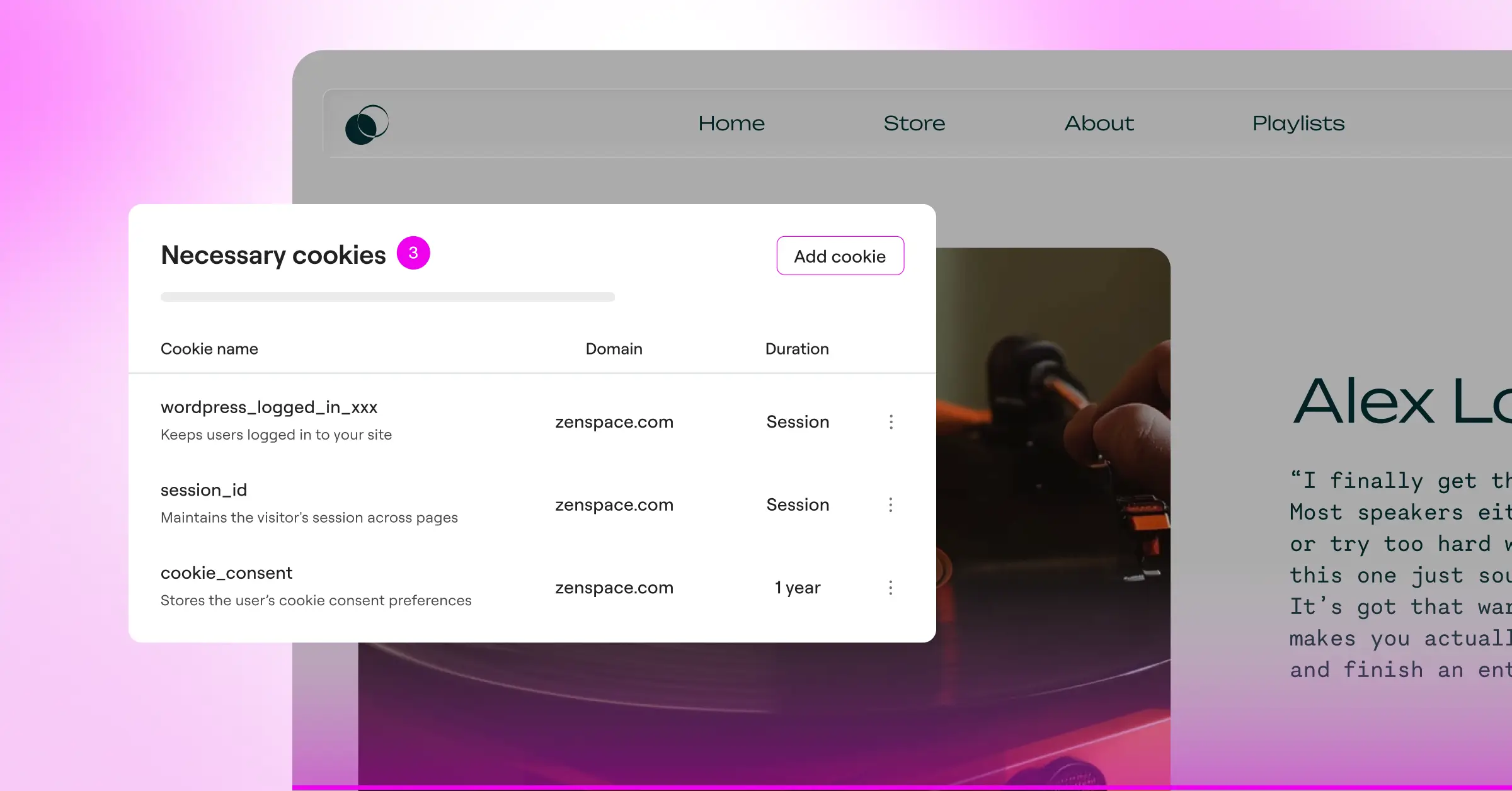
The simplest way to stop banner bounces is a tool built for your own environment. Cookie Consent is Elementor‘s native cookie consent tool, managed right from your WordPress dashboard. No complicated external setup, no slow third-party scripts dragging down your speed.
Turn it on and you get full compliance features right away: set up your banner in under five minutes, scan and sort cookies automatically, and manage scripts without leaving WordPress. It also supports Google Consent Mode v2 and Global Privacy Control, keeping you GDPR and CCPA compliant without frustrating visitors.
Going native helps performance too. Traditional consent managers pull code from external servers, slowing your page and hurting rankings. A native tool loads instantly alongside your theme files, keeping the site fast and stable, and free of the layout shifts that send people clicking away.
“Using a native consent setup is one of the most effective ways to balance legal compliance with user retention. When your consent banner loads as part of the page instead of a delayed external script, you protect your site speed and build immediate trust with your visitors.”
– Itamar Haim, Web Compliance Specialist
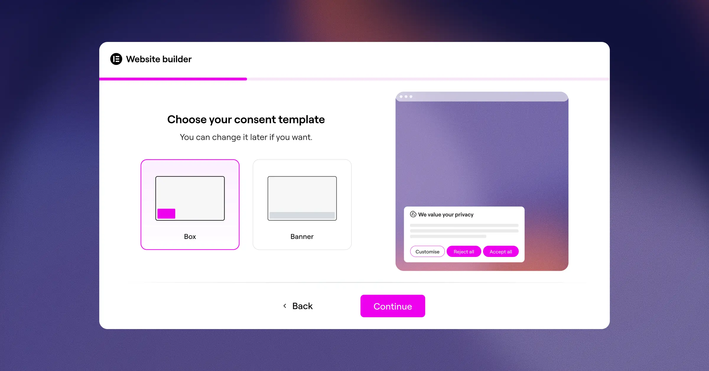
Design Principles for Low-Bounce Consent Banners
Design choices matter more than you’d think for whether someone stays or leaves. A banner that feels like part of your brand builds comfort. One that feels foreign or cluttered creates friction. Here’s how to design one that earns clicks instead of bounces.
Keep the Layout Subtle but Accessible
Skip the massive modal that darkens the whole background. A sleek bottom bar or small corner box tends to work better. A bottom-docked banner lets visitors preview your content before they decide, so they see your site has what they came for and stick around instead of clicking away.
Limit Padding and Maximize Whitespace
You don’t need heavy borders or big gaps for a readable banner. Keep the padding tight, especially on mobile. Clean spacing and clear type keep it legible without eating up screen space. (Easier than it sounds once you’re in a visual editor.)
Give Accept and Reject Equal Prominence
Privacy laws in the EU and plenty of other regions require that rejecting cookies is just as easy as accepting them. Your “Accept All” and “Reject All” buttons need equal visibility and equal ease of tapping. Use your brand color for the accept button, but make the reject option a real button, not a tiny text link in a corner. Equal prominence builds trust, and it’s the right call regardless of what the law says.
To get started, try these steps:
- Pick a clean bottom-bar layout that keeps your main content visible.
- Match the banner’s background color to your site’s footer or navigation bar.
- Style the accept and reject buttons consistently, so neither looks like an afterthought.
Technical Tweaks to Stop Banner-Induced Bounces
Sometimes bounces come down to how a banner behaves, not how it looks. Technical delays and poorly timed scripts can undo an otherwise well-designed experience. A few targeted fixes go a long way.
Use Geo-Targeting Smartly
Not every visitor needs to see a cookie banner. If you’re US-based and getting traffic from regions without strict opt-in laws, there’s no legal reason to show them a GDPR prompt. Geo-targeting shows consent banners only to visitors from the EU, UK, or California, keeping things frictionless for everyone else, for almost no effort.
Prevent Layout Shifts (CLS)
Cumulative Layout Shift measures how much your page content moves around while it loads. If your banner pops in late and shoves your header downward, it frustrates people and can cause accidental clicks. A native cookie consent tool loads instantly, claiming its layout space right away and keeping your page stable from the very first frame.
Load Scripts Asynchronously
Make sure your consent script doesn’t block other important assets from loading. Non-blocking execution means your text, images, and styles render first, so visitors can start reading while the banner loads quietly in the background.
Keep an eye on:
- Track your Core Web Vitals, especially Largest Contentful Paint (LCP) and Cumulative Layout Shift (CLS).
- Check Mobile Usability in Search Console for errors.
- Watch your Consent Rate to find the balance that works for your audience.
Comparing Cookie Consent Solutions for WordPress
Choosing the right compliance tool matters for both legal safety and a healthy bounce rate. Options differ in performance, setup time, and design flexibility. Here’s how some commonly used solutions compare.
| Feature / Metric | Cookie Consent (Elementor Native) | Cookiebot | CookieYes | Complianz | iubenda | OneTrust |
|---|---|---|---|---|---|---|
| Integration Method | Native WordPress Dashboard | External Cloud & Script | External Cloud & Script | WordPress Plugin | External Script | Enterprise Cloud |
| Setup Complexity | Very Low (Under 5 Mins) | Medium | Medium | High (Long Wizard) | High | Very High |
| Performance Impact | Minimal (No external calls) | Moderate (External script) | Moderate | Low to Moderate | Moderate | High (Heavy script) |
| Geo-Targeting Support | Yes (Built-in) | Yes (Paid plans) | Yes (Paid plans) | Yes | Yes (Paid plans) | Yes (Enterprise) |
| Google Consent Mode v2 | Yes (Ready out-of-the-box) | Yes | Yes | Yes | Yes | Yes |
| Design Customization | Full Visual Editor Control | Limited (CSS required) | Standard Templates | Standard Templates | Standard Templates | Custom CSS Required |
A native tool like Cookie Consent cuts through much of the setup and performance overhead that come with external platforms, keeping your site fast, on-brand, and fully compliant.
Step-by-Step Implementation Guide to Optimize Your Banner
Ready to build a compliant, high-performing banner that keeps your bounce rate low? Here’s the walkthrough, in the right order.
Step 1: Activate the Cookie Consent Capability
Log in to your WordPress dashboard and head to your Elementor settings. Under compliance options, turn on Cookie Consent. This activates the native compliance center without adding any extra plugins to your site. You’re one toggle away from getting started.
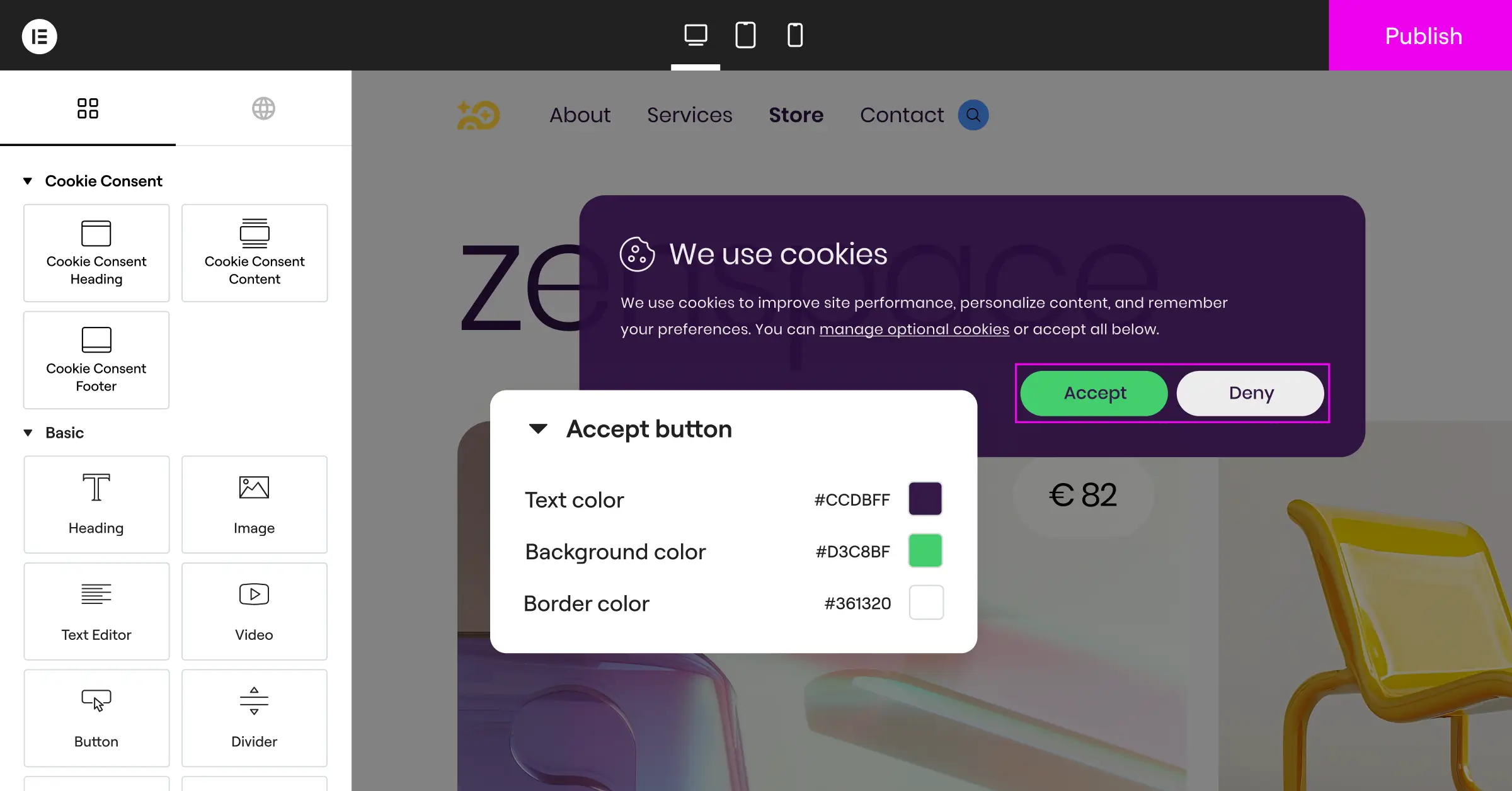
Step 2: Run an Automatic Cookie Scan
Before you design anything, find out which scripts your site actually uses. Run the built-in cookie scanner: it crawls your site, detects active tracking codes, and sorts them automatically into essential, analytical, and marketing categories, keeping your categorization accurate and legally defensible.
Run through this checklist:
- Verify that essential session cookies are marked as strictly necessary.
- Place Google Analytics or similar metrics scripts into the analytics category.
- Assign Facebook pixels or retargeting tags to marketing.
Step 3: Design the Banner Layout
Head to the design settings and pick a bottom-bar layout instead of a centered modal. Set the width to full-screen and keep the height compact. Match your background color to your brand palette, with enough contrast to stay readable. Keep the text brief and reassuring: honest rather than legally defensive.
Step 4: Configure Button Styles and Actions
Set up your main action buttons: “Accept All,” “Reject All,” and a “Customize Preferences” option for people who want more control. Give the accept and reject buttons equal visual weight so neither one is hidden or minimized. The customize option can use a softer treatment, like a text link, giving people real control without overwhelming choice.
A few styling tips:
- Use clear text. Avoid vague labels, since “Accept All,” “Reject All,” and “Customize” all work.
- Size your targets. Make buttons at least 44px tall so they’re easy to tap on a phone.
- Add hover effects so buttons read as interactive.
Step 5: Set Up Geo-Targeting Rules
Turn on geo-targeting so the banner only appears for people in regions with strict consent laws, like the EU or California. Everyone else gets an uninterrupted experience. It’s one of the easiest wins available to you, and it takes just a few minutes to set up.
Step 6: Test Your Implementation
Before you go live, open an incognito browser window and walk through your site. Check the banner on desktop and mobile, confirm you can scroll past it on a phone without blocking important links, and watch for layout shifts while it loads. If it feels smooth and blends naturally, you’re ready.
Advanced Strategies for Maximizing User Engagement
Once the basics are in place, a few more touches squeeze out extra bounce-rate improvement while keeping you legally safe and the experience natural.
Write Warm, Human Microcopy
Most cookie banners read like cold legal documents. Terms like “third-party data processing” can make people anxious enough to close the tab. Warm, conversational copy that explains why you use cookies, and what’s in it for the visitor, works a lot better.
Instead of: “We and our partners process data to track your browsing habits and deliver personalized advertising.”
Try: “We use cookies to remember your preferences and make your browsing experience smoother. Is that okay with you?”
That shift in tone makes your brand feel open and trustworthy. Safe visitors are far more likely to make a choice and keep reading instead of bouncing out of caution.
Optimize Mobile Screen Real Estate
Mobile traffic is over half of all web visits. On a small screen, a standard cookie banner can block 60% of the visible area, and if people can’t see your content, they’ll leave. Apply these mobile rules:
- Reduce font sizes to around 13px to 14px on mobile.
- Stack buttons vertically, easier to tap with a thumb than cramped side-by-side links.
- Keep padding to 10px to 15px, enough breathing room without eating into the page.
- Avoid dark overlays on mobile consent prompts. Let people see the page behind the banner.
Maintain Clean Consent Logs
If regulators audit you, you’ll need to show that visitors gave active, informed consent. Cookie Consent automatically stores secure, anonymized consent logs directly in your WordPress database, keeping you audit-ready without extra complexity. Learn more about Cookie Consent and what it includes on the Elementor features page.
Frequently Asked Questions
Why does my cookie banner increase my site’s bounce rate?
Cookie banners cause bounces when they’re too big, load slowly, or block the whole screen on mobile. If people can’t see your content or hit a confusing pop-up right away, they’ll often leave for a cleaner site. Speed and layout are the two biggest culprits.
How can I make my cookie banner less annoying for mobile users?
Place your banner at the bottom, keep the height under 150 pixels, and use compact padding. Skip the dark overlay that freezes the screen, and keep your text short. A bottom-docked banner that stays out of the way makes a big difference on small screens.
Do I have to show my cookie banner to every single visitor?
No, you don’t. With geo-targeting, you can show your banner only to visitors from regions with strict privacy rules, like the EU or California. Everyone else browses without seeing any prompt, protecting your bounce rate for most of your traffic.
What is Google Consent Mode v2 and do I need it?
Google Consent Mode v2 adjusts how Google tags behave based on a visitor’s consent choice. If you run Google Ads or track conversions from European traffic, you’ll need it. It lets you collect basic, anonymized data even when people decline cookies.
Does a native cookie consent capability load faster than a third-party option?
Yes. Native tools load alongside your theme assets since they’re built into your WordPress environment. Third-party options often rely on external databases and render-blocking scripts, which slow your load times and can hurt your Core Web Vitals scores.
Will making my cookie banner less prominent make me non-compliant?
Not if you design it carefully. Privacy laws require that consent prompts are clear and offer a genuine, equally accessible choice between accepting and rejecting. You can make your banner compact and on-brand while still meeting all legal requirements.
How do I test if my cookie banner is hurting my page speed?
Run your site through PageSpeed Insights and check your Cumulative Layout Shift (CLS) and Largest Contentful Paint (LCP) scores. If performance drops when your banner is active, that’s a strong signal to switch to a native cookie consent tool. You can also review your Core Web Vitals in Google Search Console for field data from real users.
Should I use a “Reject All” button on my banner?
Yes, just as prominent as your “Accept All” button. In many jurisdictions, including the EU, rejecting cookies must be as easy as accepting them. A clearly visible reject option builds genuine trust and heads off the frustration that leads to bounces.


