
As we move further into 2026, blog design has matured beyond mere aesthetics. Today, a successful blog seamlessly integrates user experience (UX), functionality, and brand storytelling. It’s about creating an intuitive and immersive environment where content can shine. This article will explore 12 outstanding examples of blog design that are setting the standard for digital publishing. We’ll dissect what makes them effective, from their strategic use of color and typography to their flawless mobile responsiveness and innovative features.
Key Takeaways
- Minimalism and White Space: Clean, uncluttered layouts are paramount. White space is not empty space. it’s a powerful design tool that improves focus, readability, and comprehension. By giving content room to breathe, you create a more calming and professional user experience.
- Bold Typography and Visual Hierarchy: Striking typography is no longer just for headlines. It’s a key element of brand identity. Blogs are using large, bold fonts to create a strong visual hierarchy, guiding the reader’s eye through the content and making it easily scannable.
- User-Centric Navigation: Intuitive navigation is non-negotiable. Readers should be able to find what they’re looking for with minimal effort. This includes clear menu structures, effective search functionality, and well-organized categories. A frustrating user experience is the quickest way to lose a reader.
- Engaging Visuals and Multimedia: The most effective blogs balance text with high-quality images, videos, and interactive elements. Visual content breaks up long blocks of text, illustrates complex ideas, and makes the content more memorable and shareable.
- Mobile-First and Responsive Design: With a majority of internet traffic coming from mobile devices, a mobile-first approach is essential. A blog must look and function perfectly on any screen size, from a large desktop monitor to a small smartphone.
- Accessibility and Inclusivity: Great design is accessible to everyone. This means paying attention to color contrast, providing alt text for images, and ensuring that the site can be navigated using a keyboard. An inclusive blog welcomes a wider audience.
- Personalization and AI-Powered Features: Artificial intelligence is transforming blog design. From personalized content recommendations to AI-generated images and layouts, these tools are helping creators deliver more relevant and engaging experiences.
- Strategic Calls-to-Action (CTAs): A well-designed blog guides the reader toward a specific action, whether it’s subscribing to a newsletter, downloading a resource, or making a purchase. CTAs should be clear, compelling, and strategically placed.
1. The Minimalist Maven: A Lesson in Simplicity
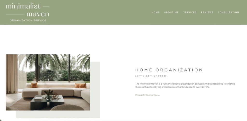
The Minimalist Maven is a lifestyle blog that champions the philosophy of “less is more.” Its design is a direct reflection of its content, featuring a clean, uncluttered layout that is both calming and sophisticated.
Design and User Experience
The blog’s homepage immediately sets a serene tone with a full-width, high-quality photograph and a simple, elegant logo. The color palette is muted, consisting of soft grays, warm whites, and a single, understated accent color. This limited palette creates a sense of harmony and allows the content to take center stage.
Typography is a key element of The Minimalist Maven’s design. A classic serif font is used for headings, conveying a sense of timelessness and authority, while a clean sans-serif font is used for the body text, ensuring maximum readability. The generous use of white space is perhaps the most striking feature. It surrounds every element, from the text to the images, creating a sense of order and tranquility.
Navigation is incredibly intuitive. A simple, sticky header contains links to the main categories: “Home,” “Lifestyle,” “Wardrobe,” and “About.” A prominent search bar is also included, allowing users to find specific content with ease. The blog’s mobile experience is flawless. The single-column layout adapts perfectly to smaller screens, and the touch targets are large and easy to tap.
Why It Works
The Minimalist Maven’s design is successful because it is a perfect extension of its brand identity. The minimalist aesthetic is not just a stylistic choice. it’s a deliberate decision that reinforces the blog’s core message. By eliminating visual clutter, the design allows the reader to focus on what’s important: the content. This creates a deeply immersive and enjoyable reading experience. The blog is a masterclass in how to use design to tell a story and build a powerful brand. It’s a testament to the idea that sometimes, the most effective design is the one you barely notice.
2. TechFlow: Where Innovation Meets Intuition
TechFlow is a leading blog that covers the latest trends in technology and innovation. Its design is as cutting-edge as its content, featuring a bold, futuristic aesthetic that is both visually stunning and highly functional.
Design and User Experience
The first thing you notice about TechFlow is its dark-mode-first design. The deep charcoal background is easy on the eyes and makes the vibrant, neon-accented visuals pop. The layout is a dynamic grid system that showcases a variety of content formats, from long-form articles to video interviews and interactive infographics.
Typography is a mix of a modern, geometric sans-serif for headings and a highly legible, slightly condensed font for the body. This combination creates a sense of forward-thinking sophistication. The blog makes excellent use of micro-interactions. Hovering over an article card triggers a subtle animation, and scrolling down the page reveals content with a smooth, fade-in effect. These small details make the browsing experience feel responsive and engaging.
Navigation is handled through a mega-menu that organizes the vast amount of content into logical categories and subcategories. This allows users to quickly drill down to their specific interests. The search functionality is powered by AI, providing instant, highly relevant results. TechFlow also features a prominent “Trending” section on its homepage, which uses an algorithm to display the most popular articles in real-time.
Why It Works
TechFlow’s design succeeds by mirroring the innovative spirit of the tech industry. It’s bold, dynamic, and unapologetically modern. The dark-mode design is not just a trend. it’s a practical choice that reduces eye strain during long reading sessions, which is a common behavior for its target audience. The use of micro-interactions and AI-powered features demonstrates a commitment to a superior user experience. This attention to detail builds credibility and positions TechFlow as a forward-thinking authority in its niche. The design is not just a container for the content. it’s an integral part of the experience, making complex topics feel exciting and accessible.
3. The Culinary Canvas: A Feast for the Eyes
The Culinary Canvas is a food blog that celebrates the art of cooking. Its design is warm, inviting, and visually rich, making it a go-to resource for home cooks and food enthusiasts.
Design and User Experience
The blog’s design is built around stunning, high-resolution photography. The homepage features a full-screen image of a beautifully plated dish, immediately whetting the reader’s appetite. The color palette is drawn from nature, with earthy tones of terracotta, sage green, and warm beige, creating a rustic yet elegant feel.
The layout is clean and organized, with a focus on readability. Recipe pages are particularly well-designed, with a clear separation between the ingredient list, instructions, and accompanying story. A “Jump to Recipe” button is prominently displayed at the top of each post, a thoughtful feature that caters to users who want to get straight to the cooking.
The typography is a friendly and approachable serif font, which adds to the blog’s warm and personal tone. The use of custom icons for cooking time, difficulty level, and serving size is a nice touch that makes the recipes easy to scan. The Culinary Canvas also includes a powerful recipe filter on its main recipe index page, allowing users to sort by course, cuisine, dietary restrictions, and even specific ingredients.
Why It Works
The Culinary Canvas understands that for a food blog, the visuals are just as important as the text. The design prioritizes high-quality photography, which is essential for making the food look appealing. The user experience is clearly designed with the home cook in mind. Features like the “Jump to Recipe” button and the advanced recipe filter show a deep understanding of the user’s needs and pain points. The warm color palette and friendly typography create a welcoming atmosphere that makes visitors feel like they’re in the kitchen with a trusted friend. The design is not just beautiful. it’s highly functional, making it an indispensable tool for anyone who loves to cook.
4. The Globetrotter’s Guide: An Immersive Journey
The Globetrotter’s Guide is a travel blog that takes readers on a journey to the world’s most breathtaking destinations. Its design is immersive, experiential, and designed to inspire wanderlust.
Design and User Experience
The blog uses a full-screen video background on its homepage, instantly transporting visitors to a stunning location. The design is heavily reliant on visual storytelling, with large, captivating photos and videos integrated throughout the articles. The layout is spacious and airy, allowing the visuals to take center stage.
The color palette is inspired by travel itself, with deep blues reminiscent of the ocean, sandy beiges, and vibrant accent colors that reflect different cultures. The typography is a modern and clean sans-serif, which is easy to read against the visually rich backgrounds.
One of the standout features of The Globetrotter’s Guide is its interactive maps. In articles about specific destinations, an embedded map shows the locations of different points of interest. Clicking on a pin reveals a pop-up with a brief description and a link to more information. This feature is both engaging and incredibly useful for travel planning. The blog also features a “Plan Your Trip” section, which is a curated collection of resources, including booking tools, travel guides, and packing lists.
Why It Works
The Globetrotter’s Guide’s design is successful because it sells an experience, not just information. The use of full-screen video and large-scale photography creates an emotional connection with the reader, making them feel like they are part of the journey. The interactive maps are a brilliant example of how to add value and functionality to content. They transform a passive reading experience into an active, exploratory one. The design is not just a collection of pretty pictures. it’s a carefully crafted tool that inspires, informs, and empowers readers to plan their own adventures.
5. The Financial Futurist: Data-Driven Design
The Financial Futurist is a blog dedicated to personal finance, investing, and economic trends. Its design is clean, professional, and data-driven, making complex financial topics accessible to a broad audience.
Design and User Experience
The blog’s design is characterized by its use of data visualizations. Charts, graphs, and interactive calculators are seamlessly integrated into the articles, helping to illustrate complex concepts and make the data more digestible. The layout is structured and grid-based, which creates a sense of order and credibility.
The color palette is a professional and trustworthy combination of blues, grays, and a single, bright accent color (often green or orange) to highlight key information and calls-to-action. The typography is a highly legible sans-serif font, chosen for its clarity and readability, especially when displaying numbers and data.
A key feature of The Financial Futurist is its use of “Key Takeaways” boxes at the beginning of each article. This allows busy readers to quickly grasp the main points before diving into the details. The blog also includes a robust search and filtering system, allowing users to find articles based on topic, author, and even specific financial instruments. For its premium content, the blog uses a paywall that is elegantly designed, clearly explaining the benefits of a subscription without being intrusive.
Why It Works
The Financial Futurist’s design is effective because it builds trust. The professional color palette, structured layout, and use of clear data visualizations all contribute to an aura of authority and expertise. The design is user-centric, with features like the “Key Takeaways” boxes and advanced filtering system catering to the needs of a time-conscious and goal-oriented audience. By making complex financial information easy to understand and act upon, the design empowers readers to make better financial decisions. It’s a perfect example of how design can be used to demystify a complex subject and build a loyal community around it.
6. The Artisan’s Almanac: Celebrating Craftsmanship
The Artisan’s Almanac is a blog that shines a spotlight on handmade goods and the artisans who create them. Its design is warm, textured, and full of character, reflecting the unique quality of its subject matter.
Design and User Experience
The design of this blog has a tactile quality, using subtle background textures that mimic paper or canvas. The layout is asymmetrical and collage-like, which gives it a creative and organic feel. The photography is intimate and personal, focusing on the details of the craft and the hands of the artisans.
The color palette is earthy and rich, with deep browns, warm ochres, and muted jewel tones. The typography is a beautiful combination of a classic, hand-drawn serif for headings and a simple, typewriter-style font for the body. This pairing gives the blog a nostalgic and authentic feel.
A standout feature is the “Shop the Story” integration. As readers scroll through an article about a particular artisan, they see embedded product cards with high-quality images, brief descriptions, and a direct link to purchase the item. This creates a seamless and non-disruptive shopping experience. The blog also features a “Meet the Maker” section, which includes in-depth interviews and studio tours, further connecting the reader to the story behind the products. This is a brilliant use of the Elementor WooCommerce Builder, allowing for a highly customized and integrated eCommerce experience.
Why It Works
The Artisan’s Almanac’s design succeeds by telling a compelling story. It goes beyond simply showcasing products and instead focuses on the people and the passion behind them. The textured backgrounds, handcrafted typography, and intimate photography all work together to create a warm and authentic atmosphere. The “Shop the Story” feature is a masterful example of content-driven commerce, turning inspiration directly into sales. The design is not just a showcase. it’s a celebration of craftsmanship that builds a deep and meaningful connection between the artisans and their customers.
7. The Daily Habit: A Bold and Energetic Approach
The Daily Habit is a blog focused on health, fitness, and personal development. Its design is bold, energetic, and motivational, designed to inspire readers to take action and live their best lives.
Design and User Experience
The blog’s design is characterized by its use of bold colors, large typography, and dynamic layouts. The homepage features a full-width hero section with a powerful image and a clear, action-oriented headline. The layout uses overlapping elements and diagonal lines to create a sense of movement and energy.
The color palette is bright and vibrant, with high-contrast combinations that command attention. The typography is a strong, modern sans-serif, used in various weights and sizes to create a dynamic visual hierarchy. The blog also makes effective use of custom illustrations and icons, which add a playful and unique touch to the design.
A key feature of The Daily Habit is its interactive challenges. For example, a “30-Day Fitness Challenge” page includes a checklist that users can interact with, a progress tracker, and embedded workout videos. This gamified approach to content is highly engaging and encourages repeat visits. The blog also features prominent calls-to-action throughout the site, prompting users to sign up for the newsletter, download a free guide, or join the community forum.
Why It Works
The Daily Habit’s design is successful because it is highly motivational. The bold colors, energetic layouts, and strong typography all work together to create a sense of excitement and possibility. The interactive challenges are a great example of how to make content more engaging and actionable. By turning passive reading into an active experience, the blog helps its readers achieve their goals. The design is not just visually appealing. it’s a powerful tool for driving user engagement and building a supportive community. It’s a perfect example of how design can be used to inspire and empower an audience.
8. The Urban Gardener: A Breath of Fresh Air
The Urban Gardener is a blog dedicated to helping people grow plants in small spaces. Its design is fresh, organic, and full of life, creating a welcoming and inspiring resource for city dwellers.
Design and User Experience
The design is light and airy, with a clean white background and plenty of green accents. The layout is simple and easy to navigate, with a focus on beautiful photography and clear, concise text. The blog makes excellent use of hand-drawn illustrations, which add a personal and whimsical touch to the design.
The color palette is, unsurprisingly, dominated by shades of green, complemented by earthy browns and a few bright, floral accent colors. The typography is a friendly and rounded sans-serif, which is easy to read and contributes to the blog’s approachable tone.
A standout feature is the “Plant Finder” tool. This interactive quiz asks users a series of questions about their living space (e.g., amount of sunlight, humidity levels, available space) and then recommends plants that are a good fit for their environment. Each plant recommendation comes with a detailed care guide. This tool is incredibly useful for novice gardeners and demonstrates a deep understanding of the target audience’s needs. The blog also has a thriving community section with a forum where users can ask questions, share photos of their plants, and get advice from fellow gardeners. This community aspect is fostered by excellent design that facilitates interaction and sharing. For web creators looking to build a similar platform, using a flexible tool like Elementor can make the process much more manageable.
Why It Works
The Urban Gardener’s design succeeds by being both beautiful and incredibly helpful. The fresh and organic aesthetic is a perfect match for the subject matter, creating a calming and inspiring atmosphere. The “Plant Finder” tool is a game-changer, providing personalized recommendations that take the guesswork out of gardening. This feature adds immense value and positions the blog as an indispensable resource. The design is not just about looking pretty. it’s about empowering people to bring a little bit of nature into their homes.
9. The Conscious Consumer: Designing for a Cause
The Conscious Consumer is a blog focused on sustainable living, ethical brands, and environmental advocacy. Its design is clean, modern, and purposeful, reflecting its commitment to making a positive impact on the world.
Design and User Experience
The design of this blog is a masterclass in accessible and inclusive design. The layout is clear and structured, with a strong focus on readability. The color palette is calming and natural, with muted earth tones and a high-contrast text color to ensure legibility for users with visual impairments. The blog also includes a toggle for a high-contrast mode, which is a thoughtful and important accessibility feature.
The typography is a clean and modern sans-serif, chosen for its excellent readability across all screen sizes. The blog provides clear and descriptive alt text for all images, making the content accessible to screen reader users. The navigation is straightforward and logical, with clear labels and a consistent structure.
As an expert in web design, Itamar Haim notes, “The Conscious Consumer’s commitment to accessibility is not just a feature. it’s a core part of their brand identity. By prioritizing an inclusive user experience, they are living their values and demonstrating a deep respect for their audience. This is the future of web design.” The blog’s use of the Ally Web Accessibility plugin by Elementor is a testament to this commitment.
Why It Works
The Conscious Consumer’s design is powerful because it is authentic. The commitment to accessibility and inclusivity is a direct reflection of the blog’s mission-driven content. This builds a deep sense of trust and credibility with the audience. The clean and uncluttered design allows the important messages to shine through without distraction. The blog is a powerful reminder that great design is not just about aesthetics. it’s about creating a better, more inclusive experience for everyone.
10. The AI Artistry Blog: Where Creativity and Code Collide
The AI Artistry Blog explores the intersection of artificial intelligence and creative expression. Its design is dynamic, experimental, and constantly evolving, much like the field of AI art itself.
Design and User Experience
The design of this blog is a showcase for the power of AI. The hero image on the homepage is an AI-generated piece of art that changes every time the page is refreshed. The layout is fluid and unpredictable, with elements that shift and rearrange as the user scrolls.
The color palette is a vibrant and eclectic mix, often drawn from the AI-generated images themselves. The typography is a blend of a futuristic, monospace font for headings and a clean, readable sans-serif for the body. This combination creates a sense of technological sophistication and artistic freedom.
A key feature of The AI Artistry Blog is its interactive gallery. Users can browse a curated collection of AI-generated art, and they can even input their own text prompts to create new images in real-time. This feature is powered by a custom integration with an AI art generator, and it provides a deeply engaging and personalized experience. The blog is a prime example of how tools like Elementor AI are being used to create truly unique and dynamic web experiences.
Why It Works
The AI Artistry Blog’s design is successful because it is a living demonstration of its subject matter. By using AI to generate key design elements, the blog creates an immersive and authentic experience. The interactive gallery is a brilliant way to engage the audience and allow them to participate in the creative process. The design is not just a platform for discussing AI art. it is a piece of AI art in itself. This innovative approach makes the blog a must-read for anyone interested in the future of creativity.
11. The Storyteller’s Sanctuary: A Digital Magazine Experience
The Storyteller’s Sanctuary is a long-form journalism and literary blog that publishes in-depth essays and narrative nonfiction. Its design is elegant, immersive, and reminiscent of a high-end print magazine.
Design and User Experience
The design is focused on creating an optimal reading experience. The layout is a single, clean column with generous margins, which helps the reader focus on the text. The articles feature beautiful drop caps, pull quotes, and chapter breaks, all of which are classic elements of print design.
The color palette is sophisticated and understated, with a classic black-on-white text scheme and a single, rich accent color for links and highlights. The typography is a highly readable serif font, chosen for its elegance and ability to reduce eye strain during long reading sessions. The line height and character spacing have been carefully calibrated for maximum comfort.
A unique feature of The Storyteller’s Sanctuary is its “read time” indicator at the beginning of each article. This helps readers manage their time and sets expectations for the length of the piece. The blog also has a “distraction-free” reading mode, which removes all navigation and visual elements, leaving only the text. This feature is a boon for serious readers who want to fully immerse themselves in the story.
Why It Works
The Storyteller’s Sanctuary’s design succeeds because it respects both the content and the reader. By borrowing from the best practices of print design, it creates a reading experience that is both beautiful and highly functional. The focus on typography and layout shows a deep appreciation for the written word. Features like the “read time” indicator and “distraction-free” mode demonstrate a commitment to a user-centric experience. The design is a perfect marriage of classic elegance and modern functionality, creating a digital space where great stories can be savored.
12. The Localvore’s Ledger: Community-Centric Design
The Localvore’s Ledger is a blog that celebrates local food, farmers, and restaurants in a specific city. Its design is vibrant, community-focused, and highly interactive.
Design and User Experience
The design is bright and colorful, with a lively and engaging feel. The layout is a dynamic mix of a traditional blog feed, a community events calendar, and an interactive map of local businesses. The photography is authentic and down-to-earth, showcasing real people and real food.
The color palette is a cheerful and energetic mix of bright, food-inspired colors. The typography is a friendly and modern sans-serif, which gives the blog an approachable and contemporary vibe.
The most powerful feature of The Localvore’s Ledger is its community integration. The blog features a user-generated content section where readers can submit their own reviews, photos, and recipes. The interactive map is also a key feature, allowing users to explore their city and discover new places to eat and shop. The blog has a robust directory of local businesses, each with its own profile page featuring photos, contact information, and user reviews. This community-driven approach makes the blog a truly collaborative and indispensable local resource. For those looking to create a similar community hub, a reliable hosting solution like Elementor Hosting is crucial to handle the traffic and data.
Why It Works
The Localvore’s Ledger’s design is successful because it is built around community. By empowering readers to contribute their own content, the blog fosters a sense of ownership and belonging. The interactive map and business directory are incredibly useful tools that provide real value to the local community. The design is not just a platform for one person’s voice. it’s a vibrant and dynamic hub for an entire community of food lovers. It’s a powerful example of how design can be used to connect people and celebrate a shared passion.
Frequently Asked Questions (FAQ)
1. What is the most important element of blog design?
While all elements are important, user experience (UX) is arguably the most critical. If your blog is difficult to navigate, slow to load, or hard to read, even the best content will be lost. A user-centric design that is intuitive, accessible, and responsive should be the foundation of any blog.
2. How much does a professional blog design cost?
The cost of blog design can vary dramatically, from free (using a pre-made template) to tens of thousands of dollars (for a completely custom design from a top agency). A good middle ground for a small business or serious blogger would be to use a flexible and powerful tool like Elementor Pro to create a custom-looking site at a fraction of the cost of hiring a developer.
3. How often should I redesign my blog?
A full redesign is a major undertaking and isn’t always necessary. Instead of thinking in terms of complete overhauls, it’s more productive to think in terms of continuous improvement. You should be regularly evaluating your blog’s performance, gathering user feedback, and making small, iterative changes to improve the design and user experience. A major redesign might be warranted every 3-5 years, or if your brand identity undergoes a significant change.
4. What is a “mobile-first” design approach?
A mobile-first approach means that you design the mobile version of your blog before the desktop version. This forces you to prioritize the most important content and features, leading to a cleaner and more focused design. Since a majority of internet traffic now comes from mobile devices, a mobile-first approach ensures that you are providing the best possible experience for the largest segment of your audience.
5. How can I make my blog design more accessible?
Making your blog accessible means designing it so that people with disabilities can use it. Key practices include:
- Using high-contrast colors for text and backgrounds.
- Providing descriptive alt text for all images.
- Using clear and logical heading structures (H1, H2, H3).
- Ensuring that your entire site can be navigated with a keyboard.
- Using a tool like Ally Web Accessibility to scan for and fix issues.
6. What are the best fonts to use for a blog?
The best fonts are the ones that are easy to read. For body text, classic serif fonts like Georgia and Merriweather, or clean sans-serif fonts like Open Sans and Lato are excellent choices. For headings, you can be more creative, but always prioritize legibility. The most important thing is to create a clear visual hierarchy and ensure that the font size is large enough to be read comfortably.
7. How important is white space in blog design?
White space (or negative space) is incredibly important. It’s the empty space around elements on a page. Proper use of white space improves readability, reduces cognitive load, and creates a more professional and uncluttered look. Don’t be afraid of empty space. it’s one of the most powerful tools in a designer’s arsenal.
8. How can I use color effectively in my blog design?
A good color palette is consistent and reflects your brand identity. A common practice is to use the 60-30-10 rule: 60% of your design should be a dominant, neutral color; 30% should be a secondary color that supports the dominant one; and 10% should be an accent color used for calls-to-action and other important elements. Always ensure that your colors have enough contrast to be accessible.
9. What is the role of AI in modern blog design?
AI is playing an increasingly important role in blog design. It can be used to:
- Generate unique images and illustrations.
- Write and refine blog post copy.
- Personalize content recommendations for individual users.
- Even generate entire website layouts and sitemaps using tools like the Elementor AI Site Planner.
10. How do I create effective calls-to-action (CTAs)?
An effective CTA is clear, concise, and action-oriented. Use strong verbs like “Download,” “Subscribe,” or “Learn More.” Make your CTAs visually distinct by using a contrasting color and placing them in a prominent location. The goal is to make it as easy as possible for the user to take the desired action.


