Note
This article only applies if you’re building your site with a section and column layout. If you’re building your site with containers, check out What is a Flexbox Container for more information about container layout.
Adjust vertical and horizontal alignment within Sections and Columns to achieve a “stretch-to-fill” layout. This allows elements of columns with different heights to align with one another.
For each section/column, set the alignment options:
Section/Column> Layout
Vertical Align: Choose from:
- Top
- Middle
- Bottom
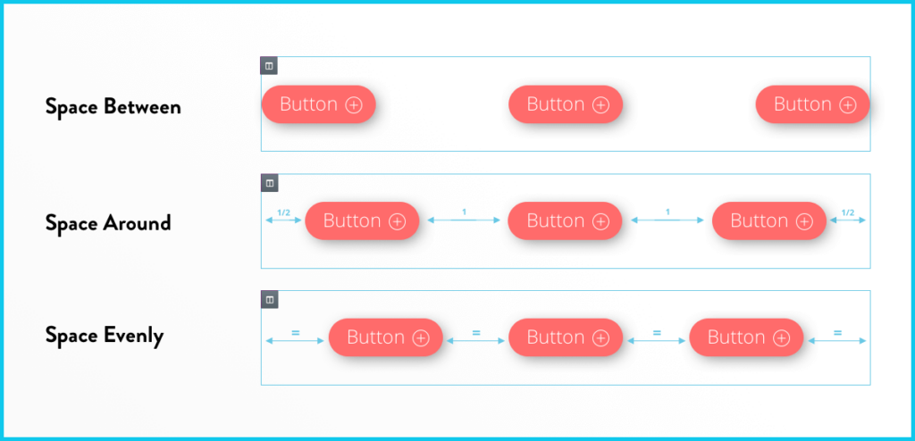
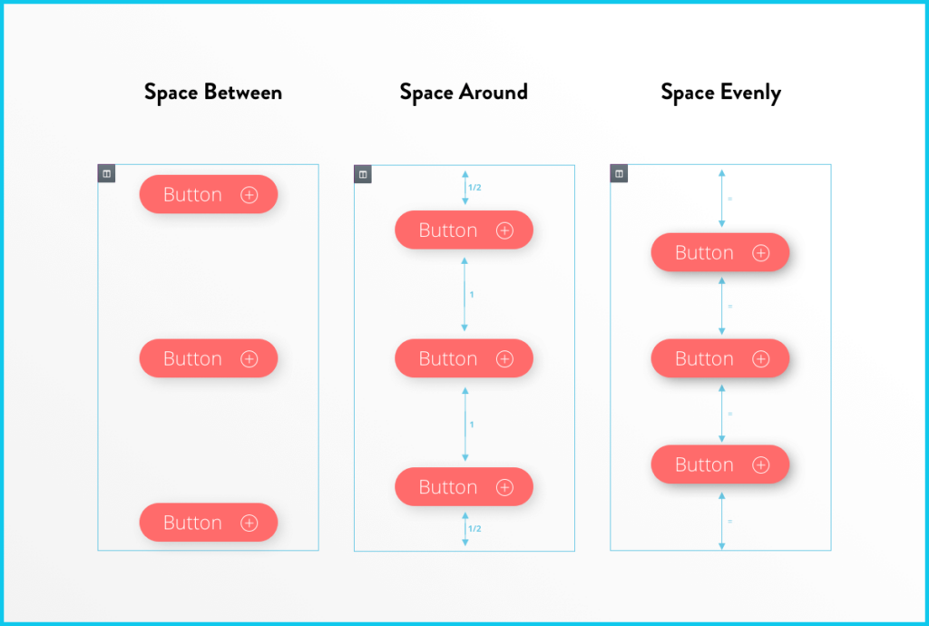
- Space Between – Widgets start and end at the edge of the column, with equal space between them
- Space Around – Widgets are spaced equally, and the edges are half the size of the space between widgets.
- Space Evenly – Widgets have equal space between, before and after them.
Horizontal Align: This extends the ability of the inline positioning and lets you horizontally align the inline widgets that are placed in the same row. Choose from:
- Start
- Center
- End
- Space Between – Same as the vertical control
- Space Around – Same as the vertical control
- Space Evenly – Same as the vertical control