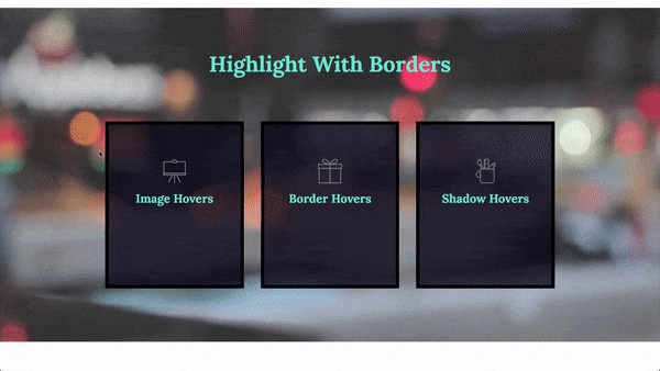
The Hover Animations feature lets you animate elements on your WordPress website when visitors mouse over the elements. Individual elements have their own unique hover effects that can be found under the Style tab but there are a number of standard effects that are under the Advanced tab.
To add hover animations:
- Add an element to the canvas.
- In the panel, click the Advanced tab.
- Open the Transform field if you want to animate the way the element appears or the Border field to animate the border around the element.
To cancel an animation, click the reset iconnext to the effect.
See the chart below for examples of these hover animations. Mouse over the images to see the hover effects.
Transform animations
Rotate: Click the pencil icon and use the slider to determine how much the element will turn when visitors hover over it. Toggle 3D Rotate to have the element rotate along 3 axes.

Offset: Click the pencil icon and use the sliders to move the element to the right or left (Offset X) or up or down (Offset Y).

Scale: Click the pencil icon and use the slider to have the element grow of shrink when visitors hover over it. Toggle Keep Proportions off if you don’t want the element to maintain the height and length ratio.

Skew: Click the pencil icon and use the sliders to have the element twist in an asymmetric way when visitors hover over it.
- Skew X: Twists the element left and right.
- Skew Y: Twists the element up and down.

Flip Horizontal: Click the button to have the element flip when a visitor hovers over it.

Flip Vertical: Click the button to have the element flip when a visitor hovers over it.

Transition Duration: Controls the length of time it takes between when a visitor mouses over an element and the time the animation takes effect.
Border animations
Border type: Select a border type from the dropdown menu to have a border appear when visitors mouse over the element.
Choices are:
- Solid
- Double
- Dotted
- Dashed
- Grooved
If you add a border, you can also choose:
- Border width.
- Border Color. For details, see Choose a color or Use global fonts and colors.
- Border Radius. For details, see Border radius tools.

Box Shadow: Click the pencil icon to add shadow to the element when a visitor hovers over it. Learn more about shadows.

Transition Duration: Controls the length of time it takes between when a visitor mouses over an element and the time the border animation takes effect.