Table of Contents
Today we are excited to introduce Elementor’s new Website Shape Divider – a new refreshing design feature that will transform your pages and help you create beautiful and professional looking designs.
Here in Elementor, we not only follow top design trends, we also set them. Shape Divider is a perfect example of that, as it broadens the range of design possibilities considerably and allows you to create cool separator effects, that until now were simply not possible.
We really fell in love with this feature. So much so, that we decided to release it to the entire Elementor community, and not just to pro users.
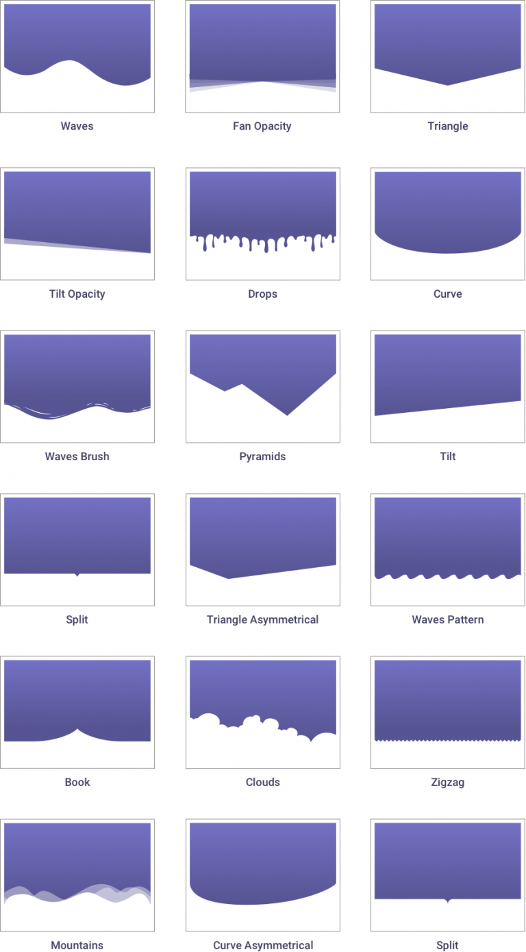
We are starting off with 18 shapes you can choose from. These are starter shapes, that can be customized to create an endless and versatile array of dividers for your WordPress websites.
Here they are:

How Shape Divider Works
The Shape Divider feature uses highly optimized SVG shapes, that are manipulated and customized on our frontend editor.
When we developed this feature, we had two important guidelines we focused on: making sure the shapes were lightweight and optimized, while delivering shapes that looked great on any screen, resolution and device.
Besides making the shapes lightweight SVG files, we have also made their loading asynchronous, meaning they only load when you need them to, and after the page has finished loading, so it doesn’t affect page speed.
Because the shapes are SVGs, this guarantees they are always seen as high resolution, including on retina screens.
Control Over Shapes
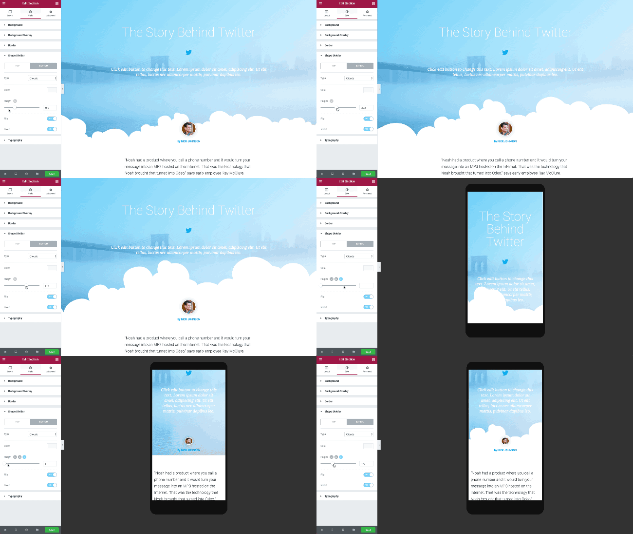
Flexibility is an important factor when creating shapes. In Elementor, you have control over the various settings that help customize each and every shape:

Background: You can separate any background with shapes, including color, image, video and gradient backgrounds

Controls: With the Shapes feature, you can control the size of the shapes, as well as invert them or flip them over

Top & Bottom Shapes: Set a different shape for the top and bottom part of the section, with a separate set of controls for each side

Mobile editing: You can quickly customize a different shape to fit desktop, tablet and mobile screens, using Elementor’s Mobile Editing feature.

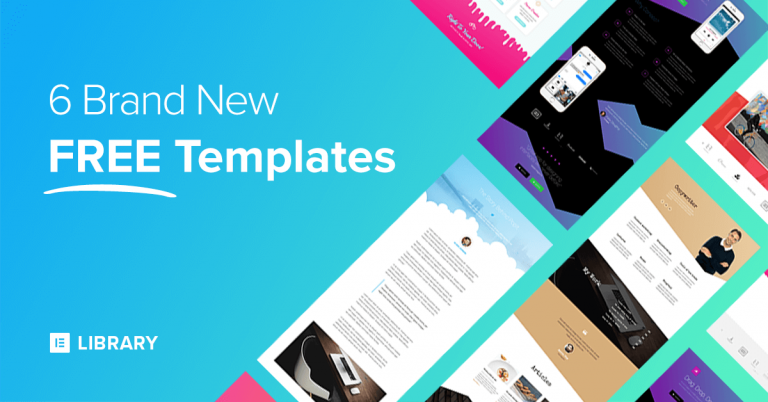
6 Shape Divider Templates to get you started!
We want you to get the fastest introduction into the shapes feature. This is why we’ve created 4 stunning FREE templates, that showcase a few creative ideas for using shapes. If you’re a Pro user, you get 2 more shape templates that are no less stunning.
You are invited to use these templates for your own website, and tinker with the shapes to get to know just how easy it is to use.
Other Improvements
Because the new shapes feature is so substantial, we won’t elaborate much on the other features added to Elementor this week. Hopefully, we will be able to publish a longer post depicting them in more detail further ahead.
In the meantime, here is a quick update on all the other improvements added to Elementor with this release.
Video Lightbox – You can now add a video lightbox modal, so when the user clicks on an image, the video opens as a lightbox. You can visually control various design settings of the lightbox. To see the video lighbox feature, make sure you add an image overlay to your video widget.
Read more about Video Lightbox →
Button Shadow – We added box shadows to Elementor back in July, and if I am not mistaken this feature is still only available on our builder. Now, you can also add shadows to buttons. How cool is that?
Smooth Scroll – A few months ago, we introduced smooth scrolling to our anchor widget. This way, you can create a one-page navigation that moves from section to section smoothly. Now you can use an ID to add smooth scrolling to any Elementor element: section, column or widget, without having to use the Anchor widget.
Icon List Dividers – As per many of our users’ request, we have now added the ability to separate the different list items with lines and spaces, and design the line style however you like. We have also fixed an issue where list items which were longer than one line wrapped around the icon instead of getting aligned one below the other.
Optimization Improvement – Without getting too technical, We’ve made sure JS scripts are included in the page only if you are using them. This means that your page only loads the widget JS scripts it needs, making Elementor pages load even faster.
Note: If you’re a developer, follow this code example to understand how it works.
Conclusion
Shape Divider has been added to a list of features we have added since the beginning of the year to the Free Elementor Page Builder, including Revision History and Gradients.
We invite you to take the new Elementor version for a spin, and share some of your creative shape divider pages with us.
Looking for fresh content?
By entering your email, you agree to receive Elementor emails, including marketing emails,
and agree to our Terms & Conditions and Privacy Policy.


