In the two years since we launched Elementor, it has become a leading WordPress Page Builder and a powerful tool, providing a complete solution for web designers.
Today, more and more designers are using Elementor, and the result is reflected in dozens of new websites appearing online every month. These websites showcase the near unlimited possibilities, flexibility, and timesaving advantages of Elementor.
Here are ten successful examples of websites that were designed and developed with Elementor that demonstrate its capabilities.
Browse through these beauties, and if you have stunning sites of your own, submit them with the link at the bottom of the article.
10
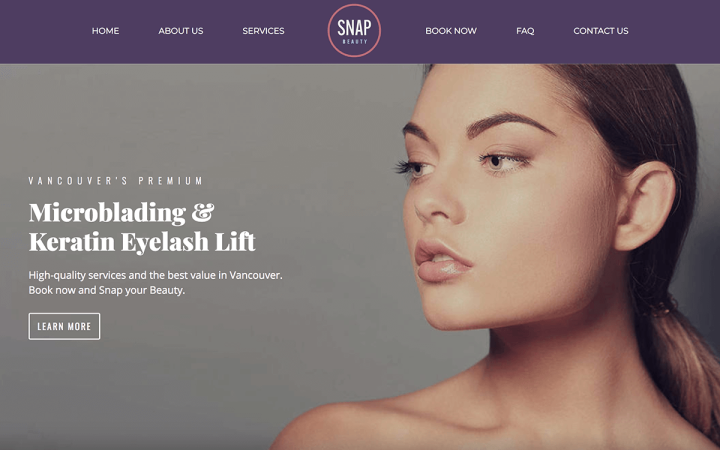
Snapbeauty is a beauty salon located in Vancouver, British Columbia, offering a range of facial make-up treatments.
The smart use of a Section Divider, large font titles, clear and symmetrical borders, and a gradient background, all make it easy to navigate between the various sections on the homepage. Violet, turquoise, and rosy hues dominate the different areas of the page, creating a consistent color palette that compliments its Hero image.
What we liked
The striking high definition image of an elegant model is a perfect choice for the homepage Hero photo. The Snapbeauty logo placed at the center of the header underlines the symmetry of the website.
Points to consider
The ‘Services’ and ‘Book Now’ pages include excessive use of entrance animation. These pages could benefit from more compelling imagery instead of animation effects.
09
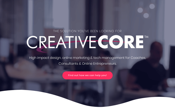
Creative Core is an Online Marketing agency for coaches, consultants and online entrepreneurs, based in Naperville, Illinois. The website they built is single paged, featuring a full-screen Hero section, curved by shape divider. A marketing message, as well as a textual logo, appear in the center, while a full-screen video plays in the background. A prominent Call-to-Action button wraps up the above the fold area.
The section below combines another (longer) marketing message with three video testimonials, followed by a shape divider, another section with a marketing message and a Call-to-Action button. The next section presents selected works with entrance animation effects and a Call-to-Action button, and the last one is a FAQ section ending, again, with a prominent Call-to-Action button.
What we liked
Creative Core’s website is very sales-oriented, displaying their marketing messages and Call-to-Action buttons throughout the page. Nonetheless, the site developer has done it tastefully. The FAQ section is another successful tool for converting visitors to new clients.
Points to consider
The website does not have a Social Media Sharing Widget, which could boost the site’s exposure and attract new clients.
08
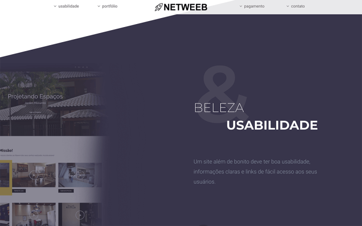
Netweeb is a website development agency based in Brazil, specializing in online stores.
Their website is built on a single page. The designer behind this site decided to keep it short and simple, to quickly deliver their message to visitors. Therefore the homepage consists of a Hero image, a few marketing messages, the agency’s portfolio, and a contact form.
What we liked
Points to consider
We found the Hero section too generic and uninspiring. The entire above the fold area, including the menu, is a bit on the dull side, and an overkill of white background.
07
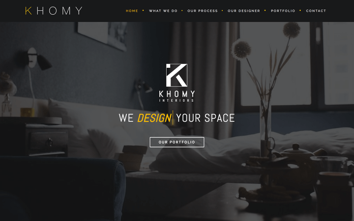
Khomy Interiors is an interior design studio from Sri Lanka. Their one-page website has a dark color scheme, a good choice for websites with mostly visual content. The Hero section features Khomy Interiors’ logo, as well as a marketing message and a button, on the background of a full-width image.
The sections below presents Khomy’s areas of expertise, as well as their work process, and founder’s bio. These sections are followed by a Counter Widget, Portfolio gallery, Form Widget and Social Media icons, as well as a Google Maps Widget.
What we liked
The black and yellow color scheme make the visuals look more prominent, and create an air of prestige. The website designer used the Animated Headline Widget to create a sophisticated marketing message in the Hero section. Furthermore, the use of a Counter Widget attracts visitors’ attention and amplifies Khomy’s marketing message.
Points to consider
A clear Call-to-Action button could generate more inquiries and potential customers.
06
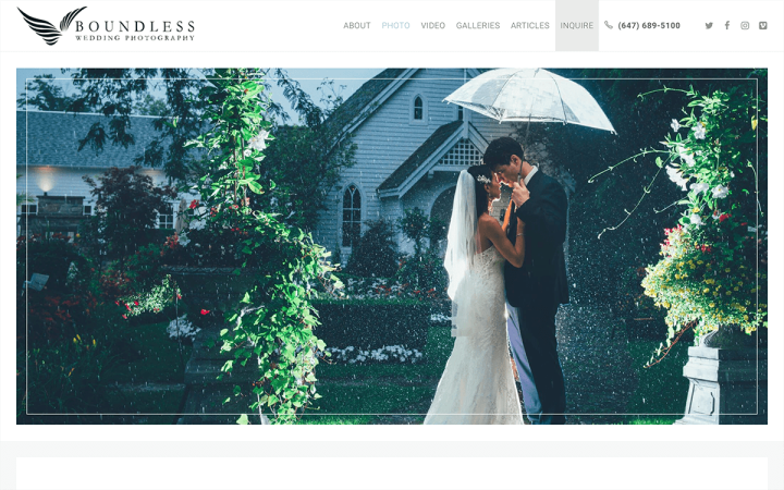
Boundless Wedding Photography, as the name suggests, is Jason Wilton’s website, a wedding photographer from Toronto, Canada. The bright, clean layout alongside an extensive use of high-resolution photographs contribute to a professional looking site.
What we liked
The prominent logo carousel features mainstream media outlets, such as the New York Times, which covered Wilton’s work, makes an excellent first impression. Eye-catching frames draw attention to the images on the page. A beautiful gallery box entices visitors to browse through the wedding galleries and discover the full-sized imagery of events photographed by Wilton.
Points to consider
05
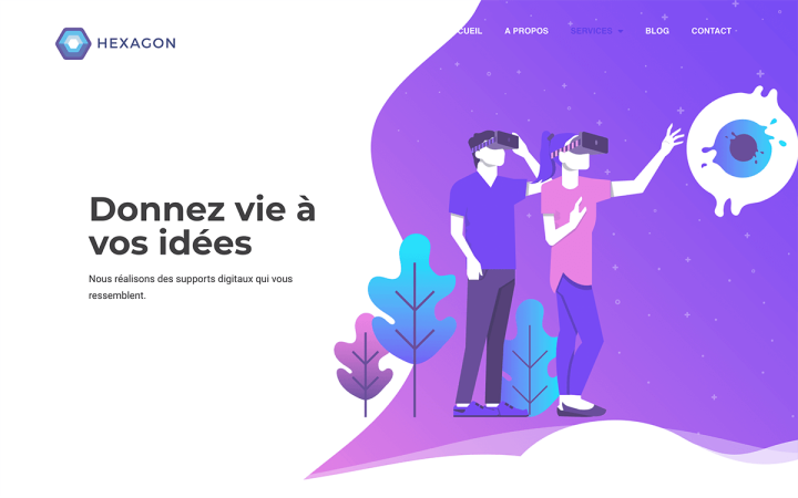
Hexagon Web is a French development agency’s website. Their site features colorful, trendy illustrations, with subtle beehive patterns in the background. They achieved a fluid layout effect by using shape dividers and curved illustrations, which combine to create a sleek modern design.
What we liked
We liked their original use of joining a shape divider with a video on the homepage.
Also, we dug the Blog post page with its expansive background image and its minimalistic content area.
Points to consider
Some sections, such as the footer section on the homepage, are too blank. You can remedy this easily by adding more content elements or background patterns.
04
What we liked
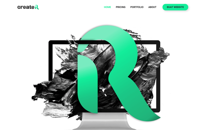
The consistent black and green color scheme appearing on all pages, and is also dominant in the different custom illustrations on the site. There is not a lot of fluff in the content, and the copy is short and to the point. The design language is well unified, simple yet attractive.
Points to consider
03
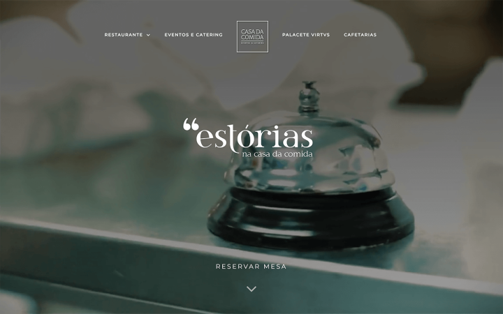
Casa Da Comida is a Lisbon-based restaurant that showcases (almost) everything a cuisine website needs to include.
What we liked
Points to consider
Adding a Google Maps widget would be useful for potential visitors, either locals or tourists.
02
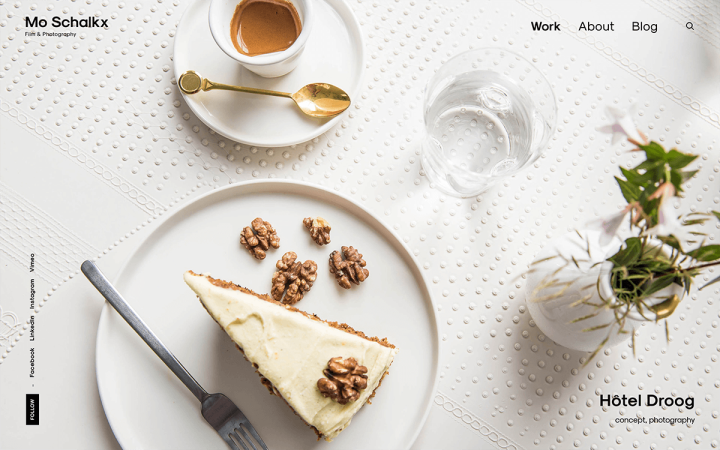
This is Mo Schalkx’s site, a Dutch photographer specializing in commercial photography and film. They say images are worth a thousand words, and Schalkx lets his photos do the talking. The top of the homepage features a full-screen Hero photo slider presenting Schalkx’s latest work. Below it is a work gallery, showcasing again his latest projects with a nice hover effect, making everything livelier. The About page has a short bio, a logo slider with a list of Schalkx’ customers, reinforced by testimonials, and a final section with further samples of past work. The Blog page shares photos from Schalkx’s Instagram account.
What we liked
Points to consider
01
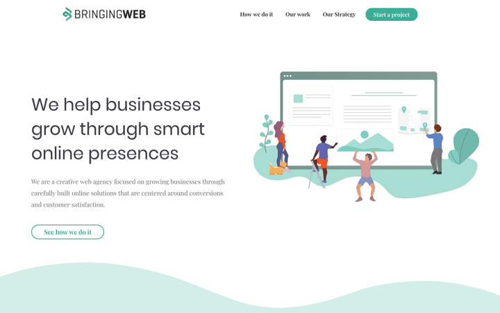
Bringing The Web is a service provider for a wide range of online solutions. It presents a well-consolidated design language, as well as a soft aquamarine theme color. An elegant division of sections using a curved shape divider conveys a serious and convincing message. The site incorporates the agency’s portfolio, as well as Call-to-Action buttons throughout the homepage, which assist the customer’s onboarding process.
What we liked
The creative and tasteful illustrations add a spark to the website. The Our Strategy page uses a brilliantly animated timeline alongside metaphors borrowed from the world of agriculture, presenting the company’s strategy to reach their clients’ targets.
Points to consider
The website lacks a Social Media Sharing Widget. Incorporating these elements could boost the site’s exposure to new potential clients.
You think your Elementor-based website or Landing page should be featured on our next Top 10 Websites column?
Then please send us a link and info to [email protected], or post your website on our Facebook Elementor Group, with the #Siteofthemonth hashtag.
