Kicking off this year’s first monthly showcase is a selection of websites that would make many top ten lists. From a refreshing take on facing cancer to a web designer literally putting his best face forward, a capital investment company that melds the old and new worlds together, and an art restoration organization that breathes new life into classical works, January’s best websites offer volumes of creativity.
See clever motifs intertwined into website elements, gorgeous color tones strategically placed near action points, photography styles that stir the emotions, world-class videography that makes you marvel, classical art that influences modern design, subtle uses of nostalgia, brutalist typography, and animated typography, as well as off-the-grid designs, thoughtful scrollytelling, and intricate delights.
Join us as we wander through the year’s debut showcase!
10
Melodui
by Mika Novokhatko
Melodui has set itself the goal of supporting future-oriented companies and startups with an individual audio brand. With their bundled expertise in branding strategy and design, as well as composition, audio production, and sound design, Melodui has developed a plan to effectively and holistically equip companies with tailor-made branding.
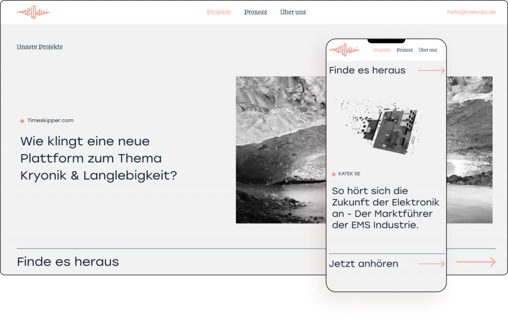
Musical frequency motifs are noticeable throughout the website, most noticeably in the logo, the hero background as well as the menu and section titles. The Munich-based creative duo beautifully presents their projects by offering a nice explanation about each concept, giving an insight into their methodology for prospective clients.
The peachy-pink color of the logo is strategically utilized in specific locations. Subtle hover effects on hyperlinks also employ the color scheme. The minimalist website also employs a modern thin sans serif text that is clearly inspired by the musical line motif, laid on a porcelain-colored canvas. There is also a subtle use of ice blue color, creating a tri-color theme.
Using a combination of elements such as background overlays and background images lifts the sound branding agency website from theory to reality. There is also a nice touch of showing the founders laughing which makes the company more human and gives potential clients a sense of the people behind the business.
Melodui provides timeless sound branding for innovative startups.
Design & Development: Mika Novokhatko
Theme: Hello
Plugins: Elementor Pro, Happy Elementor Addons, Essential Addons for Elementor, JetTabs For Elementor, Easy Smooth Scroll Links, WaveSurfer-WP
See Live Website
09
Good Fabric
by Studio Cotton
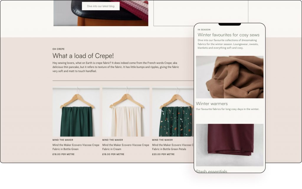
At Good Fabric, you don’t have to make the choice between a beautiful, colorful, or sustainable fabric — you can have a guilt-free shopping experience, without compromising on quality, choice, or price. Every fabric stocked has at least one eco-credential.
The UK-based fabric store uses flip boxes to display its popular products, with the color for the website coming from the images set against a desert storm-colored canvas.
The website pairs a sans serif font custom font that matches the eco-friendly grassroots look and feel of the website. It also utilizes background images, light colors, and a minimalist design to keep the attention solely on the products. There is no distraction.
Every page is layout out in a similar style with only the images really changing to match the category at hand. This is a company that knows its audience, making navigation clear, consistent, and concise.
Good Fabric is a guilt-free fabric shopping experience, without compromising on quality, choice, or price.
Design & Development: Studio Cotton
Theme: Astra
Plugins: WooCommerce, ACF, CPT UI, Ele Custom Skin, various YITH, Crocoblock plugins
08
Inzone Design
by Paolo Inzone
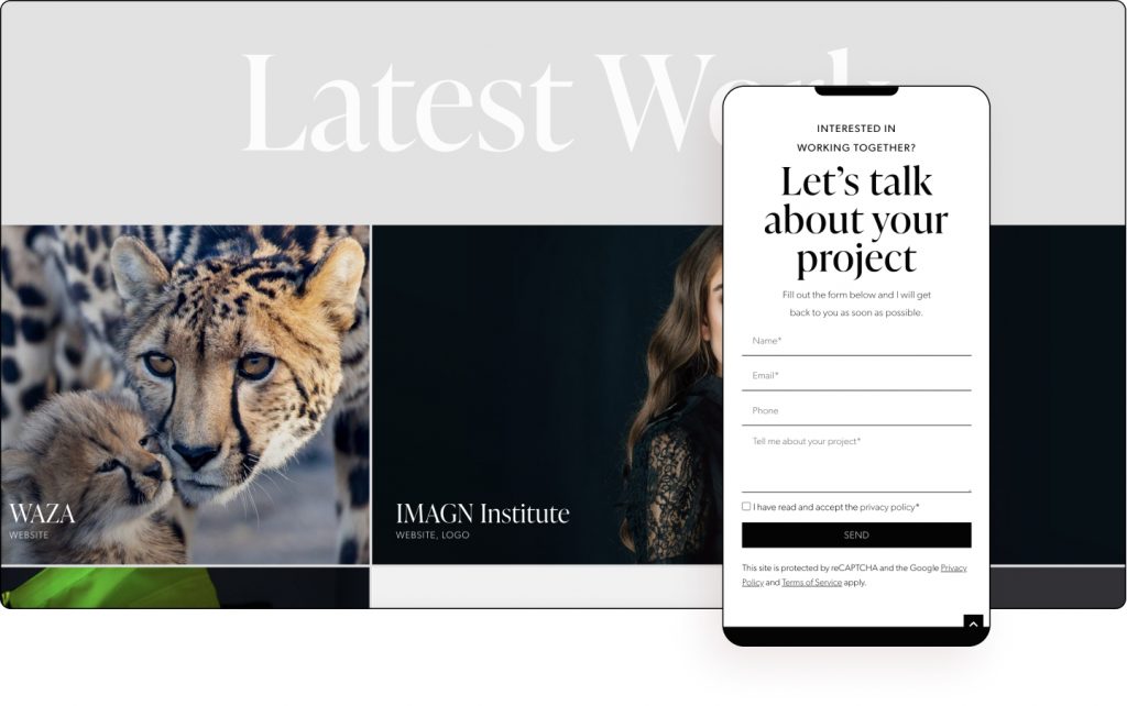
Inzone Design is owned and operated by Paolo Inzone, a professional web and graphic designer based in Barcelona with 15+ years of experience in web design, specializing in creating modern, cutting-edge websites for businesses, entrepreneurs, and NGOs. Inzone Design provides website design for brands that want to reach new heights.
Welcoming website visitors is a hero that uses a background video accompanied by crystal clear headline copy — “Take Your Business To The Next Level”. This sets the stage for an eye-level professional approach that is visible throughout the website. The multilingual website was clearly made to appeal to an international audience.
Using a combination of clever background overlays, high-quality background images, scrolling effects, and custom fonts, the minimalist website not only presents its impressive portfolio but weaves it into its storytelling.
The “approach” page, in particular, deserves special attention. As we scroll, we see US native Paolo’s design process methodically laid out using spelled out numbers that seamlessly blend. There is a tremendous amount of detail such as the mockup on the laptop which plays a video.
Bringing to life his client’s vision using design, creativity, and quality is what Paolo is all about.
Design & Development: Inzone Design
Theme: Astra
Plugins: Elementor Pro, Ultimate Addons for Elementor, Elementor Addon Elements, Language Switcher for Elementor, LoftLoader, ShortPixel Image Optimizer, WPML Multilingual CMS
07
Aurec Capital
by Spank Media
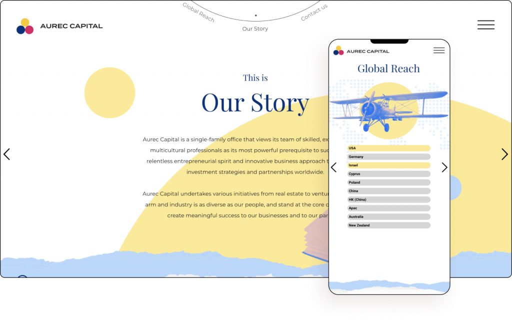
Aurec Capital is a single-family office that views its team of skilled, experienced, and multicultural professionals as its most powerful prerequisite to success, with a relentless entrepreneurial spirit and innovative business approach that leads their investment strategies and partnerships worldwide.
Taking a non-traditional approach for its industry, Aurec Capital plays on nostalgia, family values, and zine elements paired with a clean color scheme and a full-width layout. Speaking of the color scheme, the yellow, blue, and red colors gorgeously meld together the black and white past and the tri-colored present.
The homepage is a modern take on The Creation of Adam by Michaelangelo. Following this mirrored image of sorts, you’ll see the same style repeated inside each of its three sectors. Parallax effects, mouse effects, and image and media carousels are also used.
Delights are another big part of this Israeli website designed for internationals yet with a local flavor. For example, there is a hidden delight of the website’s circle motif on the “Welcome” page’s opening paragraph where it alters the color of the text. The arrow within the cursor similarly takes the direction of the last direction it was moved.
Aurec Capital does everything to show it is indeed your lifetime business partner.
Design: Ben Cohen
Development: Spank Media
Theme: Hello
Plugins: Elementor Pro, Slider Revolution, Yoast SEO
See Live Website
06
Eridan Cosmetics
by Acebears
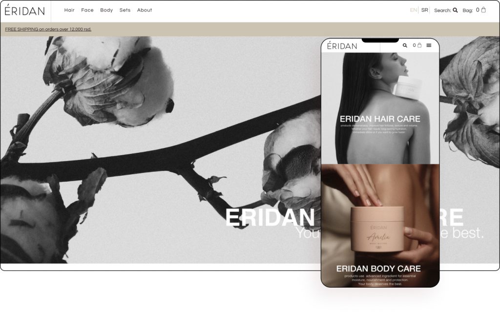
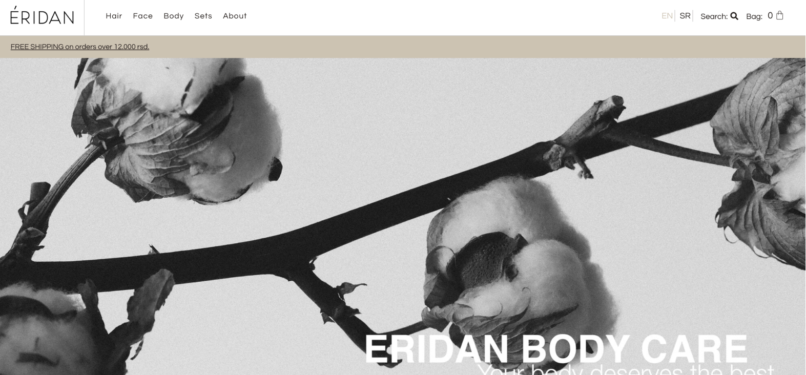
Eridan Cosmetics source the very best active ingredients from all over the world, to make its skincare most effective, giving clients visible results in a short amount of time. All their ingredients are bio-degradable, which makes Eridan an eco-friendly brand. There is no place for parabens, mineral oils, or sulfates in Eridan.
This simply sublime Serbian-based cosmetics manufacturer gives its best face using images of blemishless models next to its equally aesthetic product. Similarly, layering the images with a matte finish gives it a luxurious look and feel.
Elegant earthly colors are used throughout the website, as a homepage to the company’s commitment towards natural ingredients. In fact, each of their four category pages is colored in either brown-ironstone (homepage), soft-peach (face), lavender-Pinnochio (body), or grey-asparagus (sets).
The shop uses our popular WooCommerce Builder widget as well as icon boxes, icon lists, image boxes, posts, and slides. For a website using an intricate color scheme, our Global Styling and Theme Builder elements were also expertly utilized.
Just like its website, Eridan Cosmetics creates luxurious innovative skincare that actually performs.
Design: Miomir Milic
Development: Nikola Cvetkovic – Acebears
Theme: Hello
Plugins: Elementor Pro,JetEngine, JetWooBuilder, JetSearch, LocoTranslate, WooCommerce, Yoast SEO, LoftLoader
See Live Website
05
ArtCare Conservation
by Content Coms
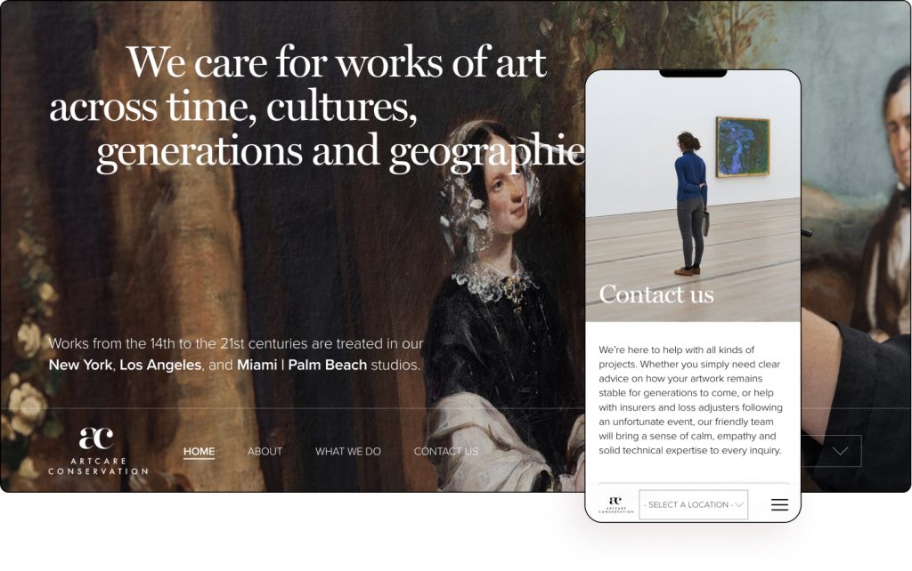
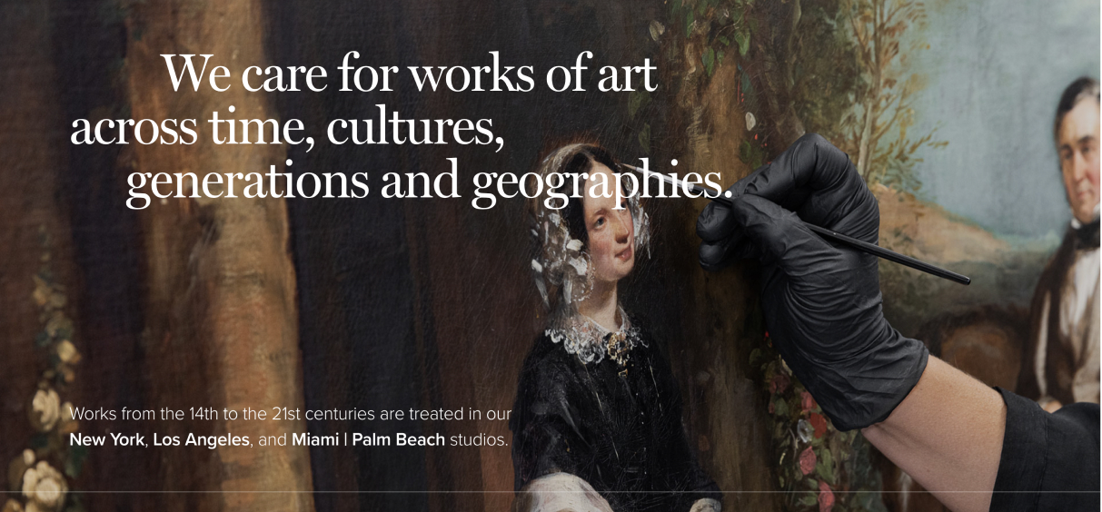
ArtCare Conservation is a leading fine art conservation company specializing in the treatment of paintings on canvas and panel. They work across three studios in New York City, Los Angeles, and Miami servicing institutions including Guggenheim, The Met, The Dali Museum, MoMA, and The Whitney, among others.
A website that uses art to create a masterpiece showcased by their presentation of artworks that speak for themselves. Restored timeless classical paintings sometimes act as canvases on this full-width website. At other times a black and white palette.
Employing a minimalist design and big typography gives the website a very high-end look and feel. Serif fonts for titles paired with sans serif fonts for paragraphs are a nice touch. There is also a nice use of block letter text, another modern trend.
An unusual feature is the fixed menu on the bottom as opposed to the top. The effect of a glossy glass on the thick menu bar almost teases the visitor to explore even further. Using combinations of background overlays, background images, custom fonts, and scrolling effect give the website a beautiful finish.
Their attention to detail shows how much ArtCare Conservation cares for works of art across time, cultures, generations, and geographies.
Design & Development: Ross Merritt – Content Coms
Theme: Hello
Plugins: Elementor Pro, Timeline Widget Addon For Elementor, Smash Balloon Instagram Feed, Yoast SEO
04
Bretler Design
by Studio Bretler Design
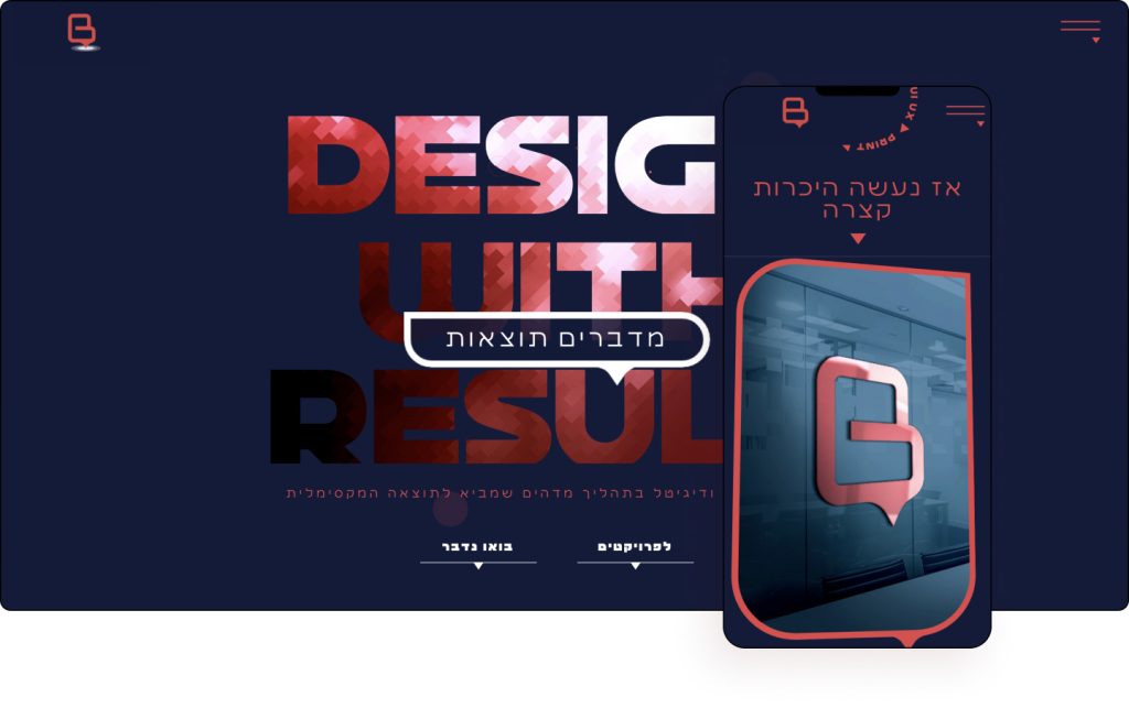
Brertler Design Studio designs visual communication in print and digital. They advance their clients’ brands using trendy and refreshing designs, in a unique and rich style with a lot of love for design, aesthetics, and precision down to the smallest details that create the perfect final product.
The Israeli website cleverly incorporates a motif of chat boxes, highlighting that any project they take on is a conversation with their clients. This is visible from their logo to the mask shapes of their featured images.
There is also a nice hierarchy of texts and images with the studio using large modern typography throughout. Shape dividers, CSS filters, background images, scrolling effects, and mouse effects as well as moving text likewise elevate the viewer’s experience.
A noticeable feature of the website is the use of delights littered throughout using a combination of hover effects that animate, change colors, change shape, colorize, and move.
Bretler Design effectively demonstrates how their processes speak results.
Design & Development: Studio Bretler Design
Theme: Hello
Plugins: Elementor Pro, Crocoblocks
03
Schloss Vasoldsberg
by Chris & Sara
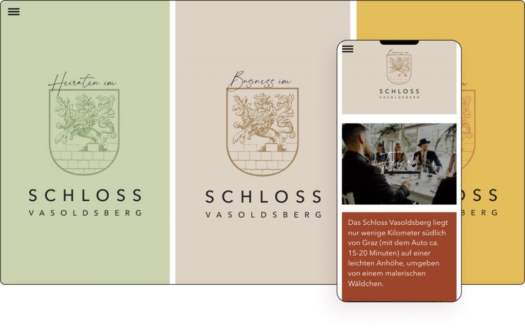
Schloss Vasoldsberg (Vasoldsberg Castle) is located just a few kilometers south of Graz, Austria, on a slight hill, surrounded by a picturesque grove. Today it is a wedding and event location. On the castle terrace, you can enjoy the wide view over the country to the Schöckl on one side and to the Koralpe on the other side.
From the colorful gorgeous hero slideshow to the flip box event images, this is an Austrian fairytale wrapped in a website. We also see the royal crest plastered on the homepage’s images. Each of the website’s event categories (business, weddings, and parties), use scrollytelling elements such as displaying hand-written quotes from famous personalities as well as subtle hover effects.
Utilizing shades of cognac, heathered-grey, oyster pink, and butterscotch, the website creates a mystical feeling as it clearly takes inspiration from its surrounding flora. Maps and high-quality videos including aerial shots also showcase the magnificence of this medieval palace set in the forests of Central Europe.
Using mask shapes, image boxes, Lottie widgets, parallax effects, scrolling effects, and mouse effects similarly bring this breathtaking site to virtual life. A touch of originality is with the mega menu which captures the attention using a panoramic video of this iconic castle embedded right into it.
Schloss Vasoldsberg has a website fit for any royalty.
Design: Chris Lettner and Sara Caroline Ibrahim
Development: Chris Lettner
Theme: HelloElementor Pro, SiteGround Optimizer, Rank Math SEO, Prime Slider, Elementor Custom Skin Pro, Complianz Privacy Suite (GDPR/CCPA) PremiumBlack Widgets, Honeypot for Contact Form 7, Modernaweb Plugin, WP ULike, MouseWheel Smooth Scroll
02
Haim Benisty
by Haim Benisty
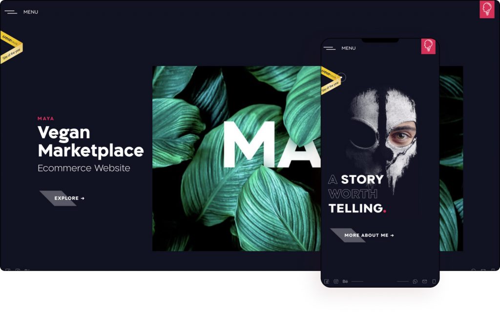
Haim Benisty uses everything he acquired along the way in his design journey to maximize his clients’ potential all around the world. He officially established the Artliner Studio for branding and web development and is all about making things happen.
If you’re a designer looking to wow clients, this website is the ultimate benchmark. There were a lot of human hours put into it. With a plethora of subtle delights, right from the hero, where the dotted face of Benisty explodes into particles on hover and seemingly magnetically comes back together, this is a website that delights, dazzles, and delivers on its promise.
Benisty also showcases his talent for scrollytelling, gorgeously pairing copy with scroll and image effects. Even the about page reads like an action story, keeping the viewer moving while captivating them with the odd hover effects such as the 2012 and 2012 sections. The level of detail here is remarkable, to say the least.
The hero of every project page seemingly moves the image using mouse effects that create an optical illusion. Other effects used are mask shapes, parallax effects, background images, and background video among a variety of other features all come together to showcase the many talents of Haim Benisty.
Catering to both international and local Israeli clients, Haim Benisty has woven a website that simply wows.
Design & Development: Haim Benisty
Theme: Hello
Plugins: Elementor Pro, Jet Engine
01
GIRLvsCANCER
by Will Hopkinson
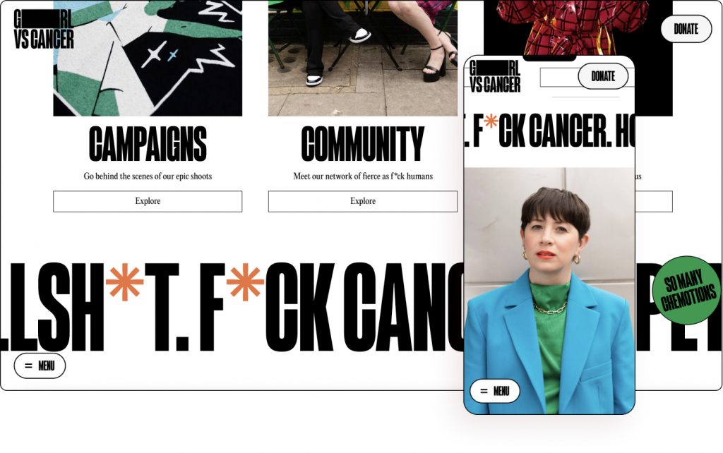
GIRLvsCANCER exists to bring about essential change for the cancer community. To do what needs to be done to empower anyone dealing with a diagnosis and impact improvements of the cancer experience for all.
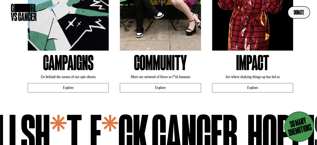
“The fierce as f*ck cancer collective” is how the website presents itself. And this is exactly the impression the website leaves with its visitors. Written in a large modern brutalist typography that dominates the hero it’s impossible to miss. Breaking convention, the movement shows that to them “hope is dope” for its younger audience with their lives ahead of them, presented as a stylish magazine as opposed to a medical diary. The website lives up to its mission to redefine the stigma of cancer by gorgeously incorporating this attitude right across its pages.
The blotted “i” in “Girl” perhaps signifies the individual is greater and more powerful than cancer, while the blog posts look like polished high-end magazine articles. The people are the stars, images are elegant, the design is tight, and the colors are vibrant on this minimalist website. GIRLvsCANCER is an eye-catching salute to the mighty women boldly facing this challenge head-on.
The menu is truly unique with various colored spots. In fact, the spots populated around the website could be a motif to symbolize cancer-free cells. The choice of bold colors such as green, blue, and red give the website a youthful vibe. It’s trendy, modern, and dare we say, fun. Photos of smiling women gorgeously transform the topic from taboo to encouragement.
GIRLvsCANCER is cancer is a website that proudly stands tall and it’s totally got its young at heart audience covered from header to footer.
Design: Phantom
Development: TPF
Theme: Astra
Plugins: Elementor Pro, Essential Addons Pro, WooCommerce
