Table of Contents
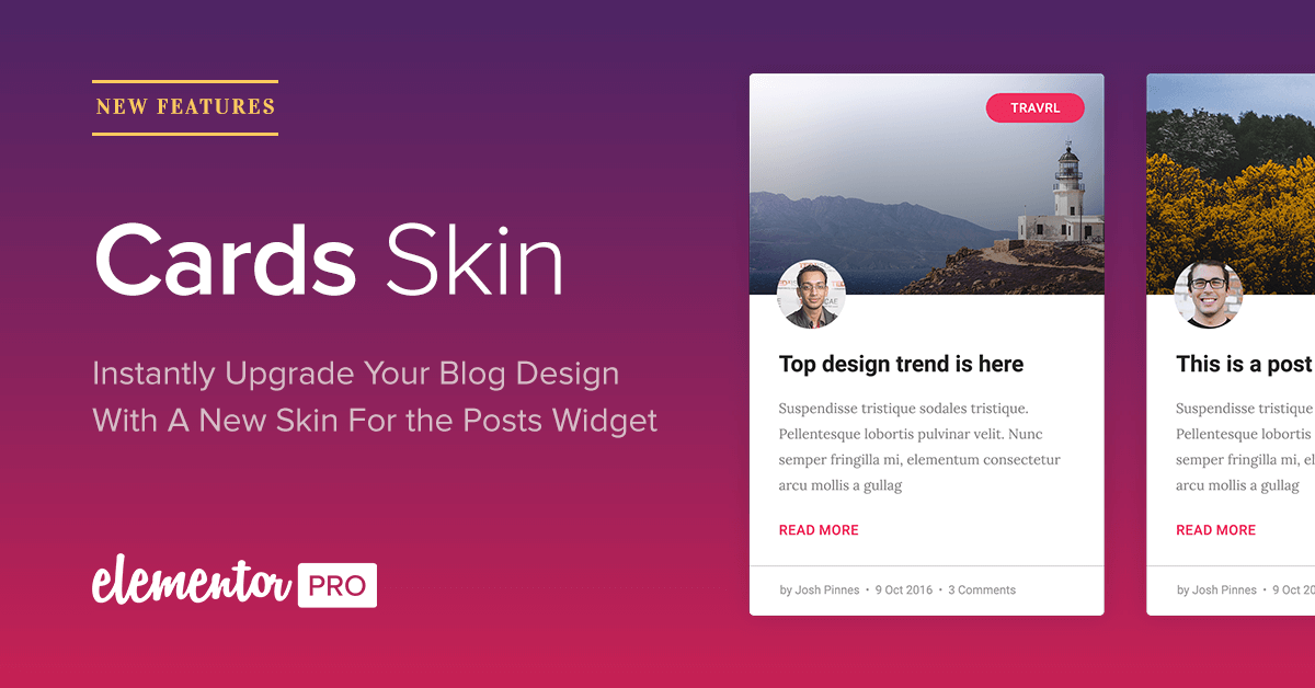
Your blog is where you display most of your content, so it has to look its best. Today, we are introducing the Cards skin, a new layer of design that sits on top of the Posts widget, allowing you to upgrade your blog design with the latest material design trend.
What is a cards layout?
A cards layout is a dynamic grid that displays content in card-like boxes. It helps organize large amounts of data in an ordered, minimalist and stylish way.
This foundation of this style is derived from Google’s material design. Pinterest was the first to incorporate it as an innovative way to lay out content on the web. Since then, cards have become extremely popular and were mentioned as one of the leading design trends of 2017. It is currently used by top brands like Dribbble, Google, and UXPin.
See how much better a blog looks with the Cards skin:
☞ Hover to reveal cards skin ☜
Skin in the game
The importance of the new Cards feature lays not only with providing you with another design layout. It represents an evolution in Elementor, the evolution into skins.
Cards is not a separate widget, and is a design layer that sits on top of the already existing Posts widget. This is why we call it a skin.
The skin expands the design capabilities of the widget further. Cards is the first skin we put out, but we have great plans for future skins. Skins are unique to Elementor and represent an important advancement of our page builder. With skins, we plan to lead the design industry and offer superior capabilities that will be useful for web designers of every level.
Skins will make Elementor much more powerful, and enable web designers to take Elementor designs even further.
Pick a card, any card
It’s time to dive in, and see the incredible options built into the new Cards skin.
Hover effects
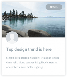
The hover effect helps bring the cards to life, and is part of the material design element of the Cards. The featured image and the card itself both change on hover. The former gets a gradient overlay, and the latter gets a box shadow.
Badge
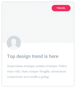
The badge lets you show the category, tag or other taxonomy inside the card. This way, the user instantly recognizes which group the card belongs to. This adds to the overall user experience, and is seamlessly integrated inside the card.
Avatar
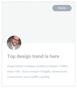
You can display the user avatar image that is related to each post in every card. This can be the author of the post, the creator of the portfolio piece and so on. As always, you get full control over the Avatar image design.
Boundless flexible design
We’ve made the Cards skin super-flexible, so you can create an endless variety of designs with it.
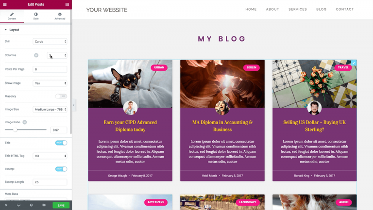
You get total control and customization over each and every element:
- Image size and ratio
- Border radius
- Color & typography of every element
- Show & hide every element
- Alignment
- Background
The list goes on… You can get really creative and create designs that are truly unique to your website.
Cards skin by Elementor
If you still haven’t upgraded to Elementor Pro, this is a great chance to do so, and explore the new features we’ve just added to the plugin.
3 features you may not know about
Because Cards are a new addition to the Posts widget, we thought it would be helpful to recap 3 important features available in the Posts widget.
1. Using the Posts widget to show related posts
After adding the Posts widget, we were surprised to find out it was used to display related posts, using the Global functionality. This is a use we had not planned for, but we’ve decided to improve it nonetheless. You can now filter the current post that is being visited, so you can make sure the visitor never sees a related post that is the same as the current post being visited.
2. Choosing from 3 possible blog layout
When designing your blog with the Posts widget, you have 3 main layouts options to choose from: Grid, Masonry or Blog (1 post per row) layouts. These options mean you can design a wide range of blog layouts with Elementor, and customize it to fit any website.
3. Creating a mobile responsive blog
Elementor’s Mobile Editing toolset appears across the page builder, including in the Posts widget. They let you visually customize a responsive blog that looks great on mobile devices. With this toolset, you can fix most responsive problems that arise in blog archive page design, like having a title that’s too big, changing the number of columns per row, changing padding and margin or changing the size of the featured image.
Improvements under the hood
When the next update of Elementor v-1.5.0 comes out in the next couple of weeks, users will have the ability to rollback to previous versions of Elementor & Elementor Pro. We’ve also added an automatic beta system and a settings system that is based on tabs.
The foundation for this update has already been placed in the new version of Elementor Pro, so all Elementor users will be able to enjoy this functionality in the next couple of weeks.
Conclusion
To conclude, the Cards skin helps expand the Posts widget capabilities even further, allowing you to showcase posts, articles, works and more in a unique and trendy fashion. I invite you to easily improve your current websites with a few simple clicks using Cards, exclusive on Elementor Pro.
Looking for fresh content?
By entering your email, you agree to receive Elementor emails, including marketing emails,
and agree to our Terms & Conditions and Privacy Policy.
