Table of Contents
Testimonials offer a great way for gaining customer trust and getting more conversions. With our latest release, we are pleased to introduced the most highly customizable way to showcase your customer testimonials.
Introducing the Testimonial Carousel widget.
The Testimonial Carousel widget joins the Media Carousel released last week, and allows you to rotate a variety of testimonials in a wide array of designs to choose from.
Since first releasing the single Testimonial widget, we’ve received a lot of user requests to add a testimonial slider. This widget is our answer, and it’s bound to get a lot of our users thrilled. Let’s explore the Testimonial Carousel options.
The Testimonial Carousel comes with 2 skins:
Default. Displays the classic testimonial carousel design.
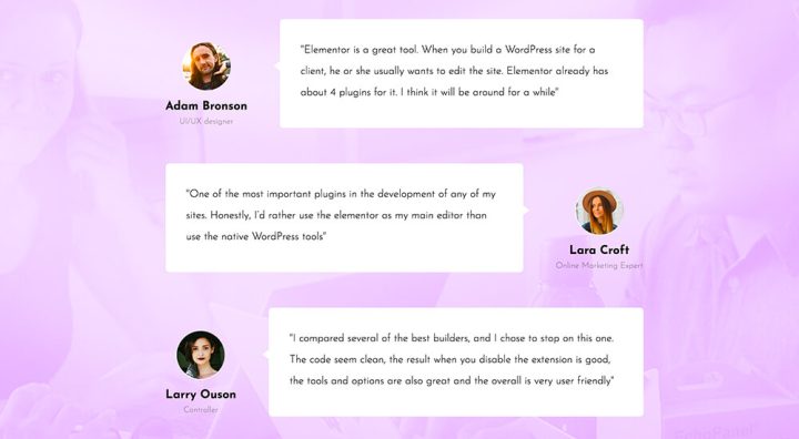
Bubble. Displays testimonials as bubbles that are connected to the profile image
Testimonials Layout & Alignment
For Each skin, you can choose between one 5 different layouts. The content can also be aligned to the left, center and right, allowing you to set the position just right
Image inline. Image appears next to name
Image stacked. Image appears above name
Image above. Image appears above content
Image left. Image appears left of content
Image right. Image appears right of content
Slides Per View & Width
The carousel slides display is easily customized. You can choose how many slides are shown per view, as well as the width that the slides take on the screen.
These settings can be separately set per device, so you can quickly set up the testimonial slider for desktop, mobile and tablet devices.
Testimonial Carousel Style & Design
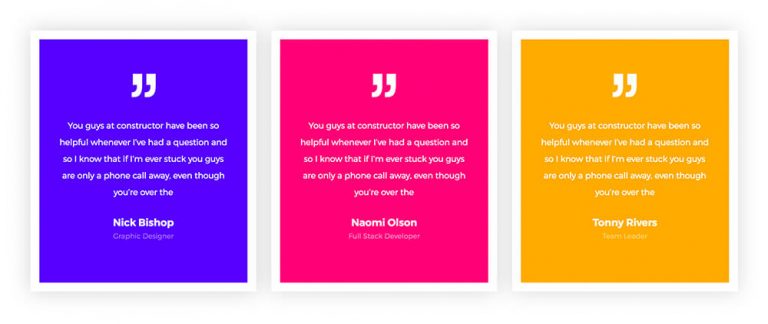
Take a look at these gorgeous testimonial slider examples, and see just how flexible this widget is.
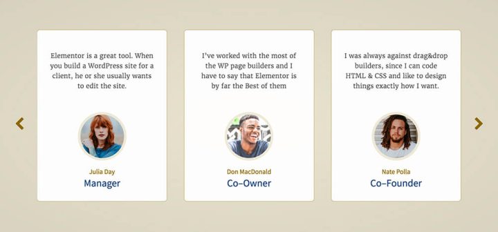
Play with the space between slides and give the slides some breathing room
Use the Bubble skin, a bold color & border radius to reach this speech bubble testimonial
The background color and padding interplay contribute to this testimonial slider’s unique design
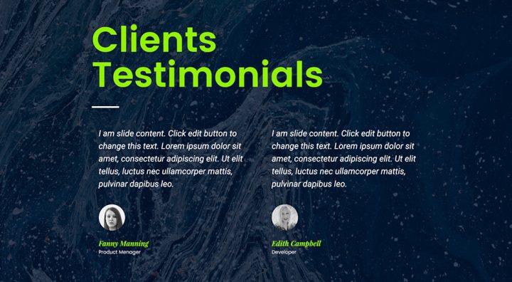
Combine multiple testimonials and play with the gap between image and content
Here you can see a play of border, border radius and image border for a stylish look
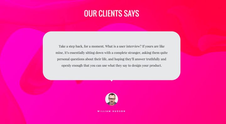
The grey bubble on top of this smashing background really makes an impact
Combine testimonials and headlines for more interesting sections
Using solid borders and padding allows us to reach this clean design
Here you can see colors and typography that help reach another stylish testimonial slider
Autoplay, Transition & Interaction
Besides letting the visitor browse through the Testimonial Carousel using the arrows and pagination navigation, you can also customize the play and speed of transition for the slides.
The options allow you to set the carousel as:
Autoplay – Have the carousel play automatically, and set the autoplay speed.
Pause on interaction – Have the carousel pause when the visitor clicks on it.
Transition Duration – Set how fast the transition between slides occurs.
Get Testimonials in Elementor Pro
Conclusion
Getting the testimonials right can have a large impact on your conversions and sales. It’s not easy, though.
You need to find the right people, and get them to write the right copy, and finally display it in a way that it integrates beautifully in your sites. For the first two tasks, I recommend you read a recent in-depth analysis of using testimonials, published on BigCommerce. For the design part, take Elementor’s new widget for a spin and experiment with the truly remarkable array of design controls available for the Testimonial Carousel widget.
I look forward to reading your comment about this widget. Please write where you plan to implement it on your site.
Looking for fresh content?
By entering your email, you agree to receive Elementor emails, including marketing emails,
and agree to our Terms & Conditions and Privacy Policy.
