Table of Contents
Welcome, Elementor witches and goblins, to our Halloween special. Halloween is the perfect time to dress up with scary costumes, not only for yourself but for your website as well.
For this seasonal special, we’ve created the most abominable and daunting Halloween kit for you to enjoy. It includes design ideas, templates, icons, images, backgrounds and more surprises. Together we will create the most hauntingly gruesome website the world has ever seen! Muhuhahaha…
Sorry, got carried away there.
🎃 Elementor's Halloween Gift Pack Made My Site BOO-tiful! 👻
Why Dress-up Your Website for Halloween
Seasonably changing the design of your site holds many advantages:
- Celebrate Halloween with your customers in an amusing and surprising way
- Ride the wave of festiveness, while drawing attention to your brand
- Enrich your unique brand story using Halloween
- Get more of those holiday sales by utilizing the holiday symbols and icons
- Plus, it looks really cool…
Let’s go over the 7 ways to BOO-st your website and make it look scary beautiful.
#1: The 'Haunted Homepage' Hero Header
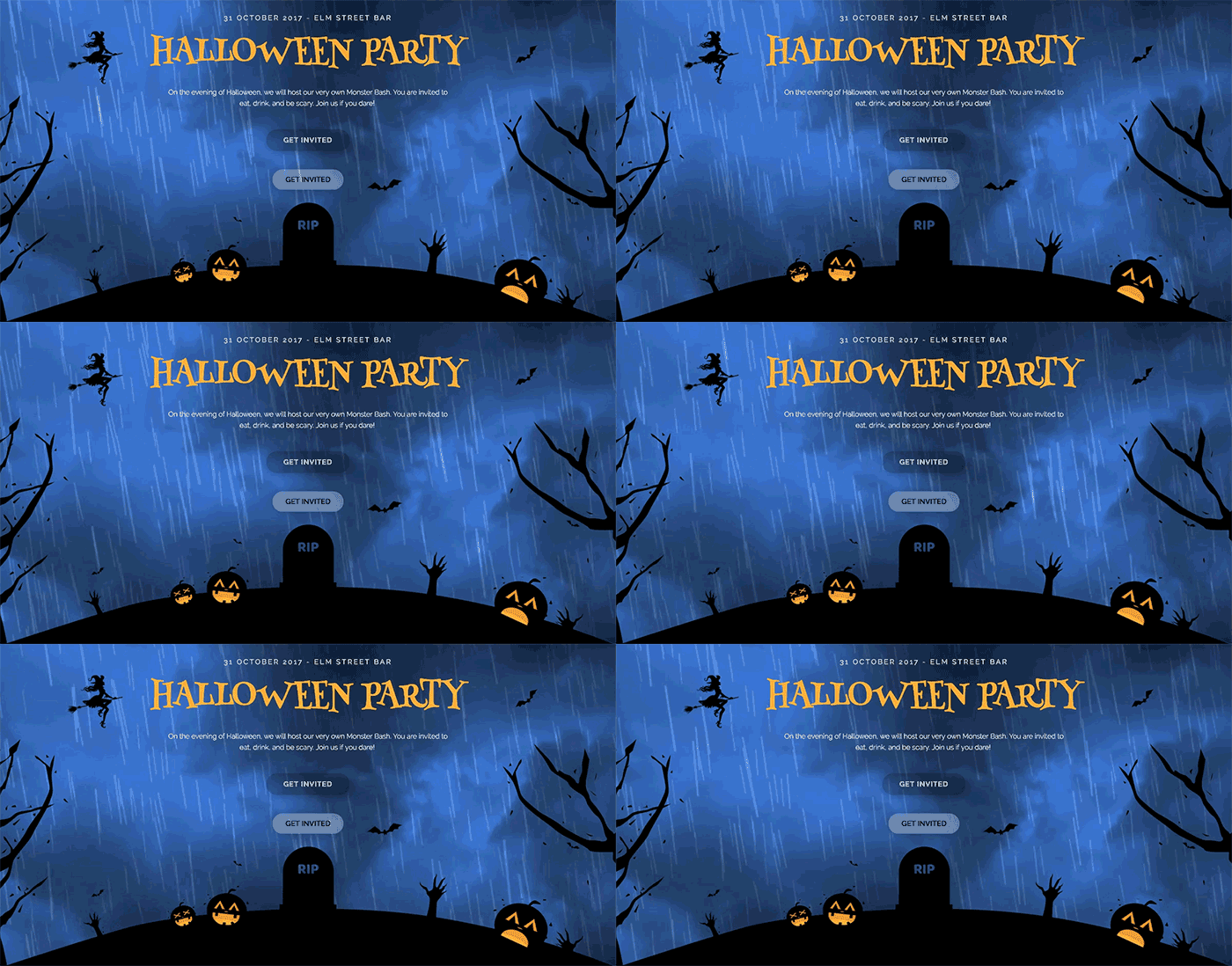
If you implement one example from this tutorial, I recommend you make it this one. The ‘Haunted Homepage’ Hero header combines a silhouette section divider and a related raining background video. The result is a dark & fear-inspiring hero header that is impossible to ignore.
Trick n’ Treat: Download Halloween silhouette & set rain background video
#2: The 'Killer Feature' Services Section
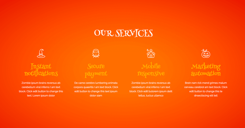
With this treat, you can implement the Halloween icon set provided in this post, you can easily transform your current services section and add the proper holiday spirit to it.
Trick n’ Treat: Download Halloween icons to replace your services icons
#3: The 'Bloody Dreadful' Call to Action Section
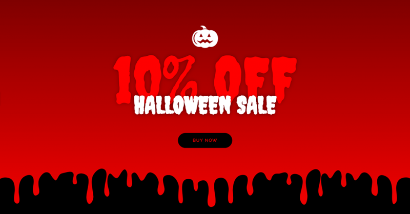
This is a very simple yet effective call to action section that can show off your Halloween sale in the best possible way. It combines the right font, some minus margin and a rather bloody shape divider.
Trick n’ Treat: Set drop shape divider for extra-bloody Halloween section
#4: The 'Starving Zombie' Menu Page
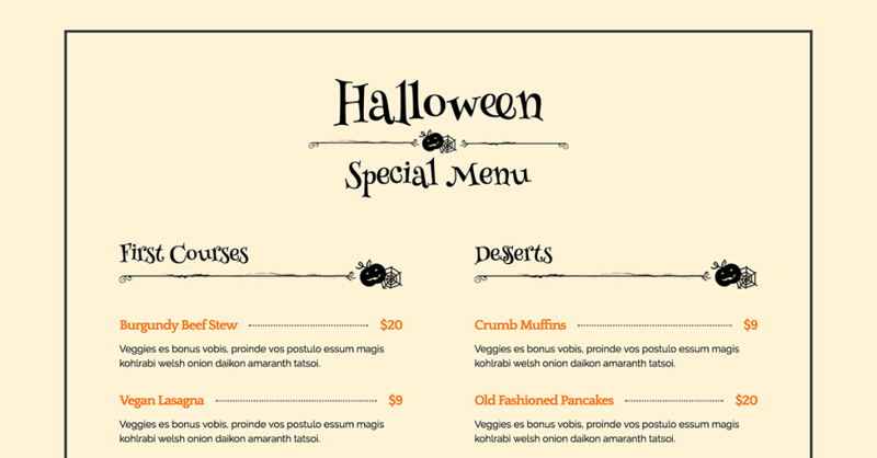
By adding a skull divider to the restaurant menu page, you can give the whole page a Halloween look. This can also look fang-tastic on blog posts, dividing the different paragraphs with a Halloween-inspired divider.
Trick n’ Treat: Download Halloween icons dividers & replace regular dividers
#5: The 'Contact The Dead' Contact Form
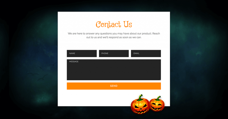
Add a few small Halloween images to dress up your contact form and give it a new festive touch. This is perhaps the smallest touch you can make on your site, and can also work for other elements like slides or images.
Trick n’ Treat: Download Halloween pumpkins & add to contact form
#6: The 'Price Slasher' Pricing Page
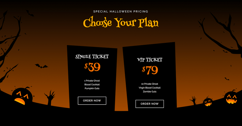
Here is a trick that combines a transparent price table with a background of tombstones, to present the pricing page in an extra-gruesome manner. Don’t worry, no animal were harmed in the making of this page.
Trick n’ Treat: Set transparent price tables & set tombstone images as background
#7: The 'Straight from Hell' 404 Page
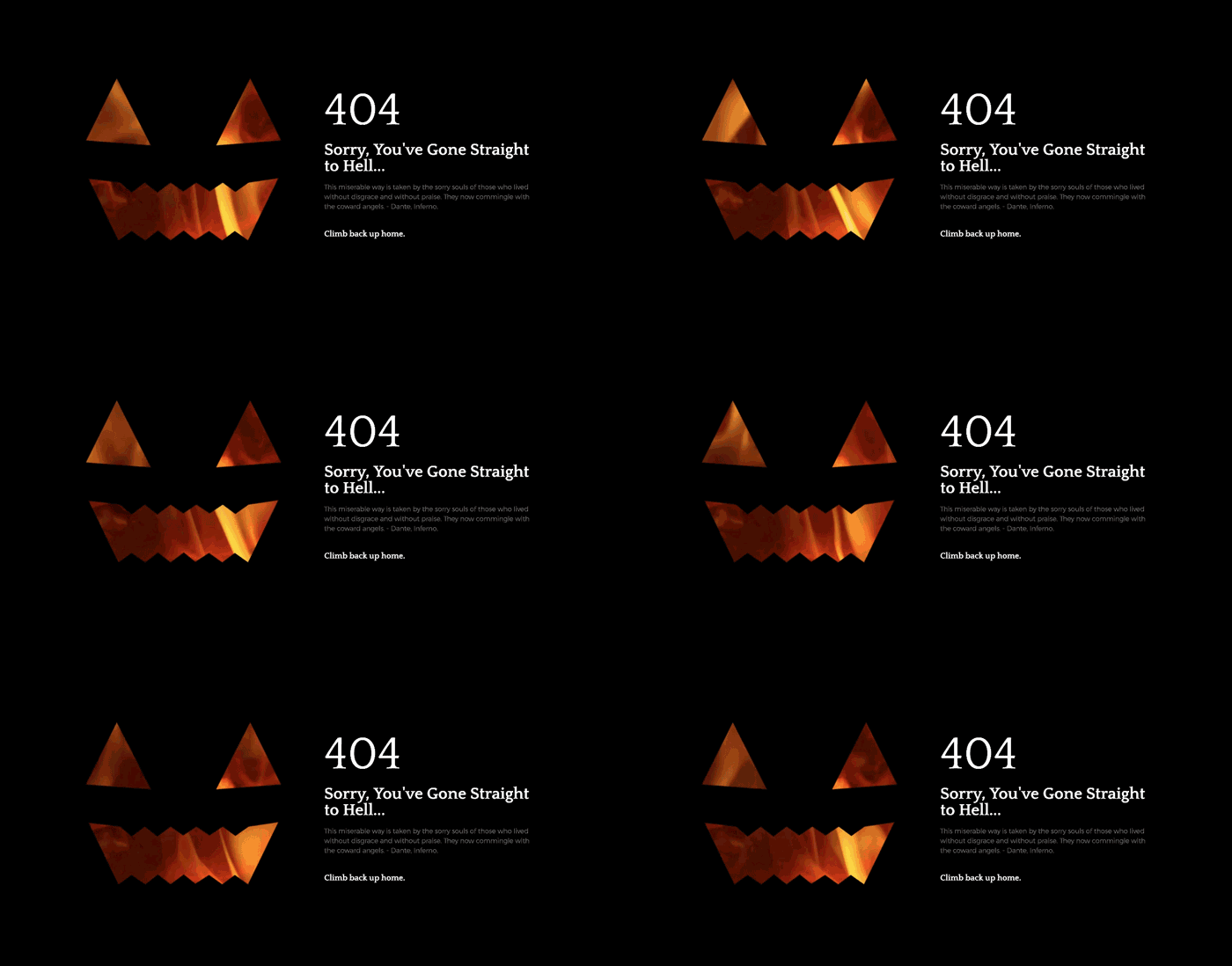
Here is a neat trick to create a 404 purgatory page that features a pumpkin mask with fire sizzling on the background. To create this trick, first set the fire video as the background. Then, set the pumpkin mask as the image overlay.
Trick n’ Treat: Set fire sizzling video background & add hollow mask as overlay
Before we depart, I want to ask each and every one of you to ‘Halloween’ your own site and send us the results in the comments below.
Looking for fresh content?
By entering your email, you agree to receive Elementor emails, including marketing emails,
and agree to our Terms & Conditions and Privacy Policy.
