We’re excited to announce that Elementor version 4.0 is now live!
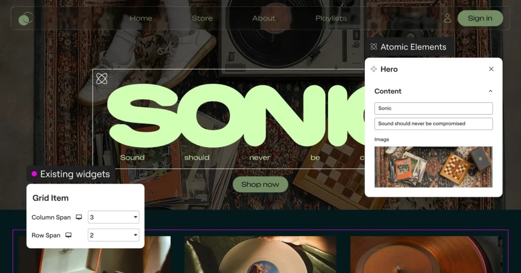
With Elementor 4.0, new Elementor installations will start with Atomic features enabled by default, including Atomic Elements, Variables, Classes, and Components.
For existing websites, updating to 4.0 will not change the current setup. Atomic features can be enabled manually from the new notice in the Elements Panel and disabled from The WordPress Admin → Elementor → Editor → Settings → Atomic Editor.
You can continue working with your current setup, and choose to combine new Atomic Elements together with existing widgets on the same page. This allows you to gradually adopt the new architecture while maintaining compatibility with existing workflows and without needing to rebuild existing layouts.
Additional Atomic capabilities will continue to expand and roll out in future releases. Follow our roadmap here.
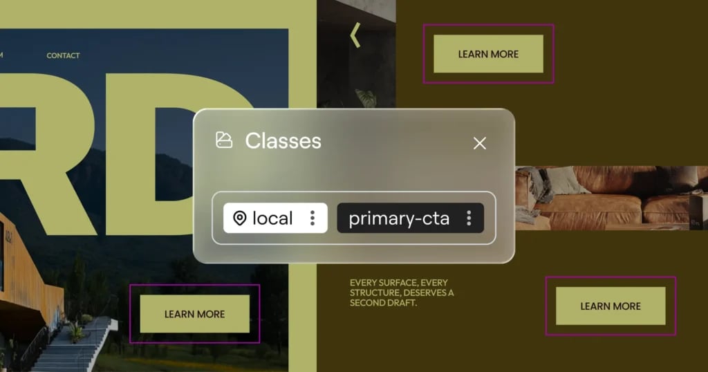
Set styles once with Classes
Imagine building a website with dozens of buttons that should share the same design. In the past, you’d need to style each one individually or rely on workarounds. With the new Classes system, you can:
- Create reusable style collections that can be applied to multiple elements
- Update styles in one place and see changes reflected everywhere
- Maintain design consistency throughout your entire site
Define interactive styles without coding using States
Bring your site to life with interactive elements using States (Pseudo-Classes). Define exactly how elements look when visitors interact with them by creating hover, focus, and active states for any class. This allows you to design engaging interactive experiences without writing a single line of code.
Control and organize your classes with the Class Manager
The Class Manager provides a command center for maintaining consistent styling across your site by allowing you to:
- Delete or rename classes from a central location
- Change class priority and hierarchy by dragging and dropping
- See all your Global Classes in one organized view
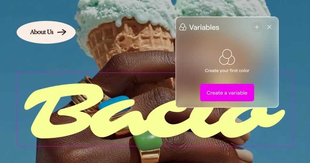
Create consistent design systems with Variables
Designing at scale becomes significantly easier with the introduction of Variables. Rather than assigning styles manually element by element, Variables allow you to define colors, font families, and size values once and apply consistently across your site.
Let’s say you use the same colors, sizes and fonts across multiple Global Classes and across different sections of your site. Instead of manually setting the background, text color, text size and font family each time, you connect those properties to Variables like primary-color, button-font, and accent-text.
Now, if your brand palette changes, a single Variable update will cascade throughout every component styled across all those Classes and Elements.
Build once, reuse everywhere with Components [Pro]
Components let you create reusable layout sections that stay synchronized across your site, while still allowing controlled per-instance customization. Turn any container into a Component and give it a clear, reusable identity.
When a Component is edited, all instances update automatically across the site. Structure and styling stay in sync, making Components ideal for shared sections such as banners, CTAs, feature grids, headers, and repeated layout patterns that need to remain consistent over time.
Components also support controlled content editing, allowing you to expose specific parts of a Component’s content for per-instance editing. Editors and clients can adjust only those exposed properties, while the layout and structure remain protected and globally synced. This balance between consistency and flexibility makes Components especially useful for professional workflows, team collaboration, and client handoff.
Together with Variables, Classes, and the new styling architecture, Components introduce a more systematic way to build and maintain websites as projects grow in size and complexity.
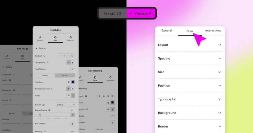
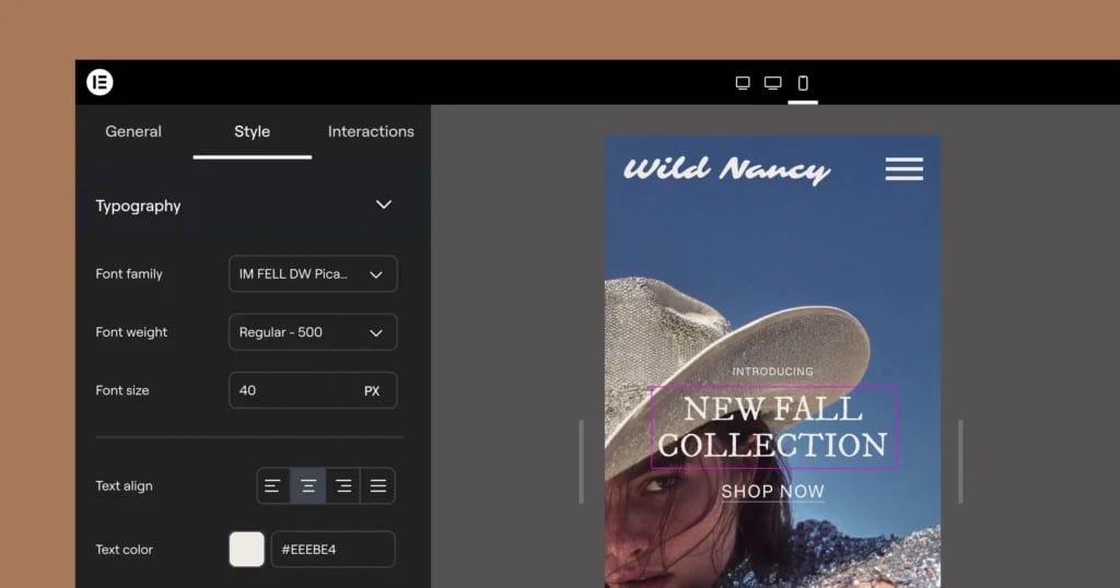
Work consistently and streamline your workflow with the unified Style Tab
Version 4 introduces a unified Style Tab that is shared for all Atomic Elements, in comparison to the panel in classic v3 widgets where each widget has its own styling options and structure.
Top advantages of the new unified Style Tab:
- Content and functionality settings remain in the General Tab
- All visual styling options are available in the Style Tab
- Learn the system once and apply it everywhere
- Access powerful styling features consistently across all elements
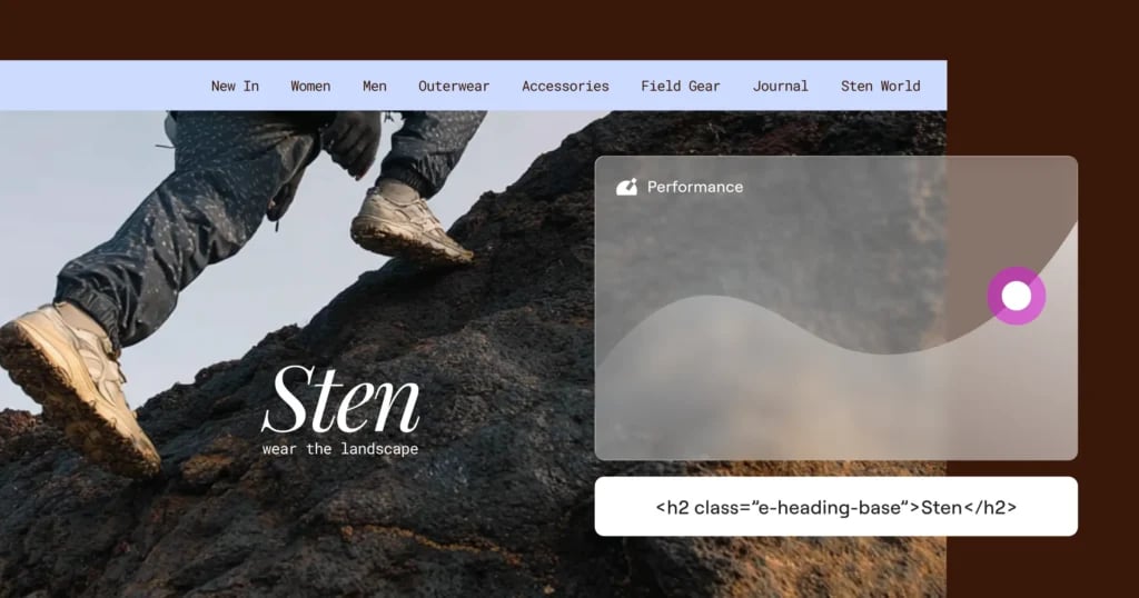
Improve your site performance with single div wrappers
Editor V4 introduces a significantly cleaner DOM structure that directly impacts your website’s performance. Now, each element uses just a single DIV wrapper, compared to the multiple nested DIVs in previous versions. The simplified structure produces cleaner HTML output, reduces overall page size, and decreases the complexity that browsers need to process when rendering your pages, resulting in:
- Cleaner code and faster rendering
- Improved SEO rankings
- A better experience for your visitors
Control every style property per device
Version 4 transforms responsive design with a comprehensive approach that gives you unprecedented control, eliminating the limitation of v3 widgets, where only specific controls have responsive options.
In Atomic Elements every single style property can be adjusted per device, with no exceptions. Simply switch between devices in the Top Bar to make targeted adjustments that only affect the specific screen size you’re editing. There are no exceptions. This means you can have completely different styling on mobile than on desktop without writing a single line of CSS.
When you switch between devices using the Top Bar selector, you’re not just previewing how your site looks, you’re entering a device-specific editing context.
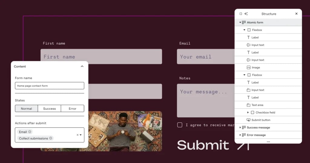
Build forms with full atomic control [Pro]
The new Atomic Forms are built by assembling individual field elements inside a Form container. Each field such as Label, Input, Textarea, Checkbox, or Submit Button, is a draggable element that lives by itself and can be dragged directly into the form structure.
Form fields behave like other elements in the editor, meaning they can be styled through the unified Style tab and participate in the broader design system with Classes, Variables, Components and more.
Because each field is an independent element, you can structure and arrange your forms visually on the canvas rather than configuring them inside a widget panel.
Now you can also nest additional elements inside the form wrapper, including text, icons, images, and layout containers, allowing you to design form layouts with greater flexibility and even multiple columns.
Future iterations will expand the system with additional capabilities such as conditional logic and more advanced form workflows.
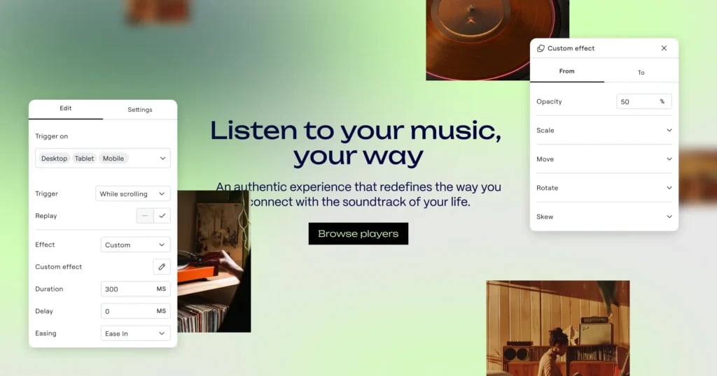
Create advanced interactions for dynamic experiences [Pro]
You can now design interactions that respond to how visitors actually use your site. Instead of relying only on entrance animations, elements can now react to real user behavior and page movement.
Triggers make it possible to build richer, more dynamic experiences, such as elements revealing as users scroll, cards reacting on hover, or components responding to clicks.
To support these interactions, the new Custom effect gives you fine control over how elements animate. Instead of selecting a predefined animation, you define exactly how the element transforms between states.
Interactions can also be configured per breakpoint, allowing you to design motion differently for desktop, tablet, and mobile. This ensures animations behave appropriately across devices. For example, using richer scroll-linked effects on larger screens while simplifying or disabling certain interactions on mobile to maintain performance and usability.