Introduction
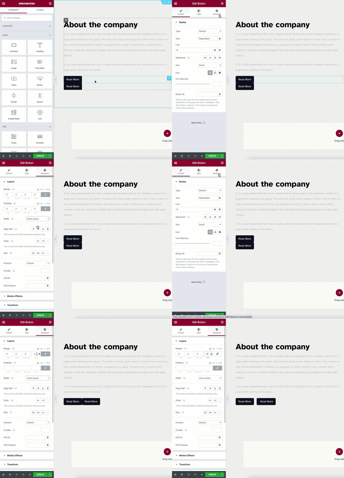
In order to place elements (widgets) next to each other, horizontally, within the same column, a setting in the Advanced Tab > Width properties is used. This setting is called Inline (auto).
Note: If the Container element is activated you will use the Direction > Row property in the Layout tab of the Container instead of the widgets Inline (auto) property.
What is Inline Positioning
When the Width > Inline (auto) setting is applied, each widget will only take up the minimum width necessary to hold it. The elements will then align horizontally within their column.
How To Use Inline Positioning
Applying Inline settings to widgets
Note: To horizontally align multiple widgets, each widget needs to be defined as Inline(auto) separately.

Under any Widget > Advanced > Layout locate the Width property dropdown. Here is where you will find the Inline (auto) setting.
- Width: Set to Inline (auto) for each widget in the horizontal stack.
- Margin: This may be used to create small spaces between the elements. To set a relative space between elements you will use the Column Layout properties below
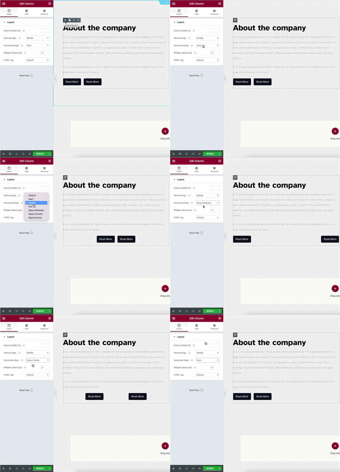
Applying Horizontal Align to the parent column

In order to distribute the elements within the column on their primary axis, you will use the Horizontal Align property in the Layout tab of the Column. This property uses Flex CSS properties and is later expanded in the Container element.
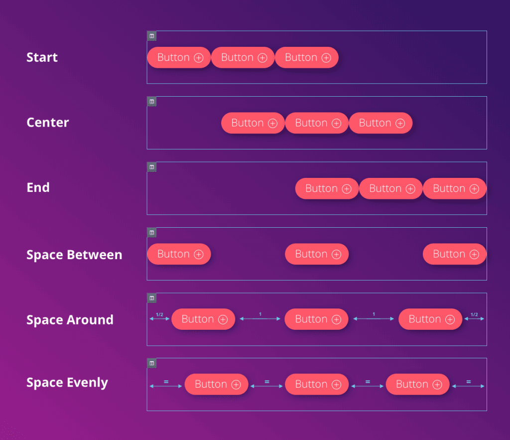
- Under the Column > Layout set your desired Horizontal Alignment. Choose between: Start, Center, End, Space between, Space Around, and Space Evenly.
Example of Flex Properties
Below is an infographic of the Horizontal Align properties. It is based on the accepted Flex CSS terms.

Note: Some elements may not function correctly when set to Inline (auto) e.g. Image Carousel, Slides etc.

