What are components?
Components in Elementor are reusable design blocks that remain globally synced across your entire website while permitting per-instance customization. When you modify a master component, every instance updates automatically, ensuring design consistency. They allow you to build custom layouts like CTAs or testimonials with flexible overrides for specific content without breaking the global sync.
What are the benefits of using Elementor components?
Using components provides several structural advantages for your website design workflow:
- Global Synchronization: Edit the master component once to update every instance across your site instantly.
- Per-instance Customization: Override specific fields like text or images for individual instances without losing the link to the master design.
- Design Consistency: Maintain a unified visual language while allowing for controlled variations in content.
- Element Compatibility: Create complex layout blocks using any Atomic elements.
Requirements:
- Components can only be created using Atomic elements
- Only users with Admin-level permissions can create and edit components
- You must have Elementor Pro to create components
How do you create a new component in Elementor?
Creating a component involves building the layout and then defining the customizable properties. Note that you must have Admin-level permissions to perform these actions. Creating a component is a two-part process: first you build your design, then you define which properties can be customized per instance. The editor guides you through both steps in one continuous flow.
- Use several V4 elements to create a design. In this example, we created a Call to action with a heading, image, paragraph and button element.
- Right-click the container holding the elements.
- Select Create component.
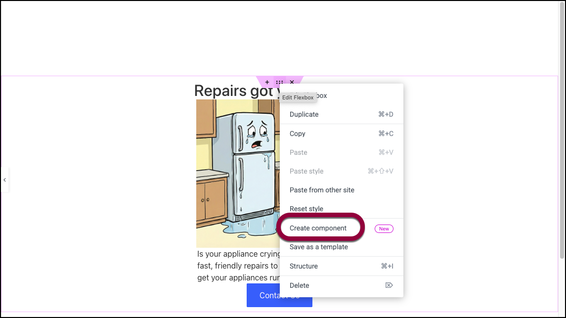
- Name your component.
- Click Create.
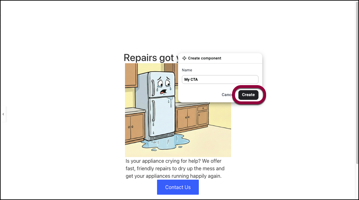
After clicking Create, you enter edit mode. The rest of your page dims with a darker overlay, focusing your attention on the component you’re building. This indicates you’re now working on the component’s master.
How can you designate customizable properties in Elementor?
Once you enter Edit Mode, you can choose which elements can be changed on individual pages.
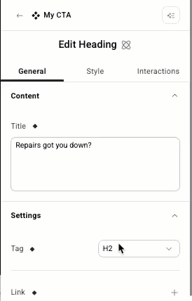
- Select the element you wish to customize.
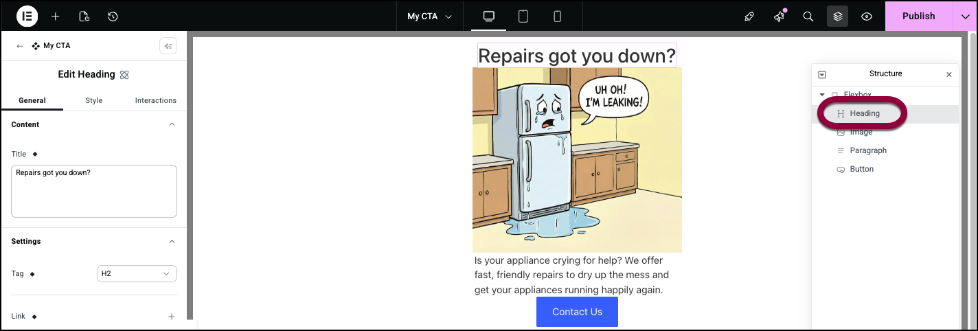
In this case, we’ll choose to customize the Heading element. - Click the properties icon next to a field you want to customize.
- Enter a name for the property.NoteOnly the settings in the General tab displaying the properties logo can be customized.
- Click Create.
The property logo is replaced with a checkmark, indicating it is customizable per instance. - Enter a new value.
This value only applies to this instance of the component. This customized value will persist for this instance, even when the master component is updated.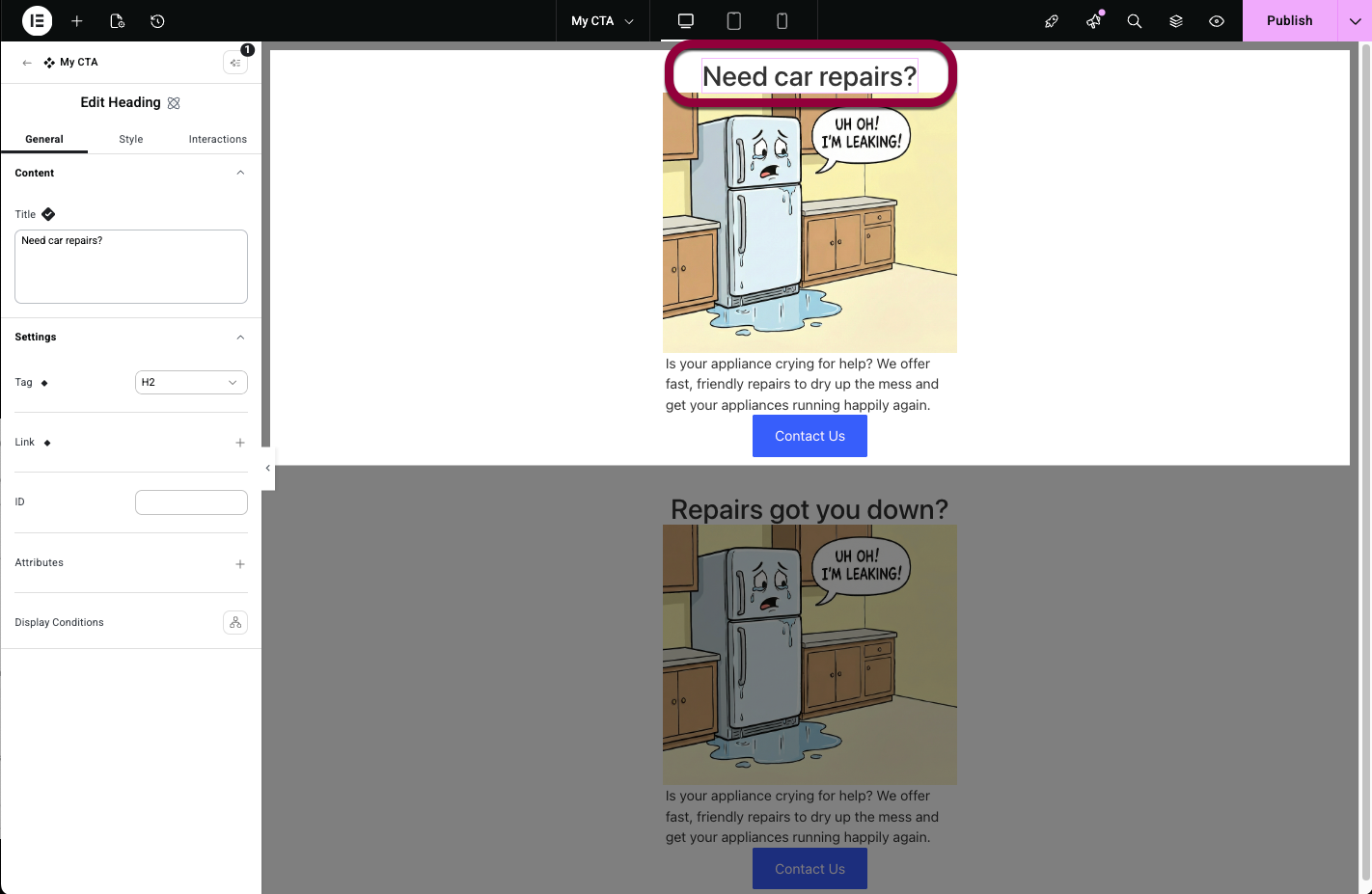
Save the component
You have two options for publishing your changes:
- Publish from Edit Mode: Click the Publish button while still in Edit Mode. This publishes only your component changes—any other changes you’ve made to the page remain unpublished.
- Exit Edit Mode and Publish with the Page: Exit Edit Mode first, then use the regular page Publish button. This publishes both your component and any other page changes together.
Your component is now complete and available from the Components tab in the Elements panel.
How do I use a component
Once created, components can be added to any page on your site.
To add a component to a page:
- From the panel, click the Components tab.
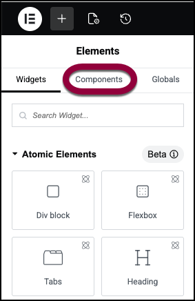
- Select the component.
The component is added to the page.
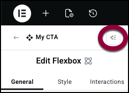
How do I edit a component?
When you need to change the component’s structure, styling, or add/remove exposed properties, you’ll edit the master component.
- There are two ways to access a component:
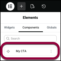
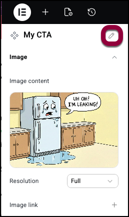
- In the panel, click the Components tab and select the component by clicking the pencil icon on the top right corner of the settings panel.
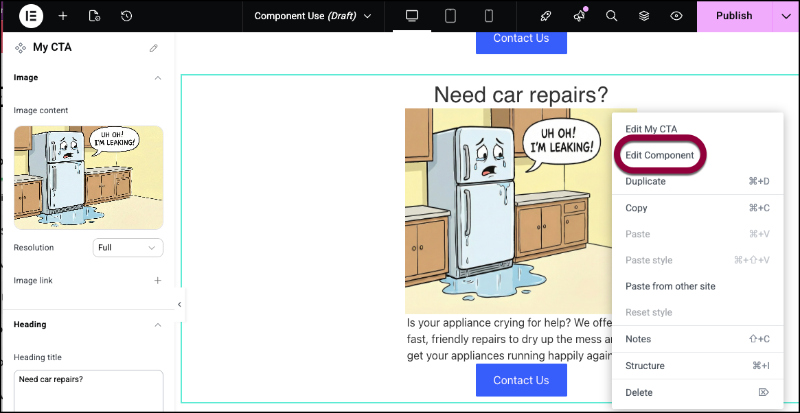
- If the component is on the canvas, right-click it and select Edit Component from the dropdown menu or double click the component to enter edit mode.
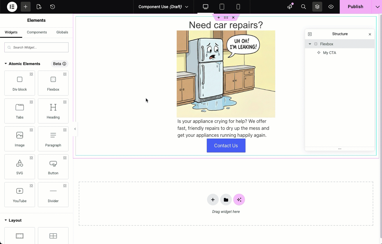
When in Edit Mode, the overlay around the component is dimmed.
You can now:- Modify the design, structure, or styling of any element
- Add or remove elements within the component
- Create additional properties or remove existing ones
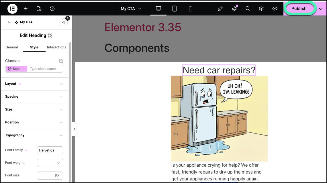
- Edit a component’s setting(s). In the example below, we’ll change the Typography of the heading.
- Save the changes.
You have two options for publishing your changes:- Publish from Edit Mode: Click the Publish button while still in Edit Mode. This publishes only your component changes—any other changes you’ve made to the page remain unpublished.
- Exit Edit Mode and Publish with the Page: Exit Edit Mode first, then use the regular page Publish button. This publishes both your component and any other page changes together.
- In the panel, click the Components tab and select the component by clicking the pencil icon on the top right corner of the settings panel.

Your changes affect all instances of this component.
How do you manage component organization and properties?
You can rename, delete, or group your properties to maintain a clean workflow in the Components tab.
Access your Components
- Click the Components tab in the Elements panel.
All your components appear in the panel.
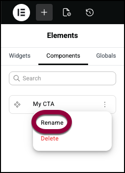
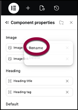
Rename a component
- Click the Components tab.
- Click the ellipses to the right of the Component name.

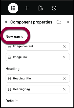
- Select Rename from the dropdown menu.
- Enter the new name.
Delete a component
Delete components you don’t need by going to component properties and selecting delete.
- Click the Components tab.
- Click the ellipses to the right of the Component name.
- Select Delete from the dropdown menu
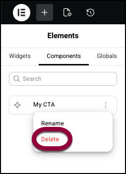
- Confirm the deletion.NoteExisting instances on your pages will remain functional. You will no longer find this component in your list.
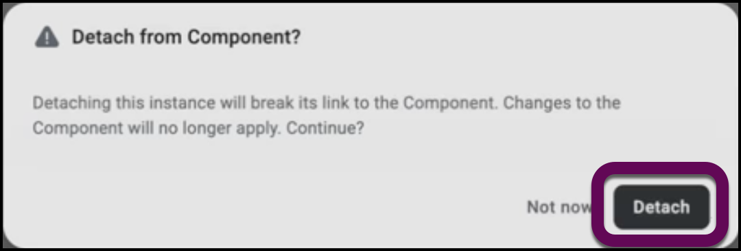
Detach a component
You can detach an instance of a component so that you can customize it without affecting other components and so that it will not be affected by changes to the component.
- Right-click the instance of the component.
- Select Detach Component.
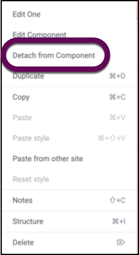
- Confirm the detachment.
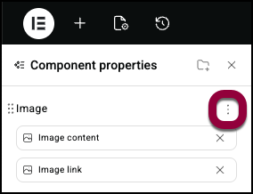
How to manage component properties
Click the property icon to properly organize your properties to help keep your workflow efficient.
Group properties
- Select a component.
- Click the properties icon.
- To group your properties, click the add new group icon.
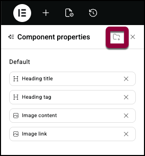
Hint: Grouping properties is a good way to keep them organized. - Name the group.
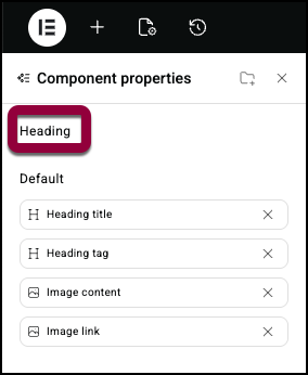
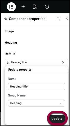
How to add properties to a group
- Click the property.
- Use the dropdown menu to add the property to a group.
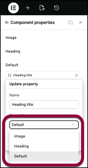
- Click Update.
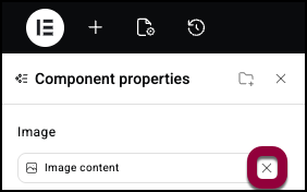
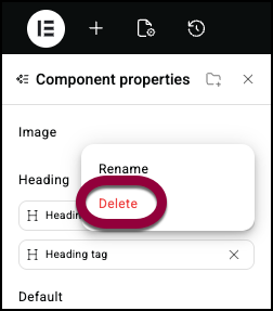
Delete a property
- Click the X to the right of the property name.
Delete or rename a group
- Hover over the group name.
- Click the ellipses to the right of the group name.
- Select Rename from the dropdown menu.
- Enter the new name.
Delete a group
- Hover over the group name.
- Click the ellipses to the right of the group name.
- Select Delete from the dropdown menu.NoteYou can only delete an empty group.
Roles and Permissions
Admins have full access to create, edit, and manage components.
Editors can add component instances to pages and customize exposed properties, but cannot create new components or edit the master component.

