Hi dear Elementors! Spring is here (well, at least in the Northern Hemispere), time for new beginnings! If you’re still debating using Elementor and embarking on a new design path, it’s probably because you haven’t come across our impressive monthly showcases.
In light of the global cannabis revolution that we’ve been witnessing over the past five years, it was just a matter of time until a medical marijuana website cropped up in our top 10. Also to whet your appetite on our list is a non-profit wildlife society, a Spanish vintage modern website, a Star Trek-influenced Tech Fest, and an Indian contest page for young designers.
Let’s get started!
10
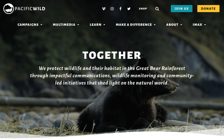
Pacific Wild Alliance is a non-profit conservation organization working to protect the Great Bear Rainforest in British Columbia, Canada. Pacific Wild was founded in 2008 with a mission to raise awareness and effect change for conservation issues in the Great Bear through powerful visual storytelling.
The website they built reminded us of National Geographic, featuring stunning wildlife photos and videos that draw visitors right into nature and provide plenty of content – articles, videos, image galleries, and infographics. The yellow color accents mainly used on the Call-to-Action buttons also reinforce this resemblance, and engage users. We also loved the brilliant Escheresque logo.
Design: Affinity Bridge & Geoff Campbell (Pacific Wild)
Theme: Custom
Plugins: Gravity Forms, Blogvault Backups, and Malware Scanning, Better Search, Yoast
09
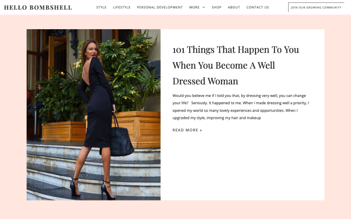
Hello Bombshell is a lifestyle and personal development space for women, striving to “inspire and empower you to become the best version of yourself and lead an extraordinary life.
Their site is inspired by fashion magazines for young women. It uses vibrant colors and optimistic confetti patterns, as well as an airy “fashion font”. Also worth mentioning is the highlight marker effect on hover. It makes browsing fun and playful.
Design: Jenaae Jackson
Theme: Twenty Sixteen
Plugins: Elementor Pro, Google Analytics
08
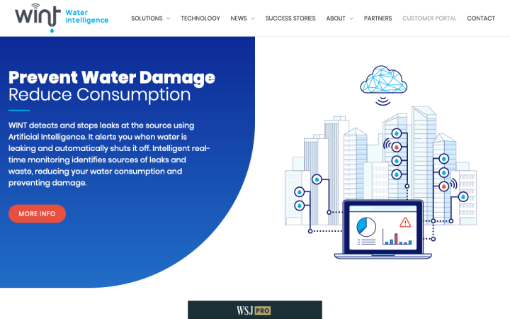
WINT (Water Intelligence Technology) has developed a system that detects leaks in real-time using artificial intelligence. WINT devices alert maintenance staff and can automatically shut off the water when needed.
WINT’s corporate website presents a solid layout with a unified design language throughout its internal pages. Blue is the predominant color, mirroring their central topic. The designer managed to create a flowing structure by using rounded images and typography, and entrance animation. The Call-to-Action buttons attract special attention thanks to their contrasting color.
07
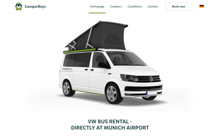
CamperBoys is a VW Bus rental company based at the Munich airport, offering VW Busses, fully equipped for camping trips.
With a clean and functional design, the CamperBoys’ website demonstrates advanced capabilities integrated with Elementor – custom post types, a booking system, and multilingual pages. All these functionalities create an advanced website that allows its owners to receive online bookings and payments, without having to code.
Design: André Schauer
Theme: Astra
Plugins: ACF, Contact Form 7, Custom Post Type UI, Elementor Pro, Jet Elements For Elementor, JetTabs For Elementor, Mailchimp for WooCommerce, Klarna Payments for WooCommerce, Reading Position Indicator, Tables For Elementor, WooCommerce, WooCommerce Bookings, WooCommerce Multilingual, WPML Multilingual CMS
06
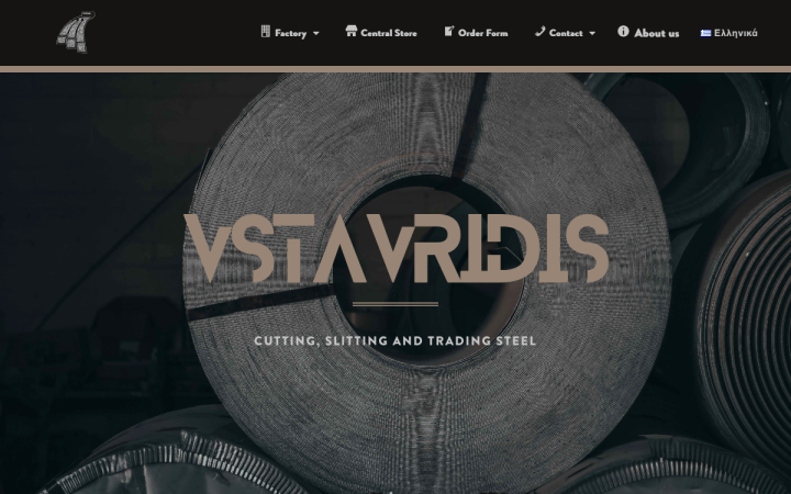
Vasilios Stavridis G.P from Thessaloniki, Greece specializes in cutting, slitting, and trading steel with the most modern machinery. The factory was founded in 1988 by Vasilios Stavridis covering a total indoor space of 2,500 square meters.
Once their main page loads, you instantly feel transported into a heavy industrial low tech factory. This is the result of the designers’ use of dark colors, thick and solid fonts, and images and videos displaying massive steel-cutting machines. The shape divider contributes to the roughness of the industrial design. The titles look like they were cut by the same machine used in the factory. All in all, it seems there was a lot of thought put into the design, as all the elements correspond well with the subject matter.
Design: John Fotiadis
Theme: OceanWP
Plugins: Polylang, Easy WP SMTP, Menu Icons, WP Fastest Cache
05
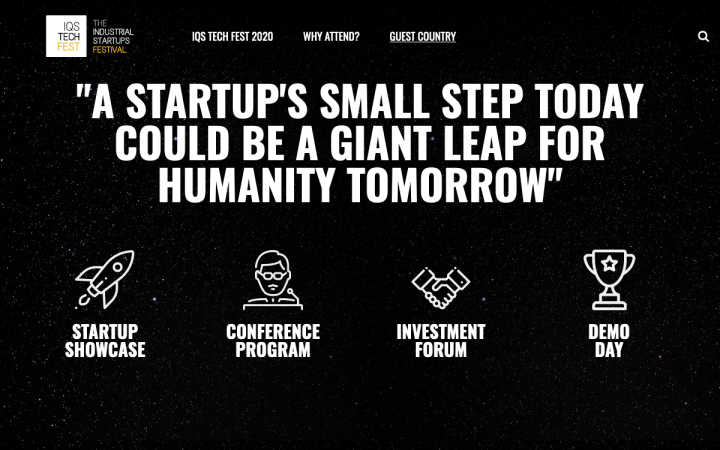
IQS Tech Fest is a festival that promotes startups at a European level, giving them a voice and a stage to make themselves known. The event takes place annually in Barcelona, Spain.
The design of this site corresponds with legendary sci-fi movies like Star Wars: Whether it’s the spacey background, the centrally aligned text and its heavyweight font, or the futuristic microcopy (“Industry as never seen before”, “A Startup’s small step today could be a giant leap for humanity tomorrow”). The result is a website, which perfectly matches the message IQS wants to convey: This is the future of the tech industry.
Design: IQS
Theme: Walinka by Calovix
Plugins: ACF Pro, PowerPack Elements
04
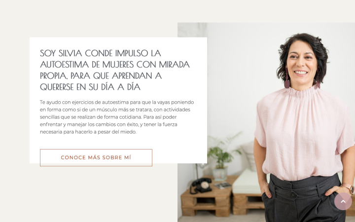
Silvia Conde from Madrid has a unique business, La Viajera Interior (The Inner Traveler), where she teaches how to improve your self-esteem. She has created an online ‘gym’ to strengthen self-esteem and a series of workshops to work on self-confidence, optimism, and emotions.
Silvia’s website has an interesting vintage modern look. On the one hand, the designer used a classic font reminiscent of the 1920s, as well as comforting pastels. On the other hand, they played with layers and texts, creating a captivating layout. The designer succeeded in creating a welcoming and restorative space, ideal for Silvia’s audience.
Design: Alberto Perojo & AES Branding
Theme: Genesis
Plugins: ACF pro, Thrive Leads
03
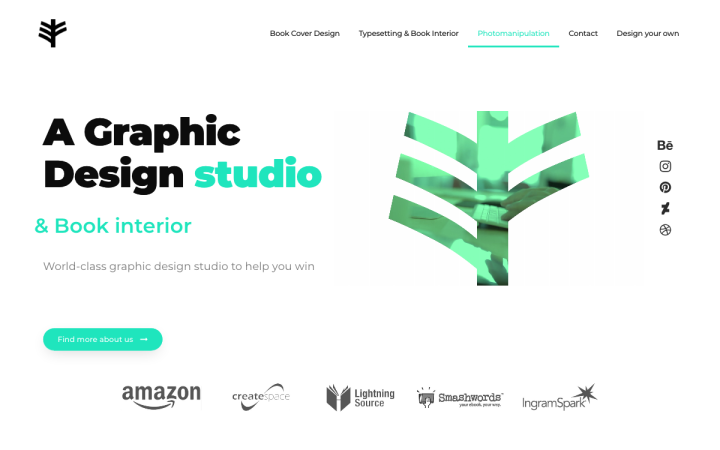
Bross Pro is a graphic design studio specialized in designing of eBook covers, paperback, and hardcovers. The studio was founded by Predrag Markovic, who holds an MA in graphic design.
We found their website a fine execution of Elementor’s unique features and elements. While it may not be the most complex website or one that shows advanced functionalities, we like it for its clean and simple appearance, the modern-designed internal pages, the smart use of animated headlines, and titles in two contrasting colors, highlighting their marketing messages.
Design: Predrag Markovic
Theme: OceanWP
Plugins: Ocean Extra, Use Any Font, WP Content Copy Protection & No Right Click
02
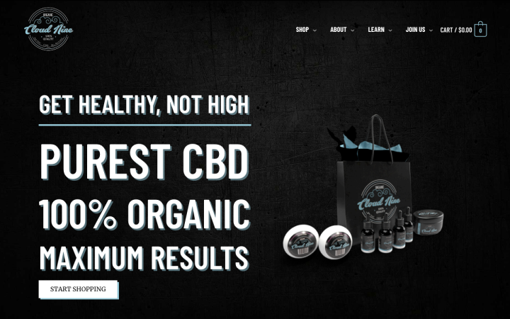
Founded in 2018, Cloud Nine delivers a guaranteed highest quality CBD-rich oils and products from organically-grown hemp in Colorado, USA.
The organic trend relates to the hipsterish vintage design elements borrowed from the 1950s. The combination of grungy background textures, a retro color scheme, the store’s logo, the classic font and shadowing around the letters, create an atmosphere straight out of Mad Men. Swell!
Design: Wattz Web Design and Marketing
Theme: Astra
Plugins: WP-Affiliate, UpDraft, ACF, CPT UI, Anywhere Elementor Pro
01
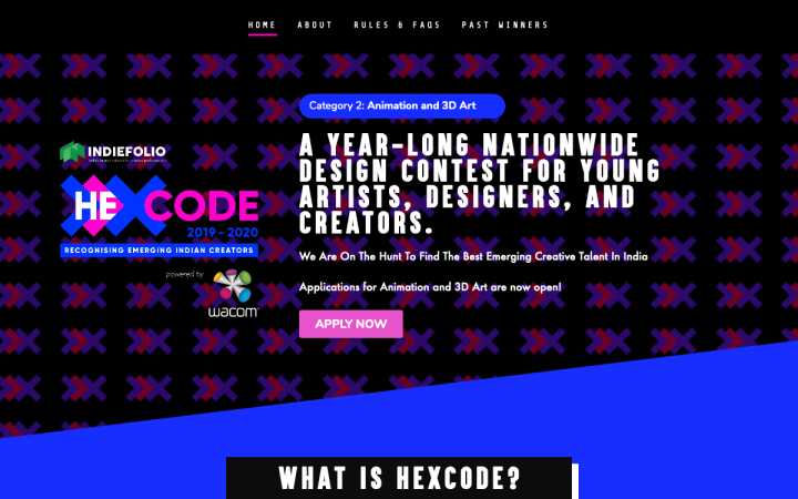
Hexcode is a year-long nationwide contest for young artists, designers, and creators from India. This contest was initiated in 2017 by IndieFolio Network, an online market network for Indian creative professionals.
The site that was created for the contest is very trendy, showing what’s cool in the web design world in 2019. The designer picked two bright contrasting colors, blue and pink, producing an effect difficult to ignore. What’s more, they decorated the arrow patterns with alternating colors, spiced up the site with subtle animation gifs and diagonal shape dividers, giving it a real edge.
Design: Kavan Antani
Theme: Jupiter X
Think your Elementor-based website or landing page should be featured in our next Top 10 Websites column? Give it a shot!
