Table of Contents
Elementor has become the standard for WordPress visual design. While this managed to remove a lot of the guesswork for designers, it presented new challenges when dealing with long-form pages and posts.
The longer the content – the more challenging it is to navigate through the different sections, move elements around, and grasp the entire page design.
This is why we developed a new UI feature, aimed to solve this exact challenge.
What is Navigator?
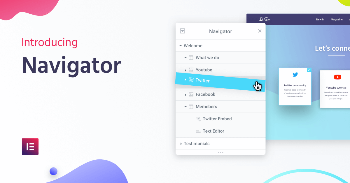
Navigator is a navigation tree window that provides easy access to every element in the editor. It enables the user to drag elements throughout the page and edit them, quickly and easily.
Navigator is particularly useful for long pages or pages with complex multi-layered designs, as well as for elements combining Z-Index, negative margin, position absolute, etc. It enables you to gain full control over the entire editing process.
Here are some of the advantages of Navigator:


Manage Your Entire Layout From One Place
Navigator displays a condensed view of your entire page. All sections, columns, and widgets are seen in one panel, giving you much better control over the layout of the page.
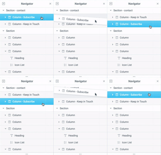
Grab any section, column or widget and move it around, changing the order of elements as you like. Navigator offers the most value when dealing with long pages, composed of 10 or more different sections.
You can choose to hide elements from the editing screen. This will only affect the editing display, giving you more focus when you design. The elements you hide from the editing screen will still be visible when you preview the page.
Custom Name for Every Element
When dealing with a long page, it sometimes gets confusing to differentiate between the different elements in the Navigator.
This is why we added the option to easily customize each element name. Just double-click on any Navigator item to give it a custom name. This way, you can quickly identify and edit each element.
The right-click options are also functional for the elements appearing in the Navigator, so you can copy, paste or delete elements from the same panel.
Put It Anywhere You Like
You can drag the Navigator anywhere on the page, change its height and width, or pin it to the side of the screen.
Your Navigator preferences are always saved on your browser. You can exit the page, open a new page, the Navigator panel will remain in the same position, so you can continue just where you left off.
How It Works
You have three simple options to open the Navigator window:
- Right-click any element and then click on Navigator. This automatically redirects you to the specific element in the navigation tree.
- Click on the layers icon in the footer of the panel.
- Use the keyboard shortcut Cmd/Ctrl + I.
#elementor Navigator: View and Edit the Entire Page Layout in One Place
Other New Features
Autocomplete URL for Internal Linking
From now on, all Elementor widgets include autocomplete URL links, letting you add internal links to all URL fields in the panel in the simplest way possible.
Once you start typing in the URL field, the system searches for the text throughout all pages, posts, and media files in your WordPress. Then all that’s left to do is choose the relevant links from the search results.
This feature is actually one of the oldest feature requests, going on already for 2 years, would you believe it? We are happy to finally release it and thank everyone who kept pushing for this feature.
Show Editing Handles
In the previous version, we changed the way elements are edited. We replaced the old edit buttons with a right-click to provide more advanced editing capabilities — including adding access to copy/paste and direct access to the navigator.
Shortly after the release, we received several requests to restore the previous edit buttons. Therefore, in this version, we provide the option to show them beside the right click.
This means that if you want to work with both methods, you can set the display of these buttons under Settings > Advanced > Editing Handles > Enable.
Debug Bar: Your "Theme Building Detective"

In this version, we added the ability to better debug the pages you load. The Debugger helps you understand why a particular template or theme file is loading, or whether they conflict with each other.
Enabling the Debugger is helpful for users in the process of building their site using Elementor’s Theme Builder.
Often, a page is composed of different parts: header, footer, single and other templates. Using Debugger, you will better understand the hierarchy of files and locations that generate the page.
How to activate the Debugger
The Debugger is located in the admin bar throughout your WordPress site.
define( 'WP_DEBUG', true ); in wp-config.php` then the Debugger will automatically be activated.
To manually activate the Debugger, go to the settings area of Elementor, and under Tools > Debug Bar, set it to Enable.
Columns Widget Now Renamed Inner Section

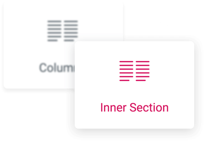
In this version, we renamed the ‘Columns’ widget to the ‘Inner-Section’ widget.
We have made the change because, after a continuous period of user-research, we found a disturbing common mistake made by users across all levels. When users needed to add a column to an existing section, instead of just right-clicking, users mistakenly dragged in a Columns widget.
This mistake adds unnecessary markup code to the page and may cause various unexpected behaviors.
We hope the name change clarifies what the widget is meant to do, which is to add an inner section to a current section, in order to build more advanced layouts.
See It in Action
Conclusion
The new version is a great testament to our continuous efforts to improve Elementor’s UI and designer workflow, and our dedication to providing you with the best possible design experience.
I encourage you to take this version for a spin and see how it impacts your workflow and ability to design faster.
I’d love to know what you think about this release in the comments below.
Looking for fresh content?
By entering your email, you agree to receive Elementor emails, including marketing emails,
and agree to our Terms & Conditions and Privacy Policy.


