Table of Contents
Enjoy New Background Slideshows & Fancy Dividers Available in Elementor Version 2.7
Image backgrounds, video backgrounds, gradient backgrounds… There is only so much you can do to make your website backgrounds special. Here at Elementor, we’re always thinking about giving our users new capabilities that will be translated into stunning website effects.
For version 2.7, we’ve considerably improved our background capabilities so that you can create intricate layouts. I know you are eager to find out all the details about what’s new in version 2.7, so here goes.
Bring Your Background to life
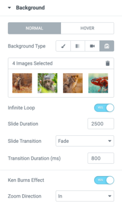
Background Slideshow

Now you can use a slideshow as the background for sections, columns, and even inner-sections. This can help you build more complex structures and layouts, while still preserving a transition effect.
As opposed to using a slider widget, which allows you to use specific layout and limited design options, the background slideshow feature gives you way more flexibility.
Use any widget, with any layout you wish to create, and wrap it all with a beautiful background slideshow to emphasize it nicely. Use the Ken Burns effect to give it another captivating touch.
More background video embed options
Vimeo Video as a Background

As part of enhancing the background capabilities, we’ve added Vimeo as a source for your background videos. So now, both team YouTube and team Vimeo can enjoy sweet backgrounds.
Vimeo has many advantages, like more privacy options, less branding, no ads, and some say better video quality.
Play on mobile
Allow Background Video to Play on Mobile
Up till now, most mobile phones didn’t play background videos. Recent browser policy changes have added this functionality to some browsers.
You are now able to turn on the “Play On Mobile” switch, and have video backgrounds play on mobile devices, given the device supports it. Learn more in our developers blog.
New ways to separate content
Improved Divider Widget
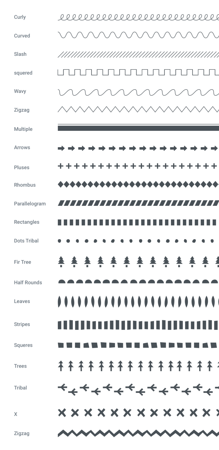
Dividers are one of the most basic and useful design elements in web design. So, of course, we went ahead and made them even better, with newly added elements and shapes.
Our Divider widget used to be quite basic and traditional. For v2.7, we added some fancy features to it. You can now choose from a list of new shiny SVG dividers and control their style and behavior.

Also, we added the option to include some text or an icon before, in the middle, or after your divider. You can select from our huge library of icons, or add your own icons.
Elementor Version 2.7: United We Stand, Divider We Use.
What’s Next?
In the upcoming versions, we will gradually release major infrastructure improvements, which will allow Elementor to be more extendable, reliable, and stable. You will be able to considerably improve your workflow in accordance with these exciting features. Stay tuned, and let us know which divider is your favorite one in the comments below!
Looking for fresh content?
By entering your email, you agree to receive Elementor emails, including marketing emails,
and agree to our Terms & Conditions and Privacy Policy.


