Build powerful, fully custom tab experiences with Atomic Tabs
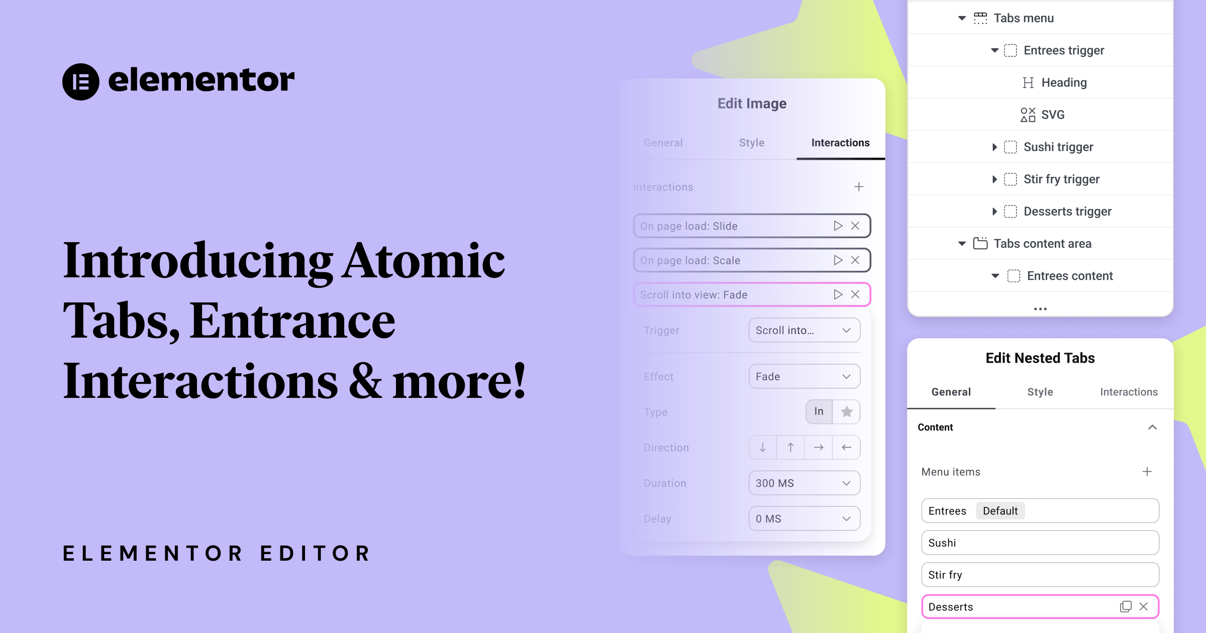
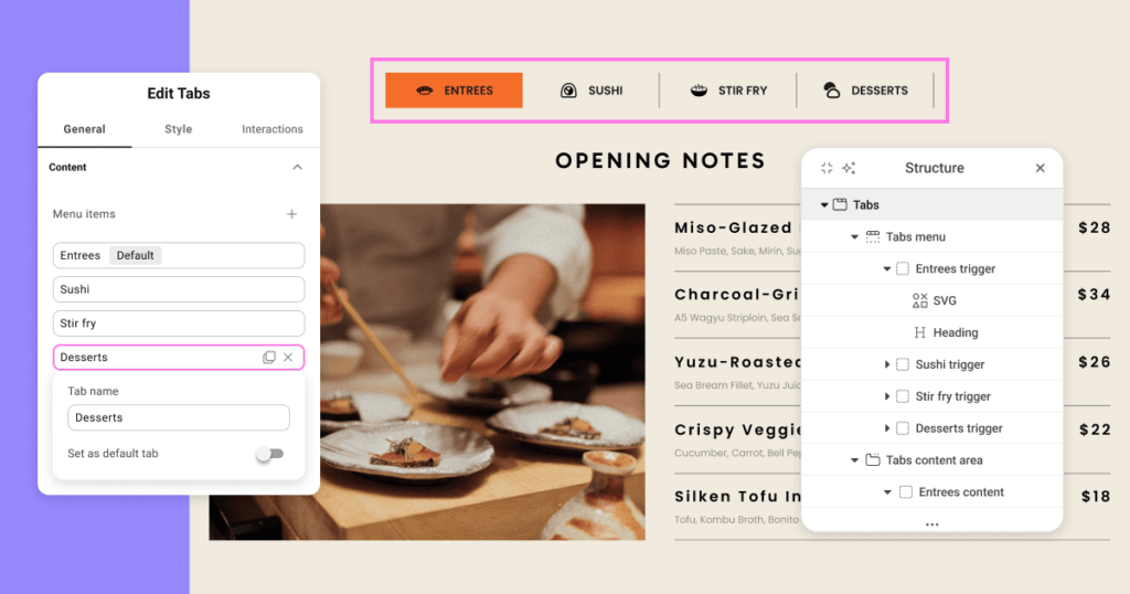
Atomic Tabs arrive as a major addition to the atomic editor, giving you complete control over the structure, styling, and behavior of tabbed layouts. Instead of relying on a single, monolithic widget, this new system breaks the interface into separate Atomic Elements you can mix, match, and design freely.
With this structure, you’re able to place any content inside tab triggers or tab panels, opening the door to layouts that were previously out of reach. Every part of the component follows the atomic styling model, meaning your Global Classes, cascading styles, and structural guardrails all work exactly as expected.
What you can customize
Nested Tabs break the traditional widget structure into independent elements you can style and configure individually:
- Tabs – main wrapper.
- Tabs menu – secondary wrapper – row containing tab triggers.
- Tab trigger – each individual trigger.
- Tabs content area – secondary wrapper – container for all content panels.
- Tab content – panel content of each individual tab.
- Tabs menu – secondary wrapper – row containing tab triggers.
A dedicated Selected state is now available for tab triggers, allowing you to style active tabs cleanly and consistently without custom code. Because the state only appears when working inside Nested Tabs, it keeps your workflow focused and your styling predictable.
Designed for the atomic styling system
You can nest any type of content inside tab triggers or content panels, unlocking tab designs that were not possible before.
Nested Tabs fully support Atomic Editor features:
- Assign Classes to any part of the structure and build reusable design systems.
- Apply styles that cascade cleanly through the hierarchy.
- Understand the layout through a clear structure panel.
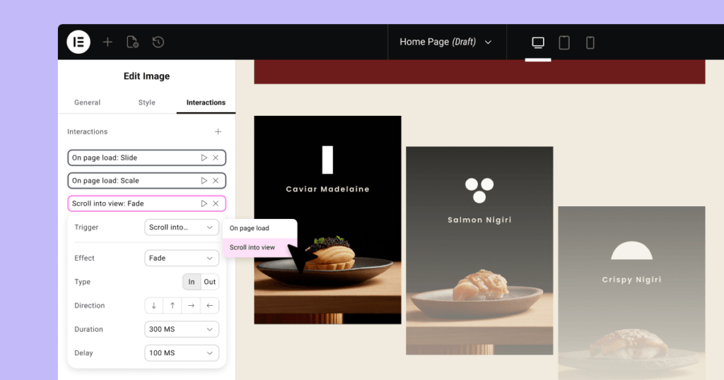
Add granular, performance‑friendly motion with Entrance Interactions
This update also introduces the first phase of atomic Interactions, starting with Entrance Interactions: a simple, performance‑minded way to add subtle motion to your elements.
A new Interactions tab now appears alongside General and Style, giving Interactions their own dedicated space, keeping the editor structured, clear, and aligned with the atomic philosophy.
Entrance Interactions focus on small, meaningful motion without heavy presets or timelines. Instead, you define animations using a set of granular, familiar properties, making results easy to tune and understand.
Available controls
- Triggers: On page load, On scroll into view.
- Effects: Fade, Slide, Scale.
- Type: In, Out.
- Directions: Up, Down, Left, Right.
- Duration: 0.1s–3s.
- Delay: 0–2s.
You can stack multiple entrance effects within the same element, combining Fade, Slide, and Scale for more expressive motion. A built-in Preview button lets you replay the animation instantly as you refine timing and behavior.
This is the foundational stage of a broader interactions system. Future versions will continue expanding capabilities while maintaining this same atomic, modular approach.
How to activate the new features
- Update to the latest Elementor version (now 3.34).
- Go to WordPress > Elementor > Settings > Editor V4 tab.
- Click “Activate.”
During the first quarter of 2026, a production-ready Beta version will be rolled out, followed by the full release shortly after.


