Table of Contents
This article will showcase five examples of using nested tabs with Elementor to improve your website’s content organization. By grouping related sections in one tidy space, you’ll create a streamlined and intuitive browsing experience for your users.
Ready to take your website design to the next level? Let’s dive in and explore how nested tabs can transform the way you showcase your content!
1. Designing Eye-Catching Tabs
Although it’s generally advised to maintain a consistent structure across tabs, there’s still an opportunity for creativity. The first step is to establish a design language.
In this example [00:40], we’ll incorporate an image, a title featuring the venue’s name and capacity, a text element with venue details, and a button. By adhering to a consistent tab structure, you can still experiment with the layout to develop a distinctive and visually engaging design.
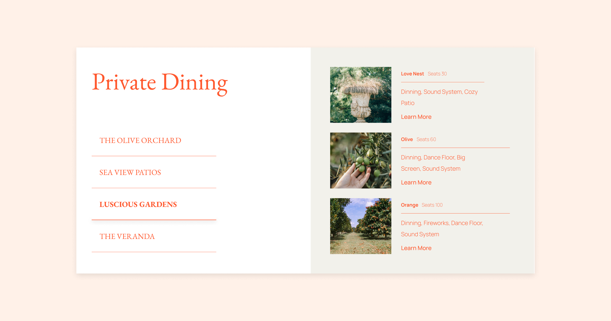
For the first tab, we opted for a simple approach, designing a single container that presents information in a clean, linear manner down the page.
We introduced an additional container in the second tab, arranging them side by side to complement each other.
Our third tab follows a unique layout with three rows, adding diversity to the design. We placed the image on the left and the text and button on the right, producing an eye-catching flow that is easy to navigate.
By experimenting with different layouts while maintaining consistent design language, you can achieve visually stunning yet practical designs with a cohesive look and feel throughout. Remember, the key to learning is to explore and have fun, so don’t be afraid to play around with different designs!
2. Add Any Widget You Like!
Nested tabs enable you to create custom structures, using any of Elementors highly configurable widgets.
In this example [02:16], we’ve used the pricing table widget to add different pricing plans and group them by various periods, like monthly, semi-annual, and annual plans.
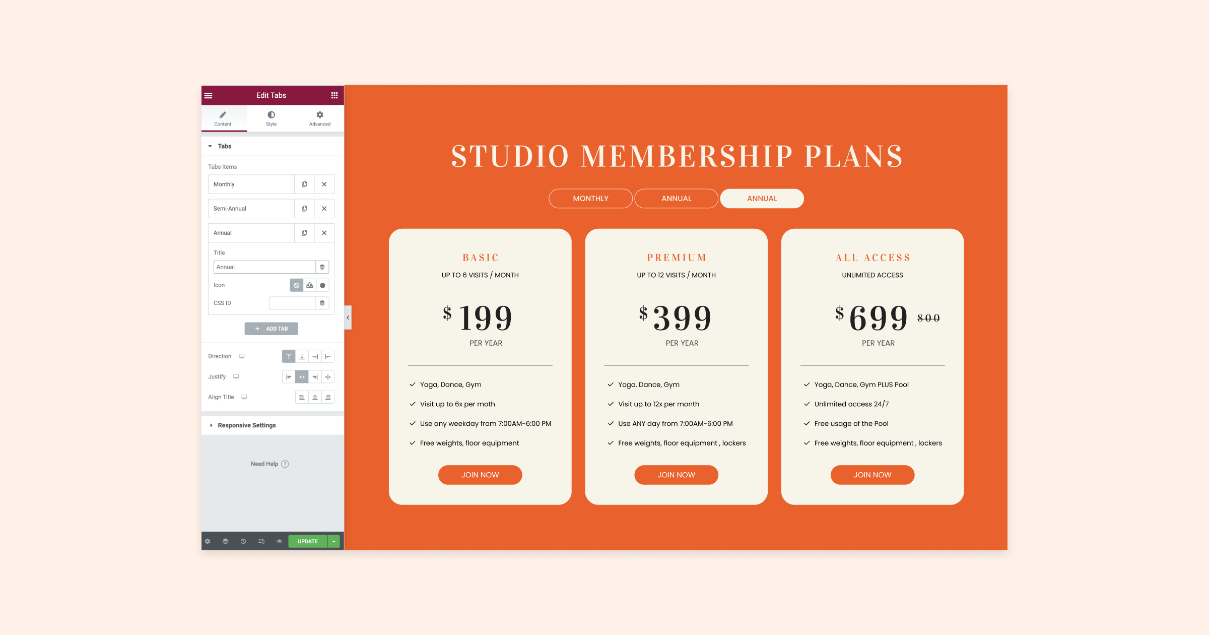
With a touch of creativity, you can use any widget with nested tabs to construct all sorts of customized structures quickly and easily!
3. Guide Your Visitors!
By keeping a consistent layout and incorporating images, nested tabs become an excellent tool for crafting an enjoyable and visually appealing experience. They effectively guide visitors through a process or help narrate a story for your audience.
In this example [03:48], we’re being walked through the setup process. On each of the four tabs, we have included icons, numbers, and text making navigation both easy and enjoyable.
Inside the tabs, we added unique text and images for a clear and engaging user experience.
Tip: Break your images up into individual assets and apply motion effects to create dynamic animations. See these effects in action by watching the video!
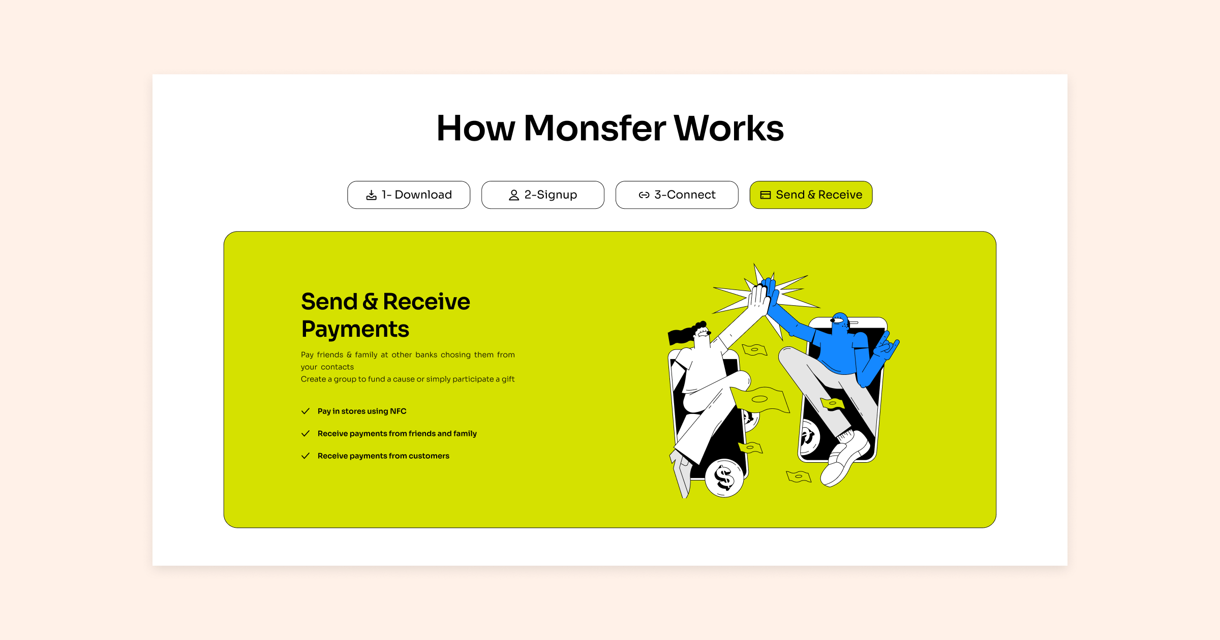
This example demonstrates how nested tabs can be effectively utilized to create an engaging and visually pleasing user experience, guiding your visitors through your content with ease.
4. Use Tabs To Filter Content!
Utilizing dynamic content by combining widgets like nested tabs and loop grids can significantly boost your website’s functionality. One fantastic way to utilize these widgets is to create your own category filters [04:27]. Display each category within a tab and show specific content for each category in a loop grid, allowing visitors to easily filter through your content and find what they’re seeking.
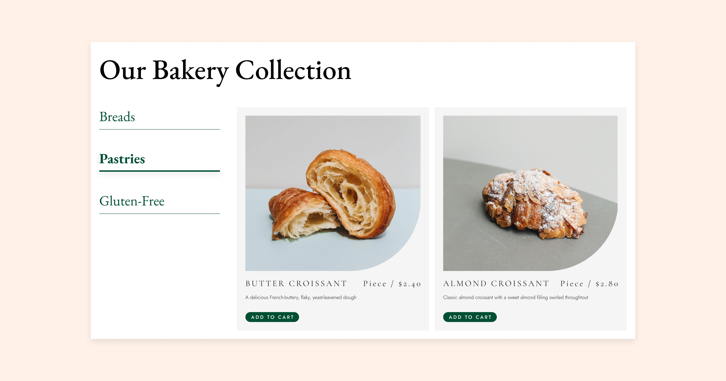
This method works well for ecommerce websites with various products, as well as portfolio websites showcasing your work in different categories like web design, graphic design, or photography.
5. Nested Tab Inception!
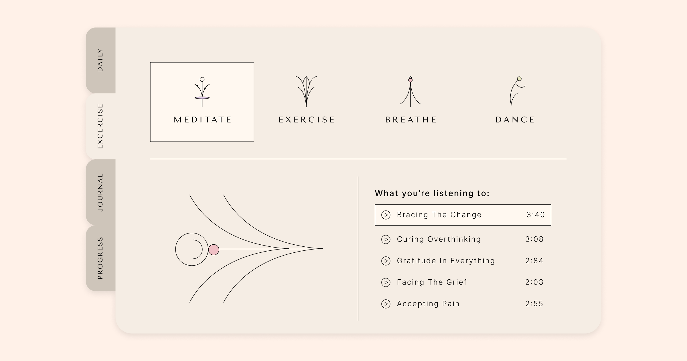
In this advanced example [05:33], we’ve crafted a custom dashboard using nested tabs within nested tabs, demonstrating their versatility and potential. The design features tabs running vertically down the left-hand side, achieved by employing the CSS ID feature available in each tab. By rotating the navigation titles of the tabs with a single line of CSS code replicated for every tab, we’ve created a visually appealing and functional layout.
We’ve further customized the secondary tabs by incorporating unique icons and adjusting the spacing between them and the content, resulting in a distinctive and user-friendly appearance. Utilizing containers and the loop grid widget, we’ve effortlessly categorized and displayed our content in a well-organized and intuitive manner.
This example showcases the incredible adaptability of nested tabs, proving that with some creativity and attention to detail, you can design a sophisticated and efficient layout for your website.
Nested tabs offer endless possibilities
Now that you’ve seen the power of nested tabs, we hope you feel inspired to try them out on your own website! With Elementor’s intuitive drag-and-drop interface, it’s easy to experiment with different layouts and structures until you find the perfect fit for your content. And remember, nested tabs aren’t just for organizing content – they can also be used to guide your visitors, filter your portfolio or products, and even create custom dashboards. So don’t be afraid to get creative and explore all the possibilities that nested tabs have to offer.
Are there any other tips or use cases you would like to share? Leave us a comment below and let’s continue the conversation!
Looking for fresh content?
By entering your email, you agree to receive Elementor emails, including marketing emails,
and agree to our Terms & Conditions and Privacy Policy.
