Effortless Font Size Conversion with Our Free Tool
In the world of web design and content creation, precision and consistency are paramount. Whether you’re a seasoned web developer, a passionate blogger, or a small business owner crafting your online presence, managing font sizes can sometimes feel like a tedious, error-prone task. You’ve meticulously chosen the perfect font, now you need to ensure it displays beautifully across all devices and screen resolutions. This is where a reliable Font Size Converter becomes an indispensable ally. Our free online Font Size Converter is designed to streamline this process, offering a simple yet powerful solution for all your font scaling needs.
For those building their websites with the incredibly versatile Elementor page builder, consistent typography is a cornerstone of a professional and user-friendly design. Elementor empowers you to control every aspect of your website’s appearance, and typography is no exception. However, understanding and applying various font sizing units like pixels (px), ems (em), rems (rem), viewport width (vw), and percentages (%) can be confusing, especially when you need to ensure your text is legible on everything from a large desktop monitor to a small smartphone screen.
This article will delve into the importance of font sizing, the various units used, and how our intuitive Font Size Converter can make your design process significantly smoother. We’ll cover why using relative units like ems and rems is often preferred for responsive design, how pixels provide absolute control, and how viewport units dynamically adapt to screen size. By the end, you’ll have a clear understanding of how to leverage our tool to achieve perfect typography on your Elementor-powered website and beyond.
The Crucial Role of Typography in Web Design
Typography is more than just selecting a font; it’s about establishing hierarchy, guiding the reader’s eye, and conveying brand personality. The right font choices and, crucially, the right font sizes, can:
- Enhance Readability: Text that is too small or too large can be a significant deterrent to visitors. Proper sizing ensures your content is comfortable to read, keeping users engaged on your site longer.
- Improve User Experience (UX): A consistent and well-scaled typographic system contributes to a seamless and enjoyable user experience. This is particularly vital for accessibility, ensuring users with visual impairments can easily interact with your content. For those focused on accessibility, exploring tools like Elementor’s Ally Web Accessibility can be highly beneficial.
- Strengthen Brand Identity: The way your text looks and feels is a direct reflection of your brand. Choosing appropriate font sizes that align with your brand’s tone and message reinforces your identity.
- Boost SEO: While not a direct ranking factor, good typography leads to longer visit durations and lower bounce rates, which are positive signals to search engines.
- Ensure Responsiveness: In today’s multi-device world, your website must adapt flawlessly to different screen sizes. This means your font sizes need to scale appropriately.
This is where the power of a Font Size Converter truly shines. It empowers designers and content creators to experiment with different units and values, ensuring their typography is both aesthetically pleasing and functionally sound across all platforms.
Understanding Font Sizing Units: Pixels, EMs, Rems, Viewport Units, and Percentages
Before we dive into how our Font Size Converter works, it’s essential to understand the common units used for defining font sizes in web design:
1. Pixels (px)
Pixels are a fixed unit of measurement. One pixel is typically defined as 1/96th of an inch. While pixels offer precise control over font size, they are considered an absolute unit. This means a font size of 16px will appear the same size regardless of the user’s browser settings or screen resolution. While straightforward, this can pose challenges for responsive design, as text might appear too small on high-resolution screens or too large on smaller devices if not handled carefully.
2. Ems (em)
An ’em’ is a relative unit. Its value is based on the font size of its parent element. For example, if the parent element has a font size of 16px, then 1em would also be 16px. If you set a child element’s font size to 1.5em, it would be 1.5 times the parent’s font size (24px in this example). EMs are powerful for creating scalable typography systems, especially for headings and elements within components. However, they can lead to unexpected compounding if not managed carefully, where nested elements might have their font sizes multiplied multiple times, leading to very large or very small text.
3. Rems (rem)
A ‘rem’ (root em) is also a relative unit, but its value is based on the font size of the root element (the <html> tag). By default, the root font size is often 16px. So, 1rem is typically 16px. If you set the root font size to 20px, then 1rem would be 20px. Rems are generally preferred over ems for global font sizing because they avoid the compounding issue. Setting font sizes with rems ensures that changes to the base font size will consistently scale all elements throughout your website, making it easier to maintain a unified typographic hierarchy and achieve better accessibility.
4. Viewport Width (vw) and Viewport Height (vh)
Viewport units are directly relative to the size of the browser viewport. 1vw is equal to 1% of the viewport’s width, and 1vh is equal to 1% of the viewport’s height. These units are excellent for creating truly responsive typography that scales dynamically with the screen size. For instance, setting a heading’s font size to 5vw means it will always be 5% of the screen’s width, making it naturally adjust from a large desktop to a small mobile screen. However, you must be cautious, as text can become too small on very narrow screens or too large on very wide screens if not combined with other responsive techniques like `min-width` and `max-width` properties in CSS.
5. Percentages (%)
Similar to ems, percentages are relative to the parent element’s font size. A font size of 100% is equivalent to the parent’s font size. While they offer a degree of responsiveness, they share the same potential compounding issues as ems. Rems and viewport units are often considered more predictable for global typographic scaling.
Why Use a Font Size Converter?
Navigating these different units and ensuring your text looks perfect everywhere can be a challenge. Our Font Size Converter is designed to simplify this process by providing instant conversions between these various units. Here are some key benefits:
- Save Time: Manually calculating conversions for every font size across your Elementor website can be time-consuming. Our tool does it for you in seconds.
- Ensure Consistency: Maintain a uniform typographic scale across your entire website, regardless of the unit you initially used or need to convert to.
- Facilitate Responsive Design: Easily experiment with different units to find the optimal sizing for various screen sizes. For example, you might want to convert a pixel value to a rem or vw to see how it adapts responsively.
- Improve Accessibility: By understanding how different units behave and allowing for easy adjustments, you can ensure your content is accessible to a wider audience.
- Cross-Browser Compatibility: While most modern browsers support these units, our converter helps ensure you’re using them effectively for predictable results.
- Experimentation: Quickly test how a specific pixel value would translate to ems, rems, or viewport units, helping you choose the best approach for your design.
How Our Free Font Size Converter Works (in 3 Simple Steps)
Using our Font Size Converter is incredibly straightforward. We’ve designed it to be intuitive, even if you’re new to web design or Elementor. Here’s how it works:
Step 1: Input Your Current Font Size and Unit
The first step is to tell the converter what you currently have. In the input field, enter the numerical value of your font size (e.g., 16, 24, 1.5). Then, select the unit that this value represents from the dropdown menu. You can choose from common units like Pixels (px), Ems (em), Rems (rem), Viewport Width (vw), and Percentages (%).
Step 2: Select Your Desired Output Unit
Once you’ve entered your starting point, you need to decide which unit you want to convert to. Simply select your desired output unit from the second dropdown menu. Whether you need to change from pixels to rems for better responsiveness, or from ems to viewport units to adapt to screen size, the tool handles all the common conversions.
Step 3: View Your Converted Font Size
That’s it! As soon as you select your desired output unit, the Font Size Converter will instantly display the equivalent font size in the chosen unit. You can then copy this value and use it directly in your CSS or within Elementor’s typography settings. No complex calculations or guesswork required.
Advanced Tips for Using Font Sizes in Elementor
Elementor provides robust control over typography within its editor. You can adjust font sizes for headings, paragraphs, buttons, and more. Here are some advanced tips:
- Utilize the Elementor Typography Controls: Within each widget’s style tab, you’ll find a dedicated typography section. Here, you can input your font size and select the unit. Use our Font Size Converter to get the perfect values before pasting them in.
- Set Global Styles: For consistency across your entire Elementor website, consider using Elementor’s Global Styles. You can define default font sizes for H1, H2, H3 tags, paragraphs, and more. This is where using rems or percentages based on your root font size is particularly effective.
- Responsive Font Size Settings: Elementor allows you to set different font sizes for different device breakpoints (desktop, tablet, mobile). After converting your base font size using our tool, you can then fine-tune these responsive settings within Elementor to ensure optimal readability on each device.
- Combine Units for Best Results: For truly dynamic typography, you might use viewport units (vw) for main headings and then use rems for body text and smaller headings, all based on a comfortable base font size. Our Font Size Converter is invaluable for making these transitions seamless.
- Accessibility Considerations: Always consider users with visual impairments. Larger default font sizes (e.g., 18px or 1.15rem for body text) can significantly improve accessibility. Use our converter to see how these values translate into different units.
When to Use Which Font Unit?
Choosing the right unit depends on your specific needs and design goals:
- For overall website font sizing and accessibility: Rems are generally the best choice. They scale consistently with the root font size, making it easy to adjust the entire site’s typography by changing just one value in your CSS or Elementor’s global settings.
- For elements that should scale relative to their parent: Ems can be useful, particularly within complex components or when you want a specific element to maintain a proportional relationship to its immediate container.
- For highly responsive headings and large text elements that should directly adapt to screen width: Viewport Width (vw) units are excellent. However, always use them with caution and consider fallback options or `min`/`max` properties to prevent readability issues.
- For fixed, absolute sizing where consistency across all devices is critical, and responsiveness is handled by other means: Pixels (px) can still be used, but they are generally less flexible for modern responsive design.
- Percentages (%) are similar to ems and can be used for relative sizing but are often superseded by the more predictable nature of rems and viewport units.
Our Font Size Converter allows you to easily experiment and see the values for each of these units, helping you make informed decisions for your Elementor projects.
Beyond Font Sizing: Other Useful Elementor Tools
While our Font Size Converter is a fantastic tool for typography, the world of web design offers many other exciting possibilities. If you’re building your website with Elementor, you might also find these tools incredibly useful:
- Elementor Business Name Generator: Stuck on naming your business? This tool can spark creative ideas and help you find the perfect name for your brand. Check out the Business Name Generator.
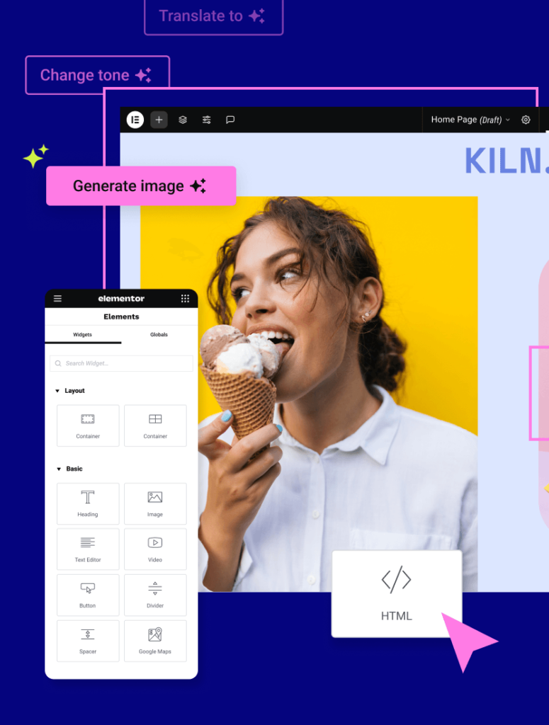
- Elementor HTML Viewer: Need to inspect or understand the HTML structure of a webpage? This tool is perfect for web developers and designers who want to peek under the hood. Explore the HTML Viewer.
- Elementor AI: Supercharge your content creation process with Elementor AI. Generate text, translate content, and optimize your writing with the power of artificial intelligence. Visit Elementor AI to learn more.
- Elementor Hosting: Looking for a streamlined way to build and host your Elementor website? Elementor Hosting provides a performance-optimized environment specifically for Elementor users. Discover Elementor Hosting.
By leveraging these tools alongside our Font Size Converter, you can build a more professional, efficient, and effective website with Elementor.
Conclusion: Perfect Typography at Your Fingertips
Achieving pixel-perfect, responsive, and accessible typography is crucial for any website’s success. Our free online Font Size Converter eliminates the guesswork and complexity involved in managing different font sizing units. Whether you’re working within Elementor or any other web design context, this tool empowers you to convert between pixels, ems, rems, viewport units, and percentages with ease.
By understanding the nuances of each unit and utilizing our Font Size Converter, you can ensure your text is always legible, your design remains consistent across all devices, and your user experience is top-notch. Don’t let font sizing be a bottleneck in your design process. Give our Font Size Converter a try today and experience the simplicity of perfect typography!
Ready to make your text shine? Use our Font Size Converter now!