Table of Contents
I'm excited to be introducing Elementor v1.9, which comes packed with Autosave, and several other UI features to help streamline your workflow.
"Hey, what the #$@&%*! did you do with my save button?"
Confused User
I know, receiving interface changes can be a tough cookie to swallow.
It might be difficult to get used to the changes, but I guarantee that a couple of hours after using it – you’re going to fall in love with the new version!
Today’s new Elementor version 1.9 introduces such changes. This is the first time in over a year and a half, that our panel gets a major update.
We are making these changes because Elementor’s capabilities are constantly growing, and the interface has to match that growth. To achieve this, we need to continually innovate and improve core elements, to allow creators and designers to stay ahead of the game.
We never cease to add cutting-edge features, while ensuring everything runs smoothly for all users, not only for the current version, but for future versions of Elementor as well.
Every change was meticulously considered from every angle, and was added based on our users’ feedback alongside our own vision.
It took us three months to ship the best solution, releasing version 1.9 following extensive testing by our team and beta testers group.
Let’s dive-in, starting with the brand new Autosave feature.
Introducing Autosave
In the past, we added two powerful features that dealt with backing up your work: Revision History for saving a revision every time you save the page, and Redo / Undo for quickly undoing any mistake.
Now, we are are adding a feature that will bullet-proof your workflow, making sure your work is always protected. With the new Autosave feature, every change you make gets saved auto-magically!
This way, you’ll NEVER need to press save again!
With the New Autosave Feature, Every Change You Make Gets Saved Auto-magically!
To test this feature:
- Go into Elementor, and make a few changes to your page
- Wait a few seconds, and notice that the page is saved automatically
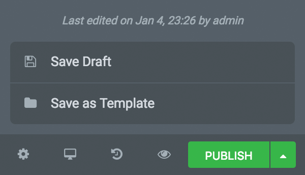
- Now, open the saving button on the right of the footer panel to see the message: ‘Last edited on Jan 4, 23:26 by Authorname’. (See grey image below)
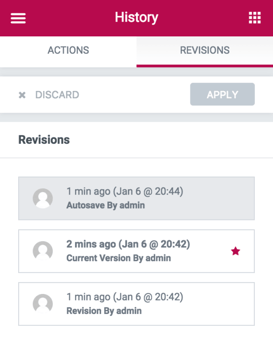
- You can go to History > Revisions and see the record of the autosave
Not Just Autosave... Auto-Draft As Well!
Every post should look perfect, right?
Remember when you were in the middle of editing an article, and visitors saw the changes before you were done?
No more! Now, you have a new ‘Draft’ status for published posts.
With this feature, you can continue editing your pages without having to worry about your visitors (or Google) seeing your unfinished work. This makes your workflow more flexible, because you can revisit your published articles, and tweak them without fear using your new ‘draft’ playground.
Publish only when you are ready to Publish
You are editing a page that has already been published. All of a sudden, you get an urgent call. You have to leave your desk, but the changes you’ve made are not ready yet and you can’t publish.
What do you do? Do you publish your incomplete changes, or discard them completely? Right here – our new ‘Publish / Draft’ feature comes to your rescue!
Instead of having only one published live version to work on, you now have two versions: the published version that your visitors see, and another NEW draft version that you can work on.
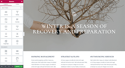
From now on, whenever you edit an already published page, you will in fact be working on the draft. ONLY when you are ready to publish the changes, hit ‘Publish’ to get the changes up and running in the live version of the site.
'Publish / Update' button instead of 'Save' button
The new Autosave and Auto-draft features made Elementor’s old save button redundant. We wanted to maintain your previous design workflow, while making it better.
This is why we’ve replaced ‘Save’ with ‘Publish’ on new pages, and ‘Update’ on existing pages. You can publish pages straight from the main panel, or open the saving options to save the page as draft or as a template.
The new buttons are similar to WordPress’s publishing buttons, offering you a more consistent experience. In WordPress, you first click on publish, and from then on click update to make changes to the published post.
Redesigned Footer Panel & Panel Menu
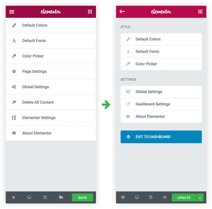
Moving on with our UI improvements, we’ve restructured our Footer Panel and Panel Menu.
The panel menu, located through the left hamburger icon, now only contains general default settings (default colors & fonts, color picker, global and dashboard settings). We’ve transferred other settings, in order to make it easier to navigate in Elementor.
This panel also contains the ‘Exit to dashboard’ button. This top-left position is in accordance to where exit button appear in most software (like Photoshop).
The bottom-left footer button now links to Document Settings. This way, all your document settings are separated and are more easily accessible. This will prove more useful once we release our theme builder, and open Elementor to documents other than pages.
Finally, the footer now has a Preview Changes button to let you see your draft before publishing your changes.
Check out the new look for the footer:

Total Library Makeover
We have now upgraded Elementor’s Template Library, so it’s now significantly easier to navigate and sort templates in terms of functionality as well as UI.
The Elementor Template Library has consistently grown since our launch, and now holds over 130 different stunning templates that help you create a wide variety of pages (landing pages, about, homepages…) across different industries (real estate, restaurant…).
As we continue to add more and more templates, it has increasingly become challenging to find a template for a specific purpose or need.
This is where the new Template Library is helpful, adding search and sort capabilities.
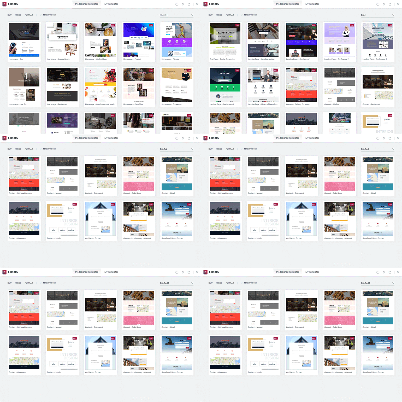
Library Search
You now have a template search box, so you can find the right template faster than ever before.
We added relevant tags to each template, so you can also search for a certain category like ‘Sport’ or ‘Food’. So now, you can search by page, name, keyword tag or purpose.
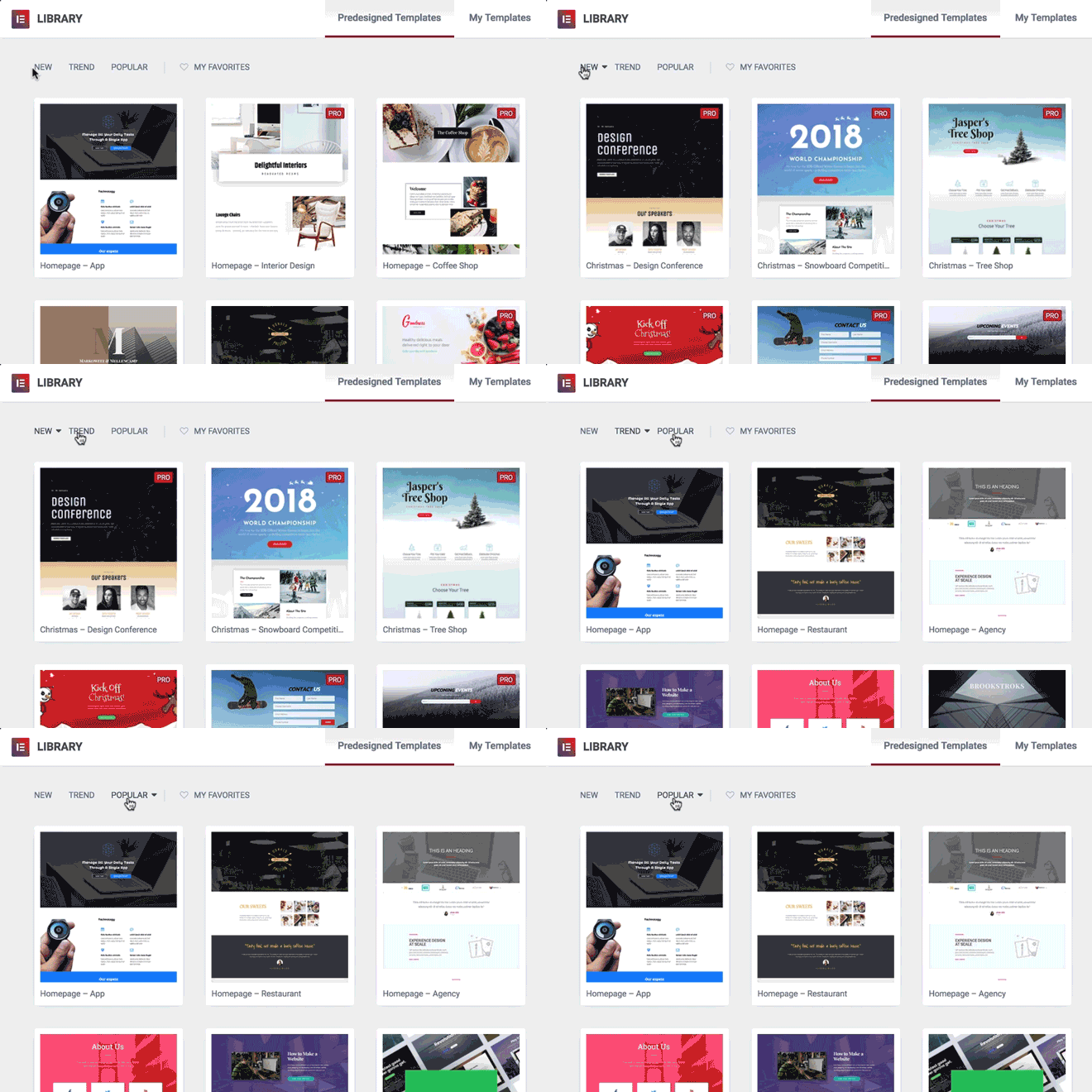
Library Filter
Our brand new filtering system lets you sort using different filters:
- New / old templates
- Popular template (the most downloaded templates in the library)
- Trendy templates (the most downloaded templates in recent days)
These filters help you find the leading templates, so you can leverage our community knowledge and take advantage of the ‘wisdom of the crowd’ to help you pick the right layout.
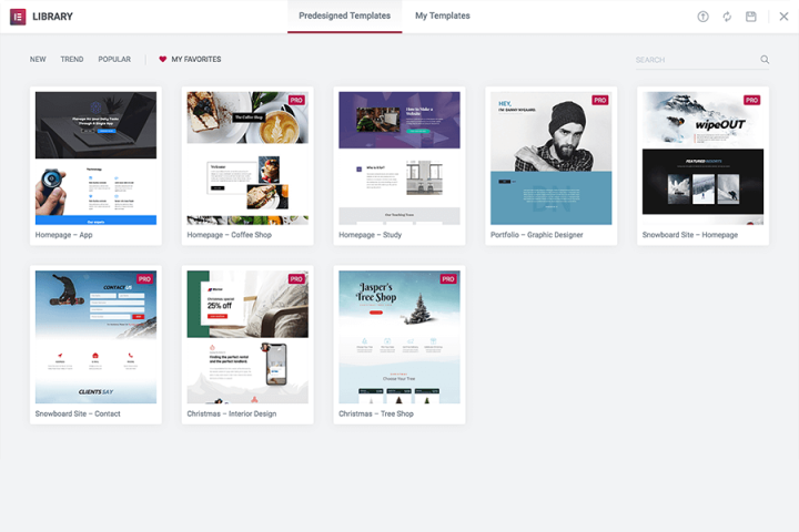
Library Favorites
The heart icon next to each template lets you save any template to the ‘My Favorites’ tab, ensuring easy access to your most loved templates. This way, you don’t have to browse through the templates or perform a search in order to find templates that you frequently use.
"Find the Right Elementor Template Faster Than Ever Before."
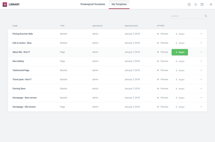
Search & Sort options for ‘My Templates’
Under ‘My Templates’ tab, you can sort your templates according to: Name, Type (page / section), Author and Date. You can also filter your saved templates by using the search bar. Looking for a specific template you previously saved? Just enter any term in the search bar to quickly find and use it anywhere.
Quick tip: When naming your templates, be as descriptive as possible. Include the purpose, client name, functionality, design concept and other attributes that might help you locate it later.
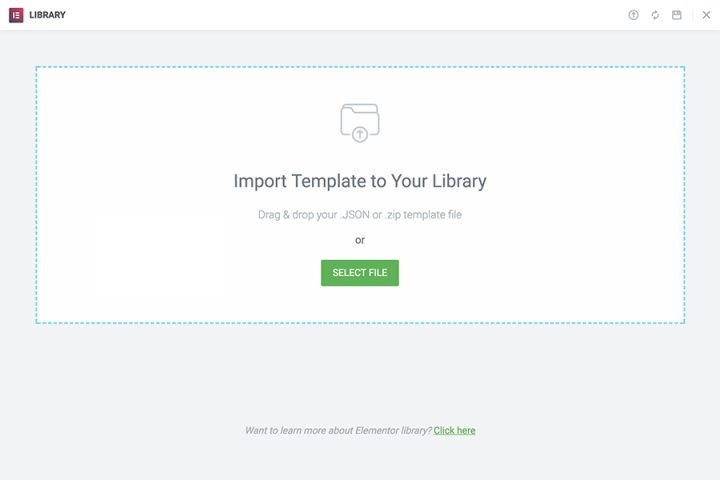
Import templates & sync Library directly
We added the ‘Import Template’ functionality to the ‘My Templates’ tab, so you can import templates directly from the Library popup. Drag your templates into the window and they will be uploaded automatically.
We also added the ‘Sync Library’ and ‘Save to Library’ buttons. Previously, these buttons were only available under the tools dashboard.
These changes came directly from recurring user feedback, that wanted an easier way to access these functions.
Style Settings Popup
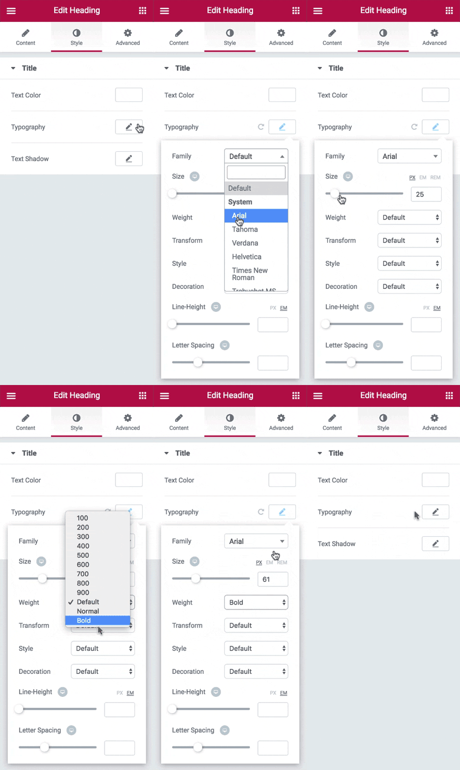
The past year, our panel was introduced with many new features and additions. Some of our users felt the panel was ‘overcrowded’ and confusing. As a result, we started working on more advanced controls that made things easier.
The result is a brand new popup control for typography, box shadow and text shadow settings.
If you edit any text widget, you will see that these settings have now been placed inside a popup window. This change will help you get better focus when customizing style settings.
Useful Elementor Widget In Your Dashboard
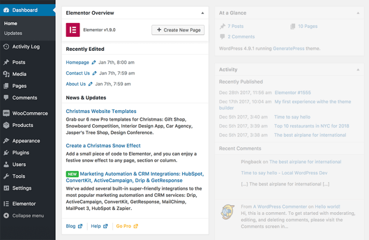
This version introduces a new Elementor Overview widget into the WordPress main dashboard, making it more convenient for users to create a new page with Elementor, access recent documents and read about newly added feature updates.
This change is especially helpful to users who use Elementor daily. Instead of creating a new page, naming it, saving it as draft and finally clicking on ‘Edit with Elementor’, you can now click on the ‘Add new page’ and go straight to Elementor.
Kickstart 2018 With a Bang!
We are happy to introduce this new functionality to our (almost) half a million users.
Elementor Version 1.9 includes several other improvements, including added Gutenberg compatibility, privacy mode for the video widget and other development improvements. You are invited to visit the Changelog for a complete list of changes.
2018 promises to be a big year for Elementor and its community, potentially reaching millions of users and rolling-out exciting never before features.
What other capabilities would you like to see inside the Template Library? Let me know in the comments below.
Looking for fresh content?
By entering your email, you agree to receive Elementor emails, including marketing emails,
and agree to our Terms & Conditions and Privacy Policy.
