Black Friday is upon us, and with it comes great responsibility.
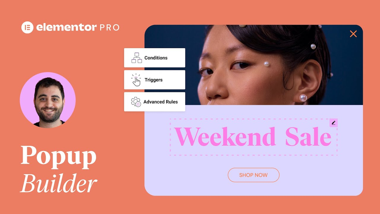
After designing our BF Landing Page, we completed the job with a Popup – using Elementor’s Popup Builder.
We’ve been getting many requests asking to show how this popup was created.
So here it is! A step-by-step tutorial demonstrating how we did it. And to make it even better, we’ve included the images we created here at our studio so you could easily follow along!
In this tutorial you’ll learn how to:
✔︎ Use Elementor’s Popup Builder
✔︎ Design with Motion Effects
✔︎ Set up conditions & triggers
✔︎ And more!
hi-oh it’s live from elemental today I
have something special in store for you
I’m sure you must have come across our
extraordinary Black Friday monster
pop-up
wonder how we made it it’s not as hard
as it might seem the pop-up has a black
friday monster set as its background
image and if we open the navigator by
pressing ctrl or command I we can see
that it consists of two sections the
helicopters for example are two images
each set with its own custom position
and motion effect just like these
navigate to labels indicate okay enough
chitchat
let’s dive in and make it together first
in your dashboard go to elementals
pop-up builder click add new and give
you pop-up a name
then create the pop-up
we won’t be choosing a premade pop-up
from a library because we are building
house from scratch so go ahead and hit
close
in pop up settings and the layout set
the width to a thousand pixels and leave
the rest as is
in the style tab and the pop-up set the
background tab to classic
and choose the black friday monster
image
in color slide the opacity all the way
down
then set the image to no-repeat
set the position to custom
set the exposition to 50%
exactly in the middle of the column
the box cutter in the overlay drop-down
set the background tap to classic and
give it this dark color drag down the
opacity to about 75%
in the close button drop-down set the
position to outside and set the vertical
and horizontal positions to 25 and 33%
respectively
set the color to white and drop the
opacity to about halfway
on hover set the color to white
I’ll leave the background-color blank
and set the size to 21
now let’s move on to the Advanced tab
the only thing we will do here is give
the pop-up a padding of 200 pixels all
around cool our Black Friday monster
pop-up is taking shape it’s time to add
the helicopter images texts and button
widgets let’s start by dragging in an
image widget
I’ll choose my cool left helicopter
image
and in the style tab set the width to
in the Advanced tab I’ll start off with
the custom positioning settings I’ll
give it a custom width of 270 pixels and
set its position to absolute so I can
place it exactly where I want I’ll make
sure to set the horizontal and vertical
orientations to top and left I can
either drag the helicopter to where I
like
or set the position accurately by using
the horizontal and vertical offset
sliders like you see here
now let’s bring it to life a bit in the
motion effects drop-down toggle on Mouse
effects and set the mouse track
direction to direct this way the
helicopter moves in the same direction
as your mouse
cool let’s give it an entrance animation
as well slidin down looks good here
great now let’s add the right helicopter
image and make them fly around the Black
Friday monster together I’ll go ahead
and duplicate the image and change it to
the right helicopter
in the advanced tab
and the positioning change the
horizontal orientation to right and set
the offset to 20 pixels set the vertical
offset to negative 120 pixels now let’s
tweak the motion effect a bit in Mouse
track change the direction to opposite
and speed to 3 cool now it seems as if
the helicopters fly independently
I’ll go ahead and open up the navigator
so we can see what we have so far I’ll
call this section helicopters so things
are clear great let’s move on to the
text same button I’ll go ahead and add a
new section with one column and drag it
below helicopters
I’ll name it texts plus button for this
pop-up I’ve gone ahead and added three
individual heading widgets for my texts
so I can style them to fit in the pop up
exactly how I like I’ll start with the
first one drag in the heading widgets
and type the text
then align it to the center and style it
a bit
you
duplicate the widget and change the text
you
I’ll set the font size to 36 pixels and
line height to 0.1 eeehm so it moves a
bit towards the first heading then
duplicate and change the text again
here I’ll set the font size to 120
pixels and line height to 1.1 a.m. so
there’s more space between these
headings great we’re almost done time to
drag in the baton widget
change the text
and add a link over here
align the button to the center and set
the size to medium
I’ll choose the gift icon from our
awesome library
and set it to appear after the text
I’ll add some spacing as well great now
let’s style this discount button I’ll
leave the default font family which in
our case is active grotesque and I’ll
set the size to 18 pixels weight to 700
and transform to a per case
great now for the colors
give it a white text color
and a nice pink red for the background
on hover I’ll just give it a slightly
darker background color then add a
hundred pixel border radius on all sides
lastly in the Advanced tab I’ll add a
little bit of padding on the top so
there’s more space between the text and
the button
and in motion effects I’ll give it an
entrance animation I’ll go for fading
app and give it a slight delay cool now
that we’re done designing it’s time to
publish and set these pop-ups conditions
and triggers I’ll add a condition for
this pop-up to only show on the upgrade
landing page
and I’ll set the on page exit intent to
trigger the pop-up so that it will show
when visitors move their mouse towards
the edge of the page
in advanced rules I’ll go ahead and set
it to only show once so we won’t to
annoy anyone god forbid in show on
devices I’ll set it to only show on
desktop depending on your marketing
campaign pop-ups on mobile devices don’t
really contribute to it of course feel
free to make some responsive adjustments
and set it to show on mobile as well
well that’s it now you know how to
create a Black Friday monster pop-up and
bring your own ones to life have fun
playing around and don’t forget to
subscribe to our YouTube channel for
more tips and tutorials ciao for now
