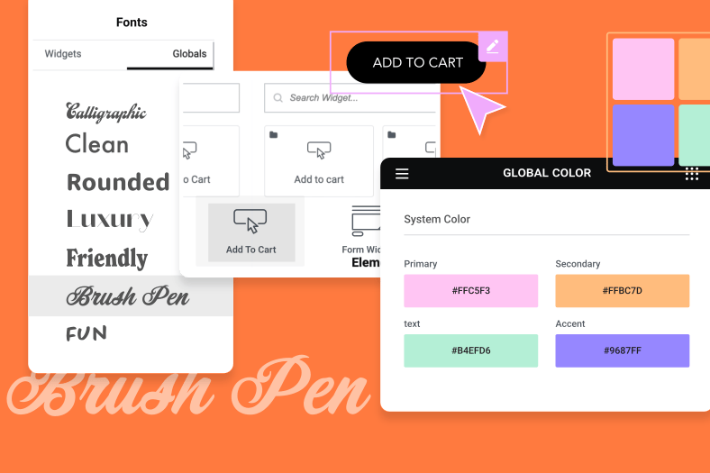
Color is one of the most fundamental cornerstones of web design. If you’ve built Elementor sites before, you know that the color picker is a tool used dozens of times throughout each project.
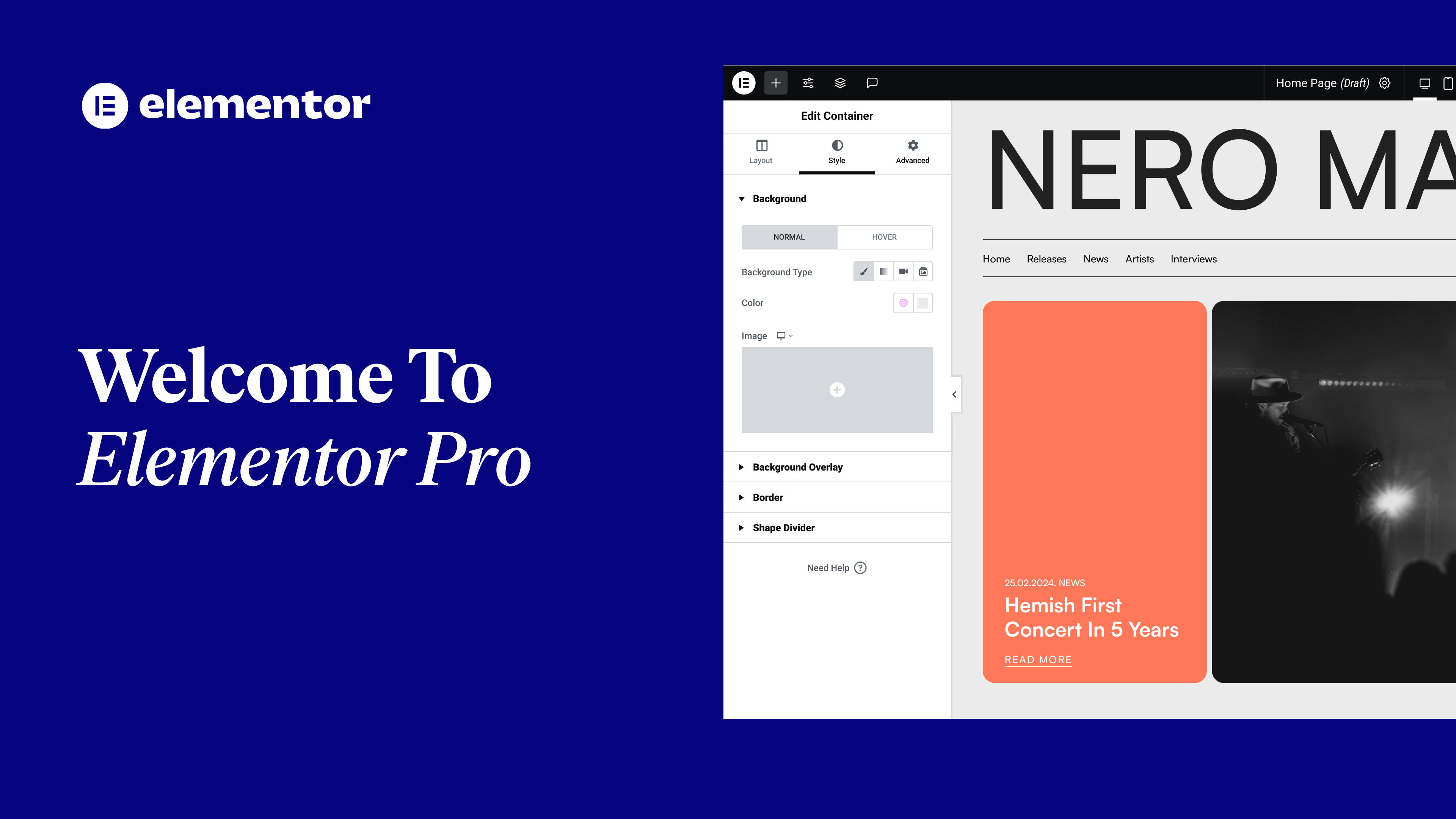
And talking about projects…Tired of getting sore eyes when editing your websites until the wee hours of the night? Meet Elementor Dark Mode!
In this tutorial you’ll learn how to:
✔︎ Save colors using the color picker
✔︎ Use Dark Mode in Elementor
✔︎ Set the background slider’s images position and scale
✔︎ And more!
hi-oh adds if from elemental as you
might know color is one of the most
fundamental cornerstones of web design
and the color picker is a tool we use
over and over again throughout each
project today I’ll show you how our
color picker helps you design faster and
more efficiently everywhere across your
site but first let’s change our
interface to doc mode in the editor
click on the hamburger menu and then
choose preferences change the UI theme
to doc hi doc mode how are you doing you
can also choose auto detect which will
sync it with your OS setting the doc
mode is great for reducing eye strain
when editing your websites at night and
can save some of your laptop’s battery
as well great now with the dock mode
activated I’m feeling inspired to
freshen up this design a bit so let’s
make some changes and check out some
other cool features along the way I’ll
start off with the left column in style
I’ll change the background color to this
dog blackish gray I want to keep this
color so I can use it later everywhere
across the site all I need to do is
click the plus icon over here
cool it’s added to our color picker
instantly I can also delete the colors
that I don’t need simply select the
color and drag it into the bin
we can also organize our colors by
dragging them to where we like as you
can see you can easily create your sites
color palette on the go I’ll go ahead
and make this heading lighter
and save the color as well let’s also
apply to the text below
and I’ll change the all dessert button
to this playful orange
and on havre I’ll use the same light
color from before
now let’s tweak the category buttons I
want these to blend in nicely with the
columns dark background color so I’ll
use the blackish gray I added before
I’ll make it a little lighter by
adjusting it over here then save the
color on hover I’ll change the
background to the orange we added before
great looking good as you can see saving
your favorite colors straight from the
picker itself really helps us design
faster and more efficiently
it allows us to save colors on any
picker on any widget end on any page and
then automatically syncs with every
other picker on your site
California klett smoove on to the right
column I want to bring it to life a bit
so in style and the background I’ll
change the type to slideshow I’ll add
some images
and set the duration to a thousand
milliseconds so they change every second
I’ll change the transition duration to
the fade takes three seconds and makes
the transition easier on the eyes
and change the background signs over
here
as well as its position cool that looks
great
the background position for mobile I
click on the desktop icon and choose
mobile
lastly to make this area look good on
mobile – I’ll change the content to a
shorter text so let’s duplicate and
shorten it a bit
cool this is more suitable for mobile
now to hide this text on mobile all I
need to do is go to the Advanced tab and
under responsive switch hide on mobile
to hide as you can see it’s grayed out
indicating that it’s hidden
now let’s hide this mobile text on
desktop
you
great
it’s hidden as well well that’s it I’m
pretty happy with the changes are made
and we’ll keep rocking this dog mode for
the time being enjoy playing around with
the color picker and improve your own
website color schemes don’t forget to
subscribe to our YouTube channel for
more tips and tutorials ciao for now


