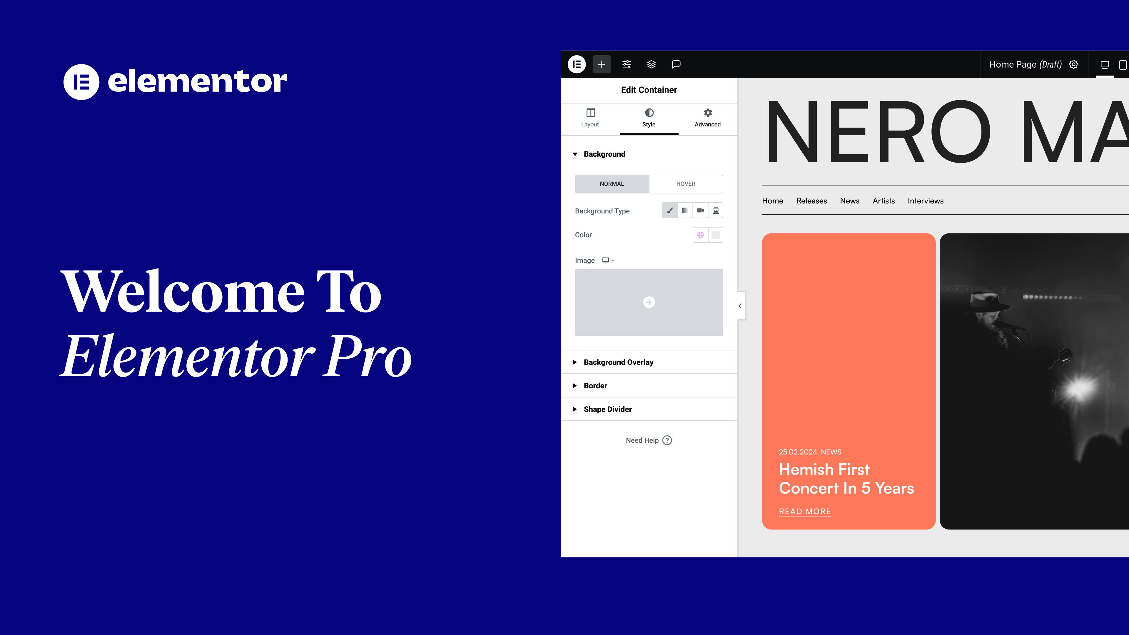
In this tutorial, we’ll go over how to use inline positioning in Elementor 2.5.
You’ll learn:
✔︎ How to align elements side-by-side in the same column
✔︎ Control an element position
✔︎ Use custom width to align your inline elements
hi Cassie from Elementor here today
we’re going to learn about inline
positioning in Elementor we’ll learn how
to align elements side by side in the
same column control an element position
and use custom width to align your
inline elements let’s dive in here I’m
working with a pre-made design but as
you can see it’s not entirely finished
in the first section we have two buttons
in the same column we want our buttons
to align side by side let’s do it click
the button and under advanced custom
positioning click the width drop-down
and choose inline now let’s do the same
to the second button cool easy-peasy
over to the next example we have four
columns hosting to inline widgets a
heading widget and a text editor widget
with vertical align we can control the
position of our widgets to the center
start and end end is perfect for this
design so let’s right-click and copy
paste style for the rest of the widgets
awesome moving on to our next section
let’s add our services features here
just below the text so drag in an image
box widget and let’s change our image
remove the title and paste in some text
in the style tab change the image width
to 40% under content align to the left
in advanced custom positioning change
the width to custom and set it to 30% of
the column width now right click and
duplicate twice and change our images
and text
you
our design is all set let’s check it out
looks phenomenal inline positioning
saves you loads of time and simplifies
your workflow don’t forget subscribe to
our YouTube channel for more fun videos
and tutorials catch you later


