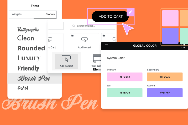
Join Ziv, Elementor Educator 🎓 for a webinar on Creating a Design System with Global Colors and Fonts with Elementor.
You’ll learn how to:
✓ Create a homepage step-by-step with Elementor.
✓ Use Elementor’s free templates Library.
✓ Build a design system with Global Colors and Fonts, and understand how it can be applied to existing as well as new sites.
✓ Save the page as a template, with global styling already setup, and use it to create a contact us page.
✓ Learn how Theme Style & Global Colors and Fonts can be used together, to create an even more streamlined design system.
✓ Discover how to make your designs 100% responsive.
- Intro:
Hi All, and welcome to this Special Global Colors and Fonts Webinar. I am Ziv, a web designer and Elementor’s Lead Educator. And Today we will build a 2 page mini site based on a free template from the Library.
We will focus on Elementor’s Design System features and see how to set up and apply Global Colors and Fonts.
As you know, Colors and Fonts are the building blocks of a web designer’s work.. and are assigned to elements consistently throughout your site.
Elementor’s Design System features allow you to take control of your site’s colors and fonts more easily and save lots of time in the long run by creating a go-to-color palette as well as a collection of font styles, which you can assign to elements globally, and all from one place.
Okay so what exactly are we doing during this webinar:
We will:
- Create a homepage step by step, based on one of Elementor’s free templates. BTW I am using Elementor’s free and lightweight Hello Theme.
- We will see how to style the page with global colours and fonts, and understand how it works on existing as well as new sites.
- We will save the page as a template, with global styling already setup, and use it to create the contact us page.
- We’ll see how global fonts can be setup for mobile and tablet devices
- We’ll also check out some other global settings that come in handy
- Lastly we will go over Theme Style and see how it can be used together with Global Colours and Fonts to create an even more streamlined design system
Okay so I’ll go ahead and share my screen and let’s make a start
TRANSITION TO SCREEN SHARE
Okay enough babbling..let’s make a start! Feel Free to ask questions in the chat, we will try to answer all of them so don’t be shy!
Default system colours: P #6EC1E4, S #54595F, T #7A7A7A, A #61CE70
Fashion Insight
- In WordPress dashboard > hold down cmd or ctrl + e to open the finder > type: add new page > hold down cmd or ctrl to open it in a new tab, so the dashboard tab remains open for later use.
- Click on the settings cog in the bottom left to enter the page settings >
- Change Title: Home Page
- Explain that we see the Site Title and Description on top
- Let’s go to Site Settings > Site Identity and change the site title + description
- Change to: “Fashion Insight” | “Come See Our Collection”
- You can set your site logo and favicon here as well
- Save + Close Site settings
- We can hide the page title
- But I’ll just change the Page layout: Canvas → with no header, no footer, only elementor – because we will use a template from the library
- Let’s go to Site Settings > Site Identity and change the site title + description
- On the page click Add template > from the Pages Tab Insert ‘Homepage – Restaurant – Page
First Section
- Click on Hero section > Style >
- Background Type > Video
- go back to dashboard tab > Media Library
- Copy & Paste Video Link: hp-hero.mp4
- End Time > Type 20
- Background Overlay > disable
- Border > Solid: 20px Bottom
- Custom Color: #1E1E1E
- we can also set it to be a global color > demonstrate Accent then Primary > we’ll come back to it soon
- Click on Logo > Content > Click Choose Image > Select your Image > Click Insert Media
- Link > Custom URL > to link it to the home page let’s first publish this page
- Search for Home Page > set it
- Style > Max-Width: 100%
Second Section
- Edit Section > Content Width > Drag to 1220
- Click Heading > Content > Type New Collection
- Style > as you can see there’s a custom color already set in the template / this could be your website before updating to Elementor v3.0
- change it to #1E1E1E
- We will use this color on more elements across the site, so let’s turn it into a global color
- Save as “New Accent”
- Hover over global to show it’s set
- Delete the Divider
- Click on Basic Gallery
- change images: click delete icon > reset
- select 6 images SUMMER COLLECTION
- create new gallery/insert
- style > set border type: solid
- width: 4
- color: new accent (demonstrates that you can assign and use these colours anywhere throughout the site)
- Go back to 1st section > Border > assign color to New Accent
- Now all 3 elements have the same color
- Let’s go to the Global Colors via this shortcut
- Let’s change New Accent and see how it affects the site > change to: E1C2B0 → cool it updates immediately
- we can also change our primary, secondary, text and accent colors + Give them a unique name. These are system colours and can’t be deleted.
- set Secondary color to WHITE
- Set Text to BLACK
- Because we will be using these soon
- Lastly, I’ll set the default accent color to the same as the the New Accent color, and delete the new one
- As you can see, there’s a notice explaining that all elements using this color will inherit a default one.
- Let’s delete it and see how it affects the site
- As you can see, the elements we assigned the Global New Accent color to,.. have inherited a default color.
- Depending on your setup .. this could be an Elementor Default color like the Primary color you see for the Heading
- Or from an unknown source, possibly your theme, or your browser, etc.
- I’ll go ahead and set them to the Global Accent color to get them back to how I want
- Lastly, I’ll set the default accent color to the same as the the New Accent color, and delete the new one
- Click on Text Editor > Style
- change text to: Amanda is our amazing fashion designer in Fashion Insight, creating an entire new collection each season. The unique style matches the needs of women for both daily and formal use. Take a peak of our new Autumn collection.
- set text colour to global: text → the black we just added
- Alignment > Click Justified
- Just to demonstrate I’ll Drag in a new Text Editor > as you can see by default it’s set to the system colour called text which we changed to black earlier > this is the default behaviour and for the same reason can’t delete system colours.. We can change their Color and rename them, not delete
- Delete the text editor
- Using the same logic as global colors, it’s Time to check out global fonts
- Click on the Heading > Style
- Like with the custom color, this template comes with some custom typography styles
- But we can also set them to primary, secondary, body, accent, back to primary.
- I’ll leave it on Primary, but change the style via this shortcut
- Click manage global fonts
- Edit Primary
- Family: EB Garamond
- Size 54(px)
- Weight 500
- Let’s also set the body text: Size 16(px) → we’ll use it later on
- Update and close
- Edit Primary
- Delete Testimonials
- Delete Breakfast
Third Section
- Click on Section > Layout
- Type 1220 > I’ll delete the value
- Because instead of setting this manually all the time > go to site settings
- layout > content width: 1220
- While we are here, let’s also set the default page layout so when we create the contact page it’ll automatically be set to canvas already
- page layout: canvas
- update + close
- Back In section settings > Style
- Choose Image ‘Presenting.jpg’ > Click Insert Media
- Click Background Overlay > Select Global Color “Accent’
- Click Heading
- Content: See Our Online Fashion Show
- Style
- Global Text Color > Select Secondary
- Global Typography > Select Primary
- Click on Text Editor
- content: The best way to experience our new collection, live from your browser. Our 25th unique fashion show takes place in the heart of London and will be viewed through Zoom. Contact us for more information and bookings.
- Style >
- Global Text Color > Select Secondary >
- Global Typography > Select Body Text
- Click on Image Carousel Widget
- Image Gallery Click the Reset Icon > Click Yes >
- Add new Images: Select Images (6 ‘Fs’ Images) > Click Create New Gallery > insert
- Slides to show: 4
- Click on button >
- Text: Contact Us
- Link > we’ll add the link to the contact pager after we create it → will come back here
- Size: medium
- Style
- Text color Select Secondary
- Select Hover
- Text colour: Accent
- Background Select Secondary
- Border > Select Secondary
- Add Hover animation: grow
- Typography Select Accent Text
- click on Pencil > and tweak it: set to uppercase (explain that it’s not global anymore) [there’s a bug where uppercase doesn’t work directly]
- Keep Visit Us Section
- Delete Image Source Section
- Click Update > Click Save Option > Save as Template
- Type: Contact Page Template > Hit Save
- We will save this page as a template because the visit us and hero section will be reused on the contact page. After saving the template we’ll delete the visit us section.
- Delete Visit Us Section > Click Update >
- Open Finder (cmd or ctrl + e)> add new: page > hold down cmd or ctrl to open in new tab
- Show it’s already set to canvas > let’s name it: Contact
- Insert contact page template
- Delete New Collection Section
- Delete See our Fashion Show Section
- Keep Hero Section > Change video to: contact-hero.mp4
- Advanced > delete padding
- Layout > min-height 50vh
Second Section
- Advanced > delete padding
- Layout > min-height: 50vh
- Click Heading > Content
- Type Contact Us
- Style
- Global Text Color > Select Accent
- Global Typography > Select Primary
- Delete Divider
- Edit Icon List > Content: delete last icon (only 3 in total)
- Style
- Icon
- Global Color Select Accent
- Text
- text color: text
- Typography > body text
- Size 17(px) >Line Height 1.8 → explain it isn’t global anymore
- Icon
- Click on Maps > Advanced
- border
- width: 5
- color: Accent
- border
- Now that we’re done with both pages, let’s go back to global colours and make some changes, see how it affects the site.
- Change Accent to: 888D85 > update close >
- preview > click logo to Homepage > All colours are updated!
- On Homepage > add contact page link in button!
- Go back to globals via Site Settings > Global Fonts
- Primary
- Font Family: Fredericka the Great
- Primary
- Preview > Homepage > click on contact button
Mobile responsive
- On Homepage in Editor
- Change to tablet mode > heading > typo: shortcut to global fonts > show responsive handles > change size to 45px > this is now set globally so all Text Elements that have this global font style will receive the 45px size in responsive tablet mode, saving lotus of time > you can always tweak it for specific cases as well of course
- Also, just so you know, Back in Site Settings > Layout > Breakpoints > you can set custom Mobile and Tablet breakpoints if you need to
- Another cool global feature is Background
- It allows you to set a default background style for your pages > so if you have a style that repeats itself ..just set it here ONCE instead of styling sections and pages over and over again.
- Choose custom color from picker > Light Grey > clear it
- Update/Close > go back to Desktop Mode
Theme Style and Global Colors + Fonts
- Drag in new heading
- As you can see this widget gets the primary color and primary heading by default. This behaviour happens behind the scenes to make sure widgets and other elements always have a certain style by default.
- And as you’ve seen during this webinar can be styled with global colors and fonts
- I can change it to another global color
- set to accent
- but when I clear the style it’ll automatically go back to its default settings, as you can see by the white tick mark.
- The same goes for typography
- set to secondary > clear it!
- I can change it to another global color
- You can take control over this design layer using Theme Style
- But Why do it?
- Make style changes across your site without coding.
- No need for the theme customizer. Change theme settings from within Elementor.
- Set the default style of plugin elements and Elementor widgets
- Maintain consistent design across the whole site, especially if you use it together with Global Colors and Fonts.. You’ll see soon.
- But Why do it?
- If we go to the content tab > you can see that the heading widget is set to H2 by default. Once again, this is set behind the scenes, and is the widgets default setup. We can change the Headings tags for SEO purposes, but I’ll leave it as H2.
- Let’s go to Site settings > Theme Style
- As you can see we can control the default styling of a couple of elements: Typography, Buttons, Images and Form Fields
- Let’s focus on the Typography settings
- You’ll get a notice to disable the default colors and fonts I was talking about earlier.. To make it work
- Click on it, don’t worry it opens in a new tab
- Check these 2 boxes > update
- Refresh page → to see changes
- Show Style: color and typo aren’t set
- As you can see the default colors and fonts aren’t applied anymore > giving the ability to control this with Elementor’s Theme Style settings
- Let’s go there again
- As you can see we can setup default fallback styles for all types of text styles on your site
- Body text, links, and headings
- Let’s go to H2 > since the heading widget is set to H2 by default
- We can set the typography and color
- Set color to custom: red
- Set typo to custom: Abril Fatface
- Lets update and close and see what we just did
- The heading widget now has a new default fallback style
- Dragging in a new heading widget will come with this style by default now
- But changing the H2 tag to H1 for example will change it, we haven’t defined H1 in Theme Style so it inherits another style from a different source ..such as your browser.
- Delete the 2 headings
- Click on the main heading > we can use Theme Style with Global Colors and fonts as well, giving you even more control
- Let’s reset the color and typography
- Go back to theme style
- Instead of setting custom colors and fonts > use the global ones
- Color: accent
- Typo: Primary [there’s a bug, the font-size isn’t applied]
[transition to big front shot]
Outro:
Okaaaaayyyyy well that’s it! Now you know how Elementor’s Design System features work and use them to set up and apply Global Colors and Fonts on your own site, improving your workflow and saving you lot’s of time.
I hope you learned a lot during this Webinar, and we managed to answer all of your questions.
I’d like to invite you to join our Facebook group for loads of helpful tips and tricks, if you haven’t already.
And become part of our huge Elementor community full of like-minded web creators.. all helping each other become better at what they do.
Also, don’t forget to subscribe to our Youtube channel, which is full of interesting tutorials to help you master Elementor
Aaaand, on our website, check out the help center for easy access to the knowledge base, FAQs, Docs, and more
Lastly, feel free to re-watch this webinar in your own time and create your own stunning designs.. And share them in the comments below!
Good luck!
And most of all ——– enjoy being creative!!
Thanks for tuning in, ciao for now!
#####
which allows you to take over the global design layer normally handled by the theme..
This way you can set fallback styles for various (basic HTML) elements, such as, Headings, Buttons, Images and Form Fields.. No matter the theme you use.
These styles only come into play as a fallback, [visual: close site settings > click on button, clear background colour] if no definitions were set and can be used together with Global Colours and Fonts to create an even more streamlined Design System.
#####
———————–
Global Setup
Click the top left Settings Menu > Click Site Settings
Click Global Fonts > Edit Primary > Family > Select EB Garamond > Size 54(px) > Weight 500
Click Back > Edit Text > Family > Select Roboto > Size 16(px) > Weight 400
Click Back > Edit Accent > Family > Select Roboto > Size 13(px) > Weight 600 > Line Height > 1.2(em)
Repeat for Secondary and Accent
Click Update > Click the back button at the top left
Click Global Colors > hover over the default ‘Saved Color’ and click Delete
Click on ‘Primary’ color picker and type #1E1E1E
Click on ‘Secondary’ color picker and type #DADADA
Click on ‘text’ color picker and type #818181
Click on ‘Accent’ color picker and type #000000
Click Add Color, Type ‘Styling’ set it to #D8D8D8
Click Update then click the X button at the top right
________________________
Fashion Insight
In WordPress dashboard > Pages > Add New > Write A Title > (right click open in new tab) Edit with Elementor
Click the bottom right icon to view the page settings > Hide Title > Select Yes > Page Layout > Select Elementor Canvas
On the page click Add template > from the Pages Tab Insert ‘Homepage – Restaurant – Page’
First Section
Click on header’s section > Style > Background Type > Video > go back to dashboard tab > library > Paste Video Link
https://fashioninsight.elementor.cloud/wp-content/uploads/2020/09/video.mp4
End Time > Type 20
Background overlay > Global Color > click Manage Global Colors > Click Add Color > Type ‘Styling’ set it to #D8D8D8 > Click update and hit the X button. Go back to background overl0000ay > select ‘Styling’ > Opacity > 0.1
*SO: hover over globe > currently set to custom (black in picker) > change to #D8D8D8, explain that we wan’t to save and re-use this colour throughout the design > save as global > Opacity > 0.1
- #D8D8D8: overlays on images and vids + dividers
]Click on Logo > Content > Click Choose Image > Select your Image > Click Insert Media > Link ‘Homepage’’ > Style > max-width > delete the value
Second Section
Edit Section > Content Width > Type 1220
Click Heading > Content > Type New Collection > Style > Global Color > click Manage Global Colors > set Primary to #1E1E1E > Update > X > Select
*assign “styling” to divider > go to globals and change the color to demonstrate
Primary> Global Typography > Select Primary
Click Divider > Style > Global Text Color > Styling (demonstrate that you can assign and use these colours anywhere throughout the site)
Click on Text Editor > Write your content > Style > Text Color > Select Text > Typography > Select Text > Alignment > Click Justified
Right Click on Basic Library Widget > Click Edit > Image Gallery Click the Reset Icon > Click Yes
Add new Images > Select your Images (6 ‘Summer Collection’) > Click Create New Gallery
*demonstrate global fonts, same logic
Delete Testimonials
Delete Breakfast
Third Section
Click on Section > Layout > Type 1220
Style > Choose Image ‘Presenting.jpg’ > Click Insert Media
Click Background Overlay > Select Global Color ‘Styling’ > Opacity Type 0.75
Drag Opacity handle to 0.6 > Then go to Border > Select Solid > Global Color Select Primary > Width > 0, 0, 50, 0 (px)
Click Heading > Content > Type New Collection > Style > Global Text Color > Select Primary > Global Typography > Select Primary
Click on Text Editor > Write your content > Style > Global Text Color > Select Accent > Global Typography > Select Text
Right Click on Image Carousel Widget > Click Edit > Image Gallery Click the Reset Icon > Click Yes > Add new Images > Select your Images (6 ‘F0’ Images) > Click Create New Gallery
Click on button > Type Contact Us > Link > Type ‘/Contact’ > Style > Typography Select Accent > Text color Select Accent > Select Hover > Background Select Primary > Border > Select Primary
Keep Visit Us Section
Delete Image Source (?)
Click Update > Click Save Option ?> Save as Template Type Page Template Hit Save
Delete Visit Us Section > Click Update > Click Top Left Menu > Exit to Dashboard > Click the Top Left WP icon > Add New > In the Title Type ‘Contact’ > Click Edit with Elementor
Click Add Template > My Templates > Click Insert ‘Page Template’ Click Yes Import Document Settings
Keep Header
Delete New Collection Section
Delete See our Fashion Show Section
Click Header’s Section > Advanced > padding > Type 100, 0, 100, 0 (px)
Second Section
Click on Edit Section > Style> Border > Select Solid > Global Color Select Primary > Width > 0, 0, 50, 0 (px)
Click Heading > Content > Type Contact Us> Style > Global Text Color > Select Primary > Global Typography > Select Primary
Click Divider > Style > Global Text Color > Secondary
Edit Icon List > Style > Global Color > Select Text > Typography > Size 17(px) > Weight 300 > Line Height 1.8
Final Global Change
Click the top left Settings Menu Icon > Site Settings > Global Colors > Primary > #C53E74 > Update > Preview Changes
OR / AND
Click the top left Settings Menu Icon > Site Settings > Global Colors > Styling > #B73131 > Update > Preview Changes
———————–
Global Setup
Click the top left Settings Menu > Click Site Settings
Click Global Fonts > Edit Primary > Family > Select EB Garamond > Size 54(px) > Weight 500
Click Back > Edit Text > Family > Select Roboto > Size 16(px) > Weight 400
Click Back > Edit Accent > Family > Select Roboto > Size 13(px) > Weight 600 > Line Height > 1.2(em)
Repeat for Secondary and Accent
Click Update > Click the back button at the top left
Click Global Colors > hover over the default ‘Saved Color’ and click Delete
Click on ‘Primary’ color picker and type #1E1E1E
Click on ‘Secondary’ color picker and type #DADADA
Click on ‘text’ color picker and type #818181
Click on ‘Accent’ color picker and type #000000
Click Add Color, Type ‘Styling’ set it to #D8D8D8
Click Update then click the X button at the top right
