Want to go from design prototype to a live WordPress website in the fastest way possible?
whether you prefer to create your
website mock up on Photoshop or sketch
once it’s done and you’ve got your
clients approval you still have to
transfer your design to the actual site
in this Monday masterclass we’ll be
showing you our recommended process for
transferring your designs to your
WordPress website
moving from PSD sketch Wix and any other
tool to WordPress and element or in the
smoothest fastest and most efficient way
now you should know there is no magic
button to press for converting from one
tool to WordPress
however since elemental is so
user-friendly we’ll show you just how
easy it is to perfectly recreate your
design in no time and this is actually
the process that our designers used to
create elemental templates they first
design it on sketch and then recreate it
in elemental let’s get started this is
the approved draft of the brand new
template kit our designers will be
publishing very soon which makes you
guys some of the very first people in
the world to see this sneak preview it
doesn’t matter if you use sketch
Photoshop Adobe XD or any of the tool
the process is exactly the same and
we’re going to take this prototype and
recreate it in elemental now when
building this prototype our designers
already had elementals widgets in mind
and we suggest that you do the same
because it will save a lot of time for
example to create this section here I’ll
use one section for the hero and add a
couple of headings and to create this
section over here I’ll use a section
with the shape divider effect to get
these angled lines and I’ll use some
image box widgets to create these
elements here so let’s get cracking and
create this page using elemental step
number one preparation as you can see
we’ve already prepared all the visual
assets the images and icons we’ll be
using later we’ve created a new page and
we’re
editing it in Elementor in the page
settings I’ve already named the page and
sets our page layouts to elements or
canvas for those of you who prefer to
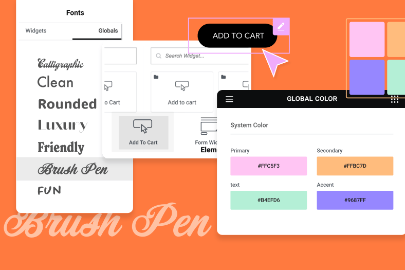
preset your colors and fonts we’ll do
this right now by clicking on the menu
icon or hamburger and select the color
picker we already know what colors we’ll
be using
so we’ll select each color dial in or
paste in the new color code from our
Photoshop or sketch file and click apply
and the same goes for the fonts for this
particular page we’re using google fonts
but you can just as easily upload a
custom fonts into elemental step to
translate our design into Elementor
let’s kick off by adding our first
section a single column section in the
Navigator will give it the appropriate
name hero now we’ll go to the Edit panel
and in the style tab we’ll add our hero
image that we’ve already resized in
Photoshop we want this in the middle so
we’ll set the position to Center Center
set the attachment to fixed and we’ll
also enable the scrolling effects and go
into the scale parameters and have the
direction to scale down and the
scrolling speed to 3 and we also want
the viewpoint to be from the bottom
these are things that we’ve already
discussed in the design meetings in the
background overlay settings will
recreate the gradient from our sketch
file by using the almost black for the
first color and the blue or bluish
violet with a little transparency for
the second color now we’ll go to the
Layout tab and set the section width to
screens and set the minimum height to
column we’ll drag a heading widget
and then duplicate it will hop over to
the editor panel for the top heading and
will paste the text believe in yourself
from our sketch file set the HTML tag to
h2 and alignment to Center and the style
tab we’ll pick our yellow color for the
text and then in the typography settings
will select the Helvetica font and set
it to 30 pixels set the weight to 300
transform to capitalize and the font
style to oblique for the second heading
over here we’ll go to the content tab
and paste the text be the best you can
be set the HTML tag to h2 and the
alignment to Center in the style tab
we’ll set the text color to white then
in the typography settings will select
the racing sans 1 font set it to 110
pixels set the weight to 400 transform
to uppercase and let’s tweak the line
height to about there we also need to
add a button which will drag down here
now we’ll paste our text our classes
align it to center we’ll add an icon
from the library and set it to appear
after the text
in the buttons style tab will go into
the typography settings and we’ll select
our racing sans one font set it to 18
pixels set the weight to 400 and
capitalized will set the normal view of
the button with the text in our violet
color and the background in the yellow
and we’ll select the opposite colors for
the hover effect here we’ll have to use
a bit of gut feeling it looks like we’re
gonna need some padding and we’ll do
that in the Advanced tab and we’ll add
about 50 pixels of padding to the top
here as you can see we need to tidy up
the column that’s holding the widgets
here in our section and we’ll do that by
selecting the column and in the editor
we’ll select the vertical alignment to
middle and set the widget space to 30
pixels in the Advanced tab we’ll add
about 250 pixels of padding to the left
and the right and add 100 pixels to the
top okay now we’ll save this draft
before moving on to the next step step 3
Corrections for responsive views the
importance of responsive views and how
to adapt your web designs to fit the
screens on various devices is something
we’ve spoken about in a previous
masterclass and just as we emphasized
then the most efficient practice is to
adapt our designs for responsive views
after each section rather than after a
full page in responsive mode I’ll start
with the tablet view and set the
sections minimum height to 70 vertical
height or VH we also want to make sure
that the scrolling settings for the
sections background are the same now
we’ll go to the column settings and set
the width to 100% and in the advanced
setting we’ll set the padding on both
sides to 15% that should look nice now
we’ll scale the size of the top heading
to around 20 pixels and then the size of
the second heading to 72 pixels and
since there are no changes for the
button we’ll save the draft and move on
to the mobile view again we’ll start
with the section here we calculated a
minus 90 pixels to the top margin and
we’ll add padding to the top and bottom
of 25%
we’ll then go to the column and add 5%
of padding all around now we’ll scale
the size of the second heading to 55
pixels and there’s not much left to
change with the button in the mobile
view except for perhaps getting rid of
the additional padding in the Advanced
tab which we’ll do by setting it all to
zero will save our draft and just like
that we’ve translated our entire hero
section across our three different views
we haven’t used an ounce of code we
haven’t had to change anything in our
original design and even if we did we
can make those changes on the fly and
see the results instantly in front of us
now having just seen how easy and
intuitive this process is many of you
might be getting that itch need to ask
why don’t we create these prototypes or
drafts or mock-ups directly in elemental
and the truth is you can you can design
and create your page build elements even
print it all to PDF and send drafts to
your client however the vast majority of
designers prefer to concentrate all of
their trial and error in a safe zone so
tools like sketch Adobe XD in Photoshop
our environments that the designers are
well-acquainted with they rely on them
because of the flexibility that they
offer designers when they want to play
around with ideas and need to see
everything all at once all of those
assets across the entire site and who
can blame them
elemental was created by designers who
not only understand the need for this
safe zone
they rely on it themselves this is
precisely why it was designed to combine
the flexibility of the safety zones with
the ability to see what the results
would look like on various devices in
real time ok so moving on we’ll add a
new section we’ll set it to full width
with no gap between the columns with a
minimum height of 90 pixels and we’ll
set the column position to top now
notice that the bottom border of this
section is at an angle we’ll create this
effect in the style tab using
shape divider feature will select bottom
and we want it to tilt we already know
that we want it to be blue and we know
that it should be 50 pixels high and
we’re going to flip it we also want it
to float over the hero section so we’ll
go to the Advanced tab and drop the top
margin by minus 140 pixels and then add
will create the downward button by
dragging a button widget and erasing the
text we’ll align it to the right and
select our icon from the library
in the style tab under typography will
enlarge the font size to 25 pixels to
make that icon a bit bigger next we’ll
select the same colors as we did in the
previous button and we’ll add some
padding
now let’s add some box-shadow and raise
the blur a bit we also want this button
to overlap the next section so we’ll set
the bottom margin to minus 15
on to the next section we’ll set it to
be 1200 pixels wide like our hero
section in the style tab we’ll set the
background to a solid blue
the bottom border of this section is at
an angle and will create it again by
going to the style tab using the shape
divider feature and we’ll select bottom
and set it to tilt at 30 pixels high we
can create the yellow border by
selecting yellow as the colour of the
divider and will flip it will also add
the padding we need in the Advanced
section and set it to 50 pixels on the
bottom now we’ll link the downward
button we made to this section by
quickly setting up an anchor widget
we’ll name it
icons and then go to the button and in
the editor under content tab we’ll set
the link to icons
and done now to build up the icon
structure itself we’ll drag an inner
section widget like we mentioned before
and we’ll use the same width settings as
the section 1200 pixels and I’ll add the
the bottom
we’ll use image boxes here because they
include a heading and a description and
I’ll select my image
I’ll paste in the heading and then the
description and in the style tab will
reduce the spacing of the image to zero
and the width to 22% then we’ll set the
spacing of the title to six the color to
white
and in typography we’ll set the font to
racing sans one size 24 weight 400 and
uppercase and then we’ll set the
description color to white and the font
to Helvetica and set it to 16 pixels and
we’ll set the weight to 200 transform to
capitalize and the font style to oblique
now this would be a perfect time to
review what we’ve done in responsive
mode and make the necessary Corrections
exactly like we saw earlier now with
your permission we’ll skip to the next
stage so that with everything looking
great and responsive you will just
duplicate the icon and text we just
created change the icons and the text to
what they should be and this is the
result in responsive mode again
adjusting designs across the various
responsive views section by section
saves us time and headaches and what’s a
surprise we’re done with this section
too now from here on out so the process
will only get quicker we can duplicate
sections save widgets as global widgets
save entire pages as templates and use
them as a foundation for the rest of the
pages in our website all this to save
having to recreate elements from scratch
and without having to use any code this
week we saw how fast and simple it is to
take your designs from sketch Photoshop
or any other tool that you prefer and
recreate them using Elementor for your
WordPress website to date anyone who has
tried using Elementor for this process
has continued to work this way and never
look back
we hope this masterclass has been
helpful and inspiring as web designers
and creators were sure that you’ll agree
we’re always happy to hear of ways to
get the job done faster and more
efficiently and we’d love to hear any
more ideas tips and tricks that could
help other users speed up this process
even further after all our goal is to be
the best at helping others excel at
their craft
speaking of which make sure you never
miss a masterclass by clicking on the
subscribe button and tap that bell
looking forward to seeing you all next
week thanks for watching
