
Add the widget to the canvas
- In Elementor Editor, click +.
All available widgets are displayed. - Click or drag the widget to the canvas. For more information, see Add elements to a page.
The Post Navigation widget is a Theme Element. It is one of the available Single Post Template widgets used to dynamically display links to the previous and next posts on a website, typically at the end of each blog post.
This allows site visitors to navigate to the previous or next post without returning to the main blog page.
Sophie is revamping a website to improve user experience and increase engagement. They update the single post template to include a sleek design with visually appealing elements. As part of this redesign, Sophie integrates the Post Navigation widget at the bottom of each post.
When visitors read one of the site’s blogs, they’ll find the navigation links below the post. With just a click, readers can easily navigate to the previous or next blog without returning to the main/archive blog page.
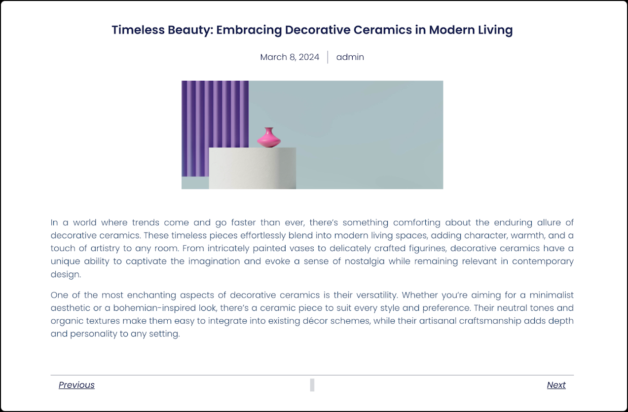
- Recipe blogs allow readers to navigate between different recipe posts seamlessly.
- Enhance user experience on photography portfolio websites by implementing navigation links to browse photo galleries easily.
- Add the Post Navigation widget to the canvas. For details, see Add elements to a page.ImportantThis widget is a REQUIRED element on the Single Post Template. If this widget is not added to the Single Post Template, the Elementor editor will not load. For more information, see Create a single post template.
- In the Content tab, Under the Post Navigation section, use the Label toggle to show or hide the previous/next labels.

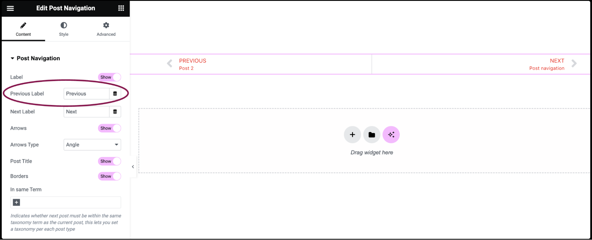
- In the Previous Label field, specify the text for the label representing the previous post. You can enter custom text or use Dynamic Tags to generate the label dynamically.
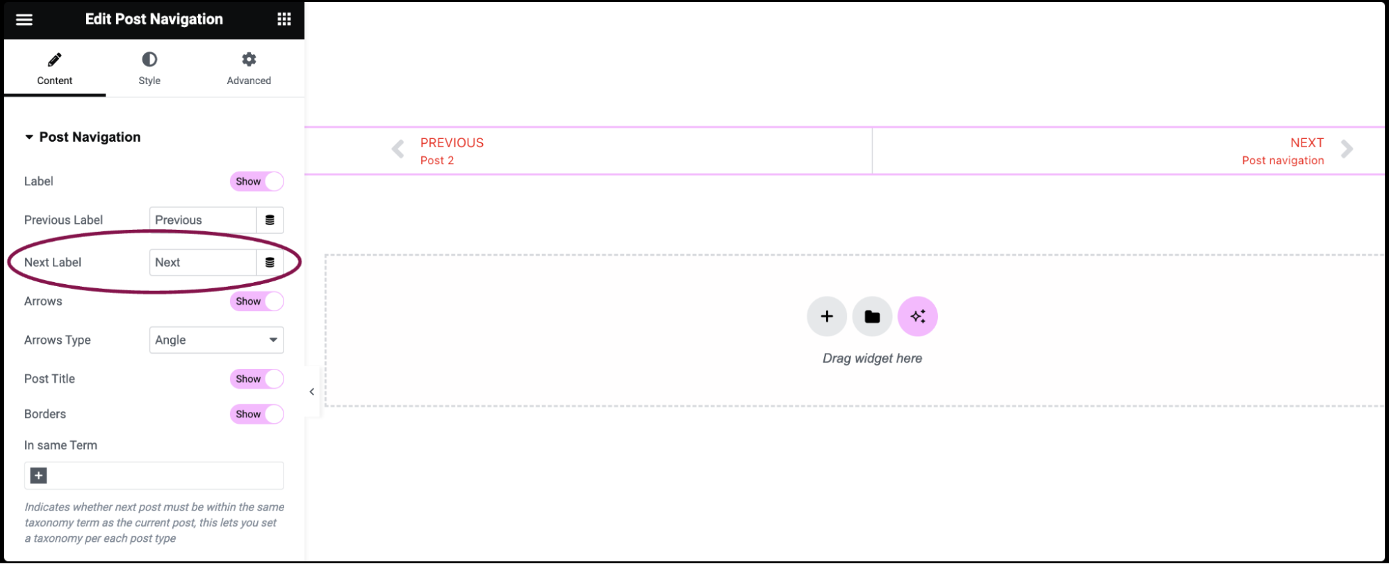
- In the Next Label field, set the text for the label representing the next post. You can enter custom text or use Dynamic Tags to generate the label dynamically.
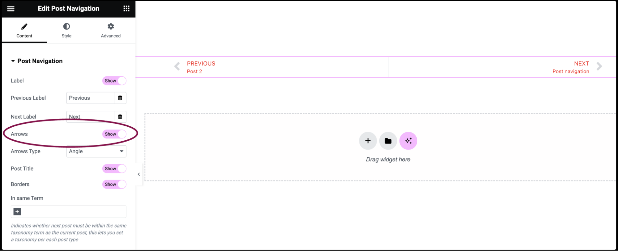
- Use the Arrows toggle to show or hide the navigation arrows.
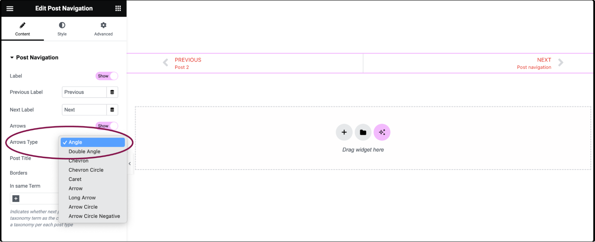
- In the Arrows Type field, from drop-down options, choose an icon to represent the navigation arrows.
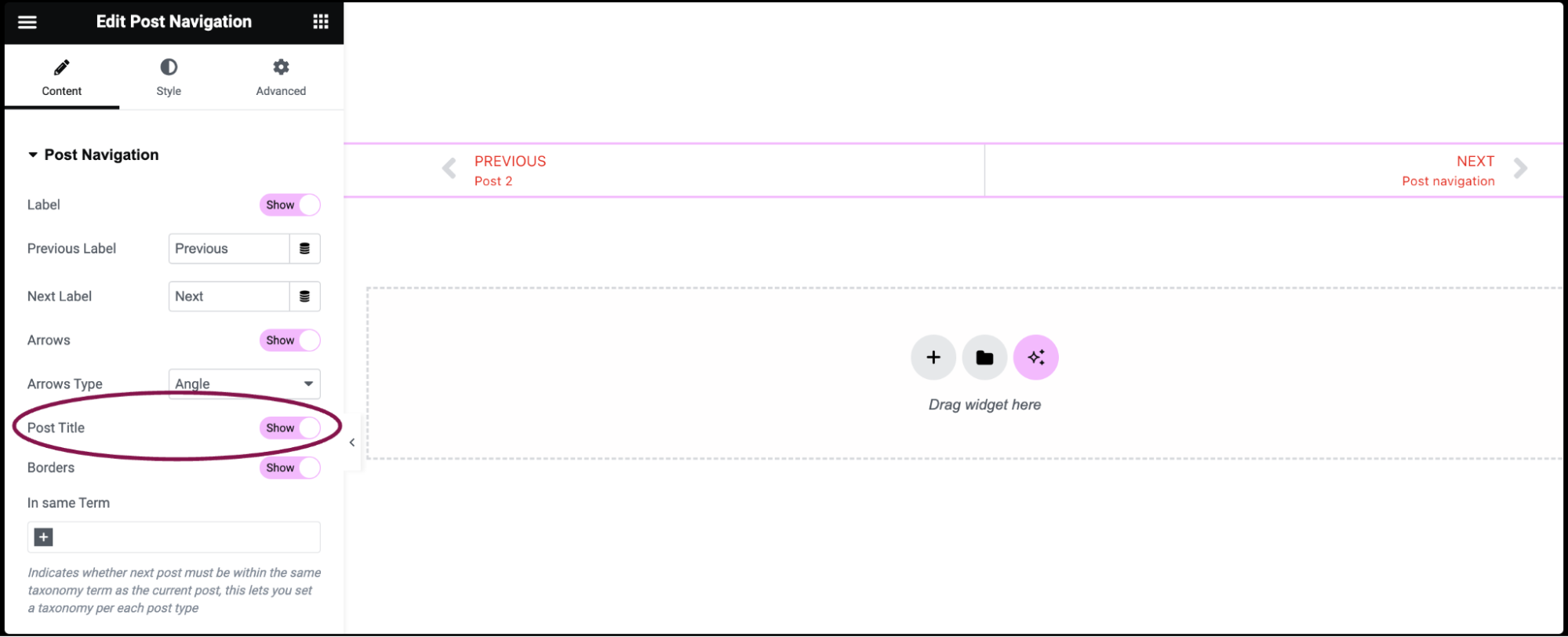
- Use the Post Title toggle to show or hide the title of the previous or next post.
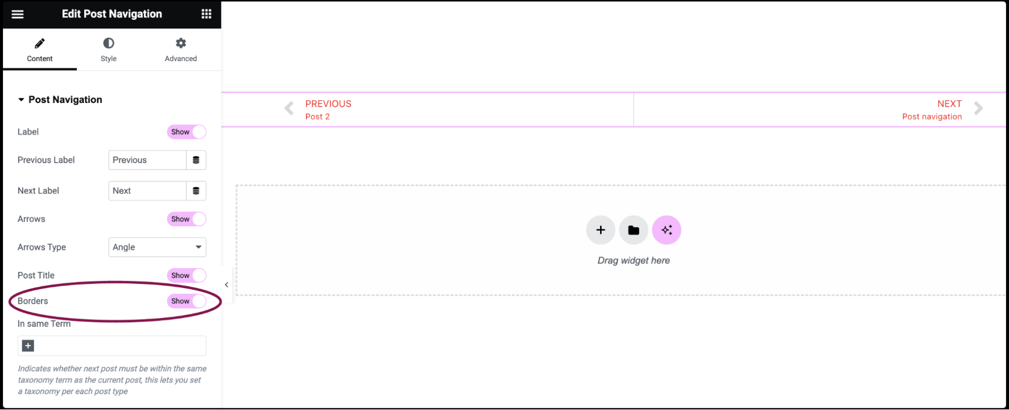
- Use the Borders toggle to show or hide borders around the widget.
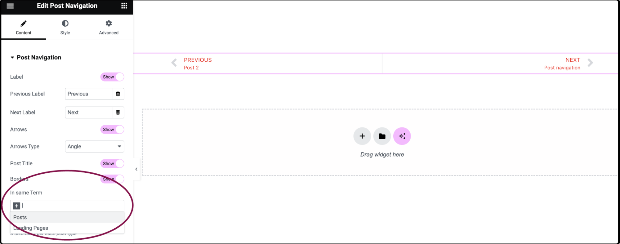
- In same Term field, determine whether the next post must belong to the same taxonomy term as the current post; this lets you set a taxonomy per each post type.
You can customize your widgets using content, style, and other advanced parameters, offering you great flexibility in tailoring them to your needs. Click the tabs below to see all the settings available for this widget.
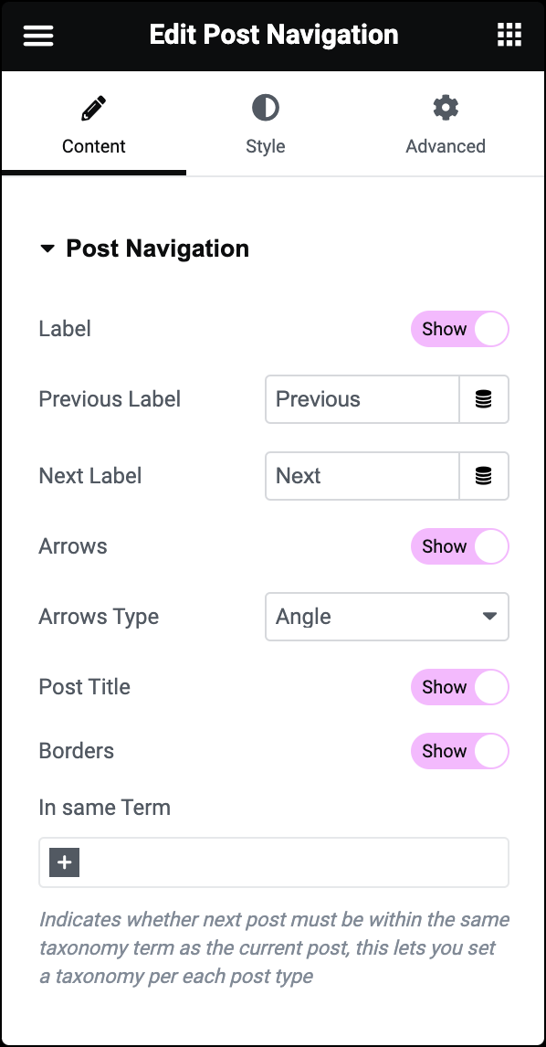
Label
Show or Hide the Previous/Next labels.
Previous Label
Enter the text or use a Dynamic Tag for the Previous label in the field.
Next Label
Enter the text or use a Dynamic Tag for the Next label.
Arrows
Show or Hide the navigation arrows.
Arrows Type
Select an icon to represent the navigation arrows.
Post Title
Show or Hide the title of the previous or next post.
Borders
Show or hide borders around the widget.
In same Term
Indicates whether the next post must be within the same taxonomy term as the current post, this lets you set a taxonomy per each post type.
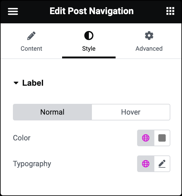
Color
Choose the color of the labels for Normal and Hover states.
Transition Duration
In the Hover state, you can set Transition Duration. This is the length of time it takes for the label to change its appearance.
Typography
Set the label’s typography options. Learn more about Typography.
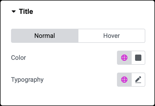
Color
Choose the color of the labels for Normal and Hover states.
Transition Duration
In the Hover state, you can set Transition Duration. This is the length of time it takes for the label to change its appearance.
Typography
Set the title’ typography options. Learn more about Typography.
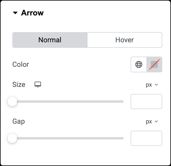
Color
Determine the color of the navigation arrows for Normal and Hover states.
Transition Duration
In the Hover state, you can set Transition Duration. This is the length of time it takes for the label to change its appearance.
Size
Set the size of the navigation arrows for better visibility.
Gap
Adjust the spacing between the arrows and the accompanying text.
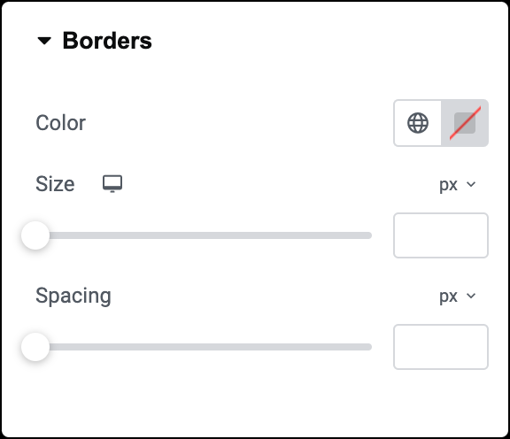
Color
Choose the color of the borders around the widget.
Size
Set the thickness or size of the borders.
Spacing
Define the spacing between the borders and the text for a balanced appearance.
The Advanced tab provides options to control widget position, adjust spacing, add custom code, and more.
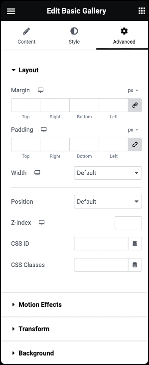
Advanced
Learn more about the Advanced tab settings.