
Add the widget to the canvas
- In Elementor Editor, click +.
All available widgets are displayed. - Click or drag the widget to the canvas. For more information, see Add elements to a page.
The Call to Action (CTA) widget helps you create attractive boxes to encourage your website visitors to take specific actions, like signing up for a newsletter, purchasing, or contacting you. It includes text, buttons, and images to grab attention and prompt engagement.
The widget also uses animations and CSS effects to create user interactions that appear when the user hovers over the box.
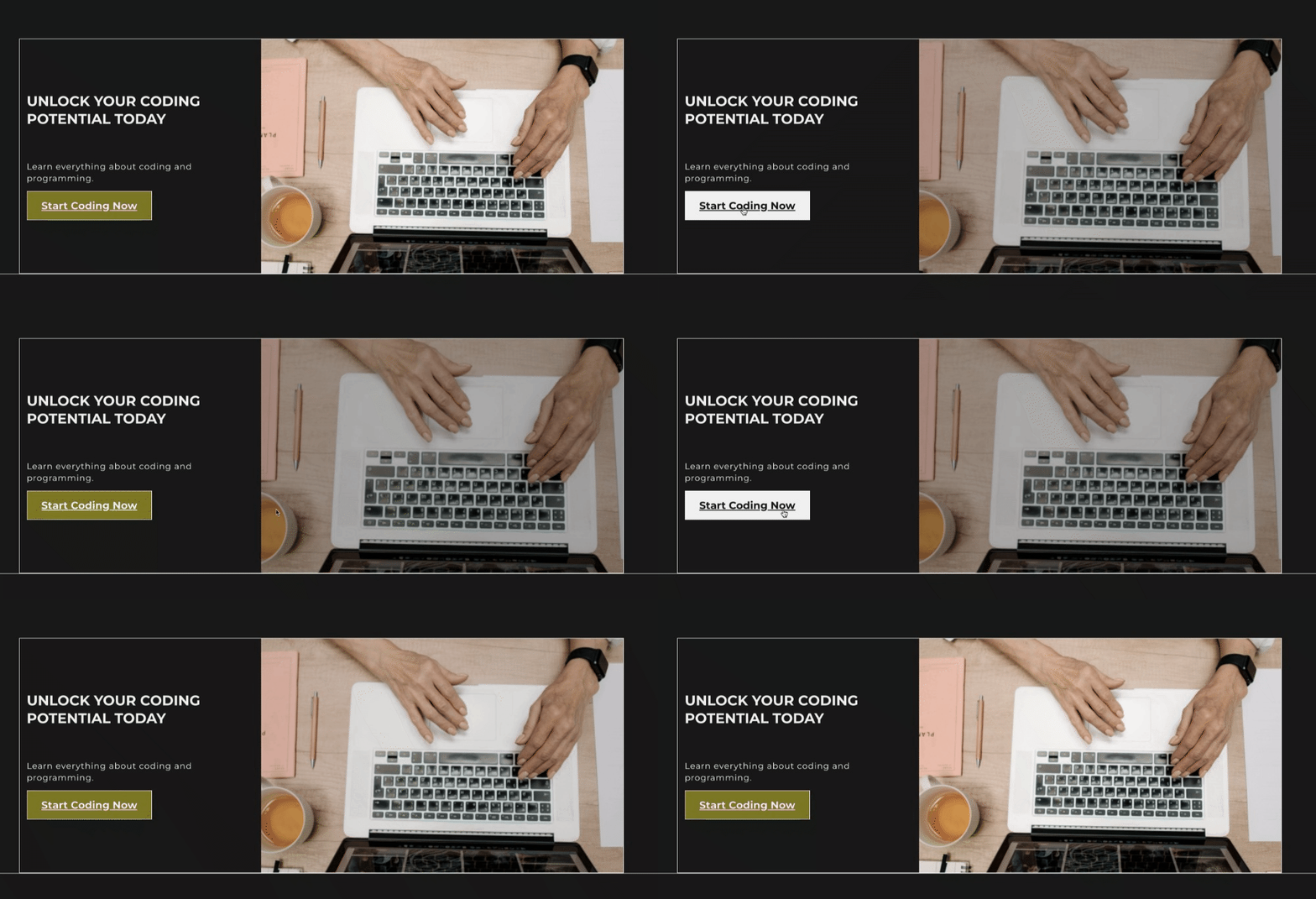
John is developing a platform for online coding tutorials and courses. They design a strategic section on the website’s home page using the Call to Action widget.
John crafts a compelling headline to entice visitors. Below the headline, they include a description showcasing the platform’s interactive learning approach. To prompt immediate engagement, John customizes a prominent button with the text “Start Coding Now” linked to the registration page.
Leveraging the styling options, John customizes the CTA section with sleek typography, a modern background gradient, and subtle hover effects on the button for an interactive user experience.
- A nonprofit organization encourages donations for a humanitarian cause through a compelling call to action.
- An e-commerce store enticing customers with limited-time offers using eye-catching call-to-action sections.
- A personal blog invites readers to subscribe to a weekly newsletter with an engaging call to action.
- A local restaurant is enticing online orders and reservations through its website’s interactive call to action section.
- Add the Call to Action widget to the canvas. For details, see Add elements to a page.
- In the Content tab, under the Image section, choose Skin type: Classic or Cover.
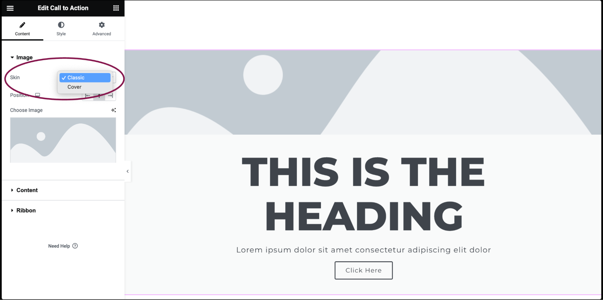 If chosen Classic Skin:
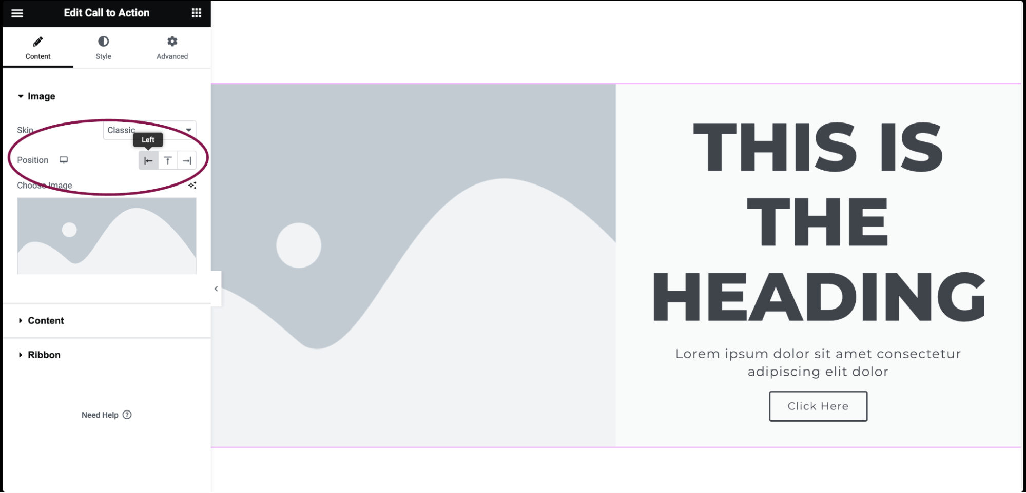
 - In the Position field, determine how the image is positioned relative to the content. Options included are Left, Above, and Right.
- In the Choose Image box, select an image for the media library or upload a new image.
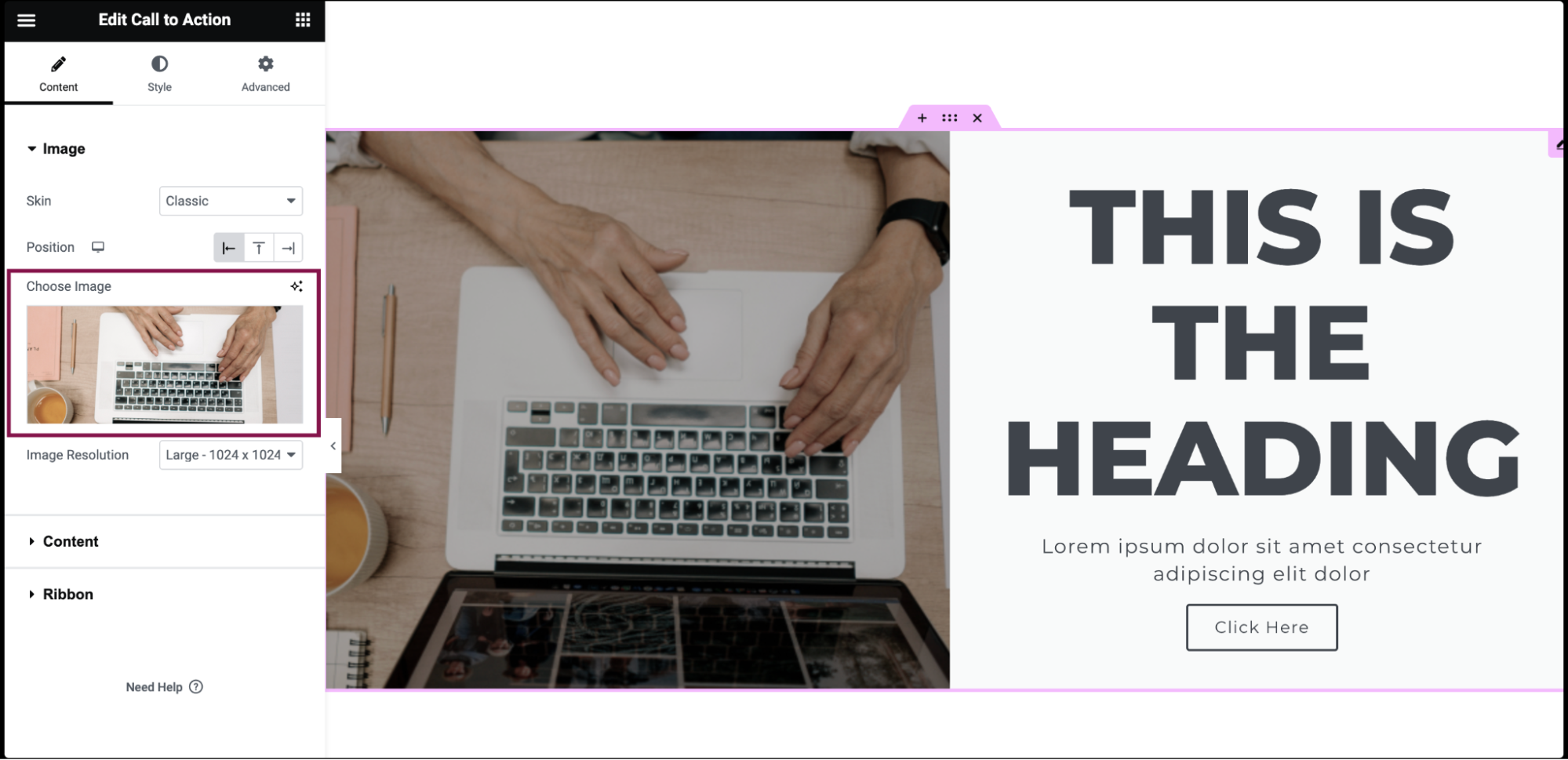
- In the Image Resolution field, you can set the size of the image from thumbnail to full or to a custom size.
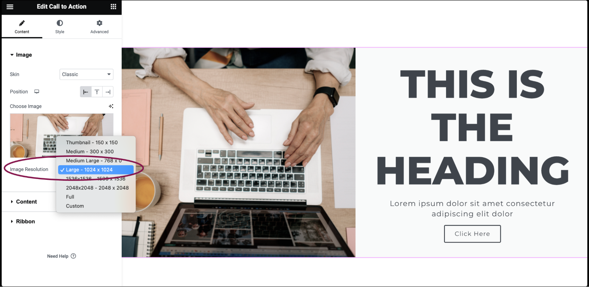
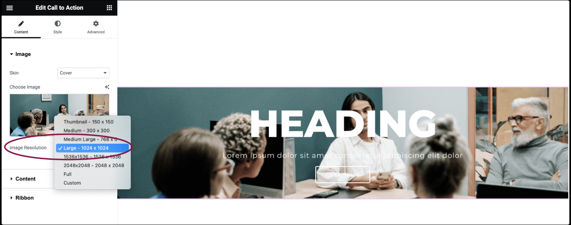
If chosen Cover Skin: - In the Choose Image box, select an image for the media library or upload a new image.
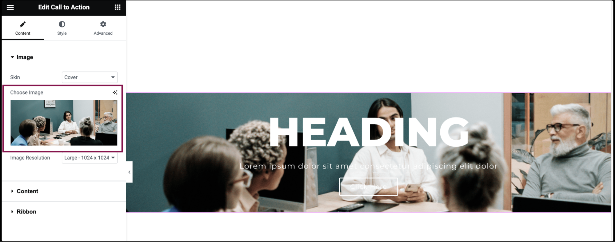
- In the Image Resolution field, set the image size from thumbnail to full or a custom size.
- Under the Content section, in the Graphic Element field, choose between None, Image, or Icon to display a graphical element above the Call to Action title.
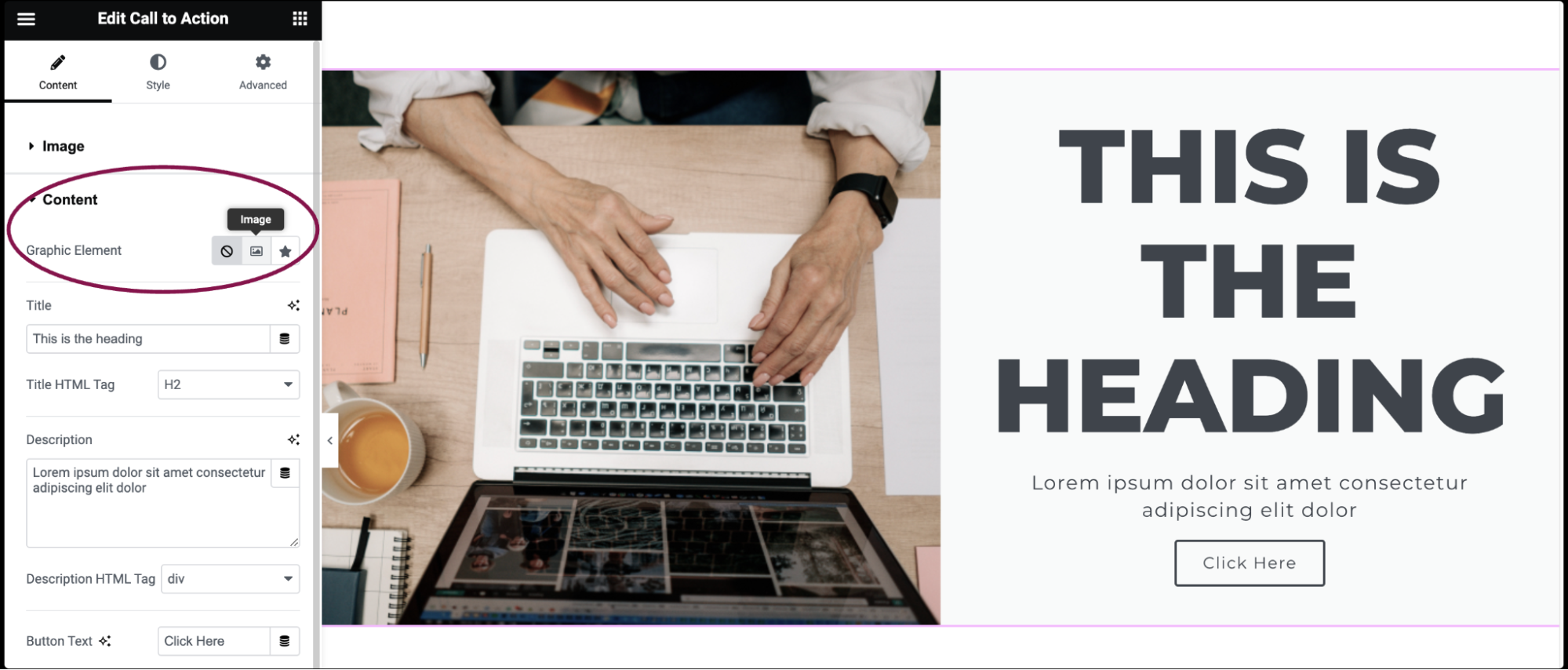
- If Image is selected as the Graphic Element:
- In the Choose Image box, select or upload an image.
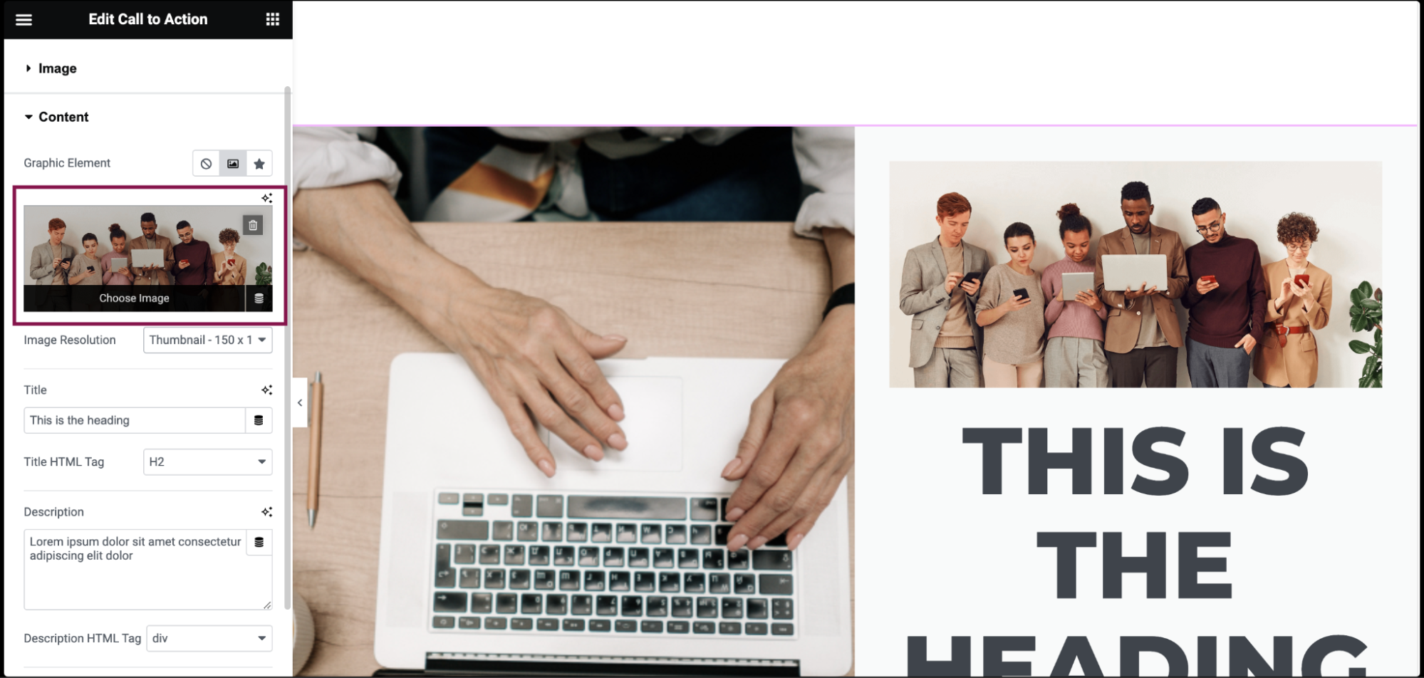
- In the Image Resolution field, set the image size from thumbnail to full or a custom size.
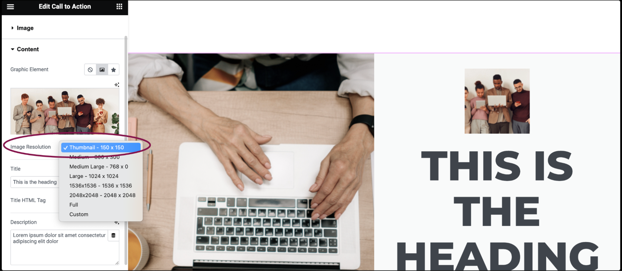
- In the Choose Image box, select or upload an image.
- If an Icon is selected as the Graphic Element:
- In the Icon box, select an icon from the icon library or or upload an SVG image. For more details, see Enable SVG Support in Elementor.
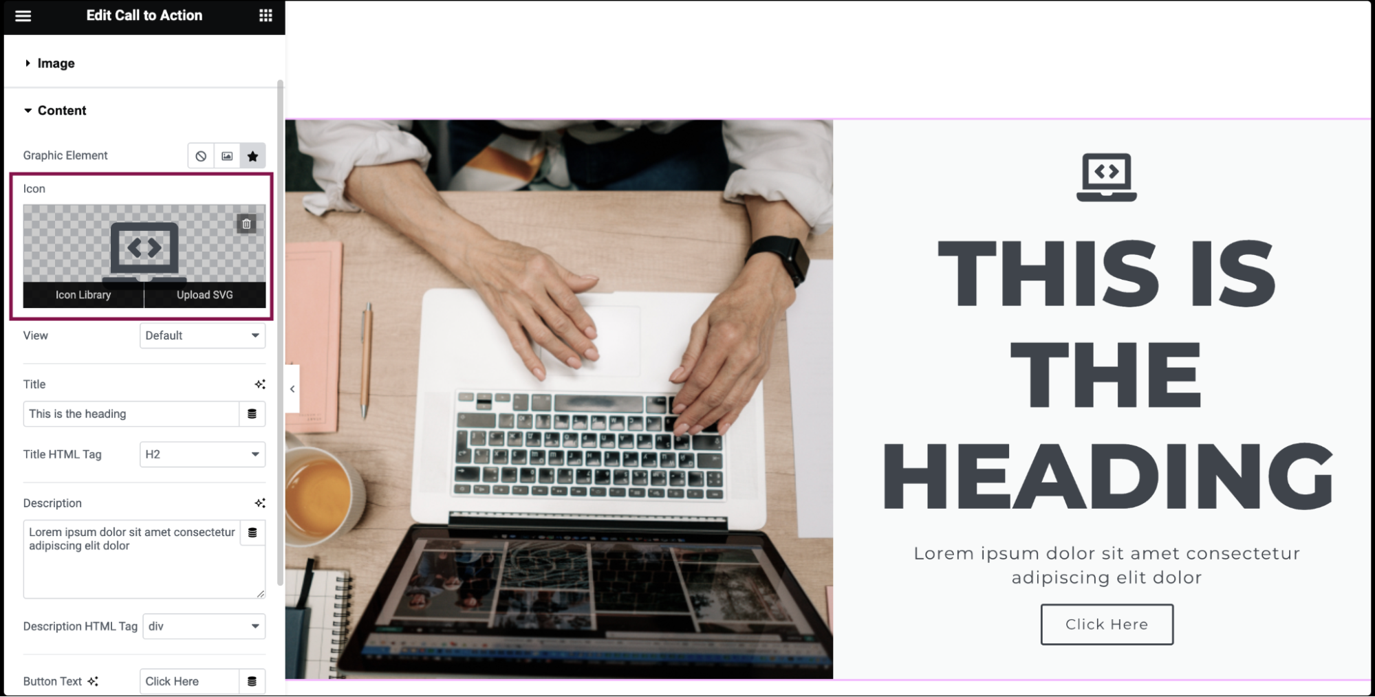
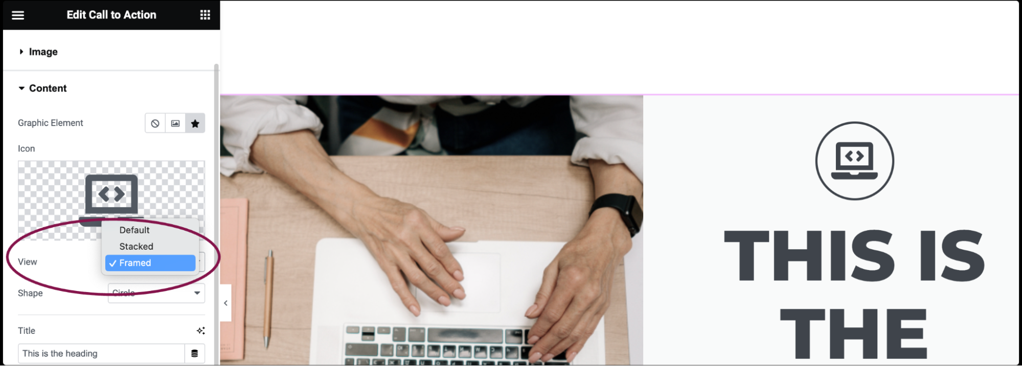
- In the View field, set the icon’s view as Default, Stacked, or Framed. When set to Stacked, the icon is displayed with its entire background filled. In Framed, it has a border around it. You can select either a Circle or Square shape for both view options.
- In the Icon box, select an icon from the icon library or or upload an SVG image. For more details, see Enable SVG Support in Elementor.
- In the Title field, add the title text.
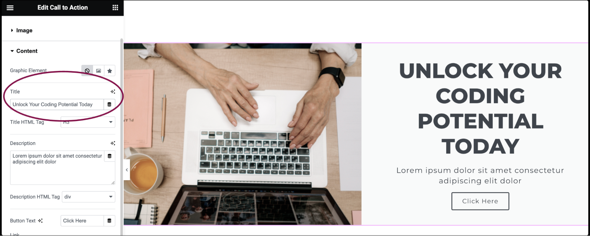
- From the options in the Title HTML Tag field, set the title’s HTML tag to H1- H6, Div, or Span.
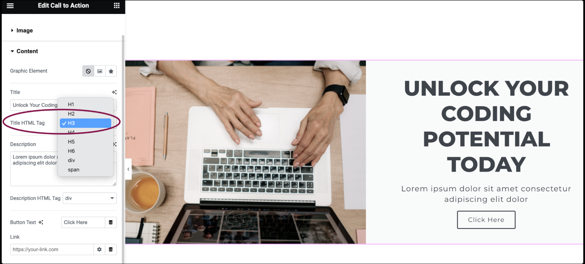
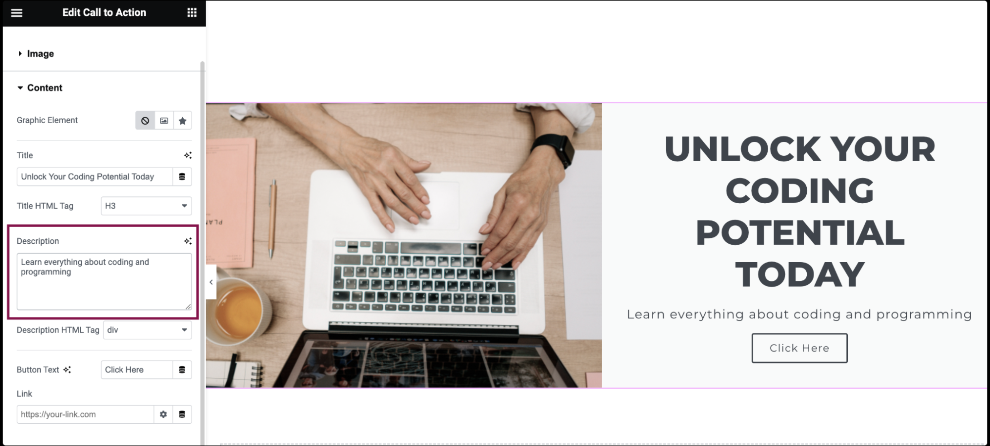
- In the Description field, add a brief description text.
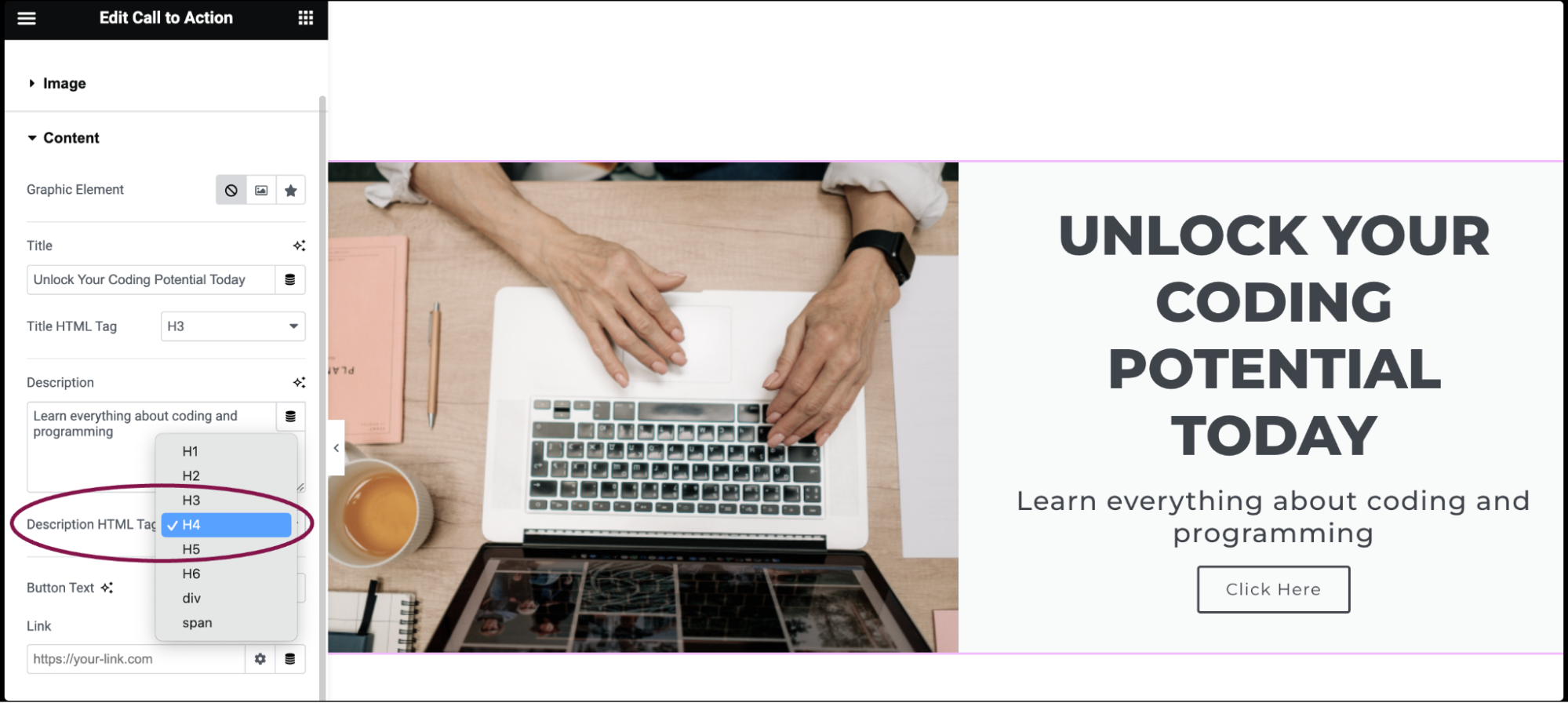
- In the Description HTML Tag field, select H1- H6, Div, or Span for the description’s HTML tag.
- In the Button Text field, specify the text to display on the button.
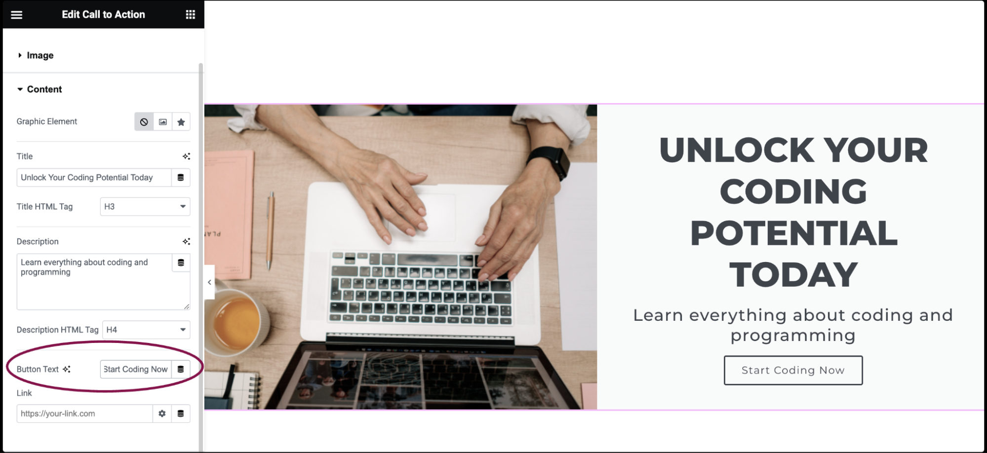
- In the Link field, enter the URL for the button’s link. Click the Link Options cog to either add rel=nofollow to the link or to open the link in a new window.
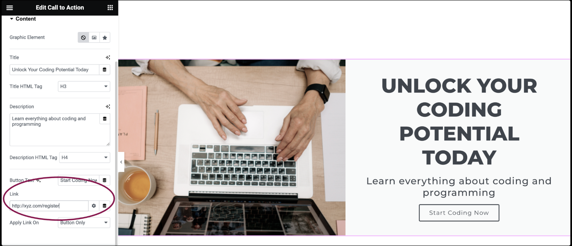
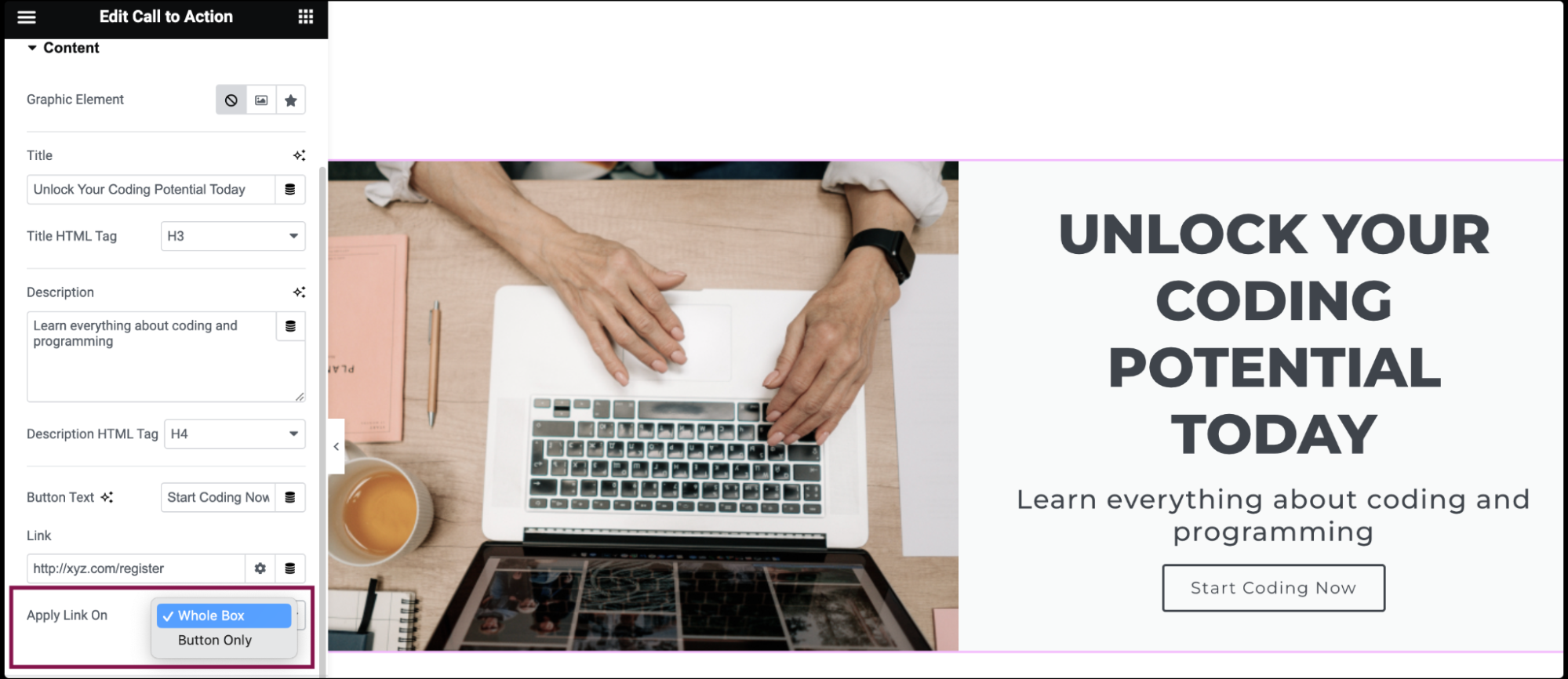
- In the Apply Link On field, choose whether to apply a link on the Whole Box on or Button Only.
- Under the Ribbon section, in the Title field, add the text to be displayed on the ribbon.
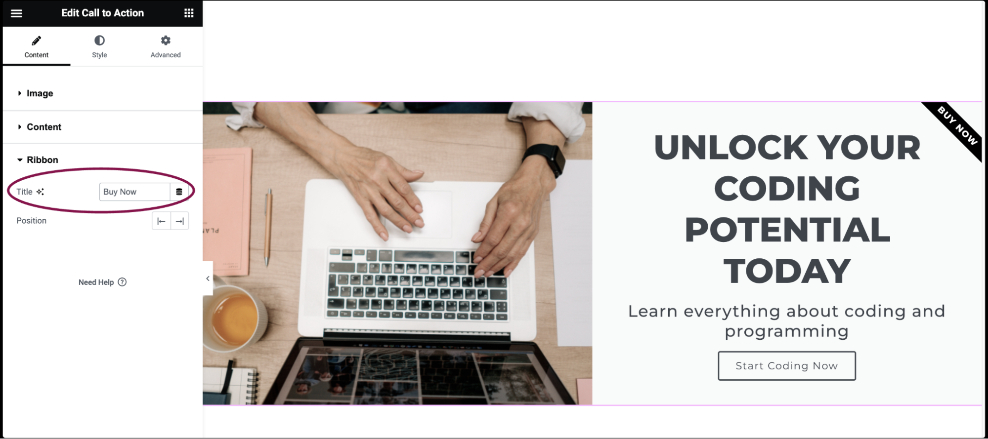
- In the Position field, choose the ribbon position – Left or Right.
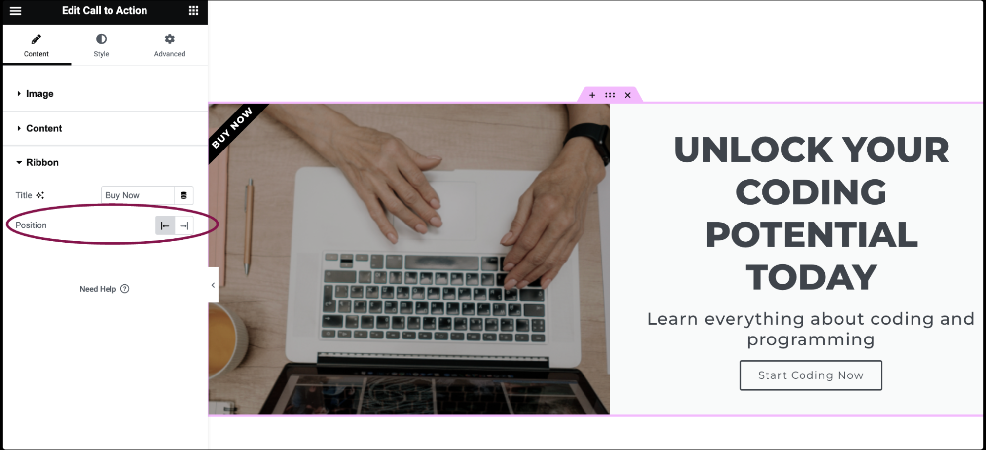
You can customize your widgets using content, style, and other advanced parameters, offering you great flexibility in tailoring them to your needs. Click the tabs below to see all the settings available for this widget.
In the Content tab, you get options to input and arrange the content elements of your Call to Action widget, such as the title, description, button, and optional image or icon.
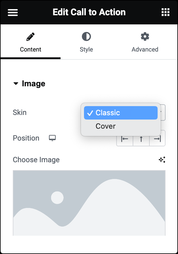
Skin
Choose either Classic or Cover skin type.
For Classic Skin
- Position: Set the image position: Left, Above, or Right.
- Choose Image: Select or upload an image.
- Image Resolution: Adjust the image resolution from thumbnail to full or set a custom size.
For Cover Skin
- Choose Image: Select or upload an image in the Image field.
- Image Resolution: Adjust the image resolution from thumbnail to full or set a custom size.
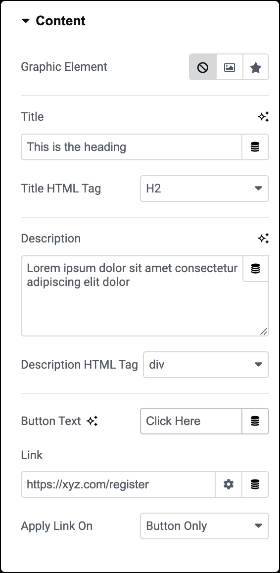
Graphic Element
Choose a graphical element: None, Image, or Icon.
- If an Image is chosen, select or upload an image and set its size.
- If Icon is chosen, select an icon and customize its appearance and shape.
Title
Add the title text.
Title HTML Tag
Set the title’s HTML tag to H1- H6, Div, or Span.
Description
Add a brief description text.
Description HTML Tag
Choose the description’s HTML tag to H1- H6, Div, or Span.
Button Text
Specify button text.
Link
Enter the URL for the button’s link. Click the Link Options cog ![]() to either add rel=nofollow to the link or to open the link in a new window.
to either add rel=nofollow to the link or to open the link in a new window.
Apply Link On
Choose whether to apply a link on the Whole Box on or Button Only.
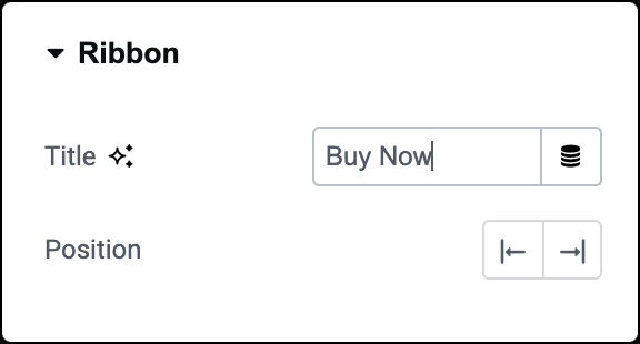
Title
Add text to be displayed on the ribbon.
Position
Choose the ribbon’s position: Left or Right.
In the Style tab, you can customize the visual appearance of your Call to Action widget. This includes options to adjust colors, typography, spacing, and effects like hover animations.
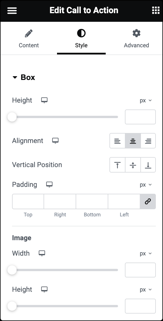
Height
Set the height of the whole box.
Alignment
Align the content to the box’s left, center, or right.
Vertical Position
Align the content to the box’s top, center, or bottom.
Padding
Control the spacing around the content.
Image (Classic Skin)
- Width: Specify the width of the image.
- Height: Allows you to set the height of the image.
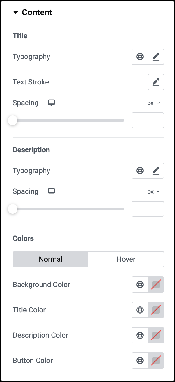
Title
- Typography: Customize the title’s typography. For more details, see Typography.
- Text Stroke: Click the 🖋️ icon icon to apply a stroke effect to the title. Learn more about Text Stroke.
- Spacing: Set the amount of space between the title and description.
Description
- Typography: Adjust the font style and size of the description. For more details, see Typography.
- Spacing: Set the amount of space between the description and the button.
Colors
- Background Color (Classic Skin): Choose the background color for normal and hover states.
- Tite Color: Choose the title color for normal and hover states.
- Description Color: Choose the description color for normal and hover states.
- Button Color: Choose the button color for normal and hover states.
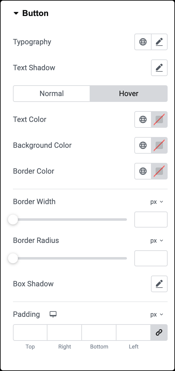
Typography
Set the typography options for the button text. For more details, see Typography.
Text Shadow
Click the 🖋️ icon to add a shadow to the button. Learn more about shadows.
Text Color
Choose the color for the text displayed on the button for normal and hover states.
Background Color
Select the color for the button’s background for normal and hover states.
Border Color
Choose the color for the button’s border for normal and hover states.
Border Width
Set the width of the button’s border.
Border Radius
Set the border radius to control corner roundness. For more details, see Border radius tools.
Box Shadow
Apply a box shadow effect to give the button’s border. Learn more about shadows.
Padding
Use this option to determine the button’s size.
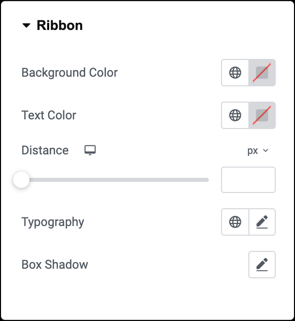
Background Color
Choose the color for the background of the ribbon
Text Color
Specify the color for the text displayed on the ribbon
Distance
Use a slider to set the distance for the ribbon.
Typography
Set the typography options for the title text displayed on the ribbon. For more details, see Typography.
Box Shadow
Set the box shadow settings for the ribbon.
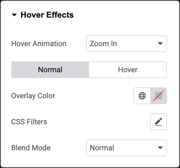
Hover Animation
Select the hover animation for the image.
Overlay Color
Choose the overlay color for normal and hover state.
CSS Filters
Set CSS filters such as blur, brightness, contrast, and saturation for the image for normal and hover states.
Blend Mode (Normal)
Set a blend mode for the image during the normal state.
Transition Duration (Hover)
Set the duration for the hover effect transition. This option determines how long the hover effect takes when the user hovers over the image.
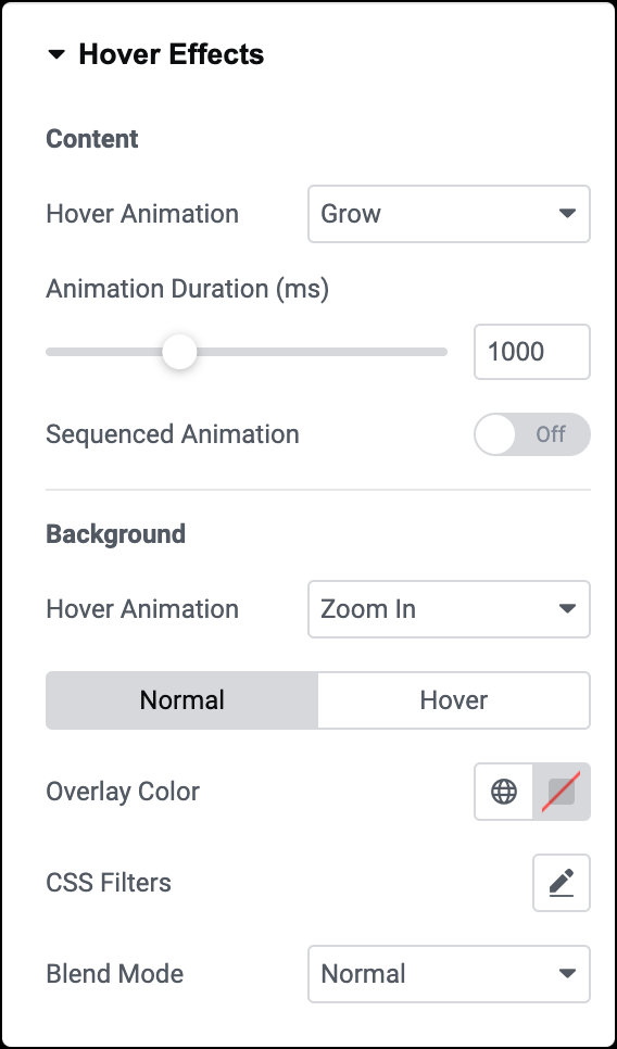
Hover Animation
Choose the hover animation for the image content.
Animation Duration
Set the amount of time the animation takes to complete.
Sequenced Animation
Choose if the animation for the text elements appears sequenced or all at once.
Hover Animation
Choose the hover animation for the background image. You can select from zoom in or out or move left, right, up, or down.
Overlay Color
Choose the color for the overlay that appears over the background image during normal and hover states.
CSS Filters
Set CSS filters such as blur, brightness, contrast, and saturation for the background image.
Blend Mode (Normal)
Set a blend mode for the background image during the normal state.
Transition Duration (Hover)
Set the duration for the hover effect transition on the background image.
The Advanced tab provides options to control widget position, adjust spacing, add custom code, and more.
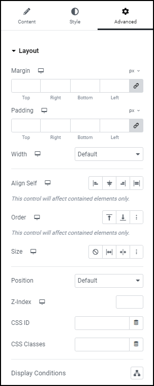
Advanced
Learn more about the Advanced tab settings.