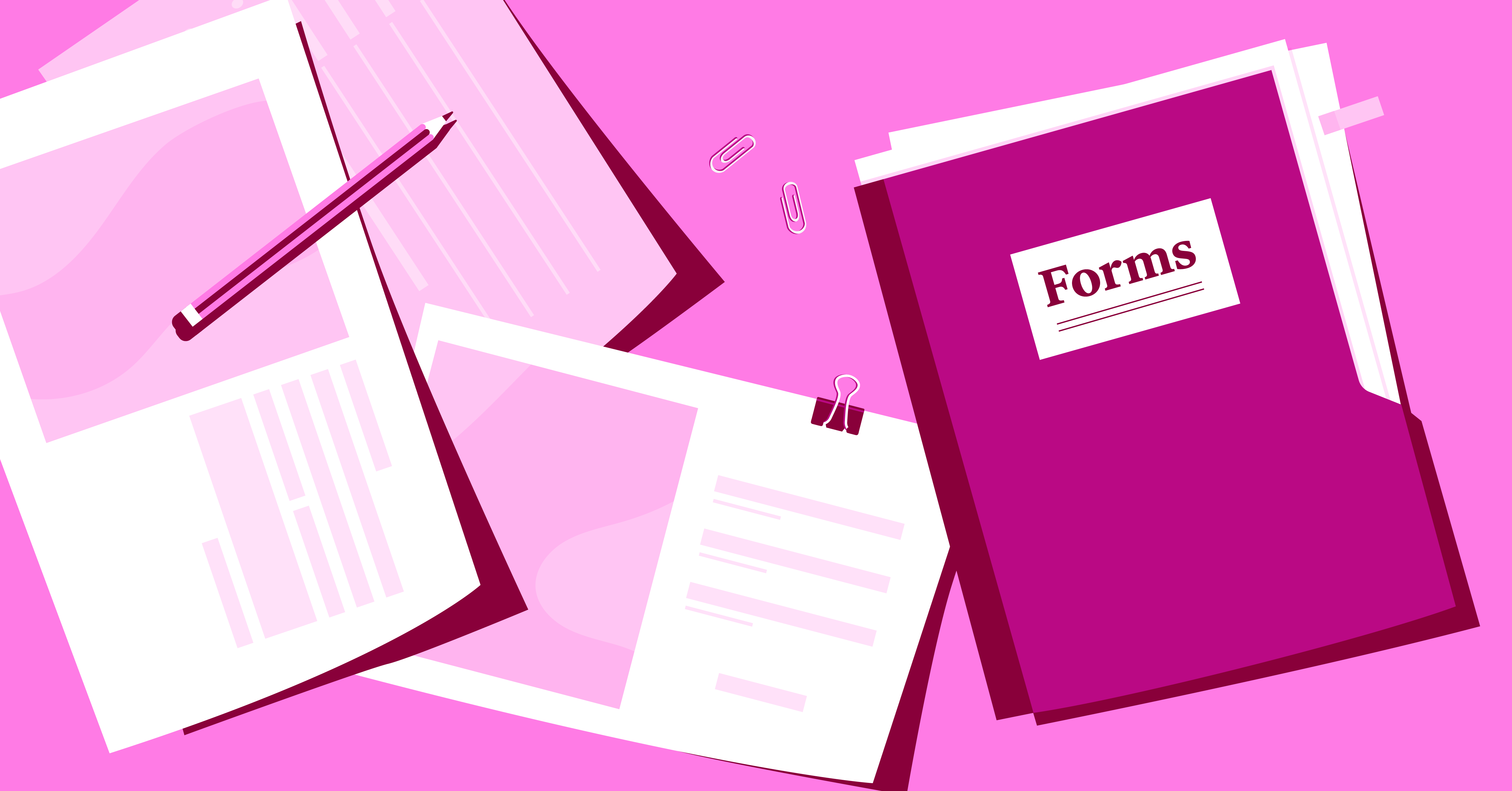
Website forms are an essential component in any website, landing page, or e-commerce store. Whether the form’s objective is to contact the website owner, complete a questionnaire, log in to an account, buy an item, sign up for a new account, book a reservation, or sign up for a free trial — every granular detail of the web form’s design and layout is crucial.
You may have asked yourself these questions in the past: Which design layout will work best for my form? What will engage users most? How can I implement my design motifs and brand identity? Should I place the form inside a website popup, or would a footer form work better?
Between the long list of website form-types and their use-cases, identifying what to consider when in your form design can be intimidating, to say the least. Rest assured, creating a high-performing website form will soon be a stress-free, challenging, yet rewarding web creation experience.
To empower our web design strategy and workflows, we’ve compiled a list of 15 examples that will show you what the very best forms are made of.
Table Of Contents
15 Unforgettable Examples of Form Design
We’re about to embark on a jam-packed journey through website forms of all shapes, colors, layouts and sizes. Prepare to be amazed by this list of 15 website forms whose design and structure will revolutionize your web creation skills.
Contact Us Forms
When you’re determined to see every user click “Submit” before exiting your site, your contact form can make or break this goal. Basic decisions like if and when to add animations or progress indicators, how large or bold your headings should be, how wide to make your form fields — all of these factors contribute to each form’s completion rate and impact your website’s user experience.
#1 Brandingo

Brandingo is an Armenian design agency and school that we chose back in January 2021 for our Top 10 Elementor sites of the month showcase. The Brandingo website was built to “showcase the agency’s talent and knowledge in design, illustration, UI/UX and branding to potential clients and students.”
What has always stood out to us in Brandingo’s site is its use of so many motion and interactive effects that all fit together like a glove. They’ve clearly mastered the art of finding a balance engaging interactive features that aren’t too much for the human eye to handle.
Our Favorite Things:
- The many uses of Lottie animations appearing as you scroll down the page.
- The text path that circles around the form’s circular background once you reach the end.
#2 The Space Cube

The Space Cube is a desktop organization product created by Carol Havener from Sydney, Australia. Built with both homeowners and offices in mind, the product addresses the pain point of organizing limited spaces (such as an office desk, a study, a family living room, etc.)
Carol built her product website with Elementor, using the WooCommerce builder to serve her e-commerce site needs. Given its wide target audience, the product’s site uses a white and black color scheme wisely. The motifs account for the product’s modern, slim and minimalist design scheme, and the contact page and its form achieve the same goal.
Our Favorite Things:
- The elegant font pairing combines calligraphy, handwritten style with the sans-serif font “Bodoni”.
The sophisticated background image placed behind the form’s solid, square white background. This really brings the product’s use-case to life, subtly reminding the user of how nice it feels to sit at a desk that’s clean, non-cluttered, and welcomes tranquility.
#3 Metropolis Moving

Metropolis Moving is a New York City moving company based in Brooklyn, NY. Their website color scheme and design use NYC-themed colors like taxi cab yellow, navy, and grey to visualize the essence of their tailor-made service for moving within the bustling “Big Apple”. The site’s Contact Us form is a brief, multi-step form for the prospective customer to fill out and receive a price quote.
Our Favorite Things:
- The demarcated map route and location points capture the unpredictable experience (path) between moving from one address to another.
- The form fields are designed with all the web form rules of thumb:
- Minimal number of form fields
- Left-aligned form fields and placeholders
- Single-column layout
- Clearly carved step indicator
Questionnaire Forms
Asking your audience questions about their interests, preferences, goals, etc. is a fine way to establish a dialogue. But what are the best ways to present your questions? Should you create an informal atmosphere? Which format will work best for your audience? All of these considerations are of equal importance, yet the options for how to tackle each one are incredibly varied.
#4 Spotify Pets

Spotify Pets is a playlist feature within the Spotify digital music, podcast, and video service. This uniquely quirky addition to Spotify uses the platform’s algorithm to create playlists for the pet and pet owner to listen to — based on the user’s listening habits and pet’s attributes.
Our Favorite Things:
- The adjustable drag bar animation that the user adjusts to describe his pet’s characteristics — is an engaging input method that also eliminates typing activity.
- The progress indicator blends into the upbeat, illustrated background.
- The multi-screen questionnaire form has one question per screen, each one being super mobile-friendly.
#5 RedBull

Red Bull is an internationally available energy drink whose slogan is “Red Bull gives you wings.” On their website product page, Red Bull engages the visitor in brand storytelling, with an interactive quiz about sustainability and environmental safety — two of the brand’s pillar values.
Our Favorite Things:
- The countdown timer for each question creates suspense and urgency to answer.
- The large selection buttons make the answer choices super accessible and easy to click.
- The homepage quiz’s animated background video.
Login Forms
Login forms are an incredibly significant component in your product’s or service’s interface. Users will likely see this form time and time again, and familiarity and simplicity are key. Your form should be inviting, intuitive, and straightforward — yet excite the user as much as possible. Many times, the smallest details and illustrations can go a long way.
#6 gidimo

gidimo is a Nigerian EdTech company whose online learning platform caters to learners of all backgrounds and stages of life. The platform’s technology uses gamification techniques and customized user journeys that “make it fun and easy to learn anything on the go”.
gidimo’s Elementor-built website (a winner of our March 2021 showcase) login page boasts a clean layout with a slider gallery beside the login form. This gives the page an added layer of engagement and appeal: users can navigate their way through alternating illustrations that reinforce the positive vibes of the platform.
Our Favorite Things:
- The slider’s background color alternates between green and white as the user navigates through.
- Each row of the form has the same width, allowing for a uniform, organized layout that breeds clarity and consistency.
#7 Snappet

Snappet is an online educational platform for tablet devices used by math teachers looking to personalize individual students’ learning paths and simultaneously monitor their performance. The learning tool is for Elementary school-aged student learning, which is easy to understand from the site’s friendly, colorful color scheme and vector illustrations.
Our Favorite Things
- The illustrated use-case on the Student login page conveys an emotional message: reminding students of the encouraging (albeit virtual) high-five and positivity they’ll feel by using the platform.
- The single-typeface typography scheme uses variations of one font (different colors and sizing). Avoiding monotony, using two different colors and sizes indicates the information hierarchy between the text elements.
Product Landing Page Forms
Product landing pages are profoundly crucial in website form design, as so much of a visitor’s shopping behaviors are a direct result of the product page design. Given all the information that consumers want to know about each individual product, deciding what and how to include on each product page must be handled with care.
#8 Bram

A winner of our WooCommerce sites showcase, Bram is a Barcelona-based handcrafted leather wallet manufacturer. The product page design layout was of particular inspiration (essentially a submission form) to us.
Our Favorite Things:
- The large variety of color choices are shown in one line for simultaneous viewing, no need to click on a dropdown menu to see each color option.
- The “Add to Cart” button is easy to find, placed at the top of the content rather than being the last component on the page (after the product details and collapsible tabs).
- The abundant white space on the page makes the product details clear and legible, and the product’s leather detail is easily visible.
#9 ABATTOIR VÉGÉTAL

ABATTOIR VÉGÉTAL is a vegan bistro and grocery located in Paris, France. The e-commerce site (built with Elementor and WooCommerce, and an August 2020 showcase winner) features both the bistro takeaway and the grocery menus, where the user can choose ingredients and dishes to order online.
Our Favorite Things:
- The use of WordPress custom fields; The product page and its order form entail all of the meal’s basic information in an efficient, engaging format.
- The engaging formats used in the page’s WooCommerce cart: the items indicator, as well as the “Add to Cart” button, are given a bright background color, adding fun and flair to the checkout user flow and the overall online shopping experience.
- The bright colored fonts and detailed photographs communicate the verbal and visual information clearly — an exciting way to begin a culinary shopping experience.
Sign Up Forms
A successful sign-up process fulfills the wishes of any web creator building a website form. So, is it really possible to turn this dream into a reality? Anything is possible, but the steps you take to satisfy your visitors can have powerful implications. Every detail, from button visibility to contrast between elements, will indicate the form submission results.
#10 Duolingo

Duolingo is a language-learning website and mobile app. As a brand, the company’s mission is to “make education free, fun, and accessible to all”. The screen shown above appears within the platform’s onboarding process, where the user sets their language-learning goal and chooses a learning path.
Our Favorite Things:
- The flat design avatars and illustrations used throughout the entire site, used as image thumbnail buttons within the form.
- The justified grid layout streamlines the seven illustrations — tying together their varying sizes, colors, and shapes.
#11 Stripe

Stripe is a payment processing software used by e-commerce websites and mobile applications. Using Stripe enables businesses to accept payments, send payouts, and manage their business online. The account registration is straightforward and easy, facilitated through a simple, yet engaging sign-up form.
Our Favorite Things:
- The drop shadow around the submission form’s background distinguishes between the sign-up form and the bullet points on the left side of the page.
- The organized, concise bullets stating three key benefits of the product, reinforcing the added value of creating a Stripe account.
Booking Forms
Successful online booking forms thrive on positive, encouraging atmospheres. When your visitors reach the point of looking into how to book your service, you must do all you can to keep them attentive, interested, and happy about what they’ll soon experience.
#12 Be A Roshan

Be A Roshan is an energy therapy and meditation center on Mauritius island. Be A Roshan’s Elementor site provides online appointment and event booking for customers. The design motifs (like the sunny day homepage background) chosen for the site mirror the atmosphere of the soothing Reiki and meditation experiences.
Our Favorite Things:
- The visual calendar interface showing the Reiki treatments available throughout the entire month.
- The informative text elements above the calendar inform the user of important details that will impact his decision of how to complete the form.
- The event registration form is designed to collect the data quickly and to create a smooth experience for the registrants without confusing or distracting them
#13 Presidio

Presidio Speech and Learning is a San Francisco children’s therapy practice catering to children who need support in speech, language, reading, and writing. The Elementor-built Presidio site featured in our November 2020 showcase, commended for its pastel watercolor, child-friendly design motifs. These details accommodate the center’s target audience: parents looking to consult and receive attentive, sensitive input on their child’s individual needs.
Our Favorite Things:
- The blue and green color palette used in the booking form extends the website’s uplifting vibes throughout the appointment-booking user flow.
- The form fields’ background color allows for an attractive, inviting layout for a pleasant submission process.
Free Trial Forms
Free trials are always appreciated by potential customers and clients. Above all else, emphasizing the advantages and added value in trying your service or product helps visitors make their final decision. The more incentive you give them to move forward, the more likely that they will.
#14 Hone

Another November 2020 showcase winner, Hone is an online learning platform that provides live classes on subjects such as team leadership, management, and interpersonal communication skills. The platform facilitates an empowering, proactive approach towards team leadership and internal communication. These ideals are successfully conveyed through the website’s upbeat, energizing pink and purple color scheme, and by the voice and tone of their site’s written content.
Our Favorite Things:
- The pink underline effect creates a visual cue to emphasize the form’s power words — emphasizing to the prospective user that Hone’s 30-day trial is completely free.
- The bullet points placed next to the form identify the product’s added value and key benefits.
- The icons used for each bullet point, resemble the product’s user experience and interface.
Subscription Forms
Once you’ve convinced your user that your content is worth subscribing to, he is counting on you to deliver content that he’ll want to keep reading. Being transparent about what you plan to send him can always go a long way so that he knows what to expect and looks forward to doing so.
#15 Codepuffin

Codepuffin is the business and portfolio website of Amy Nortje, a web developer based in New Zealand. Amy built her website with Elementor, where she lists her services and features her portfolio and personal blog. Amy’s blog entries focus on her “lessons learned” from different projects and client relationships, and serve as a personable, informal resource of insight and support for her readers.
Our Favorite Things:
- The subscription form’s content and language align with the messaging of the blog itself: humorous anecdotes that are intertwined with valuable professional insight.
- The form’s heading, “Want something cool?” cuts right to the chase. This question frames the user’s benefit in subscribing to the newsletter in a conversational tone, creating a rapport with the visitor that sparks interest in Amy’s insight and varied experiences.
Form a Masterpiece
There’s no doubt about it: nothing is more rewarding than a dashboard that shows successful form submission results. Now that we’ve learned from the very best, it’s safe to say that the best is yet to come. You’re destined to create many website forms throughout your web creation career, and now that you’ve seen 15 works of website form art, it’s time to start imagining, designing, and building the web form of your dreams.
Looking for fresh content?
By entering your email, you agree to receive Elementor emails, including marketing emails,
and agree to our Terms & Conditions and Privacy Policy.
