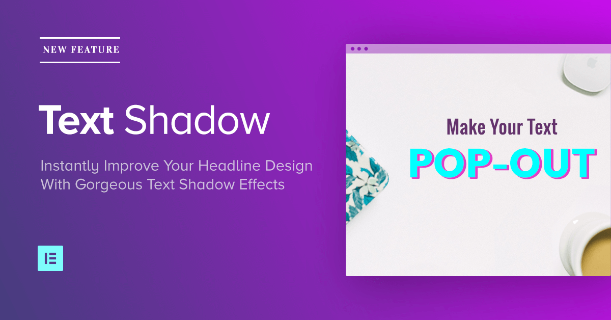
Want to instantly make your headlines look better?
Choosing the right font, line height, letter spacing and other typography settings are a good start, but what next?
Using the new Text Shadow effect in Elementor is a great way to create eye-catching text effects on WordPress that is bound to draw the attention of your site visitor.
The new Elementor text shadow effect is part of Elementor V1.6, which also featured our image & gallery lightbox feature, bulk templates upload and more new features.
In this tutorial, I want to go over 7 text shadow examples, including the exact settings to reach each effect.
1. The Plain Ol' Text Shadow

Even without doing to many alterations, text shadow works really nice in accentuating almost any headline. Make sure you don’t overdue it though. We don’t want to get a page where every headline has a text shadow…
How to do it?
- Font Family: Roboto
- Color: #b2b2b2
- Blur: 22
- Horizontal: 11
- Vertical: 3
2. The Contrast Text Shadow

In situations where the background is of the same shade like the headline, the result might be a headline that is hard to read. By adding a text shadow, so the heading gets a nice border that makes it easier to read.
How to do it?
- Font Family: Montserrate
- Color: #f801d6
- Blur: 75
- Horizontal: 0
- Vertical: 0
3. The Glow text shadow

If you are into the 80’s, then you are going to love this text shadow effect. Using the glow text shadow can be used with any bright color, and adds a retro neon effect to your headlines.
How to do it?
- Font Family: Monoton
- Color: #aa004f
- Blur: 100
- Horizontal: 0
- Vertical: 38
4. text shadow Blur

If you exaggerate and take the horizontal and vertical spacing to extreme, you can reach an interesting effect that will resemble a blurred reflection on a glass door. That’s what it looks like to me, at least.
How to do it?
- Font Family: Ubuntu Condensed
- Color: #9fa2a8
- Blur: 23
- Horizontal: -54
- Vertical: -76
5. Stroke / Hard text shadow

By not using any blur at all, you can create a stroke effect that will accentuate your headlines, retro style. This retro shade is rather popular right now, and it is also in tune with the hipster design trend.
How to do it?
- Font Family: Lobster
- Color: #09732c
- Blur:0
- Horizontal: 7
- Vertical: 7
6. 3D Text Shadow

By making the shadow drop upwards, and condensing the heading with line height, we were able to create this 3 Dimensions text shadow effect that has a certain depth to it.
How to do it?
- Font Family: Poppins
- Color: #845757
- Blur:0
- Horizontal: 7
- Vertical: 7
- Line Height: 0.6
7. Straight Down Text Shadow

This text shadow gives the effect that the headline is raised above the screen. Use this shadow as a great addition for your hero headlines or your call to action sections, making the elevated appearance of the headline.
How to do it?
- Font Family: Montserrat
- Color: #b2b2b2
- Blur:5
- Horizontal: 0
- Vertical: 16
See it in action
We’ve created this short video showing our designer whipping up some of the text shadow effects. Check it out:
Conclusion
We’ve only touched upon the various uses of text shadows, and the ways in which they can help you design better looking pages on WordPress.
Combined with other Elementor design features, like gradient colors, image overlays, background videos or shape dividers, and you can create even more elaborate text shadow designs.
I invite you to download the latest version of Elementor, and experiment with the text shadow feature. We’d love to get your page designs before and after adding the text shadow. I am sure the results will speak for themselves.
Looking for fresh content?
By entering your email, you agree to receive Elementor emails, including marketing emails,
and agree to our Terms & Conditions and Privacy Policy.
