What seems to be just another page in your sitemap, probably accessible through your header and/or footer, is actually one of your most compelling pieces of content. Or at least, it should be.
Yes, we’re talking about your website’s About Us page.
In some ways, it’s actually more appropriate to refer to this type of page as “Our Brand Story,” or if you want another alternative, “Our Identity.” We like the first one better, but they’re both pretty accurate.
This is why your About Us page is one of the most important pages on your site. It is, after all, a sheer representation of your brand identity. After reading and exploring yours, each visitor will fully understand your brand values, mission statement, added value, and so on.
This visitor wants to get to know you by listening to the story you have to tell.
The first step to create an authentic, effective about us page that really communicates who you are and what you’re about is perfecting every design detail. First impressions matter and your website needs to dress to impress.
Let’s take a look at 16 of our favorite About Us pages, whose design and content strategy are worth writing home about.
Table of Contents
- 16 About Us Page Examples
- 1. Stripe: The Animated About Us
- 2. Twitter: Brand Identity Loud and Clear
- 3. Degordian: A Refined Color Palette
- 4. Zendesk: Unique Scrolling Effects
- 5. Pixelgrade: A Background Overlay Done Beautifully
- 6. Dribbble: Telling the Stories of Real Designers
- 7. Medium: Brand Storytelling Through User Experience
- 8. Pawel Nolbert: A Vivid Personal Portfolio
- 9. ShakeDesign: Showing Their Brand Through Architecture
- 10. Atlassian: Illustrating Brand Values With Vector Drawings
- 11. Drift: An Upbeat, Authentic Vibe
- 12. G2: Traditional Design Elements Become Unique
- 13. HUMAAN: About What We Love
- 14. Gong.io: Making Sure to Stand Out
- 15. Etsy: Clear, Concise Brand Messaging
- 16. GIPHY: Focusing on Motion Effects
16 Inspiring 'About Us' Page Examples
1. Stripe: The Animated About Us
What caught our attention about Stripes’ About page?
It’s a few things, really. First off, it’s about what they highlight. We love how they highlight their features as you scroll down the page. But not only that, they dive right into the UI of each feature, so the visitor already gets a taste of what the product experience is about.
Their value proposition (which they refer to as their “mission”) is stated right at the top of the page, so their impact as a company is made known from the start of the browsing experience.
Stripe also manages to strike a fine balance between their traditional (and well-known for its design expertise, by the way) brand language while keeping the content original. This is a major success for their brand storytelling.
Finally, our favorite design element on the page is the way they illustrate their solution to the “financial complexity” point, visualizing how they simplify financial management for businesses.
So, next time you design or tweak your About Us page, we suggest keeping in mind some of the great things Stripe has done with theirs: think carefully about what you emphasize most. use the value of emphasis wisely. What we mean is, hone down on the essence of your brand values and make that the focal point of the page (and don’t forget you can create CSS text animations with Elementor).
2. Twitter: Brand Identity Loud and Clear

Oh Twitter, how do we love thee? Let us count the ways. Twitter does a fine job using the About page’s hero text as a means for giving a precise definition of their brand objective:
“Twitter is what’s happening in the world and what people are talking about right now.” This sums up exactly what their product is about and what they’re brand represents.
With five brief statements alone, Twitter’s brand objective is crystal clear: Twitter is the place where people around the world learn and discuss what’s happening everywhere, as soon as it happens.
And of course, the large typeface and crisp design is interesting, sparking curiosity among us all. The bold color scheme (we love it) is minimalistic in its own way, with brief yet concise short paragraphs as you scroll down. The alternating hashtags is also a nice touch.
Lastly, the real unique selling point of this page is the example of a tweet tweeted by Twitter’s support team, with a large, clear photograph as its background that illustrates the topic of the tweet.
The reader really experiences what the brand stands for, and what experience they provide to its users.
If you notice, their page doesn’t spend time telling a descriptive story about themselves. Instead, all of the content is subtly weaved into their design, answering questions (but without stating the questions themselves) such as: ‘What can I do with Twitter?’, ‘What’s the added value?’, ‘What will I gain by using Twitter?’ And of course, ‘What’s the product experience like?’.
We see this as a great tactic: Think of the questions your visitors want answered and preempt their questions with the answers. And good, unique design with strong visuals doesn’t hurt (to say the least)!
3. Degordian: A Refined Color Palette
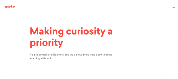
We were wowed by degordian’s About page when it loaded in our browser. Everything about it is eye-catching in its uniqueness. The way they present their team is uber creative, too. The authentic photographs breed originality, and the color scheme is simple yet pronounced and engaging all the same.
In the spirit of minimalism, the red color choice for the hamburger menu, hero text, the scroll bar and the ‘contact us’ icon let them be bold, yet unassuming and subtle at the same time…
The color scheme is powerful, paired with the Sailec Bold typeface. The fire-like font color set on the white background represents a brand that is forthcoming, and curious, as they say themselves.
The imagery in the photos of their employees, specifically their facial expressions, shows personality and dedication to their work.
Within their simplistic, minimalist design, their content covers the key topics that visitors want to know about: What they believe as a brand, what they’ve achieved, what their team likes to do, and of course, their work samples. This is definitely a great way to illustrate your brand personality and your outlook on how to connect to clients.
4. Zendesk: Unique Scrolling Effects
We have a lot of fun while browsing around Zendesk’s About page. And that’s exactly what they do so well. Their page design is informal and people-focused, with a fun, informal vibe that spreads like wildfire.
The alternating color of the hero text is synchronized with the background color of the next section, and timed perfectly. We were very impressed by that, finding it to be really unique among the many many websites we’ve seen.
Zendesk’s About page, similar to Twitter’s, goes to show how effective motion effects can be for brand storytelling. In general, we’re big fans of adding motion effects to take your website design to the next level.
In terms of its content, Zendesk introduces itself as a real conversation starter. It opens the discussion by sharing what its company culture is like, conveying a community-oriented vibe. Only then do they begin talking about numbers, such as how many paid customer accounts they have and where their customers are located.
They take a subject as simple as job openings and transform it into a visually-pleasing, original work of design, with a vivid imagery grid.
To tie it all together, the final section of their page matches the interactive hero section at the beginning, same white background, same font, Sharp Sans No1 Bold. Yet, instead of alternating only the colors, they alternate the “definitions” they’re providing for “what Zendesk isn’t”. Major points for originality.
5. Pixelgrade: A Background Overlay Done Beautifully
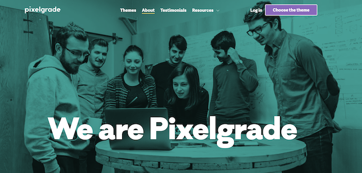
Next up is pixelgrade, which was built with none other than Elementor 🤗. What touched our design soft spot on this page is the way they use their color scheme as their secret weapon.
What do we mean?
Pixelgrade takes one single color and uses it in a different way for each section of the page. First as a background overlay for its cover image, then as a solid text background, and finally as a cut-out overlay over their team images. It’s simple on the one hand, and super cutting-edge on the other hand.
In terms of their storytelling, it’s pretty straightforward, just laid back and easy. The messaging here, both visually (design scheme and photo choices) is people-centered. You get a good community vibe from all the imagery they use of their team members, both as a group and as individuals.
And did you notice that the last team member they show is their dog? That is such a nice touch, which we’ve never seen before on a company website!
Oana Filip, Chief People Officer at Pixelgrade, shared with us the design thinking and strategy her team used when designing the page:
“Pixelgrade’s about page reflects a manifesto that reinforces what kind of experience we are shaping for our visitors. It presents how the adventure began, it highlights the values we stand for, and it gives a glimpse of how we give back to the WordPress community.
We also made room for each teammate to be on stage in an authentic and meaningful way. We like to believe that we succeed to start the narrative and a conversation that can lead us far. In the end, it’s our approach to telling a compelling and human story about our inner-why.”
6. Dribbble: Telling the Stories of Real Designers
Made for designers by designers, it’s no surprise to us that each page dribbble designs on their company website is going to be a first-class piece of design work.
The brand messaging is all about their community of creatives, and they even show artwork done by their community members as the site imagery.
The GIF of logos in the second section is truly creative and delicate, a fine combination. They’ve certainly mastered how to use motion effects in a real classy way.
The next genius technique dribbble uses is showing a “designer story”, of famed designer Pablo Stanley. This illustrates just how much the dribbble brand embraces their community members, as they insert a testimonial after the story (something you can easily do with our Testimonial widget).
Finally, their interactive technique of using a hover effect to show each team member’s bio is truly one-of-a-kind. It creates a conversational dynamic between visitor and team member, making the section an ‘image-only’ design which relies on user activity to deliver the information the user expects.
7. Medium: Brand Storytelling Through User Experience
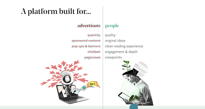
What Medium did here is sheer genius. Their About page is built to look exactly like their publication pages.
With regards to their copy, the hero text, “Welcome to Medium, where words matter” states their brand core value, followed by a description that elaborates further. Similar to dribbble, Medium’s About page showcases real articles (instead of artwork, like on dribbble’s site) written by real Medium users.
If there’s such a thing as the best way to demonstrate your user experience, Medium has nailed it.
Next off, the way Medium illustrates their brand values (after they’ve made it clear that their entire product is built around their community of readers and writers) is a creative masterpiece.
Medium explains who their brand personas are, and who their persona is not. Usually, the first image we have in our head when thinking of online media sites is the overdose of ads that surround the articles themselves. Medium is the exact opposite: No ads. They use a counterbalance effect to illustrate their ‘no ads’ policy to the user.
‘We’re not advertisers, we’re people, we’re about quality, not quantity…’. There’s absolutely no way to leave this About page being confused or unsure of what Medium’s brand is all about.
And ironically, their UI reminds us so much of an old-fashioned, standard newspaper, yet newspapers are also always full of ads. Who doesn’t like a bit of irony to make things interesting?
It goes without saying that Medium has aced the art of white space. Yet at the same time, their brand story is so rich and present everywhere on their site, no matter what content you encounter.
8. Pawel Nolbert: A Vivid Personal Portfolio
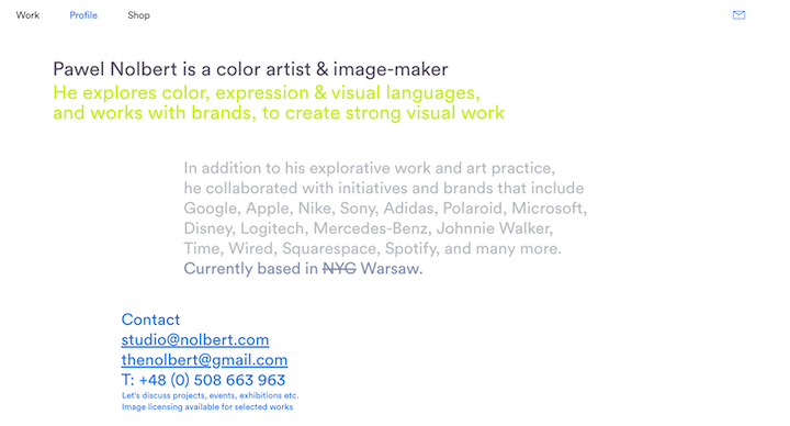
Pawel Nolbert’s About page is text-only and uses Circular Book font in each of the colorful paragraphs, each one a different color, along the page. We were excited by his creative way of designing a text-only page that is by no means boring in any way. His choice to not use any imagery for this page makes sense in the context of how he designed his site’s homepage.
Pawel Nolbert’s portfolio site is a vivid array of illustrations, each of which are different from each other, while following a theme of paintbrush strokes. This brushstroke effect is highly unique and creative, and each project’s color scheme matches the brush strokes around it perfectly.
Nolbert creates a personal brand with this signature design technique, as each project he showcases has a type of brushstroke representing it.
This is why having a text-only About page is a wonderful way to complement such an image-focused website. Pawel’s page is a great example of a creative way to find the right balance between text and images on a website.
9. ShakeDesign: Showing Their Brand Through Architecture
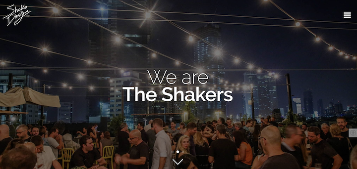
Another ‘built with Elementor’ masterpiece, ShakeDesign uses a slideshow gallery as their hero image. The photographs vary, yet they all convey the same messaging: we are a community. We party together, work together, hang out together, and so on.
Before even delving into what they do, what they sell, what they make, etc., they focus solely on their community of humans.
Only once you scroll down, then do you learn that they’re a design firm with an upbeat, laid back voice and tone (“shake it up”).
But the community feel doesn’t stop there. Each section, which talks about their brand values shows a different section of their office (and each section is designed immaculately, obviously.)
The page’s design is so image-based, but so sleek at the same time. Each section has a large photo, with most of the sections being full-width.
How does this layout not overwhelm the eye? I think you can agree that it doesn’t. We attribute this to the design of each room clearly sync together in their design schemes, but it’s also the selection of photos they use for their images.
All in all, we were quite impressed, to say the least.
10. Atlassian: Illustrating Brand Values With Vector Drawings
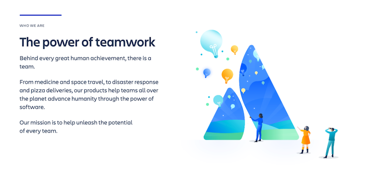
The uniqueness of Atlassian’s Company page inspires us because it conveys a sense of confidence in their beliefs as an organization, proudly displaying the principles and the value proposition that their product (and company) is built on.
Atlassian’s About page, or as they call it, their “Company” page, is built around telling the story of their brand values. They have a way of fusing the principles of their brand values with the product’s concrete added value into a single sentence. In other words, killing two birds with one stone.
Unlike other company’s About pages that show real images of their team members (both individual headshots and candid photos of team members working together), Atlassian shows very few of these imagery types. Instead, they illustrate their company culture with vector drawings that align with their branding and general design theme. We love the way they integrate their logo into an uplifting, brightly colored illustration that inspires visitors to want to learn more.
11. Drift: An Upbeat, Authentic Vibe
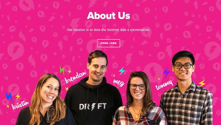
The uniqueness and creativity that we see in Drift’s About Us page makes their design work stand out on several fronts. The bright pink background, including its low transparency pattern, makes an immediate ‘statement’ of “we’re different, come get to know us.”
Drift’s varied usage of Proxima Nova font family accomplishes a level of simplicity that stays interesting thanks to the different font weights used for the titles and the body text. This is also true for their brand imagery; exclusively real images (no stock photos), used often throughout their branding.
The vivid video clips of their team members on their “About Us” that subtly transition from one video to the next. It feels authentic, with seamless transitioning between locations and people without getting overwhelmed.
On a thematic level, their language and design elements used throughout the page (white space, and hints of color here and there), convey positivity and an upbeat vibe as the user scrolls down.
12. G2: Traditional Design Elements Become Unique
G2’s About G2 page finds a way to use traditional black on white design with colorful components that’s still part of a really unique and unusual design scheme. This applies to their font family as well; the standard Roboto font still looks original even though it’s such a commonly used typeface.
We love their subtle tactic of using a bright color for specific snippets within text paragraphs whose main color is black. This generates a sense of clarity throughout the user experience as the user learns that as a brand, G2 is very clear on which of the wording is most important to the user’s understanding of the page content.
The way G2 communicates their content is another strategic success, asking the visitor questions in the headings (that the text answers in the next paragraph), creating a passive dialogue with the reader as you scroll down the page.
13. HUMAAN: About What We Love
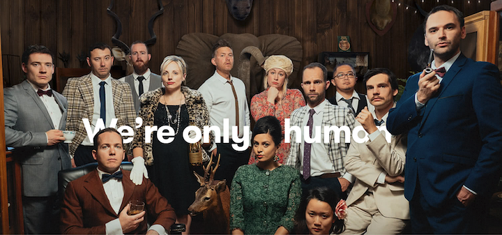
HUMAAN’s About page is all about their people. This is true for a few reasons. Firstly, the page’s hero image is a full-width, relatively close up photograph of their team in costumes. This directs the visitor’s attention to the company’s team in an informal, artistic setting focusing on their leisurely activities rather than more formal pictures of team meetings and working at the office.
The dramatic costumes and photo backdrop gives each teammate character and artistic value. As you scroll down, HUMAAN takes a spin on your typical ‘Our Team’ section design as each employee’s photo is a GIF of them doing something recreational, be it blowing bubbles or playing with a Rubik’s cube.
The two lists in the next section, “What we do” vs “What we don’t”, is another creative, atypical way to express their company values and culture. Once you then scroll to the photos of the company offices, you get a visual representation of their brand’s personality as a business.
Once again, the “About Us” page feels very people-first, showing books that the company has in their library and how many coffees they drink, what kind of jokes they make, and which employee is their “Ping Pong champ.”
14. Gong.io: Making Sure to Stand Out
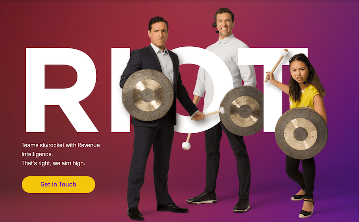
There are many elements that we could point to on GONG’s About page which represent just how creative their page design is. Be it the gradient page background, the hero image which integrates and weaves graphic letters behind and in front of images of real humans, or the primary color of deep purple, there was evidently a lot of advanced thinking behind the look of this page.
We also love the hover effects over each employee’s photo, it gives a sense of individuality and significance to what we can learn about each person.
The minimal amount of text is also a defining feature, as we see that the most dominant element on the page is the background color composed of different shades of purple, communicating the brand personality visually, rather than verbally.
The first and last thought that any visitor will have when looking or exiting this page is: This is a bold, confident, and unique brand that’s definitely worth learning about.
15. Etsy: Clear, Concise Brand Messaging
Etsy uses the concept of white space and minimalist design in a phenomenal way. All they needed to add to their vast white space with large black font is the colorful GIF illustrations that set a friendly casual tone for visitors.
With few words alone, they represent what their product is and what their brand values are. There’s no room for confusion. They do the same when communicating to the user what they’re brand is about and what they believe in.
Etsy’s “About Us” page design gives web creators living proof that in web design, less is more. The clearer your brand’s messaging and content is, the bigger your impact on visitors will be, even if you keep your content on the short side.
16. GIPHY: Focusing on Motion Effects
GIPHY shows us web creators how to make a video background look awesome. They position their value proposition nicely under a short animation, and then dive into their virtual reality-like GIF that lets visitors feel like they’re going on an adventure by scrolling down the page.
It makes perfect sense that a site whose product is all about animation will use animation for every design element possible when designing their site. This comes to play with the motion effects they use such as the googly eyes above the ‘Contact Us’ section, and the interactive avatars that represent each of their employees.
Since their job is to prove their expertise in animated illustrations, GIPHY does a great job of telling their story by showing all sorts of animated effects that are sophisticated, playful, and creative all the same.
So, What Are You About?
As you can tell, we love the inspiring examples we’ve just listed above. Brand storytelling, both in words and in design, is such a powerful tool for business and community prosperity. Now that you’ve seen these works of art, it’s time to get cracking on your About pages.
To recap, these are some takeaways we’ve learned from our personal favorite design examples:
- Choose what to emphasize – Think carefully about what you want to emphasize, be it design elements, typography, or messaging. Your visitors are taking the time to get to know you better, so be very clear about what you want to share and what’s most important to the conversation.
- Find the right design language – Choose a design language that not only correlates directly to your branding (both visual and messaging), but really communicates what you want your About page to accomplish. If you’re looking to use it as an interpersonal gesture between you and your audience, for example, then choose imagery and content that focuses on community, human connections, social interactions, etc.
- Use trendy design features. Now is your time to plug in to motion effects, interesting layouts, minimalist design, and so on. You can even think of your About page as a way to test new design techniques that you’re considering adding on to your site, but aren’t sure if they’re the right fit.
- Be super creative. You want to leave a good impression on your audience, right? Think about how you can be different to your competitors, how you can stand out, and what innovative design you can leverage to create a unique identity.
- Show your audience how much you appreciate them. Community is key to any business’s growth, so it’s time to put your community members at the center! Find ways to convey how important your team is to your company, and how significant your community members to your brand value.
- Integrate your product’s actual UX. Whether it’s making the page look like your product’s UI, or alternative ways such as using a lot of the same imagery, symbols, typeface, etc.
As with most things in web design, trends chosen and loved by web creators are constantly changing and evolving. We can’t wait to see what you come up with for your About Us pages and how you continue to design them later on!
Looking for fresh content?
By entering your email, you agree to receive Elementor emails, including marketing emails,
and agree to our Terms & Conditions and Privacy Policy.
