Brutalism is one of those trends that seems to come and go in web design. It’s not because there isn’t much value in brutalist design. It’s more that it doesn’t always fit with the style and tone of the times.
That’s part of what makes brutalism so intriguing though. When most websites tend to fall in line and adopt the same basic trends from year to year, a website that doesn’t play by the rules can easily steal the spotlight.
You just need to know whether that’s the right kind of light you want to shine on the brand. Brutalism can sometimes come off as cold and somber. If it’s not properly executed or not used for the right kind of brand, it can send the wrong signals to website visitors.
In this guide to brutalism in web design, we’ll discuss what it is and how it differs from minimalist and antidesign trends. In addition, we’ll break down the principles that guide brutalism, show some examples of brutalist websites, and offer suggestions on when and when not to use it.
20 Principles of Website Design Every Web Professional Should Know
What Is Brutalist Web Design?
Brutalism in web design is a crude, plain, and transparent style that prioritizes functionality over form and effectivity over aesthetics. It’s characterized by its raw appearance and extremely simplistic and minimalist approach.
Brutalism is a style of design that originated in the field of architecture in the 1950s. The word “brutalism” comes from the French brut, which translates to “raw”.
The Met Breuer, formerly the Whitney Museum of American Art building, is a good example of how brutalist design in architecture prioritizes function over form:

It’s a massive structure with striking features, built from raw materials. The Whitney Museum’s website is an equally accurate representation of what brutalism in web design looks like:
While brutalist websites might not have the megalithic and severe presences that brutalist buildings do, they are constructed in a similar fashion using the raw materials of the web. This means a greater reliance on HTML instead of CSS and JavaScript.
These are some of the identifiable traits of this web design technique:
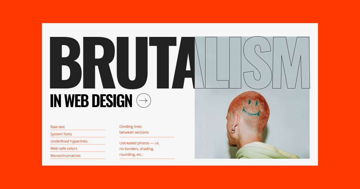
- Raw text
- System fonts
- Underlined hyperlinks
- Web-safe colors
- Monochromatism
- Solid color backgrounds with little to no decoration (so no gradients)
- Geometric components and sharp edges
- Untreated photos — i.e. no borders, shading, rounding, etc.
- Open navigation (as opposed to dropdown or hamburger menus)
- Dividing lines between sections
- Content contained within tables
- Outline buttons
While many brutalist websites share these traits, the designs aren’t always executed in the same manner — especially when web designers infuse brutalism into modern design techniques. For instance, the Whitney Museum website contains a predictable structure by today’s web design standards while also utilizing lots of imagery.
A Brief History of Brutalism
Brutalism emerged in Europe in the 1950s as countries sought to rebuild after World War II. One of the primary reasons this bare-bones style of design was pursued was because it was cost- and resource-efficient. While exposed concrete and brick facades and monochromatic palettes might not have led to the most attractive buildings, they were easier and cheaper to construct.
Countries like the United Kingdom (where brutalism originated) adopted brutalism because it was a practical and low-cost way to build functional housing, educational institutions, and government buildings. The Soviet Union was another country that adopted brutalism post-WWII. It did this in order to deal with its housing crisis. It was also a way to reject the politeness and extravagance of the bourgeoisie.
The brutalist movement eventually declined in the 1970s. While the cheap, raw materials that architects used to construct brutalist buildings allowed for fast rebuilding and growth, the looming, rugged forms gained a negative reputation for their seeming coldness, harshness, and association with Communism.
That said, brutalism didn’t completely disappear. Websites built in the early days of the Internet were brutalist.
In fact, some of the websites from the ‘90s that exist today maintain this style. Founded in 1995, Craigslist is one of the most popular examples of the brutalist web design trend. Here’s what it looked like back in 2000:

There’s no imagery — just column upon column of blue links against white backgrounds. Here’s what the website looks like in 2022:

While the site has a more refined feel to it, the original structure and raw approach to design remain the same. Craigslist passes on the imagery and white space you’d find on a conventionally attractive modern website. Instead, it uses column headers and blue hyperlinks to construct its main pages.
There are many directions in which web designers can go with brutalism. That said, it’s important not to confuse it with antidesign. This design trend is one that emerged in 1960s Italian architecture as well as in web design in the 1990s — it was characterized by garish, exaggerated, and disorienting interfaces.
The original purpose of brutalism was to strip design and construction down to the basics and make it more practical. Ugly designs were unfortunately sometimes the byproduct, but not the original intention as it was with antidesign.
Brutalist vs. Minimalist Web Design
While you might not look at a brutalist design and confuse it with a minimalist design, they do have one thing in common. Both design trends revolve around the idea that less is more. And that every element should serve a clear purpose.
Simplicity
Brutalism tends to take this concept to the extreme by stripping a website down to its skeletal framework. Function matters far more than form.
Minimalism, however, aims to balance simplicity with beauty, so the details still matter. Default CMS settings, system fonts, and overused color palettes rarely have any place in minimalism. Instead, web designers carefully plot out every detail related to spacing, hierarchy, symmetry, and more.
Aesthetics
Brutalist designers tend not to care too much about taste. The goal is to take the resources they have and implement them in a way that effectively gets the point across. Brutalism is truly a content-first approach to designing websites.
Minimalist designers, on the other hand, are more intentional. While the content is the most important component on the site, designers use more UI components and don’t shy away from styling or animation in order to draw attention to key areas of the page.
Relevance
Another big way in which these design trends differ is in how practical they are to use. Minimalism has been a long-standing trend in web design. That’s because it is an evergreen approach to design — simple, attractive, and usable interfaces will always be embraced by consumers.
Brutalism tends to have a much shorter lifespan when it doesn’t emerge among the year’s design trends. It also doesn’t have that many relevant use cases. It’s usually a trend adopted by creatives whose works are equally brutalist or avant-garde.
4 Principles of Brutalism in Web Design
Brutalism doesn’t always play by the principles of web design. That doesn’t mean that brutalist UIs are unusable though. They just play by a different set of rules:
1. Get Done What You Need to with the Bare Minimum
Brutalist design does not allow for waste. You use only what you need to create an effective website. That usually means working with unstyled HTML and using default settings for fonts, colors, shapes, and so on.
Functionality should also be straightforward and simplified. Visitors shouldn’t be burdened by excessive content, distracting features, or slow-loading pages.
2. Project Strength and Stability Through Structure
A brutalist website might seem primitive on its face, but you can project a lot of strength and stability through this style of design. Even if your web pages aren’t dominated by oversized, looming typography, the exposed structure of the UI — like the separating lines, tables, and open navigation — can give a site a sturdy feel.
Using basic colors like black, white, and natural colors like grey, tan and copper will make a website feel more solid, too — like the physical structures they’re modeled after. Rough, imperfect UIs with hard edges also contribute to a more industrial-feeling website.
3. An Effective Design Doesn’t Need to Be Attractive
While there might not be anything pretty about a stripped-down interface, that might not matter much to users who want a fast and easy way to engage with the site and convert.
That said, brutalist web design doesn’t necessarily need to be ugly. There are plenty of examples of contemporary and modern brutalist architecture, furniture, and websites that are intricately designed without being wasteful or extravagant.
4. Convey Transparency Through Simplicity
When brutalism first entered the scene, it was a practical and efficient way to construct buildings. It also challenged the artificiality and lightness that was seen everywhere else.
As such, today’s brutalism isn’t just useful for conveying strength. Its rugged and imperfect interfaces can also convey certain truths about a brand that words alone sometimes cannot. Brutalism in web design enables brands to put their real selves out there, and in a way that many brands and people wouldn’t be confident enough to do so.
7 Examples of Brutalist Web Design
Let’s take a look at some examples of brutalist website examples that showcase the different ways in which this design trend is being used today:
1. 56 Digital
56 Digital is a digital studio based in Toronto. What you see above is the agency’s portfolio website. While prospective clients will find portfolio graphics tucked under the collapsible project list at the bottom, there isn’t a lot to look at.
There is no navigation to speak of — just some basic information about the company and links to their social media. There’s also a plain text list of the agency’s creative services. Beneath that is a table containing project names and years. It’s only when the visitor hovers over the project rows that they’ll be able to reveal the associated image and a single-line description.
2. A2-TYPE
A2-TYPE is an independent font foundry. The GIF above comes from the company’s Fonts page. That said, the majority of this site is what you would call brutalist in design — that goes for the open navigation at the top of the site that displays all pages without the need for engagement.
The background of this page is a solid magenta color. The fonts are displayed in the same size, along the same column, and are evenly spaced within their categories. There are no images to speak of, but that’s because the embedded fonts are all the visitors will want to see anyway.
3. Alicia Keys
In recent years, singer, songwriter and actress Alicia Keys has made a point of scaling back her physical appearance, often appearing without makeup at high-profile events. So, we weren’t surprised to see her website imbued with that same kind of raw, authentic quality.
Most of the images on the home page are untreated. In other words, they appear on the page in their original size, shape, and container. What’s more, they’re accompanied by very few words, styled using a basic sans serif typography.
4. Apelido & Apelido

Apelido & Apelido is a quirky digital design studio with an equally quirky website. The screenshot above is what the hero section of the site looks like. There is no header to speak of. Just boxes containing text and a funky logo.
The single-page website isn’t completely brutalist though. Visitors encounter random animations, an interactive video, and a guestbook in lieu of a traditional contact form.
5. Balenciaga

Balenciaga has long pushed people’s buttons with its fashion. Years ago, it took its website to an extreme in terms of style, too.
What you see above is a screenshot of the Balenciaga homepage in 2017. The site’s design resembled a wireframe more than a full-fledged website. It wasn’t until shoppers made their way through the categories that they’d encounter product imagery and a UI they’d be more familiar with.
These days, the brutalist design is not as all-encompassing as it once was. Here’s what the site looks like in 2022:
The header, footer, navigation, live chat widget, and buttons retain the site’s rudimentary wireframe-like look.
6. Drudge Report
Drudge Report is a news aggregation website that’s been around nearly as long as Craigslist has. Just like Craigslist, Drudge Report has maintained its brutalist style to this day.
While readers will find the occasional image or third-party ad banner on the page, the majority of the UI consists of plain text links to articles and news sources. They’re depicted in a basic black underlined style. The links are also organized haphazardly on the page and each section is divided by thin black lines.
7. Seth’s Blog
Seth Godin is an entrepreneur and author who maintains a brutalist-styled blog called Seth’s Blog. There are no images on the long-scrolling page. The navigation is visible in full and at all times on the left. In addition, any hyperlinks that appear within the post appear as blue underlined text links.
Despite this all-text blog being styled in the fashion of brutalism, it has an attractive design. That’s because it follows many of the UX principles that inform how designers should space, group, and layout pages based on human psychology and user preferences.
Should You Use Brutalism on Websites?
Brutalism can be a cutting-edge way to approach web design. But it’s a tricky design trend to master — not only in terms of technique but also in terms of when and where you apply it.
If you’re intrigued by brutalism and wondering how you can make it work on the web, here are some pros and cons to consider:
The Pros of Brutalist Web Design
- Stand out from the crowd: A brutalist website will look unlike anything the competition is doing, which will automatically make the brand stand out. This is especially useful for artistic types who want to make a killer impression on potential clients, users, or buyers.
- Maximum effectiveness: In brutalism, it doesn’t matter if a website is attractive so long as it’s effective. If you have a solid understanding of web design principles and human psychology, you can create distraction-free and usable UIs that are highly successful at converting users.
- Minimize costs and resources: Brutalism is a cost- and resource-efficient way of designing websites. If you’re working with a client who wants a high-converting site without all the bells and whistles, brutalism can be a great way to fulfill that request.
- Faster loading times: Because brutalist designs are primarily created using HTML and are light on imagery, you and your clients will benefit from the byproduct of speed. Without all that CSS and JavaScript to slow things down, brutalist websites can load very quickly — which is good for the user experience and SEO.
The Cons of Brutalist Web Design
- Visually unappealing: Brutalist designs aren’t always the most visually pleasing. While aesthetics are not a priority in brutalism, an ugly interface can send visitors screaming according to the Aesthetic-Usability Effect.
- Negative associations: Brutalism doesn’t have the best of reputations, with many viewing these designs as cold, somber, rough, imposing, post-apocalyptic, and a host of other negative descriptors. Be careful with how raw you go with your designs or else the brand may be associated with those adjectives, too.
- Not durable: Unlike minimalism which will always feel modern and timely, brutalist web design isn’t the most durable of trends. If you use it on a website, you’ll likely have to monitor its performance closely and implement a redesign when engagement and conversions drop.
- Less readable: Brutalist websites are not necessarily the easiest to look at over long stretches. So, you’ll have to be mindful of that when deciding when to use this style. You may have to “break” some of brutalism’s rules in order to bring balance, space, and other elements to the UI to make it less difficult to read.
Conclusion
Brutalism may have had its roots in the 1950s architecture of Europe, but the Internet has been dabbling with this web design trend for decades now. That said, brutalist design isn’t like modern design trends like minimalism or flat design that are here to stay.
Brutalism is a special breed of web design. It works well for quirky, creative brands and individuals. However, this rule-bending design technique isn’t always well-received, no matter how closely you follow its basic principles.
While there are some great examples of brutalism on the web today, many of those brands have mixed old-school brutalism with modern design trends so as to ensure their user-friendliness. If you’re thinking about utilizing this web design trend, that’s something to keep in mind.
Today’s consumers have grown comfortable with attractive interfaces. Brutalism taken to the extreme might create too jarring of an experience for them. So, striking a good balance between brutalism and modern minimalism will be a safe way to play around with this technique.
